2. Summary
GDP growth slowed marginally to 0.4% in the first quarter of 2016. This is below the average quarterly growth of 0.6% seen since Q11 2013 when GDP growth became well established. GDP growth in the first quarter was driven by the services industries, while the other main sectors contracted.
Since the economic downturn, there has been considerable focus on the ‘productivity puzzle’ – why productivity growth has not recovered in tandem with rising GDP growth. This edition of the Economic Review looks at the top and bottom industries in terms of output growth and compares them to the strongest and weakest performing industries in terms of productivity growth.
Inflation has continued to rise gradually during the early months of 2016, mainly as a result of a pick-up in core inflation. The ‘wedge’ that opened up between headline and core inflation measures during 2015 has therefore remained broadly unchanged as the main elements differentiating the two – energy, food, beverages and tobacco – are those that have been most susceptible to downward price pressure.
Updated analysis of different components of the Consumer Price Index (CPI) inflation basket indicates that it is the more import-intensive components that have been contributing to low inflation, coinciding with the appreciation of sterling during 2014 and 2015 which has fed through to lower prices of imported goods and services.
UK export growth performed relatively well during 2015, compared with world export growth and the performance of the UK’s export markets. This improvement in export growth during 2015 was due to a larger pick-up in export growth for goods rather than for services. However, the contribution to export growth from services has been more consistently positive in recent years, while goods export growth has tended to be more erratic.
The recently developed ‘cash’ household saving ratio is lower than the National Accounts defined saving ratio, and has been negative since 2013. The key difference between the two is the exclusion of imputed and non-cash expenditure and income (resources) from the National Accounts saving ratio, possibly making the ‘cash’ version of the saving ratio more meaningful to households. The cash version of the saving ratio has fallen by less than the National Accounts definition since 2010 and rose slightly in 2015.
As the labour market showed signs of tightening over the past three years, attention has turned to when recruitment difficulties might feed through to higher earnings growth for those people starting new jobs. This Review analyses that relationship, and finds evidence that new-starter earnings growth tends to increase during periods of recruitment difficulty, although the relationship is weak at times. The analysis adjusts the earnings growth for compositional effects – such as education levels and the sector of the economy – which improves the relationship to some extent. Additionally, the pay differential associated with age, education, industry and other characteristics of new starters has changed over the past two decades.
Notes:
- Q1 refers to January to March; Q2 refers to April to June; Q3 refers to July to September, Q4 refers to October to December.
3. GDP
The preliminary GDP release indicated that the UK economy grew by 0.4% in the first quarter of 2016, slightly slower than during the previous quarter (0.6%), and below the quarterly average of the past three years (0.6%) when GDP growth became more established. The economy grew more steadily from the first quarter of 2013 compared to the earlier years between the economic downturn and 2013, but growth in the first quarter of 2016 marked a slight moderation in that trend.
Figure 1: GDP growth
Chained volume measure, quarter on quarter and quarter on same quarter previous year, UK, Q1 2012 to Q1 2016
Source: Office for National Statistics
Download this chart Figure 1: GDP growth
Image .csv .xlsGDP is now 7.3% above its pre-downturn peak and has been growing for 13 consecutive quarters. Figure 2 shows the path of GDP and the headline industries since the downturn, with Q1 2008 indexed to 100. The chart shows that the services industries have experienced the strongest and steadiest growth in the recovery, continuing the shift of output towards these industries and away from manufacturing. It also shows that the latest easing in GDP growth has been driven by falling output in the construction, manufacturing and production (excluding manufacturing) industries. In contrast, the output of the services industries experienced only a slight easing in growth to 0.6% in the first quarter of 2016 from 0.8% in the fourth quarter of 2015.
Figure 2: GDP and main components
Chained volume measures, UK, Q1 2008 to Q1 2016
Source: Office for National Statistics
Download this chart Figure 2: GDP and main components
Image .csv .xlsHowever, while output growth in the most recent quarter was entirely driven by the services industries, the contributions of the broad industry groupings to Gross Value Added (GVA) have been mixed when comparing growth to their relative importance in the UK economy. The services industry – which accounted for around 79% of UK output in 2012 – has accounted for a larger share of output growth (84%) since the onset of a more sustained economic recovery in Q1 2013. The cumulative contribution of construction and agriculture (9.4% and 1.4%) are also greater than their shares of output (5.9% and 0.7%, respectively). However, the performances of manufacturing and production excluding manufacturing have been more modest (accounting for 2.8% and 2.2% of output growth, compared with output shares of 10.3% and 4.6%, respectively). This highlights the unbalanced nature of the economic recovery, with recent growth in weaker performing components doing little to restructure the economy towards manufacturing and its components.
Nôl i'r tabl cynnwys4. GDP and productivity
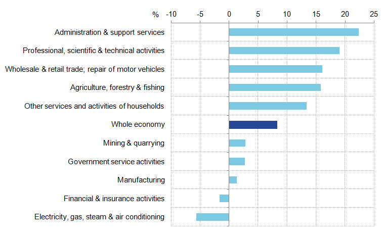
The increase in GDP growth since 2012 reflects mixed, but generally positive growth across industries. Figure 3 examines GVA growth between 2012 and 2015 by industry section and focuses on the 5 fastest growing and the 5 slowest growing industries. Services industries have generally seen the highest rate of growth. Administrative and support service activities has grown by the largest amount, with a growth rate of 22.3% for the 4 year period, closely followed by professional, scientific and technical activities at 19.1%.
Figure 3: UK gross value added (GVA) growth by industry section – five fastest and five slowest growing industries
% growth between 2012 and 2015
Source: Office for National Statistics
Download this image Figure 3: UK gross value added (GVA) growth by industry section – five fastest and five slowest growing industries
.png (16.4 kB) .xlsx (10.7 kB)While services are prevalent among high-growth industries, production industries made up 3 of the 5 slowest growing industries. One production industry – electricity, gas, steam and air conditioning supply – was one of only two industries to experience negative growth across the four year period. However, even among the lowest growth industries, most experienced positive growth. Mining and quarrying, government service activities and manufacturing all experienced modest positive growth, at rates of 2.8%, 2.7% and 1.3%, respectively.
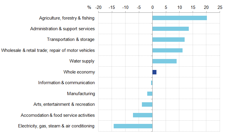
These differing output performances partially reflect differences in labour productivity1 growth across industries, shown in Figure 4. While there is some overlap between industries with high GVA growth and industries with high productivity growth, differences between the two provide an interesting window on drivers of the UK’s productivity puzzle.
Figure 4: UK gross value added (GVA) per hour growth by industry section– five fastest and five slowest growing industries
% growth between 2012 and 2015
Source: Office for National Statistics
Download this image Figure 4: UK gross value added (GVA) per hour growth by industry section– five fastest and five slowest growing industries
.png (16.2 kB) .xlsx (10.7 kB)Production industries again feature toward the lower end of the labour productivity distribution, but not as prevalently as in Figure 3. In addition, among service industries there is variation in the extent to which relatively high output growth aligns with relatively high productivity growth. While professional, scientific, and technical activities experienced the second highest GVA growth, it did not feature among the top 5 in terms of productivity growth – implying that output growth in this industry partially reflected an increase in labour inputs. However, administration and support service activities features toward the top end of both distributions, suggesting the industry relied more heavily upon improvements in the productivity of labour to increase output.
Differences between Figures 3 and 4 highlight important differences in the contributions labour inputs and labour productivity have made to output growth, but do not take account of the effect of labour quality and how capital is used in the production process. ONS will be releasing multifactor productivity estimates for 2014 on 6 May 2016 which provide this more detailed decomposition of output growth.
Notes:
- Labour productivity here is measured as output per hour worked.
5. Inflation
The Consumer Price Index (CPI) 12-month rate steadily declined between June 2013 and April 2015, reaching a low of -0.1% in April, September and October 2015. The inflation rate began to rise in November 2015 and by March 2016 it had reached 0.5% – an increase of 0.2 percentage points compared with the February 2016 rate – and the highest rate since December 2014. Inflation is nevertheless still below the Bank of England’s target of 2%, which is set by the Treasury. Inflation has been below 2% since January 2014.
The fall in inflation in 2014, and the rise in recent months, is reflected in both headline and core CPI inflation. Figure 5 shows the path of headline and core inflation during the last two years. In March 2014, core and headline inflation were both at 1.6%, but the fall in oil and therefore energy prices and the competitive pressures holding down food and beverage prices during 2015 served to open up a pronounced gap between headline and core inflation. By March 2016, core inflation was 1.5% – one percentage point higher than headline (all items) inflation. The prices of food, energy, alcohol and tobacco, which account for 21.2% of the basket of goods that makes up all items in the headline CPI, have collectively weighed down on inflation over the last 18 months.
Figure 5: Headline and core CPI inflation
% change on same month previous year, UK, March 2013 to March 2016
Source: Office for National Statistics
Download this chart Figure 5: Headline and core CPI inflation
Image .csv .xlsThe sharp decline in oil prices during 2014 and 2015 has been a significant factor weighing down on headline CPI inflation, and has been an important element of the expanding gap between headline and core inflation. Brent crude, the UK’s primary oil type, fell by 72% from $112 a barrel in June 2014 to $31 a barrel in January 2016. Fuels and lubricants, the main CPI component incorporating oil prices, has contributed negatively to inflation consistently over the past two years (Figure 6). However, this downward pressure increased sharply at the start of 2015, with the negative contribution peaking at 0.6 percentage points in January and February 2015. The fall in oil prices was also reflected in the downward contribution from electricity, gas and other fuels, which sharply increased in late 2014 and has persisted since. In addition, food has also made a persistent negative contribution since late 2014, and in March 2016 stood at -0.3 percentage points. Contributions from the beverages categories (both alcoholic and non-alcoholic) have contributed the least to headline inflation (positively or negatively) during the last two years with both posting small negative contributions in March 2016. Tobacco is the only ‘non-core’ CPI category to have had an upwards contribution throughout and this has been consistently between 0.1 and 0.2 percentage points.
Figure 6: Contribution of food and energy prices categories to annual CPI inflation (percentage points),
Percentage points, UK, March 2014 to March 2016
Source: Office for National Statistics
Download this chart Figure 6: Contribution of food and energy prices categories to annual CPI inflation (percentage points),
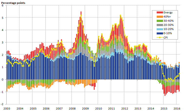
Image .csv .xlsIn addition to the impact of falling oil prices since 2014, sterling appreciated by 11% between mid-2013 and mid-2014, which served to lower the price of imported goods and services, resulting in lower CPI inflation. Figure 7 shows the contributions to inflation of products with different import intensities. The import intensity of a CPI good or service is calculated as the percentage of final household consumption made up of directly imported goods or services; goods and services are then grouped together by their import intensity, and ‘energy’ is categorised separately.
Figure 7: Headline inflation and contributions to inflation by import intensity
Percentage points, UK, January 2003 to March 2016
Source: Office for National Statistics
Download this image Figure 7: Headline inflation and contributions to inflation by import intensity
.png (46.8 kB) .xls (45.1 kB)Much of the variation in CPI inflation is driven by changes in the contribution from import intensive goods and energy. In September 2008, when inflation reached a peak of 5.2%, the contribution of goods and services with an import intensity of over 20% was 0.9 percentage points while energy contributed 2.1 percentage points. In contrast, when inflation fell to 1.1% by September 2009 the joint contribution of the two fell to -0.4 percentage points. While these two categories account for much of the fall in inflation since 2014, the contribution of less import intensive goods and services has fallen in recent years. The contribution of goods and services with an import intensity of less than 10% fell from an average of 2.1 percentage points in 2011 to an average of 1.0 percentage points by 2015.
Part of the recent pick-up in inflation may reflect a fall in Sterling and partial recovery, or stabilisation, of oil prices. Changes in the CPI contribution from import intensive goods and services broadly coincide with changes in Sterling’s exchange rate, shown in Figure 8. The local peak of inflation at 5.2% in September 2008 followed the beginning of a depreciation of Sterling in 2008. This depreciation continued into 2009, and may have partially elevated inflation in 2010 and 2011, as the depreciated exchange rate gradually passed through to goods and services in the UK. From 2014 until late 2015 Sterling was generally appreciating, coinciding with the fall in CPI inflation. However, this general appreciation masked divergent trends between Sterling, the Euro and the US Dollar – while Sterling appreciated against the Euro, it depreciated against the Dollar, complicating the effect that currency movements may have had on inflation.
Figure 8: Sterling exchange rate movements against the Euro, the US Dollar, and effective exchange rate (trade-weighted basket of currencies)
% change on same month previous year, UK, January 2003 to March 2016
Source: Bank of England
Download this chart Figure 8: Sterling exchange rate movements against the Euro, the US Dollar, and effective exchange rate (trade-weighted basket of currencies)
Image .csv .xls6. Producer price inflation and import prices
Currency movements directly affect both the prices faced by consumers, and the prices paid by businesses for imported goods and raw materials. The Producer Price Index (PPI) – a measure of manufacturing firms’ input and output prices – showed that both input and output price inflation declined during late 2014 and most of 2015, following a period of appreciation between mid-2013 and mid-2014, but have recovered in recent months. However, overall both input and output prices are still falling compared with a year earlier. In March 2016, input price inflation stood at -6.5% and output price inflation at -0.9%. The path of output and input PPI suggests that during recent years input costs have been feeding through to the output prices of manufactured goods, although labour costs are typically a much larger share of manufacturers’ output prices compared to input costs.
Figure 9 shows the rate of inflation for imports into the UK and the 12-month change in the trade-weighted effective exchange rate since 2010. It is expected, all other things being equal, that an appreciation of Sterling will reduce the price of imports and vice versa. Since 2010, the inverse relationship between the effective exchange rate and import price inflation (12 month rate) has held relatively strongly. In the last five months (mid-November to early April) Sterling has depreciated markedly, by 11%, and this has been reflected in a sharp increase in import inflation.
Figure 9: Import price inflation and changes in the Sterling effective exchange rate (trade weighted exchange rate)
% change on same month previous year, UK, January 2010 to March 2016
Source: Office for National Statistics, Bank of England
Download this chart Figure 9: Import price inflation and changes in the Sterling effective exchange rate (trade weighted exchange rate)
Image .csv .xls7. Trade
Trade remains an important element of UK economic growth; its performance has been varied during the last six years, but remains in line with the general variation of UK and world export growth over the past 15 years (Figure 10). UK export growth has been in line with world export performance, although world export growth has tended to fluctuate more than UK export growth. This may be in part due to the relatively mature nature of the UK economy and the different make-up of economic growth that comes with that, compared to the emerging and developing economies which make up a significant, and rising, share of world export growth. Figure 10 illustrates the UK’s export growth performance relative to world export growth.
Figure 10: UK export growth, world export growth and UK export market growth (export-weighted GDP growth) for goods and services
Volumes, % change on previous year, 2000 to 2015
Source: Office for National Statistics, International Monetary Fund (IMF)
Notes:
- World export growth is sourced from the IMF WEO, April 2016. UK export market growth is based on ONS estimates of country shares of total exports multiplied by GDP growth in the relevant country based on IMF GDP growth data.
Download this chart Figure 10: UK export growth, world export growth and UK export market growth (export-weighted GDP growth) for goods and services
Image .csv .xlsThe chart also shows UK export growth compared to GDP growth in UK export markets, weighting each country’s growth by the share of UK exports going to that country in 2014. This provides an indication of what potential export growth might be, given economic growth, and therefore demand, in our export markets. Figure 10 shows that UK export growth has performed broadly in line with UK export market growth, however, in most years since 2010 UK export growth has been faster than UK export market growth. Since 2010, UK export growth has performed relatively well given the weaker growth in UK export markets, particularly the EU which makes up around half of the UK’s export market. This is particularly so in 2015, when UK export growth performed better than both UK export market growth and world export growth.
The better performance of UK exports in 2015 was driven by exports of goods – of the 5.1% growth in 2015, goods made up 3.9 percentage points while exports of services contributed 1.1 percentage points (Figure 11). However, the relative composition of export growth since 2010 has been more varied, with services making a more stable contribution to export growth when compared to the relatively erratic contribution of goods exports. It should be noted, however, that goods exports are around one and a half times that of services exports.
Figure 11: Contributions to export growth for goods and services
Volumes, percentage points, UK, 2000 to 2015
Source: Office for National Statistics
Download this chart Figure 11: Contributions to export growth for goods and services
Image .csv .xls8. Alternative savings ratio
The Quarterly National Accounts published on 31 March 2016 contained information on the household saving ratio: the fraction of household and non-profit institutions serving households (NPISH) disposable income in each period which is left over after taxes, interest payments and consumption. As reported in a previous edition of the ONS Economic Review, the saving ratio fell to 3.8% in Q4 2015 – a 50 year low, and considerably lower than the post-downturn average. Much of this fall in the saving ratio was as a consequence of stronger growth in consumption, which increased by 1.8% on the quarter, compared with household income which rose by 0.7% over the same period.
The saving ratio in the National Accounts reflects the balance on household income and outgoings, including a mixture of observed income and expenditure – such as wages and salaries, income from self employment and spending on goods and services – as well as imputed and non-cash income and expenditure. These latter categories include the value of several ‘non-cash’ items, many of which are not readily apparent to households, such as employer’s pension contributions and imputed rentals - the value of housing services that are implicitly paid for by owner occupiers and accrue to these households. Excluding these imputed and non-cash elements of income and expenditure yields a more narrowly defined saving ratio, which may be a better approximation of the ‘cash’ position of the household sector and reflect more closely the experience of households, which was the subject of recent analysis by ONS.
Both the headline National Accounts saving ratio and the alternative ‘cash’ saving ratio are shown in Figure 12. It indicates that while the trajectory of both saving ratios has been similar since 1997 – falling until 2007, rising during the economic downturn, then falling again – the difference between the two series has varied. As shown by the bars in Figure 12, the gap between the two ratios has fluctuated between 6 and 11 percentage points, reflecting variation in the impact of imputed and non-cash income and expenditure through time. On a cash basis, the saving ratio was markedly negative prior to the economic downturn, and has fallen below zero again in recent years, reflecting dis-saving by the household sector as a whole.
Figure 12: The saving ratio, the alternative ‘cash’ saving ratio (%) and the difference between the two (percentage points)
UK, 1997 to 2015
Source: Office for National Statistics
Download this chart Figure 12: The saving ratio, the alternative ‘cash’ saving ratio (%) and the difference between the two (percentage points)
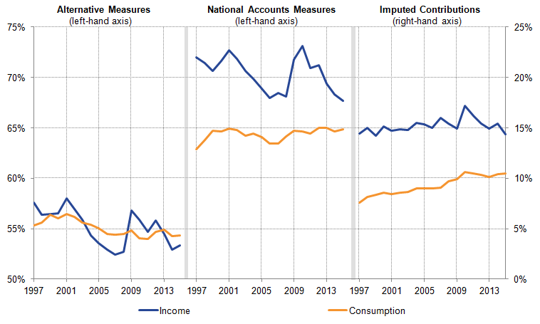
Image .csv .xlsThe relative strength of the National Accounts measure of the saving ratio indicates that imputed and non-cash income accruing to households is greater than the imputed components of their consumption, raising the value of households’ income by more than the rise in the value of households’ expenditure. To examine these effects in more detail, Figure 13 shows households’ income and consumption for the cash (left panel) and national accounts saving ratios (middle), expressed as a share of nominal GDP. It indicates that moving from the cash to National Accounts basis by adding the imputed components adds around 15 percentage points to household income each period (shown in the right hand panel). While this difference has fluctuated between 14 and 17 percentage points, the addition of the imputed elements of income has left the profile of households’ income broadly unchanged.
Figure 13: Income and consumption expenditure: Alternative/cash basis, National Accounts basis, and the value of imputed income and expenditure
Households and Non-Profit Institutions Serving Households, % Nominal GDP, UK, 1997 to 2015
Source: Office for National Statistics
Download this image Figure 13: Income and consumption expenditure: Alternative/cash basis, National Accounts basis, and the value of imputed income and expenditure
.png (28.8 kB) .xls (51.2 kB)Throughout this period, the addition of imputed expenditure raises the level of household consumption, but by a smaller amount than the rise in income, which in turn explains why the cash saving ratio is lower than that in the National Accounts. However, adding imputed consumption to the cash measure also alters the profile of household expenditure. On a cash basis, consumption fell as a share of GDP during much of the 2000s – from around 56% of GDP to around 54% (left hand panel). However, on a National Accounts basis, consumption has been broadly flat at around 65% of GDP over this time period, reflecting the growing proportion of household consumption in the National Accounts which is imputed (right hand panel). This imputed component of expenditure has risen from around 7.6% of GDP to close to 10.5% between 1997 and 2015.
Nôl i'r tabl cynnwys9. Labour market
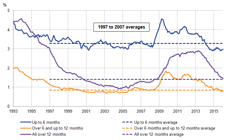
The UK labour market has been improving gradually over the past few years since the downturn, and has been relatively stable in recent months. The headline indicators of the labour market – the employment rate, employment levels, unemployment rate and unemployment levels – have been fairly steady in the three months to January 2016 and to February 2016. The employment rate among those aged 16 to 64 remained at 74.1%, which is higher than a year earlier (73.4%) and the joint highest since comparable records began in 1971. Conversely, the unemployment rate for those over the age of 16 remained at 5.1% in the three months to February 2016. However, there was a slight rise in the unemployment rate among those aged 16 to 64, from 5.2% in the 3 months to November 2015, to 5.3% in the 3 months to February 2016, reflecting a small rise in unemployment levels. The recent, slight rise in unemployment is reflected in a slight increase in the shorter-term unemployment brackets (Figure 14). Although unemployment in all three duration brackets has fallen since mid 2013, Figure 14 shows a small up-tick in unemployment in the latest periods for the ‘up to six months’ and the 6 to 12 month brackets. The decline in unemployment over the past three years reflects a fall in longer term unemployment, while the recent increase reflects movement toward the shorter end of the unemployment duration groups. Nevertheless, unemployment for short, medium and longer term durations are all below or close to the average over the last 10 years.
Figure 14: Unemployment rate by duration compared with respective averages between 1997 and 2007
%, UK, seasonally adjusted, December-February 1993 to December-February 2016
Source: Office for National Statistics
Download this image Figure 14: Unemployment rate by duration compared with respective averages between 1997 and 2007
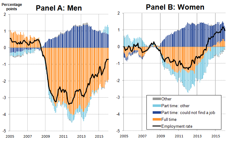
.png (27.1 kB) .xlsx (30.0 kB)The increase in the employment rate since 2013 – resulting in a record high of 74.1% for 16 to 64 year olds in the three months to February 2016 – reflects differing experiences for men and women. These experiences are explored in Figure 15, which shows contributions to the change in the male and female 16 and over employment rate, relative to 2008. While rates fell during the economic downturn in 2008-09, primarily driven by a fall in full-time work for both, the rate fell by more for men than for women. In both cases the contribution from involuntary part-time workers (those who could not find full-time work) rose. “Part-time: Other”, which includes all voluntary part-time workers, contributed to a fall in the female and male employment rate relative to 2008 – part of a long-term trend toward full-time work for women.
Figure 15: Contributions to the change in the male and female employment rate relative to 2008
Ages 16 and over, percentage points, UK, December-February 2005 to December- February 2016
Source: Office for National Statistics
Download this image Figure 15: Contributions to the change in the male and female employment rate relative to 2008
.png (35.1 kB) .xlsx (41.6 kB)Since 2013 both the male and female employment rates have increased, due in part to an increase in full-time employment. However, while the female employment rate exceeded its pre-downturn peak in 2014, the male employment rate remains lower – primarily due to full-time employment. Additionally, the increase in part-time workers unable to find full-time work has fallen for both men and women in recent years, but more prominently for men than for women. These trends in employment may reflect, along with other factors, changes to government policy – an increase to the female pension age from 60 to 65, the gradual extension of Work Capability Assessments to those previously in receipt of incapacity benefits from around 2011, and changes to Income Support for lone parents since November 2008. These factors may have increased the proportion of women engaged in the labour market.
These labour market trends for both men and women partially reflect the evolving structure of the labour market. One such evolution is the trend to self-employment, which has played an important role in reducing unemployment and raising employment, as Figure 16 shows. This could well be because employees that have been made redundant have turned to a self-employed or freelance way of working, making use of skills and networks they have built up during previous employment. It may also be because self-employed people are continuing to work beyond retirement or into later years than they have done previously.
Figure 16 indicates that much of the rise in the level of employment relative to the 2008 average has been among self-employed workers. In the first quarter of 2010, at the start of the recent, strong rise in self-employment, it was almost 110,000 higher than in 2008. The rise in self-employment gained momentum throughout the economic recovery, and now accounts for around 15.0% of total employment, though the pace eased off during some of 2014 and 2015.
Figure 16: Contributions to the change in employment relative to 2008
Ages 16 and over, thousands, UK, seasonally adjusted, December-February 2006 to December- February 2016
Source: Office for National Statistics
Download this chart Figure 16: Contributions to the change in employment relative to 2008
Image .csv .xlsFigure 17 splits the growth in self-employment into those that work full-time or part-time. It shows that relative to the 2008, increases in self-employment have been concentrated among the part-time self-employed – 416,000 of the 710,000 increase in self employed workers between 2008 and 2015 were part-time. While part-time self employment has increased steadily since 2006, growth in full-time self employment was concentrated toward the end of 2013. This strong increase in self-employment reflects a marked structural shift in the UK’s labour market. The ONS will publish an article in June to indentify the drivers of these changes in self-employment.
Figure 17: Increase in self-employed workers by their respective working status, relative to 2008
Ages 16 and over, thousands, UK, seasonally adjusted, December-February 2006 to December- February 2016
Source: Office for National Statistics
Download this chart Figure 17: Increase in self-employed workers by their respective working status, relative to 2008
Image .csv .xls10. New starter pay
Despite recent falls in unemployment and the climb of the employment rate to a historic high, the rate of earnings growth in the UK economy has slowed in recent months. Average weekly regular pay in the three months to February 2016 was 2.2% higher than the same period a year earlier – considerably weaker than the pre-downturn average growth rate of around 4% and below the rates of between 2.3% and 2.9% observed during mid-2015. While the weakness of average earnings growth is broadly consistent with the recent relatively poor performance of productivity, it appears at odds with the evidence of a tightening of the labour market and the growing number of firms reporting recruitment difficulties.
Previous editions of the Economic Review have explored how the changing composition of inactive people joining the labour market, fewer workers moving between jobs, the composition of the broader labour force and underemployment among those in work may account for some of this subdued average earnings growth. However, an alternative approach to assessing the degree of inflationary wage pressure is to examine the earnings of workers who have recently changed employers. As earnings are thought to be more flexible at the point that workers move between jobs – when firms and employees can negotiate pay based on current labour market conditions – than for continuing members of staff, it is possible that wage pressures may emerge in the earnings of new starters before they are apparent in average earnings data. If earnings growth among new starters is particularly strong, it may indicate that firms are bidding up wages to attract recruits from a limited pool of workers. Alternatively, weak new starter pay may indicate that current labour market conditions favour firms over workers.
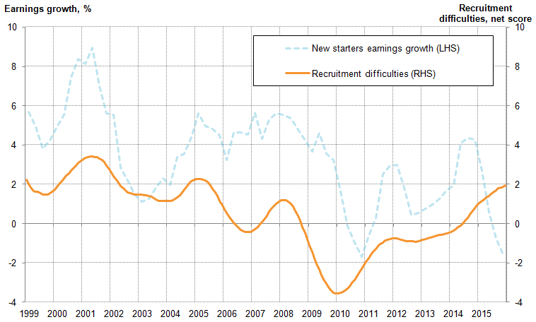
To examine these effects in more detail, Figure 18 shows the growth of average earnings for those with their employer for less than a year (left hand axis) and a measure of recruitment difficulties as reported by businesses to the Bank of England’s Agency Network1 (right hand axis), in which a higher net score indicates greater recruitment difficulty. It suggests a broad correlation between the two series, and some correspondence in the turning points in particular. Increases in recruitment difficulties in 2001 and 2005 each coincide with stronger growth in average new starter earnings, and the easing of recruitment difficulties following the economic downturn in 2008 and 2009 is accompanied by a fall in new starter earnings growth. While the relationship between the two is not perfect – with periods of divergence in 2006 and in 2015 in particular – it appears to suggest that more reported recruitment difficulties are associated with stronger growth of average new starter earnings.
Figure 18: Recruitment difficulties and growth in average earnings for new starters
Net score (12 month moving average) and % growth in four-quarter moving average, UK, Q1 1999 to Q4 2015
Source: Office of the Chief Economic Adviser calculations, Labour Force Survey, Bank of England
Notes:
- Data for earnings in Quarter 1 2001 have been estimated due to missing data for the period. New starters’ earnings growth includes those earning less than £100 an hour and less than £3500 a week.
Download this image Figure 18: Recruitment difficulties and growth in average earnings for new starters
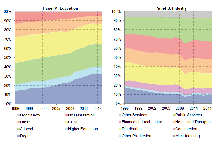
.png (28.3 kB) .xls (42.5 kB)While average new starter earnings growth may signal changes in the degree of spare capacity in the economy, it is also likely to reflect the changing composition of this group. For example, if new starters in a given period are relatively highly (poorly) skilled, then the average earnings of this group are likely to be higher (lower) to reflect this. Changes in the composition of new starters between periods can therefore result in changes in the growth of average new starter earnings, absent any changes in recruitment difficulties. Figure 19 shows two of these compositional changes, examining how the educational attainment and industry of employment of new starters has varied since 1996. Panel A suggests that the proportion of new starters who have a university education has increased over much of this period, rising from 14% in 1996 to 32% in 2013, but stalling thereafter. As more highly educated workers tend to earn more on average, the growing share of new starters with university degrees is likely to have supported average new starter earnings growth over this period. Equally, the slowdown in the share of new starters who are highly educated since 2013 may help to explain the recent slower earnings growth.
Figure 19: Composition of new starters by various characteristics
%, UK, 1996 to 2015
Source: Office of the Chief Economic Adviser calculations, Labour Force Survey
Notes:
- Industries exclude private households as employers and extra-territorial industries.
Download this image Figure 19: Composition of new starters by various characteristics
.png (31.4 kB) .xls (34.3 kB)The mix of industries which new starters report joining has also changed over the last 20 years, moving away from manufacturing toward finance, real estate, and public services. If new starters in a given industry earn more (or less) on average than in other industries, then the changing industrial mix in Panel B will also have a bearing on the average new starter earnings. If new starters increasingly move into relatively highly (poorly) paid industries, then this development is likely to support (depress) the growth of average new starter earnings. Panel B also suggests that the composition of hiring can change over quite a short time period: between 2007 and 2009 the proportion of new starters in public services increased from 21% to 27%, likely reflecting the different hiring responses to the downturn in the private and public sectors.
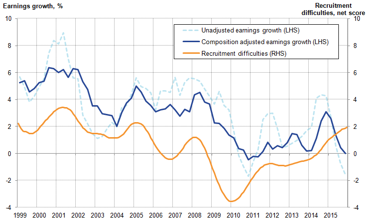
Controlling for compositional effects econometrically generates an earnings growth series adjusted for the characteristics of new starters, which arguably provides a clearer signal of wage pressures from new starting employees2. It also improves the relationship between new starters’ average earnings growth and recruitment difficulties somewhat (Figure 20). Prior to the downturn, composition-adjusted earnings growth varies within a smaller range than the unadjusted series, which corresponds with the narrower range of recruitment difficulties in this period. The turning points in adjusted earnings growth series also more closely correspond to turning points in recruitment difficulties than the unadjusted series, although periods of divergence remain – in particular in recent quarters.
Figure 20: New starter earnings growth, controlling for composition of new starters
Net score (12 month moving average) and % growth in four-quarter moving average, UK, Q1 1999 to Q4 2015
Source: Office of the Chief Economic Adviser calculations, Labour Force Survey, Bank of England
Notes:
- Data for earnings in Q1 2001 have been estimated. New starters’ earnings growth includes those earning less than £100 an hour and less than £3500 a week.
Download this image Figure 20: New starter earnings growth, controlling for composition of new starters
.png (36.5 kB) .xls (42.0 kB)Alongside changes in the composition of new employees, average new starter pay can also be affected by changes in the relative returns on worker attributes. Recent analysis by the Bank of England has indicated that the returns on specific individual characteristics – including on education, age and job tenure – have changed relatively markedly over the past 20 years. In particular, they conclude that the pay premium attached to holding a degree relative to holding no qualifications has fallen from around 45% in 1995 to 34% in 2015, while the pay premium for longer tenure has also declined over this period.
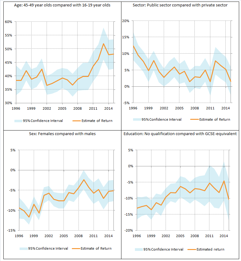
Applying this kind of analysis to new starter pay permits analysis of how the returns to new starting worker characteristics have changed through time, and in particular to identify whether some of the recent weakness in new starter earnings growth (shown in Figures 18 and 20) has been driven by changes in the return on specific individual attributes. Figure 21 shows the pay premium associated with four different characteristics: Panels A and B show the pay premiums associated with being aged 45 to 49 relative to the youngest workers and working in the public relative to the private sector respectively; Panels C and D show the pay premiums for females relative to males and for those holding GCSE level qualifications relative to holding no qualifications respectively.
Figure 21: Changing effects of characteristics over time, premium on hourly pay for specific worker attributes
%, UK, 1996 to 2015
Source: Office of the Chief Economic Adviser calculations, Labour Force Survey
Notes:
- Base case characteristics: 16-19 years old, distribution industry, sales occupation, private sector, female, GCSE-equivalent education, located in North East England, working full-time.
Download this image Figure 21: Changing effects of characteristics over time, premium on hourly pay for specific worker attributes
.png (58.6 kB) .xls (25.6 kB)All four panels of Figure 21 indicate that the returns to various new starter attributes have varied over the past 20 years. Panel A suggests that the pay premium for being an older worker relative to a younger work has risen considerably in recent years. In 2015, a worker aged 45 to 49 earned around 47.5% more than a worker aged 16 to 19 – holding all other characteristics constant – a considerably higher premium than in much of the pre-downturn period, when these workers enjoyed a relative pay premium of closer to 37%. This result, reflected across the range of older age groups, suggests that the pay of new starting older workers has been considerably stronger in recent years relative to new starting younger workers. Panel B report the pay premium associated with new starters entering employment in the public sector – again, holding all other characteristics constant. It indicates that following a period of relatively strong new starter earnings during the downturn, the pay premium associated with the public sector has declined in recent years.
Panels C and D both indicate negative premia associated with their reported characteristics. Panel C shows the hourly pay gap between men and women for new starters and how it has varied since 1996. Holding all other characteristics constant, this result suggests that women starting a new job earned close to 10% less than men in the late 1990s. However, over the following 20 years this gap has fallen to around 5%. Panel D shows the penalty associated with having no qualification relative to holding GCSEs. It indicates – consistent with the Bank of England analysis – that holding a GCSE adds between 10% and 15% to earnings relative to not holding a qualification, and that this gap has closed over recent years.
All of these results indicate that both the returns to specific worker attributes and the compositional mix of new starters appear to have played a role in the recent relatively weak growth of new starter earnings. While new starter wage growth has moved fairly closely with evidence of recruitment difficulties over the long term, the recent divergence means that the outlook for earnings growth is particularly uncertain.
Notes:
- Prior to 2005 the series for ‘skills shortages’ is used.
- To control for the characteristics of workers, we run a regression model in which the dependent variable – log earnings of new starters – is explained by their characteristics - including: Sex, age, industry, occupation, region, education, full- or part-time worker, and public/private sector employment, as well as a set of time period dummy variables. The composition adjusted earnings growth series presented is based on estimated coefficients on the time period dummy variables. The full results of this regression are available upon request.
11. Reference tables
Table 1: UK demand side indicators
| 2014 | 2015 | 2015 | 2015 | 2016 | 2015 | 2016 | 2016 | 2016 | |
| Q3 | Q4 | Q1 | Dec | Jan | Feb | Mar | |||
| GDP1 | 2.9 | 2.3 | 0.4 | 0.6 | 0.4 | ||||
| Index of Services | |||||||||
| All Services1 | 3.3 | 2.7 | 0.7 | 0.8 | .. | 0.3 | 0.1 | 0.1 | .. |
| Business Services & Finance1 | 3.8 | 2.7 | 0.6 | 0.7 | .. | 0.2 | -0.3 | 0.2 | .. |
| Government & Other1 | 1.9 | 0.7 | 0.5 | 0.4 | .. | 0.4 | -0.1 | 0.3 | .. |
| Distribution, Hotels & Rest. 1 | 4.7 | 4.7 | 0.9 | 1.4 | .. | - | 1.0 | 0.1 | .. |
| Transport, Stor. & Comms. 1 | 3.1 | 4.3 | 0.9 | 1.2 | .. | 0.8 | 0.4 | -0.5 | .. |
| Index of Production | |||||||||
| All Production1 | 1.3 | 1.0 | 0.2 | -0.4 | .. | -1.1 | 0.2 | -0.3 | .. |
| Manufacturing1 | 2.7 | -0.3 | -0.4 | 0.1 | .. | -0.3 | 0.5 | -1.1 | .. |
| Mining & Quarrying1 | -0.5 | 6.9 | 2.4 | -2.2 | .. | -3.9 | -4.9 | 3.6 | .. |
| Construction1 | 7.5 | 3.4 | -1.6 | 0.3 | .. | 2.1 | -0.4 | -0.3 | .. |
| Retail Sales Index | |||||||||
| All Retailing1 | 3.9 | 4.5 | 0.9 | 1.0 | 0.8 | -1.3 | 2.0 | -0.5 | -1.3 |
| All Retailing, excl.Fuel1 | 4.3 | 4.2 | 0.9 | 0.5 | 0.9 | -1.2 | 2.1 | -0.3 | -1.6 |
| Predom. Food Stores1 | 0.8 | 2.2 | 0.4 | 1.1 | 0.9 | 1.2 | 1.0 | -0.4 | -1.9 |
| Predom. Non-Food Stores1 | 6.6 | 4.5 | 0.8 | -0.3 | 0.9 | -3.3 | 3.1 | 0.0 | -1.5 |
| Non-Store Retailing1 | 11.8 | 13.4 | 3.7 | 1.9 | 0.3 | -2.1 | 1.8 | -1.1 | -0.6 |
| Trade | |||||||||
| Balance2, 3 | -34.0 | -36.7 | -8.9 | -12.2 | .. | -3.6 | -5.2 | -4.8 | .. |
| Exports4 | -1.4 | -0.4 | -2.3 | -1.1 | .. | -0.5 | 0.1 | 0.9 | .. |
| Imports4 | -1.4 | 0.1 | 0.9 | 1.4 | .. | -2.6 | 3.7 | 0.0 | .. |
| Public Sector Finances | |||||||||
| PSNB-ex3,5 | -2.1 | -20.7 | -2.8 | -4.6 | -5.6 | -4.1 | -2.4 | -0.6 | -2.6 |
| PSND-ex as a % GDP | 84.0 | 84.8 | 84.5 | 84.8 | 83.5 | 84.8 | 83.1 | 82.8 | 83.5 |
| Source: Office for National Statistics | |||||||||
| Notes: | |||||||||
| 1. Percentage change on previous period, seasonally adjusted, CVM | |||||||||
| 2. Levels, seasonally adjusted, CP | |||||||||
| 3. Expressed in £ billion | |||||||||
| 4. Percentage change on previous period, seasonally adjusted, CP | |||||||||
| 5. Public Sector net borrowing, excluding public sector banks. Level change on previous period a year ago, not seasonally adjusted | |||||||||
Download this table Table 1: UK demand side indicators
.xls (31.2 kB)
Table 2: UK supply side indicators
| 2014 | 2015 | 2015 | 2015 | 2015 | 2015 | 2015 | 2016 | 2016 | ||||||
| Q3 | Q4 | Q1 | Dec | Jan | Feb | Mar | ||||||||
| Labour Market | ||||||||||||||
| Employment Rate1, 2 | 72.9 | 73.7 | 73.7 | 74.1 | .. | 74.1 | 74.1 | .. | .. | |||||
| Unemployment Rate1, 3 | 6.2 | 5.4 | 5.3 | 5.1 | .. | 5.1 | 5.1 | .. | .. | |||||
| Inactivity Rate1, 4 | 22.2 | 22.0 | 22 | 21.8 | .. | 21.8 | 21.7 | .. | .. | |||||
| Claimant Count Rate7 | 3.0 | 2.3 | 2.3 | 2.3 | 2.1 | 2.2 | 2.1 | 2.1 | 2.1 | |||||
| Total Weekly Earnings6 | £480 | £492 | £494 | £495 | .. | £496 | £496 | £491 | .. | |||||
| CPI | ||||||||||||||
| All-item CPI5 | 1.5 | 0.0 | 0.0 | 0.1 | 0.3 | 0.2 | 0.3 | 0.3 | 0.5 | |||||
| Transport5 | 0.3 | -2.1 | -2.4 | -1.6 | -0.6 | -0.2 | -0.7 | -1.1 | -0.1 | |||||
| Recreation & Culture5 | 0.9 | -0.6 | -0.8 | -0.3 | -0.1 | -0.3 | -0.1 | -0.1 | -0.2 | |||||
| Utilities5 | 3.0 | 0.5 | 0.3 | 0.3 | 0.4 | 0.3 | 0.4 | 0.3 | 0.4 | |||||
| Food & Non-alcoh. Bev. 5 | -0.2 | -2.6 | -2.5 | -2.7 | -2.5 | -2.9 | -2.6 | -2.3 | -2.7 | |||||
| PPI | ||||||||||||||
| Input8 | -6.6 | -12.8 | -13.6 | -12.0 | -7.6 | -10.4 | -8.1 | -8.2 | -6.5 | |||||
| Output8 | 0.0 | -1.7 | -1.8 | -1.5 | -1.0 | -1.4 | -1.0 | -1.1 | -0.9 | |||||
| HPI8 | 10.0 | 6.7 | 5.6 | 7.1 | .. | 6.7 | 8.0 | 7.6 | .. | |||||
| Source: Office for National Statistics | ||||||||||||||
| Notes: | ||||||||||||||
| 1. Monthly data shows a three month rolling average (e.g. The figure for February is for the three months Jan - Mar) | ||||||||||||||
| 2. Headline employment figure is the number of people aged 16-64 in employment divided by the total population 16-64 | ||||||||||||||
| 3. Headline unemployment figure is the number of unemployed people (aged 16+) divided by the economically active population (aged 16+) | ||||||||||||||
| 4. Headline inactivity figure is the number of economically active people aged 16 to 64 divided by the 16-64 population | ||||||||||||||
| 5. Percentage change on previous period a year ago, seasonally adjusted | ||||||||||||||
| 6. Estimates of total pay include bonuses but exclude arrears of pay (£) | ||||||||||||||
| 7. Calculated by Jobseeker's Allowance claimants plus out-of-work Universal Credit claimants divided by Jobseeker's Allowance claimants plus out-of-work Universal Credit claimants plus workforce jobs | ||||||||||||||
| 8. Percentage change on previous period a year ago, non-seasonally adjusted | ||||||||||||||
