2. Main points
Import intensity
It is possible to use data from supply and use input-output tables to generate estimates of import intensities for household consumption, capturing both goods imported directly for household consumption and the imported input content of goods produced domestically for household consumption. However, a number of assumptions have to be made regarding, for example, the use of imports and the conversion from Classification of Products by Activity to Classification of Individual Consumption According to Purpose so these estimates should be treated with caution.
The resulting total import intensities of consumer goods correlate closely with their direct import intensities, other than goods with zero direct import intensity, such as services, which show a wide range of indirect import intensity.
The estimates generated as a result of these assumptions allow us to group consumption goods into buckets according to their degree of import intensity. The highest import intensity bucket shows an inflation rate that tracks movements in the sterling exchange rate more closely than the lowest import intensity bucket; an intuitively appealing result.
CPIH-consistent inflation rates for UK household groups
Consumer Prices Index including owner occupiers’ housing costs (CPIH)-consistent inflation rates have been calculated for different UK household groups. However, since 2014, the difference in the inflation rates experienced by these groups has narrowed.
The estimates of import intensities for household consumption can be applied to these groups to calculate the import intensity of their expenditure baskets. These show that, excluding owner occupiers' housing costs, retired households have a higher level of import intensity than other groups although there is not a huge difference.
Consumption goods in the highest import intensity bucket have contributed more strongly to the inflation rate of both retired and non-retired households over the period since the end of 2016, but there appear to be offsetting factors at play that mean that overall the difference in the contributions is small.
Changes in energy prices over the period since 2005 have had different impacts on retired and non-retired households, reflecting the difference in each group’s expenditure shares for these categories.
Economic Statistics Transformation Programme: a flow of funds approach to understanding quantitative easing
We introduce the flow of funds framework and the accompanying Experimental Statistics to demonstrate a new approach that can lead to better understanding of the effect of quantitative easing in the UK. We show that the additional counterparty information enables assessment of the portfolio rebalancing channel in a way that has not been discussed in the literature.
Nôl i'r tabl cynnwys3. Introduction
This edition of the Economic Review is the fourth following the introduction of Economic statistics theme days in January 2017. Each Economic Review in this new format will have an overarching analytical theme and follow a quarterly publication timetable. The theme of this edition is prices, with updated analysis of import intensity for household consumption and impact on the Consumer Prices Index including owner occupiers’ housing costs (CPIH) and inflation rates for different UK household groups.
Where possible, each Economic Review will also highlight progress being made to develop improved methods and statistics, which reflect the modern economy in line with the recommendations in the Independent review of UK economic statistics final report (Bean Review). In this review we highlight flow of funds as an approach to understanding quantitative easing.
The next Economic Review is due for publication in April 2018 with a theme of regional economy analysis.
Nôl i'r tabl cynnwys4. Import intensity
Introduction
This article aims to update and develop the previously published methods and figures for calculating the import intensity of the CPIH, Consumer Prices Index including owner occupiers’ housing costs, basket of goods and services. This is done by both updating the data to the latest available and by including the measures of indirect import intensity for the first time. Therefore, these total estimates differ from the direct estimates that were published previously by also taking into account the imported content of household consumption of domestically-assembled products and services.
Estimating the import intensity of the CPIH basket is particularly relevant given the recent sterling exchange rate movements, in which the Effective Exchange Rate Index (ERI) has depreciated by 20% between November 2015 and October 2016, including a record 6.5% fall between June and July 2016 following the EU referendum vote. A weaker pound makes imports relatively more expensive for UK consumers. This has coincided with an increase in CPIH inflation from a low of 0.2% in October 2015 to a December 2017 rate of 2.7%. However, the rate at which this affects prices depends upon the import intensity of consumer demand and the extent of the “pass-through” of the exchange rate.
In this article, we detail the different approaches that can be taken to estimate both direct and indirect import intensity and their associated assumptions and caveats. We find an average direct import intensity of the CPIH basket of 13.0% and a total import intensity of 20.3%. These import intensities are lower than basic price-derived import intensities, which are 29.4% for the direct and 38.8% for the total, because we use purchasers’ prices in the denominator, which adds the net effect of taxes, subsidies and margins.
The advantage of this approach is that it more accurately reflects the proportion that imports make up of the prices consumers face. This makes purchasers’ price approaches particularly appropriate when considering inflation effects. The basic price approaches, on the other hand, remove the effects of taxes, subsidies and margins, making them perhaps more relevant when assessing the broader macroeconomic impacts of exchange rate movements and when considering products where the tax rate is a fixed ratio of the expenditure such as with VAT.
We focus on CPIH in this article because CPIH is the Office for National Statistics’s (ONS’s) lead measure of inflation. However, it is worth noting that the equivalent purchasers’ price direct import intensity of the Consumer Prices Index (CPI) basket is 15.9% and the total import intensity is 24.3%. The CPIH is lower than the CPI average because of the very low import intensities of owner occupiers’ housing costs (OOH) and Council Tax, which are not included in the CPI basket.
Import intensity
Import intensity, also known as import penetration, attempts to capture the proportion of consumption that is imported. A number of different approaches can be taken to calculating import intensity, two of these – the basic and purchasers’ prices approaches – are presented in this Economic Review article. Having calculated import intensity, we then group the products into import intensity buckets of low intensities of 0 to 10% such as maintenance and repairs, up to high import intensities of 40% and over like garments. Energy products, including gas, electricity and fuels or lubricants, are categorised separately, as are owner occupiers’ housing costs (OOH).
Import intensity numbers can be derived using household consumption data taken from the input-output analytical tables (IOATs) and represent the proportion of consumption that is attributed to the import of goods or services. Previous versions of the import intensity statistics were published in the Economic Review October 2014 and February 2015, as well as the monthly Prices Economic commentaries and used 2010 reference year IOATs. The IOATs for 2010 predate the transition from the European System of Accounts 1995: ESA 1995 to the European System of Accounts 2010: ESA 2010 and major classification changes in the UK National Accounts. By contrast, the more recent IOATs are produced in accordance with ESA 2010 and incorporate most recent classification changes. This Economic Review piece uses import intensity numbers that are based on the IOATs for 20141.
This piece uses import intensities estimated on the basis of the IOATs for 2014 to analyse the entire time period of 2006 to 2017. Although the tables for 2005, 2010 and 2013 are also available, only the latter was compiled using the same international statistical framework as the 2014 IOAT. This renders year-on-year comparisons with the earlier tables inappropriate. As a result, import intensities are assumed constant for 2006 to 2017. Thus the data support analysis of the short-term impact of price movements but presents challenges for interpreting longer-term dynamics, in which substitution effects and general technological changes might significantly alter the relationship between imported and domestically produced goods.
Calculating direct import intensity
To derive the import intensity contributions there are three main steps. The first is to take the aforementioned IOAT domestic and import consumption data on a classification of products by activity (CPA) basis. IOATs take consumption data in purchasers’ prices, that is, the prices that consumers face, and convert them to basic prices. The purchasers’ price comprises domestic output at basic prices, plus imports, distributors’ trading margins (DTMs) and taxes less subsidies on products. By removing DTMs and taxes less subsidies, values are then converted to basic prices. This means that although the overall consumption data are expressed in purchasers’ prices, the domestic and import data breakdown is only available in basic prices. It is important to note however, that imports in basic prices do not strip away the foreign margins, subsidies and taxes included in the import price. Thus, there are two possible ways to calculate direct import intensity: the basic price approach and the purchasers’ price approach.
Figure 1: Difference between the purchasers price and basic price direct import intensities,
UK, Input-output analytical tables 2014
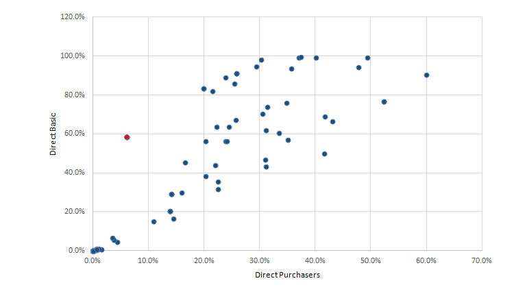
Source: Office for National Statistics
Download this image Figure 1: Difference between the purchasers price and basic price direct import intensities,
.png (15.2 kB)
Since the denominator in purchasers’ prices approach is greater owing to the inclusion of DTMs and taxes less subsidies, this leads to the estimates of import intensity that are lower than those obtained using the basic prices approach. This difference can sometimes be very significant. For example, the lighter (red) dot in Figure 1 for spirits, wine, beer and tobacco, have direct import intensities of 58.5% by the basic prices approach compared with just 6.1% by the purchasers’ price approach because of the high tax rates on alcohol and tobacco.
The second step is to “convert” these CPA estimates to a classification based on the COICOP (Classification of Individual Consumption According to Purpose) standard, which is how CPIH is classified. This is done using a converter, or bridge matrix, which allocates the splits of CPA consumption to COICOP categories. By using the latest available bridge matrix (2013 with 2014 IOAT data) we ensure that the most recent years’ conversions are as close to accurate as possible, although if there are differences in the conversion over time this will not be detected by these estimates. Furthermore, the converter is designed for use with total consumption data. By using the same converter for imported and domestically produced data separately, we implicitly assume that imported and domestic products within each CPA category are consumed for the same purposes.
It is worth noting that although imports are a basic price concept, technically they still include the expenditure on all wholesale and retail services in a foreign country because when the goods reach the border they are evaluated at cost, and thus one cannot separate out the foreign wholesale or retail services. As an example, a French imported bottle of wine in basic prices removes UK distributors’ margins, taxes and subsidies but not French ones. However, we can separate out wholesale and retail services for domestic consumption and we make adjustments for this and other conversions in calculating total import intensities (see following subsection). Finally, the converter is designed for use with data prior to supply and use adjustments and is estimated at purchasers’ prices so basic price conversions should be treated with caution.
The third step is to apply the COICOP import intensities to the CPIH basket. CPIH can be broken down into the 85 class level components that make CPI as well as a measure of owner occupiers’ housing costs measured using an internationally recognised approach known as rental equivalence, and Council Tax. These components of CPIH, which include categories as diverse as cultural services, garments and pharmaceutical products, can then be categorised into groups based on their degree of import intensity.
CPIH is classified on a COICOP basis, although some of the categories are removed because they are not part of CPIH such as refuse collection and life insurance (for a list of the COICOP categories included in CPIH and their corresponding import intensities see the appendix). There are also some categories that are combined and some that are separated, for example, the COICOP classification motor cars is broken down into new cars and second-hand cars for CPIH, however, because we do not have the necessary weights to do otherwise, we assume the same import intensity for both types of car.
Direct import intensity contributions
Figure 2: CPIH contributions by purchasers' price direct import intensity groups and owner occupiers' housing costs and energy
UK, January 2006 to December 2017
Source: Office for National Statistics
Notes:
- Contributions may not sum due to rounding. For a full list of which class-level categories are included in which import intensity bracket, please see the appendix.
Download this chart Figure 2: CPIH contributions by purchasers' price direct import intensity groups and owner occupiers' housing costs and energy
Image .csv .xlsFigure 2 shows that the recent increases in inflation since September 2015 were driven initially by increases in “energy” where a contribution of negative 0.54% in September 2015 then increased to a local peak of 0.41% in February 2017. From that point on, increases in CPIH were driven primarily by a broad-based increase across all import intensity groups. Since February 2017, declines in contribution for energy by negative 0.15% to 0.27% in December 2017 and a fall in OOH contributions from 0.43% to 0.23% over the same period have offset continued increases in the other categories leaving CPIH flat at around 2.7%.
Since 2005, a significant driver of large changes in CPIH has been energy-related COICOPs, however, over the same period the relationship between the import intensities groups and CPIH has been more variable.
Calculating indirect import intensity
The direct approach of calculating import intensity does not take into account indirect imports, which is when goods or services produced domestically use imported materials (or services). The value of such goods and services used as inputs is recorded in IOATs as intermediate consumption. For example, a consumer may purchase furniture produced by a domestic firm, which is made using imported timber and other materials.
It is possible, using the input-output framework, to estimate the value of domestic and imported goods and services used in domestic production on a CPA basis. We then use the same bridge matrix to convert these estimates to a COICOP basis. This process is subject to the same methodological challenges as explained in the previous subsection. In addition, the activities of wholesale and retail trade services, which constitutes up to 18% of indirect imports, do not map to any particular COICOP as they cannot be categorised into “products”. The crucial distinction is, again, between purchasers’ prices in which each product category includes any associated wholesale and retail services and basic prices in which those services are categorised separately. In the latter case, as with indirect imports, the converter does not allocate the wholesale and retail trade services back to their respective products.
We allocate the wholesale and retail trade services in proportion to the distributors’ margin for household use of each product. We know total distributors’ margin for household use from the entries for household use of wholesale and retail services at basic prices in the input-output tables published annually. We know the distributors' margin for total use on each product from the supply table published annually. To estimate the distributors' margin specific to household use of each product we multiply the total margin on the product by the household share of total use for that product at basic prices.
There is one caveat to this however, which is that the converter currently maps the CPA category “Wholesale and retail trade for motor vehicles and repairs” entirely to the COICOP category “Maintenance and repairs”. This makes sense in the purchasers’ price context for which the converter is made, because the consumer does not buy “wholesale and retail trade services” by themselves, but instead buys a product that may have associated wholesale and retail trade services’ costs, thus in purchasers’ prices all wholesale and retail services are zero. This then implies that any remaining purchasers’ price expenditure in “Wholesale and retail trade for motor vehicles and repairs” must be repairs-related and should be mapped to “Maintenance and repairs” COICOP classification just as the converter does. However, in a basic price context, such as with indirect imports, we have separated the wholesale and retail trade services from their associated products.
To estimate the proportion of “Wholesale and retail trade for motor vehicles and repairs” that are repairs we instead calculate the proportion that are wholesale and retail trade for motor vehicles and take the difference. Unfortunately, this figure in the IOATs is not available so we estimate it by taking the average proportion that households make up of total expenditure on margins and multiply it by the total expenditure on motor vehicle margins to give household expenditure on motor vehicle margins.
We can then estimate “Wholesale and retail trade for motor vehicles and repairs” to be 86% margins and 14% repairs. We can then allocate these margins manually to their corresponding COICOP categories namely “Cars” and “Motorcycles and bicycles”. Further adjustments are made to the conversion process to ensure that the “except motor vehicles and motorbikes” wholesale and retail trade services are only mapped to non-motor vehicle products. The effect of all these adjustments is that the import intensity of repair services falls by 3.9%, “Cars” increases by 3.3% and “Motorbikes” increases by 2.2% but all other categories have minimal changes.
Total import intensity
Figure 3: Difference between the purchasers direct and total with allocation by margins import intensities
UK, Input-output analytical tables 2014

Source: Office for National Statistics
Download this image Figure 3: Difference between the purchasers direct and total with allocation by margins import intensities
.png (17.3 kB)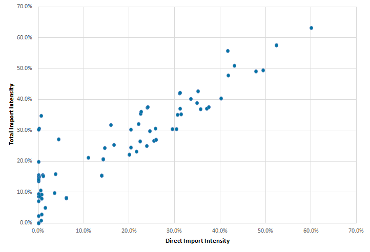
The distributors’ margins approach to calculating total (that is, both direct and indirect) import intensity leads to results that, on the whole, are proportional to the direct approach of calculating import intensities although there are a number of low direct import intensity goods and services that have higher total import intensities, such as restaurants, which have a direct import intensity of 0.0% but a total import intensity of 15.1%.
Figure 4: Graph of CPIH contributions by purchasers' price total import intensity groups and owner occupiers' housing costs and energy
UK, January 2005 to December 2017
Source: Office for National Statistics
Notes:
- Contributions may not sum due to rounding. For a full list of which class-level categories are included in which import intensity bracket, please see the appendix.
Download this chart Figure 4: Graph of CPIH contributions by purchasers' price total import intensity groups and owner occupiers' housing costs and energy
Image .csv .xlsAs with the direct case, most of the recent increases in CPIH have been driven by the more import intensive categories and energy. For example, between August 2016 and December 2017, CPIH increased from 1.0% to 2.7%, but 94% of that increase was driven by increases in the contributions 25 to 40%, 40% and over import intensity categories and energy.
Figure 5: Inflation rates for the most and least import intensive groupings compared against the 12-month inverted Effective Exchange Rate Index
UK, January 2006 to December 2017

Source: Office for National Statistics, Bank of England
Download this image Figure 5: Inflation rates for the most and least import intensive groupings compared against the 12-month inverted Effective Exchange Rate Index
.png (38.4 kB) .xlsx (19.4 kB)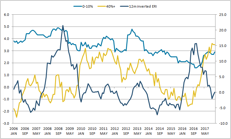
Figure 5 compares the 12-month inverted Effective Exchange Rate Index (ERI) in the (dark (blue) line) and special aggregate inflation rates for the 0 to 10% (light (blue) line) and 40% and over (intermediate (yellow) line) import intensity categories. What we find is that there seems to be no clear correlation between the exchange rate movements and the inflation rate of the 0 to 10% import intensity category. However, it does seem that sterling’s rapid depreciation in late 2015 and early 2016 was followed, with a lag, by a corresponding increase in the inflation rate of high import intensity goods and services.
Notes for: Import intensity
- The complete set of IOATs for 2014 is expected to become available after the publication of the Economic Review.
5. CPIH-consistent inflation rates for UK household groups
Introduction
The Consumer Prices Index including owner occupiers’ housing costs (CPIH) is our most comprehensive measure of consumer price inflation. It measures the change in the prices of the goods and services as consumed by households. However, because the consumption baskets of specific households differ and because prices do not all change at the same rate, the price experience of different groups of households may differ from the average figure for all households.
Office for National Statistics (ONS) has recently published CPIH-consistent inflation rates for different household groups. These provide an insight into how these price changes can vary between different groups, within an established framework based on economic principles. You should note that the CPIH-consistent inflation rates for different household groups are experimental indices and therefore we would caution against any use other than for research purposes.
Table 1 provides a summary of average annual inflation rates for selected household groups1, which have been updated from previous analysis to include data to the end of December 20172. For example, retired households have experienced slightly faster price growth than non-retired households since 2005 (2.3% on average per year compared with 2.2%); however, these averages conceal a larger variation in the 12-month inflation rates experienced by the two groups at different points over the period. The difference in the inflation rates experienced by different UK household groups has narrowed over the period since 2014.
Table 1: Average annual inflation rates for selected groups, UK, 2006 to 2017
| Group | Inflation(%) | |||
|---|---|---|---|---|
| Decile of | 1 | 2 | 9 | 10 |
| Disposable income | 2.5 | 2.3 | 2.2 | 2.3 |
| Expenditure | 2.7 | 2.4 | 2.1 | 2.2 |
| Retired households | 2.3 | |||
| Non-retired households | 2.2 | |||
| Households with children | 2.2 | |||
| Households without children | 2.3 | |||
| CPIH | 2.2 | |||
| Source: Office for National Statistics | ||||
| Notes: | ||||
| 1. Deciles of disposable income and expenditure are calculated on an equivalised basis, adjusting for the composition of the household. Please see the Glossary for more details on equivalisation. | ||||
| 2. Equivalised income deciles (1 = lowest-income households, 10 = highest-income households) | ||||
| 3. Equivalised expenditure deciles (1 = lowest-expenditure households, 10 = highest-expenditure households) | ||||
| 4. Differences may not sum due to rounding. | ||||
| 5. The average presented is the compound average annual growth rate. | ||||
Download this table Table 1: Average annual inflation rates for selected groups, UK, 2006 to 2017
.xls (27.6 kB)One of the limitations of this analysis is that data are not available on price indices that are specific to each household group. This would reflect the fact that different households will purchase goods and services from different outlets and therefore face different prices, which may also change at different rates. Instead we use national price indices as an approximation. This means that any differences in inflation rates experienced by the different household groups are driven by differences in the expenditure share for these groups.
We can look at these expenditure shares to provide further insight into the differences between inflation rates experienced by different groups. In particular, this article updates the analysis to December 2017 and applies the import intensity analysis introduced in Section 4 to the different household groups. It also focuses further on the impact of changing energy prices.
Import intensity of different household groups’ baskets
We can apply the same principles of the import intensity analysis presented in Section 4 to the CPIH-consistent inflation rates for different household groups. In particular, we will focus on the total import intensity3 and consider how this may affect different household groups in different ways.
Table 2 presents the import intensity of different household groups’ expenditure baskets. To calculate these figures, the class-level import intensity estimates have been applied to the average expenditure weights for each class (covering the period 2005 to 2017) for each household group and then summed to get the average import intensity of the whole basket.
Table 2: Import Intensities for selected household groups, UK, average 2005 to 2017
| Import intensity (%) | OOH weight (out of 1000) | Import intensity excl. OOH (%) | |
|---|---|---|---|
| Retired | 19 | 255 | 25.5 |
| Non-retired | 20.6 | 157 | 24.4 |
| Income Decile 2 | 20 | 191 | 24.7 |
| Income Decile 9 | 20.7 | 168 | 24.9 |
| Households without children | 20.6 | 157 | 24.4 |
| Households with children | 21.2 | 141 | 24.7 |
| Expenditure Decile 2 | 19.6 | 174 | 23.7 |
| Expenditure Decile 9 | 20.6 | 167 | 24.7 |
| CPIH | 20.3 | 175 | 24.6 |
| Source: Office for National Statistics | |||
Download this table Table 2: Import Intensities for selected household groups, UK, average 2005 to 2017
.xls (26.6 kB)The import intensity results in the first column seem counter-intuitive at first. The assumption is that lower income households and retired households spend more of their expenditure on necessities (which tend to be goods) and goods tend to have a higher import intensity.
However, these results can be explained if you look at the expenditure share of each group on owner occupiers’ housing costs (OOH), which is column 2 in Table 2. OOH are the costs of housing services associated with owning, maintaining and living in one’s own home. This is distinct from the cost of purchasing a house, which is partly for the accumulation of wealth and partly for housing services.
OOH is measured using the rental equivalence approach, which targets the measurement of ongoing consumption of OOH services rather than when OOH is acquired or when it is paid for. Rental equivalence uses the rent paid for an equivalent house as a proxy for the costs faced by an owner occupier. This explains why retired households, who may not necessarily pay for their house on an ongoing basis through mortgage payments for example, still have a high weight for OOH in their expenditure basket.
OOH has very low import intensity (approximately 5.0%). When you calculate the import intensity share excluding OOH, this is more in line with expectations: retired households and households in the second income decile have a higher import intensive basket compared with non-retired households and households in the ninth income decile respectively.
In comparison, the import intensity of the Consumer Prices Index including owner occupiers’ housing costs (CPIH) basket is 20.3%. When you exclude OOH, the import intensity is 24.6%, which is more in line with the import intensity of Consumer Prices Index (CPI) discussed in Section 4. It is not exactly the same because the CPI also excludes Council Tax and the weightings of the two baskets differ for this reason.
Import intensity of retired and non-retired households
Retired and non-retired households experienced some of the largest differences in inflation rates over the period to 2017.
Figure 6 shows the proportion of the average expenditure basket from 2005 to 2017, excluding OOH, by import intensity category for retired and non-retired households. Expenditure weights for each group are fairly stable over time. Excluding OOH, retired households spend more of their budget on goods and services within the 25 to 40% and 40% and over import intensity brackets (which includes categories from food and clothing) and energy (which includes electricity, gas, and fuel and lubricants). In comparison, non-retired households spend more on the 0% to 10% and 10% to 25% categories, which is where a lot of services are categorised.
Figure 6: Proportion of CPIH basket (excluding OOH) made up of different import intensity categories, for retired and non-retired households
UK, average 2005 to 2017
Source: Office for National Statistics
Download this chart Figure 6: Proportion of CPIH basket (excluding OOH) made up of different import intensity categories, for retired and non-retired households
Image .csv .xlsTo see how these import intensive categories may have influenced the experience of retired and non-retired households over time, a contribution chart similar to Figure 2 has been produced for retired (Figure 7a) and non-retired (Figure 7b) households respectively.
In general, both household groups have seen increasing contributions from higher import intensive categories and energy in recent periods. As discussed in Section 4, this can be linked to movements in the sterling effective exchange rate, in particular the depreciation of sterling following the referendum on leaving the EU in June 2016.
Figure 7a: Contributions to 12-month CPIH-consistent rate for retired households, from import intensity categories
UK, January 2006 to December 2017
Source: Office for National Statistics
Notes:
- Contributions may not sum due to rounding. For a full list of which class-level categories are included in which import intensity bracket, please see the appendix.
Download this chart Figure 7a: Contributions to 12-month CPIH-consistent rate for retired households, from import intensity categories
Image .csv .xls
Figure 7b: Contributions to 12-month CPIH-consistent rate for non-retired households, from import intensity categories
UK, January 2006 to December 2017
Source: Office for National Statistics
Notes:
- Contributions may not sum due to rounding. For a full list of which class-level categories are included in which import intensity bracket, please see the appendix.
Download this chart Figure 7b: Contributions to 12-month CPIH-consistent rate for non-retired households, from import intensity categories
Image .csv .xlsFigure 8 presents the differences between the two sets of contributions, showing non-retired less retired households. When the line is positive, non-retired households have experienced a higher rate of inflation compared with retired households. The positive stacked bars indicate which categories have contributed to this difference, that is, they have put upwards pressure on the inflation rate of non-retired households compared with retired households.
The two downward spikes observed in Figure 8 prior to October 2009 indicate that retired households experienced higher inflation in those periods compared with non-retired households. OOH seems to be the main positive contribution for retired households, consistently higher over the period since the beginning of 2011. Higher import intensive categories also tend to push the inflation of retired compared with non-retired households, especially in the period from 2006 to 2011, although this trend has lessened considerably in the more recent period, with the higher import intensive categories having a much smaller effect on the differences between the two groups. In comparison, low to medium import intensity categories push the inflation rate of non-retired households compared with retired households over much of the period since 2006.
There has been no noticeable impact on the difference between the two groups since the latest sterling depreciation. The contributions from the higher import intensive categories have increased since the beginning of 2017 for both retired and non-retired households, but they have increased fairly equally so there is no differential impact on the groups.
We can look at a lower level of aggregation to see if there are any offsetting movements within import intensity buckets. For example, the category “Garments” is categorised in the 40% and over category, but non-retired households spend a much higher proportion of their expenditure on this category compared with retired households. Therefore, recent price increases for clothing will have increased the inflation rate for non-retired households compared with retired households. In comparison, retired households spend more on food products, such as meat. The recent price increases in this category would have increased the inflation rate for retired households compared with non-retired households.
Figure 8: Differences in contributions to 12-month rate CPIH-consistent rate for retired and non-retired households, from import intensity categories
UK, January 2006 to December 2017
Source: Office for National Statistics
Notes:
Contributions may not sum due to rounding. For a full list of which class-level categories are included in which import intensity bracket, please see the appendix.
This figure presents the difference between non-retired less retired households. When the line is positive, non-retired households have experienced a higher rate of inflation compared with retired households.
Download this chart Figure 8: Differences in contributions to 12-month rate CPIH-consistent rate for retired and non-retired households, from import intensity categories
Image .csv .xlsEnergy is an interesting category as it generally contributes more to push up the inflation rate of retired households compared with non-retired, but there are some cases where it acts in the opposite direction. Most recently, the effects on energy have cancelled out.
We can explore this further by looking at the contribution of different components of energy (electricity, gas, and fuel and lubricants) to the inflation rate of retired and non-retired households (Figures 9a, 9b and 9c).
Figure 9a: Contributions to 12-month CPIH-consistent rate for retired households, from gas, electricity, and fuel and lubricants
UK, January 2006 to December 2017
Source: Office for National Statistics
Notes:
- Contributions may not sum due to rounding.
Download this chart Figure 9a: Contributions to 12-month CPIH-consistent rate for retired households, from gas, electricity, and fuel and lubricants
Image .csv .xls
Figure 9b: Contributions to 12-month CPIH-consistent rate for non-retired households, from gas, electricity, and fuel and lubricants
UK, January 2006 to December 2017
Source: Office for National Statistics
Notes:
- Contributions may not sum due to rounding.
Download this chart Figure 9b: Contributions to 12-month CPIH-consistent rate for non-retired households, from gas, electricity, and fuel and lubricants
Image .csv .xls
Figure 9c: Differences in contributions to 12-month rate of energy from retired and non-retired households
UK, January 2006 to December 2017
Source: Office for National Statistics
Notes:
Contributions may not sum due to rounding.
This figure presents the difference between non-retired less retired households for energy. When the line is positive, non-retired households have experienced a higher rate of price change for energy compared with retired households.
Download this chart Figure 9c: Differences in contributions to 12-month rate of energy from retired and non-retired households
Image .csv .xlsIn general, contributions from household energy (electricity and gas) have acted to increase the rate of price increases for retired households over the period to beginning of 2015. Over the last two years, household energy prices have stabilised with a slight increase from mid-2017, resulting in a negligible difference between the two groups.
Fuels and lubricants instead are more volatile – acting to reduce price increases for the retired by comparison with non-retired households over much of the period to mid-2012. However, over much of the period since 2015, differences in contribution from fuel are the main driver of the differences in the energy component between these two groups. This could be due to the fact that retired households have a much lower expenditure weight for fuels and lubricants, reflecting the fact that they might not drive as much as non-retired households. Therefore, changes in the price of fuel (in particular, falling oil prices) will benefit non-retired households more than retired households. In turn, this will provide an upward pressure on retired households’ inflation compared with non-retired.
Figure 10 shows the 12-month growth rate of fuels and lubricants, gas and electricity as well as a special aggregate of “Energy” using the expenditure weights of retired and non-retired households. In 2009, the 12-month growth rate of fuels and lubricants prices fell sharply compared with household energy (corresponding to the fall in oil prices around 2009). A similar pattern had been seen since the beginning of 2013 up to mid-2016. By comparison, 2010 and 2017 have seen the 12-month growth rate of fuels and lubricants recover. In 2010, household energy prices also fell sharply.
Figure 10: Gas, fuels and lubricants and energy 12-month growth rates; special aggregate of energy 12-month growth rates for retired and non-retired households
UK, January 2006 to December 2017
Source: Office for National Statistics
Download this chart Figure 10: Gas, fuels and lubricants and energy 12-month growth rates; special aggregate of energy 12-month growth rates for retired and non-retired households
Image .csv .xlsThese movements are reflected in the special aggregate of energy for retired and non-retired households. In particular, because non-retired households have a higher expenditure share on fuels and lubricants, the aggregate energy inflation rate for this group is more influenced by the price changes for fuels and lubricants (which can be seen especially in the periods where fuel prices have dropped and energy prices have remained fairly high). More recently, the increase in fuels and lubricants prices have impacted more on non-retired households.
Import intensity of households by income decile
As well as dividing households by retirement status, we can also look at the UK household population divided into income deciles: 10 equally-sized groups of households ranked by their equivalised disposable income.
Figure 11 shows that households in the ninth income decile spend more of their budget on goods and services within the 10 to 25% import intensity bracket. In comparison, households in the second income decile spend more on the 25 to 40% and energy categories, with more minor differences in the other categories.
Figure 11: Proportions of CPIH basket (excluding OOH) made up of different import intensity categories, for income deciles 2 and 9
UK, average 2005 to 2017
Source: Office for National Statistics
Download this chart Figure 11: Proportions of CPIH basket (excluding OOH) made up of different import intensity categories, for income deciles 2 and 9
Image .csv .xlsA similar analysis can be done to compare the contributions from these groups. Figure 12 presents the differences in contributions between the second and ninth income deciles.
Figure 12: Differences in contributions to 12-month CPIH-consistent rate for income decile 2 and income decile 9 households, from import intensity categories
UK, January 2006 to December 2017
Source: Office for National Statistics
Notes:
Contributions may not sum due to rounding. For a full list of which class-level categories are included in which import intensity bracket, please see the appendix.
This figure presents the difference between households in income decile 2 less households in income decile 9. When the line is positive, households in income decile 2 have experienced a higher rate of inflation compared with households in income decile 9.
Download this chart Figure 12: Differences in contributions to 12-month CPIH-consistent rate for income decile 2 and income decile 9 households, from import intensity categories
Image .csv .xlsThe overall trend of Figure 12 indicates that, up until December 2014, the income decile 2 household group generally experienced higher inflation compared with the income decile 9 household group. Over the most recent period, differences are small between the two groups and there is no noticeable impact since the latest sterling depreciation. The higher import intensive categories appear to contribute more to households in the second income decile over the period, but in the more recent years they have pushed up the inflation rate of households in the ninth decile, compared with households in the second decile.
Similar to the analysis for retired households, we can look at a lower level of aggregation to see if there are any offsetting movements within import intensity buckets. For example, the category “New cars” is categorised in the 40% and over category, but households in income decile 9 spend a much higher proportion of their expenditure on this category compared with lower-income households. Therefore, recent price increases for this category will have increased the inflation rate for households in income decile 9 compared with households in income decile 2.
In comparison, households in income decile 2 spend more on food products, such as meat. The recent price increases in this category would have increased the inflation rate for households in income decile 2 compared with higher-income households.
Import intensity of households by other household groups
The published ONS analysis also computed CPIH-consistent inflation rates for expenditure deciles and households with and without children.
Figure 13 shows the proportion of the average expenditure basket, from 2005 to 2017 excluding OOH, by import intensity category for expenditure deciles 2 and 9. Excluding OOH, households in expenditure decile 9, similar to households in income decile 9, spend more of their budget on goods and services within the 10 to 25% import intensity bracket. Households in the second expenditure decile spent more of their budget on the 0 to 10% and the 25 to 40% import intensity brackets.
Figure 13: Proportion of CPIH basket (excluding OOH) made up of different import intesity categories, for expenditure deciles 2 and 9
UK, average 2005 to 2017
Source: Office for National Statistics
Download this chart Figure 13: Proportion of CPIH basket (excluding OOH) made up of different import intesity categories, for expenditure deciles 2 and 9
Image .csv .xlsThe contributions charts for differences between the expenditure deciles are presented in Figure 14. Over much of the period they are similar to the trends seen when comparing the differences between households in the second and ninth income decile. However, in the most recent period there is a small increase in higher import intensive categories putting upward pressure on the inflation rate experienced by households in the ninth expenditure decile, compared with the second expenditure decile group.
Figure 14: Differences in contributions to 12-month CPIH-consistent rate for expenditure decile 2 and expenditure decile 9 households, from import intensity categories
UK, January 2006 to December 2017
Source: Office for National Statistics
Notes:
Contributions may not sum due to rounding. For a full list of which class-level categories are included in which import intensity bracket, please see the appendix.
This figure presents the difference between households in expenditure decile 2 less households in expenditure decile 9. When the line is positive, households in expenditure decile 2 have experienced a higher rate of inflation compared with households in expenditure decile 9.
Download this chart Figure 14: Differences in contributions to 12-month CPIH-consistent rate for expenditure decile 2 and expenditure decile 9 households, from import intensity categories
Image .csv .xlsHouseholds with and without children do not experience much difference in their inflation rate over the period. Both household groups had fairly consistent spending patterns on import intensity categories and there was not a significant difference in contributions from different import intensity categories between the two groups, as both household groups’ expenditure followed the same trend.
Glossary
Equivalised
Income and expenditure groups are based on a ranking of households by equivalised income and expenditure. Equivalisation is the process of accounting for the fact that households with many members are likely to need a higher income to achieve the same standard of living as households with fewer members.
Equivalisation takes into account the number of people living in the household and their ages, acknowledging that while a household with two people in it will need more money to sustain the same living standards as one with a single person, the two-person household is unlikely to need double the income. This analysis uses the modified-Organisation for Economic Co-operation and Development (OECD) equivalisation scale (PDF, 165KB).
Disposable income
Disposable income is that which is available for consumption and is equal to all income from wages and salaries, self-employment, private pensions and investments, plus cash benefits less direct taxes.
Disposable income deciles
Households are grouped into deciles (or tenths) based on their equivalised disposable income. The richest decile (decile 10) is the 10% of households with the highest equivalised disposable income. Similarly, the poorest decile (decile 1) is the 10% of households with the lowest equivalised disposable income.
Expenditure deciles
Households are grouped into deciles (or tenths) based on their equivalised expenditure. The highest-expenditure decile (decile 10) is the 10% of households with the highest equivalised expenditure. Similarly, the lowest-expenditure decile (decile 1) is the 10% of households with the lowest equivalised expenditure.
Households with children
Households with children are defined as any household with one or more household members who are under 18 years of age, in full-time education and have never been married.
Retired persons and households
A retired person is defined as anyone who describes themselves (in the Living Costs and Food Survey (LCF)) as “retired” or anyone over minimum National Insurance pension age describing themselves as “unoccupied” or “sick or injured but not intending to seek work”. A retired household is defined as one where the combined income of retired members amounts to at least half the total gross income of the household.
Notes for: CPIH-consistent inflation rates for UK household groups
Please see the Glossary provided at the end of this section for information on how these household groups are defined.
A more detailed update to this analysis will be published in a quarterly dataset, to be published in spring 2018.
Total import intensity here is defined as direct + indirect, measured by purchasers’ prices and using the way of reproportioning that includes margins.
6. Economic Statistics Transformation Programme: a flow of funds approach to understanding quantitative easing
Abstract
In this section, we introduce the flow of funds framework and the accompanying Experimental Statistics to demonstrate a new approach that can lead to better understanding of the effect of quantitative easing in the UK. We show that the additional counterparty information enables assessment of the portfolio rebalancing channel in a way that has not been discussed in the literature. We also outline ongoing work in the Enhanced Financial Accounts initiative to improve the quality, coverage and granularity of UK financial accounts statistics.
Introduction
The financial crisis in 2007 to 2008 saw the global financial system fail in a way and on a scale that was unprecedented. The sub-prime mortgage crisis that began in the United States (US) quickly spread to the rest of the world, including the UK, in large part due to the highly-interconnected nature of the global system and the widespread use of complex financial instruments that obscured true underlying exposure and risk (see previous ONS analysis by Lai and others (2017)).
Ten years on, the crisis has left a significant footprint on monetary policy. Monetary authorities around the world adopted highly expansionary policy to counter its negative effects on the global economy. Interest rates were reduced to their effective lower bound but central bankers in many advanced economies judged that additional easing in monetary policy was required to meet the objectives of monetary policy. Consequently, consumers and firms have become accustomed to historically low interest rates and “quantitative easing” (QE), an unconventional policy instrument where the focus has shifted towards the quantity of money. Recent developments, however, suggest that there is an increasing focus on monetary policy normalisation. The US Federal Reserve raised its funds rate above 0.25% for the first time in eight years in December 2015, with four further increases since then and further hikes in 2018 expected, and indicated recently that its QE programme will be reversed. The Monetary Policy Committee in the UK increased the Base Rate in November 2017, the first time since July 2007, and has confirmed its belief that “further modest increases” are likely to be needed over the next few years.
Understanding the impact of monetary policy on the economy is therefore of particular relevance at this point in time. This will require having access to a range of granular data. However, as has been illustrated by the financial crisis, the existing data are not always sufficient. In recent years, the Barker and Ridgeway Review (2014) and Bean Review (2016) reinforced the need for more detailed financial flow statistics. To address this gap, we established the Enhanced Financial Accounts initiative, in partnership with the Bank of England in late 2014, to enhance the coverage, quality and granularity of financial accounts statistics for the UK. The centrepiece of this project is to develop granular from-whom-to-whom, or “flow of funds” (FoF), statistics on the balance sheet positions and inter-sectoral financial flows for a larger number of sectors and instruments. An international comparison of the provision of financial statistics by Nolan and Matthews (2016) points out that successful delivery of this project will make the UK one of the world leaders in this area.
In this section, we introduce the experimental UK flow of funds statistics1,2, to demonstrate a new approach to understanding the effect of QE in the UK, in particular on the portfolio holding of the non-bank financial sectors. This builds on the counterparty information that underpins the from-whom-to-whom nature of the FoF framework. While the literature on the effect of QE is vast, existing discussions based on a full FoF approach are limited. We show that this approach can provide valuable insights.
The rest of this section describes the Bank of England’s QE programme, introduces the flow of funds framework, provides a discussion of the advantages of flow of funds over standard financial accounts, and concludes by outlining ongoing development in the Enhanced Financial Accounts initiative.
The Bank of England quantitative easing programme
At the time of its introduction, the Bank of England’s quantitative easing (QE) programme was an unconventional monetary policy to encourage spending in the economy and keep inflation on track to meet the government’s 2% target. As the Bank Rate was reduced to near zero, the focus of monetary policy shifted towards the quantity as well as prices of money. QE provides stimulus through creating money and using it to buy financial assets – mostly gilts originally held by non-bank financial companies (McLeay and others (2014)). The new money is then expected to boost nominal spending in the economy and therefore help to achieve the 2% inflation target through several transmission channels: policy signalling, liquidity premia and portfolio rebalancing. See Joyce and others (2011b) for a review.
In this section we focus on the portfolio rebalancing channel. Theoretically, as the Bank of England’s purchasing of gilts increases, the price of those gilts increases and the yield on them decreases. For investors, this will lead to, other things being equal, an increase in the relative attractiveness of other assets. The sellers of those gilts are expected to use the cash raised to buy those more attractive assets and thus rebalance their portfolios. This shifts the excess cash to yet new sellers and in turn they may rebalance their portfolios and buy other assets, and so on until all demands are satisfied and an equilibrium is reached. This process will raise the general price of assets, leading to lower yields and therefore lower borrowing costs for firms and households, which is expected to eventually stimulate spending.
Over the period between March 2009 and January 2010, the Bank of England purchased £200 billion of gilts which at the time represented 14% of GDP. Between October 2011 and May 2012, another round of QE saw the Bank purchase an additional £125 billion of gilts. Since then, two more rounds of QE were announced, bringing the total amount of gilts purchased to £435 billion3.
The flow of funds framework to understanding quantitative easing
The flow of funds (FoF) framework is a useful tool for understanding the portfolio rebalancing aspect of quantitative easing (QE). On top of the standard financial account and balance sheets that are currently available in the UK Economic Accounts (UKEA), it shows which sectors are providing financing to which other sectors and through what instruments. This additional information provides a framework to fully consider the flows of money in the economy as a result from the gilts purchase initiated by the Bank of England. It helps answering questions such as whether and/or how QE money has flowed through to the domestic non-financial sectors.
The FoF framework we introduce is based on, and consistent with, the National Accounts classifications of economic sectors and financial instruments. The meanings4 of key sectors and financial instruments relevant for the discussion of QE are listed in Tables 3 and 4 respectively.
Table 3: Table of key sectors and sub-sectors meanings
| Sector / sub-sector | Meaning | |
| Monetary financial institutions (MFI) | This is a sub-sector of Financial Corporations. It includes three further sub-sectors: | |
| - central bank (the Bank of England) | ||
| - deposit-taking corporations (that is retail banks and building societies) | ||
| - money market funds (for example unit trusts) | ||
| Other financial institutions (OFI) | This is a sub-sector of Financial Corporations. It includes four further sub-sectors: | |
| - non-money market funds (for example hedge funds, private equity funds etc) | ||
| - other financial intermediaries (for example non-bank securities dealers, securitisation special purpose vehicles and so on) | ||
| - Financial Auxiliaries (for example central clearing parties, brokers, asset manager and so on) | ||
| - Captive financial institutions and money lenders (including, for example holding companies) | ||
| Insurance companies and pension funds (ICPF) | This is a sub-sector of Financial Corporations. It includes insurance companies which provide non-life, life, pensions and annuity products; and pension funds which invest the assets of pension schemes. | |
| Private non-financial corporations (PNFC) | This is a sub-sector of Non-financial corporations. It includes corporations in which the principal activity is the production of goods and non-financial services for the market. | |
| Households (HH) | This includes mostly individuals who are consumers | |
| Central government (CG) | This is a sub-sector of General Government. It includes all administrative departments of the state and other central agencies whose competence extends normally over the whole economic territory. It is the issuer of gilts. | |
| Rest of world (RoW) | This includes all institutions or individuals that are not resident in the UK but have economic interactions with resident units. These can be overseas corporations, charities, governments or private individuals, or international organisations, irrespective of their geographical location | |
| Source: Office for National Statistics | ||
Download this table Table 3: Table of key sectors and sub-sectors meanings
.xls (29.2 kB)
Table 4: Table of key financial instruments meanings
| Instrument | Meaning |
| Equity and Investment Fund Shares (EIFS) | This includes listed and unlisted shares, other UK equity and mutual funds units/shares |
| Debt Securities | This includes short term (with maturity less than or equal to one year) and long term (with maturity more than one year) negotiable financial instruments serving as evidence of debt, such as gilts and bonds |
| Loans | This includes short term (with maturity less than or equal to one year) and long term (with maturity more than one year) non-negotiable instruments that are created as creditors lend to debtors |
| Deposits | This generally refers to cash held within bank accounts |
| Source: Office for National Statistics | |
Download this table Table 4: Table of key financial instruments meanings
.xls (26.6 kB)Figure 15 provides a representation of the potential financial flows resulting from QE in the FoF framework. It shows the potential financial transactions between the sectors in the economy. During the first stage of the QE mechanism, the Bank of England (a sub-sector of Monetary financial institutions (MFI)) purchases gilts (classified as long-term debt) from corporations that are in the Insurance companies and pension funds (ICPF) or Other financial institutions (OFI) sectors, and in return provides deposits. These flows, which we refer to as the primary effect, are depicted by the red arrows (deposits) going from the BoE to the seller sectors and orange arrows (long-term debt) going in the opposite direction. In the second stage, those seller sectors have the choice of what to do with the new holdings of deposits to create secondary flows. For example, with the new money they can invest in other assets, such as buying bonds from the Private non-financial corporations (PNFC) sector (inward orange arrows) and providing it with deposits (outward red arrows), which would be desirable under the stated objectives of QE. Alternatively, the new cash could be invested in overseas assets or re-invested into buying UK government bonds. Beyond the second stage, there may be more multiplier effects that impact upon financial flows and the resulting portfolios of sectors (for example, PNFC using the new cash to purchase assets with OFI, which in turn provides further funding to Households (HH), which in turn invests in some assets and so on).
Figure 15: Potential financial flows between sectors as a result of QE

Download this image Figure 15: Potential financial flows between sectors as a result of QE
.png (122.6 kB)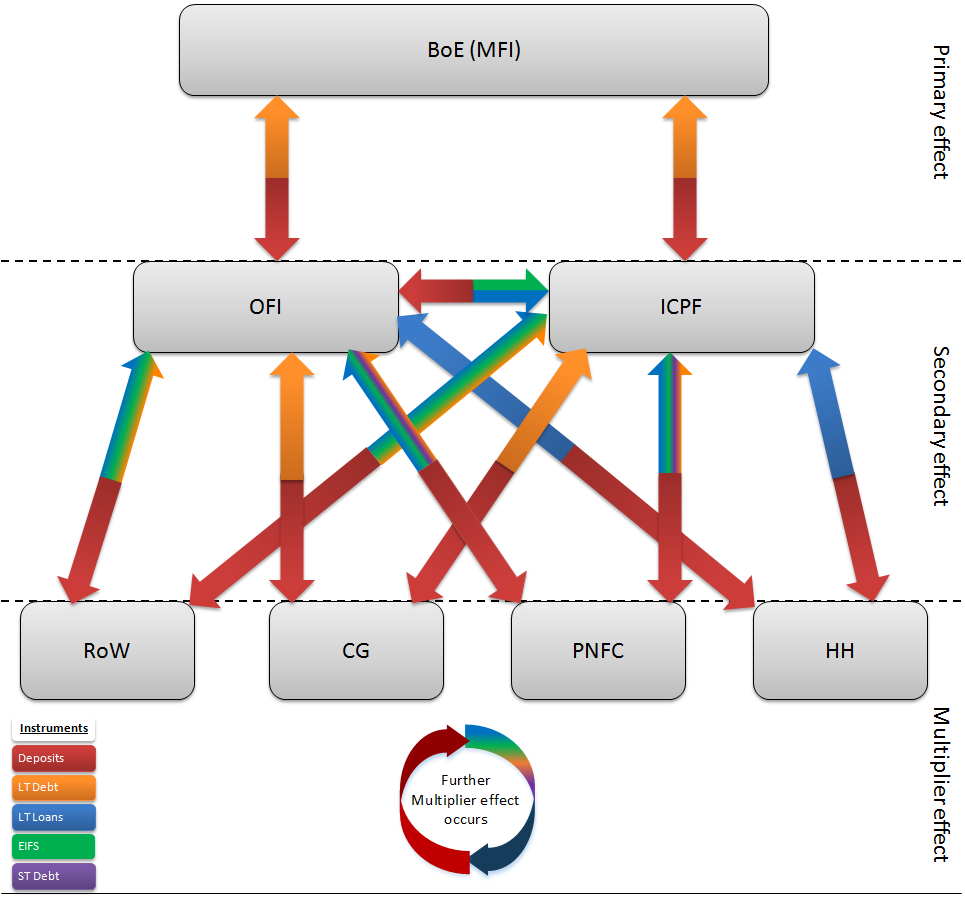
Financial accounts data currently available in the UK Economic Accounts are insufficient to fully map out the flows depicted in Figure 15. While counterparty information is available for certain financial instruments such as gilts (long-term debt issued by central government (CG)) and deposits with UK banks, there is no similar official breakdown available for most other financial instruments, such as corporate bonds issued by PNFC or investment fund shares issued by OFI. This gap is plugged by the experimental flow of funds data, which are structured using the same framework as illustrated in Figure 15 This makes it possible now to observe directly all the relationships in which the depicted flows are captured5,6. In this sense the FoF statistics can be viewed as an integration of the existing financial data into a wider and more encompassing framework. We show some example series from the experimental FoF data next.
Figure 16 shows the MFI asset holdings of CG long-term debt instruments from 1997 up to 2016. This is the aggregate-level transaction with which the Bank of England’s purchase of gilts will appear in the FoF data (UKEA also provides this information currently). Prior to QE, the MFI sector held only a very small amount of gilts. The sharp expansions around the time of the announcements of QE (represented by the vertical lines) map well the Bank of England’s QE operation.
Figure 16: MFI holdings of long-term debt issued by CG
Source: ONS experimental flow of funds statistics
Notes:
- The vertical lines refer to the 5 rounds of QE announcements: (a) = Q1 2009; (b) = Q4 2011; (c) = Q1 2012; (d) = Q3 2012; (e) = Q3 2016.
Download this chart Figure 16: MFI holdings of long-term debt issued by CG
Image .csv .xlsWhile there is no published information from the Bank of England on the counterparty breakdown of its gilts purchasing as part of QE7, it may be possible to infer the information from the holdings of CG long-term debt by the non-bank financial sectors, that is OFI and ICPF, in the FoF data. Figures 17 and 18 show the OFI and ICPF holdings of CG long term debt respectively (these are also available in the UKEA under gilts data).
The OFI sector’s holding of gilts decreased visibly around all announcements of QE operations. Such coincidences are indicative evidence8 of the OFI sector’s participation in QE. It is worth noting that as these are net figures (that is not considering buying and selling of assets separately) the effects are not as pronounced as they might have been. For example, the decrease in OFI holdings of gilts in 2009 was £50 billion while the Bank of England announcement was £200 billion. This is because of the large-scale issuance of additional gilts by the Debt Management Office9 at the same time partly bought up by the same sector.
Figure 17: OFI holdings of long-term debt issued by CG
Source: ONS experimental flow of funds statistics
Notes:
- The vertical lines refer to the 5 rounds of QE announcements: (a) = Q1 2009; (b) = Q4 2011; (c) = Q1 2012; (d) = Q3 2012; (e) = Q3 2016.
Download this chart Figure 17: OFI holdings of long-term debt issued by CG
Image .csv .xlsIn contrast to the OFI sector, Figure 18 shows that the ICPF holdings of gilts did not appear to decrease in response to the operation of QE. However, as mentioned this is likely because of the issuance of additional gilts at the same time partly bought up by the ICPF sector, leading to smaller than expected (or even positive) net changes. This shows that even for primary flows it can be hard to infer from the data on face value if confounding factors are not taken into account (see footnote 8).
Figure 18: ICPF holdings of long-term debt issued by CG
Source: ONS experimental flow of funds statistics
Notes:
- The vertical lines refer to the 5 rounds of QE announcements: (a) = Q1 2009; (b) = Q4 2011; (c) = Q1 2012; (d) = Q3 2012; (e) = Q3 2016.
Download this chart Figure 18: ICPF holdings of long-term debt issued by CG
Image .csv .xlsShifting the focus to secondary flows, Figure 19 shows the ICPF holding of long-term loans issued to the PNFC sector. It increased visibly after most announcements of QE, which is suggestive evidence of QE having its desirable impacts towards boosting borrowing and nominal spending, though caution must again be exercised about the netted nature of the series and the possibility of other confounding factors (see footnote 8). Nonetheless, this highlights the additional value of the FoF data – the information is unavailable in the UKEA, in which only the ICPF sector’s aggregate holding of UK non-government non-overseas loans is shown.
Figure 19: ICPF holdings of long-term loans issued to PNFC
Source: ONS experimental flow of funds statistics
Notes:
- The vertical lines refer to the 5 rounds of QE announcements: (a) = Q1 2009; (b) = Q4 2011; (c) = Q1 2012; (d) = Q3 2012; (e) = Q3 2016.
Download this chart Figure 19: ICPF holdings of long-term loans issued to PNFC
Image .csv .xlsWith similar caveats in mind, Figure 20 shows the OFI sector’s holdings of long-term loans issued to the PNFC sector, which look to increase after QE announcements with lag. This information is currently unavailable in the UKEA.
Figure 20: OFI holdings of long-term loans issued to PNFC
Source: ONS experimental flow of funds statistics
Notes:
- The vertical lines refer to the 5 rounds of QE announcements: (a) = Q1 2009; (b) = Q4 2011; (c) = Q1 2012; (d) = Q3 2012; (e) = Q3 2016.
Download this chart Figure 20: OFI holdings of long-term loans issued to PNFC
Image .csv .xlsUsing the experimental statistics it would also be feasible to plot other relationships that capture the QE secondary flows. Many of these are unavailable within UKEA, such as OFI holding of long-term loans to HH, ICPF holdings of EIFS issued by OFI, etc.
Advantage of the flow of funds framework
Much of the literature on the effect of QE focuses on outcomes such as asset prices and yields, and leave the transmission mechanism, such as how the portfolios were rebalanced to achieve those new prices and yields, as a “black box” (see Joyce and others (2011a) for the UK, Gagnon and others (2011) and D’Amico and others (2012) for the US, and Koijen and others (2016) for the Euro area). A smaller literature (for example, Butt and others (2012), Saito and Hogen (2014), Carpenter and others (2015) and Joyce and others (2017)) exists and alludes to flow of funds analysis but is partial in nature: those papers are either restricted to the analysis of a very small number of specific instrument-counterparty relationships, or only focus on portfolio rebalancing from a purely financial instrument perspective without counterparty information.
The counterparty information on inter-sectoral positions within the flow of funds (FoF) framework means it is now possible to assess the effect of quantitative easing (QE), in particular the portfolio rebalancing channel, in a way that was not possible before. It allows researchers to fully assess whether financial flows are present in places they are expected to be, and where the blockages and bottlenecks are.
To highlight this, let us take the example of Joyce and others (2017), which, by applying time series econometric techniques to standard UK financial accounts data, find that QE led to the Insurance companies and pension funds (ICPF) sector shifting its portfolio away from gilts toward corporate bonds but did not lead to a shift into equities. While this is a useful finding that sheds some light on the portfolio rebalancing behaviour, it stops one step short of showing exactly how those investments were distributed across counterparty sectors. For example, could the null effect on equities investment be masking investment into the Other financial institutions (OFI) sector and simultaneous disinvestment into the Private non-financial corporations (PNFC) sector? Could the increased demand in corporate bonds be concentrated in large corporations rather than being distributed to small to medium enterprises (SME) and across the economy? How much of the investment was leaked overseas and to which countries? These questions about counterparty all have implications for the economy but cannot be answered by existing information in the UK Economic Accounts (UKEA), as discussed previously. The additional counterparty information within the FoF framework holds key to understanding the distribution of policy effects. Note also that it is straightforward to incorporate FoF statistics into existing studies, as they are simply disaggregated series of the financial accounts data typically being used.
Future development
Ongoing work in the ambitious Enhanced Financial Accounts (EFA) initiative is looking to improve upon the current experimental flow of funds (FoF) statistics by producing granular estimates for more detailed sub-sectors (see Evans (2017b)) and for a more detailed breakdown of financial instruments. This will provide users with a more complete picture of the financial system to monitor the impact of policy changes. Our preferred approach in achieving better data granularity is to use non-survey record level data such as administrative, regulatory and commercial data sources. Such data allow greater flexibility over surveys in responding to evolving user requirements for granularity. They also reduce burden on business. Where necessary, survey data will continue to be used to fill any gaps. The EFA initiative is studying a wide range of data sources to achieve its ambition and as progress is made, experimental statistics will be released at the earliest opportunity on an incremental basis before full implementation into the national accounts. This will give users early sight of development and an opportunity to offer feedback.
We list the areas of further improvement that we are aiming to make with regards to informing analysis surrounding the effect of quantitative easing (QE):
increasing the level of sub-sector detail for the OFI sector into different types of funds, for example exchange traded fund, hedge fund, private equity fund etc., and other financial intermediaries, such as security and derivative dealers, consumer credit lender, financial vehicle corporations, financial auxiliaries and so on
increasing the level of sub-sector detail for the ICPF sector into insurance companies and types of pensions funds
increasing the level of sub-sector detail for the PNFC sector into large corporations and “small to medium enterprises” (SME)
increasing the level of sub-sector detail for the RoW sector into regions and countries
breaking down debt securities by maturity
breaking down loans by maturity and by types, for example mortgage, finance leasing, credit card and so on
breaking down equity by listed and unlisted companies
reducing the size of the Unknown counterparty sector
providing FoF estimates for transaction flows, revaluations and other changes in volumes
We are interested in your feedback on this content as well as future development of FoF. Please send any comments to flowoffundsdevelopment@ons.gov.uk.
Authors and acknowledgements
Keith Lai and Rikesh Patel
Disclaimer: The views and opinions expressed in this section are those of the authors and do not necessarily represent those of the Office for National Statistics of the Bank of England.
Acknowledgement: The authors of this section would like to thank (in no particular order) Dave Matthews, Sumit Dey-Chowdhury, Phil Davies, Richard Campbell, Sarah Levy, Phillip Lee, Philip Tyrer, Ed Palmer and Jonathan Athow from ONS, and Stephen Burgess and Matt Corder from the Bank of England for their contributions and comments.
Notes for: Economic Statistics Transformation Programme: a flow of funds approach to understanding quantitative easing
See Nolan (2016) and Nolan and Matthews (2016) for an introduction to the experimental flow of funds statistics.
The data are consistent with Blue Book 2017 – see Evans (2017a). As the data are experimental, they may not be fully accurate and are subject to review. Existing gaps in the experimental data, such as the presence of the Unknown sector, are constantly reviewed as part of the ongoing work. Further information on development can be found in section 5.
As part of the QE program these was also a corporate bond purchase scheme in parallel. Currently, the amount of asset purchased through this scheme stands at £10 billion. For simplicity, this article abstracts from this scheme and focuses solely on gilts purchase.
For full definitions, refer to the European System of National and Regional Accounts 2010.
The current experimental flow of funds statistics only include data on stock positions, and do not provide a breakdown by transaction flows, revaluation and other changes in volume. See section 5 for a discussion on future development.
The current experimental flow of funds statistics only include data on stock positions, and do not provide a breakdown by transaction flows, revaluation and other changes in volume. See section 5 for a discussion on future development.
The institutions eligible to participate in the Bank of England’s competitive gilt auctions are participants in the Bank of England’s gilt-purchase open market operations and gilt-edged market makers (GEMMs), but as these are mainly intermediaries the eventual sellers are not identified.
In order to interpret them as direct evidence of participation, one would need to make suitable assumptions the counterfactual state, that is what the series would have looked like in the hypothetical world without QE policy, and compare to the actual series. The same point also applies to Figures 18 to 20, which may provide some indication of the effects of QE but are not direct evidence until an appropriate counterfactual is chosen.
The Debt Management Office is responsible for debt and cash management for the UK Government. One of its key functions is to issue gilts on behalf of HM Treasury according to the annual financing remit, to ensure the public finance funding requirement of the government is met.
7. Recent releases
This section highlights some of the Office for National Statistics (ONS) releases on the economy over the last quarter.
For the first time, ONS is using Value Added Tax turnover (VAT) data from 630,000 businesses within gross domestic product (GDP) estimates, published on 22 December 2017.
Demonstrates the impact of removing “imputed” transactions from real household disposable income and the saving ratio to better represent the economic experience of households. These are Experimental Statistics.
This article informs users of the planned scope and content of the UK National Accounts, The Blue Book: 2018 edition, and UK Balance of Payments, The Pink Book: 2018 edition, due to be published on 31 July 2018.
The annual update of the matrices and includes a new visualisation. This will bring the data in line with the latest Blue Book publication published on 31 October 2017.
The feasibility of measuring the sharing economy: November 2017 progress update
An update on the work undertaken by ONS so far on assessing the feasibility of measuring the sharing economy in the UK.
Nôl i'r tabl cynnwys8. Appendix 1: CPIH import intensities
The use of supply-use data for imports on a national basis is not always perfectly compatible with domestic consumption used in the construction of CPIH. This explains, for example, why the method described in this paper produces a direct import intensity of 1.5% for owner occupiers' housing costs despite them being based only on domestic prices in CPIH.
Appendix 1: CPIH import intensities
| COICOP | Direct | Total | ||
| 1.1.1 | Bread and cereals | 22.40% | 35.40% | |
| 1.1.2 | Meat | 31.00% | 42.10% | |
| 1.1.3 | Fish | 33.50% | 40.20% | |
| 1.1.4 | Milk, cheese and eggs | 22.00% | 32.20% | |
| 1.1.5 | Oils and fats | 34.90% | 38.90% | |
| 1.1.6 | Fruit | 31.10% | 42.10% | |
| 1.1.7 | Vegetables including potatoes and other tubers | 35.10% | 42.70% | |
| 1.1.8 | Sugar, jam, honey, syrups, chocolate and confectionery | 30.50% | 35.00% | |
| 1.1.9 | Food products | 31.10% | 37.10% | |
| 1.2.1 | Coffee, tea, cocoa | 31.30% | 35.20% | |
| 1.2.2 | Mineral waters, soft drinks and juices | 20.30% | 30.30% | |
| 2.1.1 | Spirits | 6.10% | 8.10% | |
| 2.1.2 | Wine (including Perry) | 6.10% | 8.10% | |
| 2.1.3 | Beer | 6.10% | 8.10% | |
| 2.2 | Tobacco | 6.10% | 8.10% | |
| 3.1.2 | Garments | 40.10% | 40.30% | |
| 3.1.3 | Other articles of clothing and accessories | 29.40% | 30.50% | |
| 3.1.4 | Dry-cleaning, repair and hire of clothing | 0.50% | 10.70% | |
| 3.2 | Footwear including repairs | 47.80% | 49.20% | |
| 4.1 | Actual rents for housing | 0.00% | 7.00% | |
| 4.2 | Owner occupiers housing costs | 1.50% | 5.00% | |
| 4.3.1 | Products for the regular repair of dwelling | 16.50% | 25.30% | |
| 4.3.2 | Services for the regular repair of dwelling | 0.00% | 13.50% | |
| 4.4.1 | Water supply | 0.00% | 9.50% | |
| 4.4.3 | Sewerage collection | 0.00% | 8.70% | |
| 4.5.1 | Electricity | 0.10% | 30.60% | |
| 4.5.2 | Gas | 0.60% | 34.80% | |
| 4.5.3 | Liquid fuels | 23.90% | 37.40% | |
| 4.5.4 | Solid fuels | 0.00% | 30.30% | |
| 4.9 | Council tax | 0.00% | 0.00% | |
| 5.1.1 | Furniture, furnishings | 24.50% | 29.80% | |
| 5.1.2 | Carpets and other floor coverings | 19.90% | 22.10% | |
| 5.2 | Household textiles | 19.90% | 22.10% | |
| 5.3.1 | Major HH appliances and small electrical HH appliances | 37.00% | 37.20% | |
| 5.3.3 | Repair of household appliances | 0.10% | 15.00% | |
| 5.4 | Glassware, tableware and household utensils | 21.50% | 23.20% | |
| 5.5 | Tools and equipment for house and garden | 30.30% | 30.50% | |
| 5.6.1 | Non-durable household goods | 25.40% | 26.60% | |
| 5.6.2 | Domestic services and home care services | 0.50% | 0.80% | |
| 6.1.1 | Pharmaceutical products | 41.70% | 47.90% | |
| 6.1.2 | Other medical and therapeutic equipment | 49.30% | 49.50% | |
| 6.2.1 | Medical services and paramedical services | 13.90% | 15.40% | |
| 6.2.2 | Dental services | 13.90% | 15.40% | |
| 6.3 | Hospital services | 13.90% | 15.40% | |
| 7.1.1A | New cars | 52.30% | 57.60% | |
| 7.1.1B | Second-hand cars | 52.30% | 57.60% | |
| 7.1.2 | Motor cycles and bicycles | 41.60% | 55.80% | |
| 7.2.1 | Spare parts and accessories | 60.00% | 63.10% | |
| 7.2.2 | Fuels and lubricants | 24.10% | 37.50% | |
| 7.2.3 | Maintenance and repairs | 0.00% | 2.30% | |
| 7.2.4 | Other services for personal transport equipment | 0.20% | 8.60% | |
| 7.3.1 | Passenger transport by railway | 0.90% | 15.60% | |
| 7.3.2 | Passenger transport by road | 0.00% | 15.50% | |
| 7.3.3 | Passenger transport by air | 4.30% | 27.10% | |
| 7.3.4 | Passenger transport by sea and inland waterway | 0.10% | 19.90% | |
| 8.1 | Postal services | 1.00% | 15.30% | |
| 8.2 | Telephone and telefax equipment and services | 25.80% | 26.90% | |
| 9.1.1 | Equipment for sound and picture | 25.80% | 26.90% | |
| 9.1.2 | Photographic, cinematographic and optical equipment | 25.80% | 26.90% | |
| 9.1.3 | Information processing equipment | 23.80% | 25.00% | |
| 9.1.4 | Recording media | 10.90% | 21.10% | |
| 9.1.5 | Repair of audio-visual, photo. And data processing equipment | 0.10% | 15.00% | |
| 9.2.1 | Major durables for in/outdoor recreation | 43.10% | 50.90% | |
| 9.3.1 | Games, toys and hobbies | 20.30% | 24.50% | |
| 9.3.2 | Equipment for sport camping and open-air recreation | 35.60% | 36.90% | |
| 9.3.3 | Garden plants and flowers | 22.60% | 36.10% | |
| 9.3.4 | Pets and related products | 15.90% | 31.80% | |
| 9.4.1 | Recreational and sporting services | 3.70% | 15.90% | |
| 9.4.2 | Cultural services | 14.50% | 24.40% | |
| 9.5.1 | Books | 14.20% | 20.70% | |
| 9.5.2 | Newspapers and periodicals | 14.20% | 20.70% | |
| 9.5.3 | Misc. printed matter, stationery and drwaing materials | 14.20% | 20.70% | |
| 9.6 | Package holiday | 0.00% | 0.00% | |
| 10 E | Education | 0.70% | 2.90% | |
| 11.1.1 | Restaurants and cafes | 0.00% | 15.10% | |
| 11.1.2 | Canteens | 0.00% | 15.10% | |
| 11.2 | Accommodation services | 0.00% | 14.60% | |
| 12.1.1 | Hairdressing salons and personal grooming establishments | 0.60% | 9.40% | |
| 12.1.2 | Appliances, articles and products for personal care | 37.50% | 37.60% | |
| 12.3.1 | Jewellery clocks and watches | 22.30% | 26.40% | |
| 12.3.2 | Other personal effects | 25.70% | 30.60% | |
| 12.4 | Social protection | 3.50% | 9.80% | |
| 12.5.2 | Insurance connected with the dwelling | 0.00% | 14.40% | |
| 12.5.3 | Insurance connected with health | 0.00% | 14.40% | |
| 12.5.4 | Insurances connected with transport | 0.00% | 14.40% | |
| 12.6.2 | Financial services n.e.c. | 0.00% | 14.00% | |
| 12.7 | Other servies n.e.c. | 0.60% | 8.00% | |
| CPI Weighted Average | 15.90% | 24.30% | ||
| CPIH Weighted Average | 13.00% | 20.30% | ||
| Source: Office for National Statistics | ||||
| Notes: | ||||
| 1. n.e.c. equals not elsewhere classified. | ||||
| 2. Some categories reported equal as grouped together in CPA classification. | ||||
Download this table Appendix 1: CPIH import intensities
.xls (39.4 kB)9. References
Barker, K, and Ridgeway, A (2014). 'National Statistics Quality Review: National Accounts and Balance of Payments'. Office for National Statistics.
Bean, C (2016). 'Independent Review of UK Economic Statistics'. Cabinet Office, HM Treasury.
Butt, N, Domit, S, McLeay, M., Thomas, R, and Kirkham, L (2012). 'What can the money data tell us about'. Bank of England Quaterly Bulletin 2012 Q4, pages 321 to 331.
Carpenter, S, Demiralp, S, Ihrig, J, and Klee, E (2015). 'Analyzing Federal Reserve asset purchases: From whom does the Fed buy?' Journal of Banking and Finance volume 52 , pages 230 to 244.
D'Amico, S, English, W, Lopez-Salido, D, and Nelson, E (2012). 'The Federal Reserve's Large-scale Asset Purchase Programmes: Rationale and Effects'. Economic Journal, volume 112 (564) , pages 415 to 446.
Evans, K (2017a). 'Economic Statistics Transformation Programme: enhanced financial accounts (UK flow of funds) - 2017 matrix update'. Office for National Statistics.
Evans, K. (2017b). 'Economic Statistics Transformation Programme: enhanced financial accounts (UK flow of funds) – improving the economic sector breakdown'. Office for National Statistics.
Gagnon, J, Raskin, M, Remache, J, and Sack, B (2011). The Financial Market Effects of the Federal Reserve's Large-Scale Asset Purchases. 'International Journal of Central Banking, vol. 7(1) ', pages 3 to 43.
Joyce, M, Lasaosa, A, Stevens, I, and Tong, M. (2011a). The Financial Market Impact of Quantitative Easing in the United Kingdom. 'International Journal of Central Banking, vol. 7(3) ', pages 113 to 161.
Joyce, M, Liu, Z, & Tonks, I (2017). 'Institutional Investors and the QE Portfolio Balance Channel'. Journal of Money, Credit and Banking, volume 49(6) , pages 1225to 1246.
Joyce, M, Tong, M, & Woods, R (2011b). 'The United Kingdom’s quantitative easing policy: design, operation and impact'. Bank of England Quarterly Bulletin 2011 Q3 , pages 200 to 212.
Kojien, R, Koulischer, F, Nguyen, B, and Yogo, M. (2016). 'Quantitative Easing in the Euro Area: The Dynamics of Risk Exposures and the Impact on Asset Prices'. Banque de France Working Paper No. 601.
Lai, K, Cheung, K, Havire, O, Brown, C, Habib, J, Henry, Z, and others. (2017). 'Economic Statistics Transformation Programme: Enhanced financial accounts (UK flow of funds) – A flow of funds approach to understanding financial crises'. Office for National Statistics.
McLeay, M, Radia, A, and Thomas, R (2014). 'Money Creation in the Modern Economy'. Bank of England Quarterly Bulletin 2014 Q1 , pages 14 to 27.
Nolan, L (2016). 'Economic Statistics Transformation Programme: Developing the enhanced financial accounts (UK Flow of Funds)'. Office for National Statistics.
Nolan, L, and Matthews, D (2016). 'Economic Statistics Transformation Programme: Flow of funds - the international context'. Office for National Statistics.
Saito, M, and Hogen, Y (2014). 'Portfolio Rebalancing Following the Bank of Japan's Government Bond Purchases: Empirical Analysis Using Data on Bank Loans and Investment Flows'. Bank of Japan Research Papers No. 14-06-19.
Nôl i'r tabl cynnwys