1. Main points
GDP grew by 0.4% in Q3 2015, revised down from the previously published estimate of 0.5%. Growth averaged 0.5% during the first three quarters of 2015, following growth of 0.7% per quarter during 2014. GDP is now 6.1% higher than its pre-downturn level
The levels and rates of longer term unemployment, and that for the younger age groups have all fallen in recent months, which is important for the medium to longer term human capital and skill base of the economy
Although nominal and real wage growth has come down since July 2015, both are still well above where they were around a year ago. Despite this recent rise in households’ disposable income, stronger household consumption has resulted in a lower household saving ratio
While the level of productivity is higher in large than in small firms, micro-firms of fewer than 10 employees have experienced faster growth in output per worker than larger firms since 2009
The proportion of firms and employees working at zero or negative levels of productivity was lower in 2014 than at any point since 2008
Professional, scientific and technical firms accounted for almost 1 in 3 of the UK’s highest productivity non-financial business economy firms in 2014: significantly above their share of close to 20% of all firms that year, and considerably higher than in 2008
2. Introduction
GDP continued to grow in Q3 2015, as it has been doing for the past eleven quarters. Although growth was 0.4% quarter on quarter in Q3 2015, and averaged 0.5% across the previous three quarters of 2015, this represents something of an easing in GDP growth compared to 2013 and 2014. Aggregate output is now 6.1% above its pre-downturn level. Broader measures of economic well-being also increased in Q3 2015, notably GDP per head and Real Net National Disposable Income per head.
Household consumption has been one of the main drivers of GDP growth over the last year, while net trade and private sector housing investment dragged on GDP growth over the same period. This edition of the Economic Review examines how the balance on trade in goods and services has varied since 2008, as well as the contributions of the income components to aggregate GDP growth. It also considers the revisions to GDP introduced in the Quarterly National Accounts, identifying revisions to the output and income measures in the financial industries as the primary cause.
The growth of household consumption during the economic recovery has outpaced growth of household incomes. As a result, the saving ratio has fallen over this period, dropping from its peak in 2010, at 11.9%, to 4.4% in Q3 2015. This edition of the Review examines these dynamics, and highlights the importance of relatively weak inflation to increasing the purchasing power of households over the last year. It also shows how lower energy and food prices in particular have driven a ‘wedge’ between headline and core inflation, which has persisted since late 2014.
The recent relative strength of real wages and the rise in employment have both come alongside a fall in average hours worked. This edition of the Review finds that the fall in hours has been particularly marked among full time workers and that suggests that this might help to explain the recent moderation of weekly earnings growth. It reviews the recent fall in the unemployment rate, finding that levels and rates of longer term unemployment, and that for the younger age groups have all fallen in recent months. These have implications for the medium to longer term human capital and skill base of the economy.
Output per hour increased by 1.3% in the year to Q3 2015, unchanged from the previous quarter, and considerably stronger than in 2014. This edition of the Review conducts an analysis of firm-level productivity using detailed data from the Annual Business Survey (ABS) and the Inter-Departmental Business Register (IDBR). It finds that the distribution of firm level output per worker is strikingly varied – even within specific industries – that it has changed in shape over the course of the economic downturn and recovery and that professional services firms in particular grew as a share of the UK’s most productive firms between 2008 and 2014.
Analysing firm-level output per worker data, it concludes that on average, larger businesses have been more productive than small- and micro-firms over the 2008 to 2014 period. However – either as a consequence of stronger productivity growth among these smaller firms, or because of less-productive small firms ceasing trading during the downturn – the productivity gap between the largest and smallest firms has narrowed over this period. The proportion of firms and employees working at zero or negative levels of productivity was lower in 2014 than at any point since 2008.
Nôl i'r tabl cynnwys3. GDP
The Quarterly National Accounts (QNA) indicated that the UK economy grew by 0.4% in the third quarter of 2015, and by 2.1% when compared to the same quarter of the previous year. This represents a 0.1 percentage point downward revision to the quarter on quarter growth rate and a 0.2 percentage point downward revision for growth compared to the previous year. Although weaker than previously estimated, this still represents the eleventh consecutive quarter of GDP growth and continues the positive trend in rising output that started in 2013.
Broader measures of economic well-being also increased in Q3 2015. GDP per head increased by 0.3% over this period compared to the previous quarter and was 0.3% above its pre-downturn level, having initially surpassed it in Q2 2015. Real Net National Disposable Income (NNDI) per head - which adjusts GDP for capital consumption and net income flows - gives a measure which represents the income available to UK residents. In Q3 2015 real NNDI also increased by 1.3% compared with Q2 2015, somewhat faster than GDP per head as a result of an improvement in the UK’s net earnings in direct investment abroad.
The QNA provides much greater information on the expenditure and income measures of GDP, as well the sector accounts. A breakdown of the expenditure components of GDP growth is shown in Figure 1, and illustrates that GDP growth in the third quarter was driven – as it has been for more than two years - by household (and NPISH) final consumption (HHFCE) and gross fixed capital formation (GFCF), of which business investment was the major contributor. Government consumption also made a small positive contribution to growth, as it has done for most recent quarters.
Net exports pulled down GDP growth slightly by 0.2 percentage points, for the quarter on quarter a year ago growth, but by 1.0 percentage point for quarter on quarter growth. Net exports have exerted a modest drag on GDP growth since the recession, though within that there has been some volatility in the contribution from net trade.
Figure 1: Contributions to GDP growth, expenditure components, quarter on same quarter of previous year, percent and percentage points, chain volume measure
Source: Office for National Statistics
Notes:
- HHFCE refers to Household Final Consumption Expenditure.
- NPISH refers to Non-Profit Institutions Serving Households.
- GFCF refers to Gross Fixed Capital Formation.
- Q1 is Quarter 1 (Jan to Mar), Q2 is Quarter 2 (Apr to June), Q3 is Quarter 3 (July to Sept) and Q4 is Quarter 4 (Oct to Dec).
Download this chart Figure 1: Contributions to GDP growth, expenditure components, quarter on same quarter of previous year, percent and percentage points, chain volume measure
Image .csv .xlsThe drag from net trade on GDP growth is the volume counterpart to changes in the net trade balance of both goods and services in current prices, which is illustrated in Figure 2. It shows how the quarterly balance of these two components, as a percentage of nominal GDP, has changed relative to the average level in 2008. Between 2009 and 2011 the net balance of services remained relatively steady, averaging just 0.3% of GDP above the level in 2008. From Q1 2011 the balance of services made a significant positive contribution to the reduction in the trade balance, averaging 1.4% of GDP above the 2008 average.
In contrast, the performance of the goods balance has been much more varied, making a negative contribution to the change in the trade balance in 13 of the 19 quarters since 2011. This has largely been driven by the absence of growth in the export of goods, which in Q3 2015 were 1.7 percentage points lower than the average level in 2008 (as a percentage of nominal GDP), while the import of goods increased by 1.1 percentage points over the same period.
Figure 2: Contributions to cumulative change in the trade balance relative to 2008 average, percent of GDP, current prices
Source: Office for National Statistics
Notes:
- Q1 is Quarter 1 (Jan to Mar), Q2 is Quarter 2 (Apr to June), Q3 is Quarter 3 (July to Sept) and Q4 is Quarter 4 (Oct to Dec).
Download this chart Figure 2: Contributions to cumulative change in the trade balance relative to 2008 average, percent of GDP, current prices
Image .csv .xlsThe quarterly national accounts also provide detail on the income measure of GDP. Figure 3 shows that the main drivers of GDP growth in nominal terms were from growth in compensation of employees and ‘other income’ (including mixed income - a measure of the income and profits generated from the self employed). The consistent contribution from compensation of employees (COE) in recent quarters echoes the contribution from household consumption to the expenditure measure of GDP. The contributions to the income measure of GDP also highlight the different performance of the financial and non-financial sectors, with the latter contributing more positively and on a more consistent basis.
Figure 3: Contributions to GDP growth, income components, quarter on same quarter of previous year, percent and percentage points, current prices
Source: Office for National Statistics
Notes:
- FinCo GOS refers to Financial Corporation Gross Operating Surplus.
- NFC GOS Ex refers to Non-Financial Corporation Gross Operating Surplus, and covers both private and public corporations.
- CoE refers to Compensation of Employees.
- Q1 is Quarter 1 (Jan to Mar), Q2 is Quarter 2 (Apr to June), Q3 is Quarter 3 (July to Sept) and Q4 is Quarter 4 (Oct to Dec).
Download this chart Figure 3: Contributions to GDP growth, income components, quarter on same quarter of previous year, percent and percentage points, current prices
Image .csv .xlsAs noted at the start of this section, this quarterly national accounts release brought some notable revisions to GDP growth, particularly for elements of the financial sector relating to life insurance profits and pension funds, which were reflected in the GDP output and income measures. These revisions to the output and income measures were correspondingly reflected in the expenditure measure in GFCF revisions.
The measurement of the financial sector in the national accounts is more susceptible to revisions than some other sectors, in good part because of the inherent nature of the transactions and instruments, and the longer lead times for in-coming data which means forecasts are in the datasets for a relatively long period during the quarter.
The main causes of these revisions were:
life insurance profits, with new annual data for 2014 from financial institutions, revisions to Q2 2015 data and the replacing of forecast data for Q3 2015 with actual survey data
other financial institutions data resulting in a revision to Q2 2015 data, to reflect some stock market volatility that affected asset valuations, and the updating of the forecast for Q3 2015
revisions to FISIM estimates for Q3 2015
4. GDP growth forecasts for 2015 and 2016
Although GDP growth during the first three quarters of 2015 has been positive, and has been above growth seen in most of the years following the downturn, it has nevertheless been somewhat subdued in comparison to 2014. Quarter on quarter a year ago growth averaged 2.9% during 2014 compared to 2.3% during 2015.
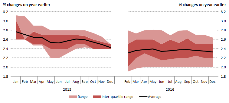
This easing in the growth rate since mid-2014 is reflected in a gradual reduction in the forecasts of GDP growth for 2015 and 2016 by other organisations, both public and private sector, but which appear to gravitate toward the OBR’s forecast (Figure 4). Forecasts for 2016 stabilise around the 2.3% mark, mirroring the averaged GDP growth for the first three quarters of 2015.
Figure 4: External forecasts of GDP growth for 2015 and 2016 – average and distribution around the mean (%, changes on a year earlier)
Source: Treasury (Her Majestys)
Notes:
- For some months, an overwhelming majority of forecasts were the same number across percentile swathes.
Download this image Figure 4: External forecasts of GDP growth for 2015 and 2016 – average and distribution around the mean (%, changes on a year earlier)
.png (17.8 kB) .xls (20.0 kB)
5. Sector accounts – households’ saving ratio
The saving ratio for households (and non-profit institutions serving households (NPISH)), measures the amount of money households (and NPISH) have available to save as a percentage of their total disposable income. Decomposing this into households’ income and consumption levels, and the ratio of households’ saving to income gives some insight into their financial position.
The saving ratio is a nominal concept, so the difference between consumption and income also bears some relationship to price and earnings growth. Prior to 2015, inflation was well above wage growth and this may have had a bearing on the saving ratio. For instance, it may have encouraged households to spend more in a bid to limit the squeeze on the volume of goods and services that they could purchase with a given level of income. Figure 5 shows the movements in the saving ratio over the past fifteen years.
In keeping with an improving economic position and household confidence, the saving ratio has fallen considerably from its peak in 2010 at 11.9%, down to 4.4% in Q3 2015 – broadly the same as at the start of the downturn (Figure 5). This downward trend has mainly been driven by faster growth in households’ consumption expenditure than in disposable incomes, particularly in the most recent quarters. This is consistent with an improved outlook since the economic downturn, as increased consumption reflects improving consumer confidence.
Figure 5: Growth of household resources and consumption in determining the saving ratio (%)
Source: Office for National Statistics
Notes:
- Estimates for 2015* are based on the first three quarters of 2015; growth of household resources and consumption are calculated using the first three quarters of 2015 compared to the first three quarters of 2014.
Download this chart Figure 5: Growth of household resources and consumption in determining the saving ratio (%)
Image .csv .xlsFigure 5 shows that the growth of household consumption relative to income and other resources has been bringing down the balance of household resources available to save – the saving ratio. Since the start of 2010, household resources have grown by 13.5% whilst household consumption has risen by 23.1%, thus lowering the saving ratio from 11.8% in Q1 2010 to 4.4% in Q3 2015. The main component of household total resources is wages and salaries, but an important contribution providing resources for consumption comes from other income streams, particularly net property income (accounting for 12% of total household resources in 2015) and social benefits (27%).
Whilst the falling saving ratio is beneficial to the economy in terms of consumption it presents some risks in terms of household exposure in servicing their liabilities. In a previous edition of the Economic Review, October 2015, the exposure of households to mortgage interest rate changes was covered, indicating that whilst the median leverage of mortgagor households has increased slightly during the recovery, average mortgagor gearing has fallen, reflecting the fall in interest rates. However, there is now a higher concentration of gearing, with more households attributing 15-20% of disposable income to mortgage repayments than in previous years.
Nôl i'r tabl cynnwys6. Inflation
Despite the continued growth of GDP - particularly household consumption - alongside a resilient labour market position and improving real earnings, inflation and price pressures remain historically low. The headline rate of inflation has generally been falling since its peak of 5.2% in September 2011. The Consumer Price Index (CPI) rose by 0.1% in the year to November 2015. Inflation remains broadly flat, and has been around zero for 10 months. This is due to a combination of factors that include low oil and petroleum product prices, subdued industrial and agricultural raw material prices, supermarket price competition, slow growth in labour costs and the appreciation of sterling during 2015 pushing down the prices of imports.
Core inflation, which excludes some of the more volatile prices of goods and services such as energy, food, alcohol & tobacco, increased from 1.1% in October to 1.2% in November. Figure 6 shows the ‘wedge’ between headline and core inflation, and therefore the contribution that energy, food, alcohol and tobacco have made to the downward pressure on headline inflation.
Figure 6: Inflation – headline and core (12 month percentage change)
Source: Office for National Statistics
Notes:
- CPI All Items: Percentage change over 12 months.
- Core CPI: Excludes energy, food, alcohol & tobacco.
Download this chart Figure 6: Inflation – headline and core (12 month percentage change)
Image .csv .xls7. Labour market
The weakness of inflation has been important factor driving the recent growth of real wages, which is one of several indications of continuing strength in the labour market. Employment has continued to grow in recent months, with the employment rate rising to 73.9% in the three months to October 2015. Unemployment has also continued to fall – dropping to a rate of 5.2% among those aged over 16, in the same period. Despite these signs of growing labour input, average hours worked have fallen over the past twelve months, indicating that while more people are in work, they are working fewer hours on average. The reasons for this trend are unclear but may include slightly faster growth in part time than full time workers and the improvement in real earnings over the past year, meaning that employees have not needed to work quite as many hours to maintain a desired level of income.
Figure 7: Actual weekly hours worked, total (million) and average per worker
Source: Office for National Statistics
Download this chart Figure 7: Actual weekly hours worked, total (million) and average per worker
Image .csv .xlsThe fall in average weekly hours worked has been especially marked for full time workers, reversing the upward trend seen since 2009. This echoes the stronger growth in part time workers than full time workers. Average hours among workers have continued on their broadly upward trajectory over the same period. It remains to be seen whether this presages a return to the pre-recession trend of declining average hours.
Figure 8: Average hours worked, full time and part time workers (main job only)
Source: Office for National Statistics
Download this chart Figure 8: Average hours worked, full time and part time workers (main job only)
Image .csv .xlsUnemployment has been falling sharply since the start of 2013, with the unemployment rate now down to 5.2% (among those aged 16 and over), the lowest rate since 2008. As a result, the level of unemployment has fallen by more 240,000 over the past year. The decline in unemployment has been across all age groups, but has been greater for the 18 to 49 age brackets during this period (Figure 9).
Figure 9: Unemployment by age group , selected periods, thousands
Source: Office for National Statistics
Download this chart Figure 9: Unemployment by age group , selected periods, thousands
Image .csv .xlsThe fall in unemployment also appears to have affected workers who have been unemployed for a range of durations. While the level of short term unemployment has returned to its pre-downturn level most quickly, recent falls in the number out of work have been more concentrated among those unemployed for longer durations. As the short term unemployed are thought to be more attached to the labour market than those out of work for longer, this may be an indication that firms are drawing more deeply from the unemployed pool to fill their vacancies. From the perspective of the UK economy, it also means that the level of long term unemployment has peaked much lower than in previous downturns reducing the extent of skill atrophy in the labour market.
Figure 10: Unemployment level (age 16+) by duration, thousands
Source: Office for National Statistics
Notes:
- Q1 is Quarter 1 (Jan to Mar), Q2 is Quarter 2 (Apr to June), Q3 is Quarter 3 (July to Sept) and Q4 is Quarter 4 (Oct to Dec).
Download this chart Figure 10: Unemployment level (age 16+) by duration, thousands
Image .csv .xlsA further indication of the improvement in the labour market, and therefore household earnings, is the rate of wage growth. Although annual growth in average regular pay has come down in recent months – from 2.9% in the three months to July 2015 to 2.0% in the three months to October - nominal earnings growth was nevertheless higher in September and October than it was for the period from mid-2011 to March 2015. Real earnings growth has been between 1% and 3% over 2015, having been negative for the previous six years.
Figure 11: Average nominal and real wage growth (3 month on 3 month a year ago)
Source: Office for National Statistics
Download this chart Figure 11: Average nominal and real wage growth (3 month on 3 month a year ago)
Image .csv .xlsThe aforementioned decline in average weekly hours worked may be one factor in the recent moderation in average weekly earnings, and hourly earnings may have held up more strongly. Experimental statistics for the Index of Labour Costs per Hour (ILCH) show that hourly wage costs rose by 3.6% in the year to Q3 2015, broadly unchanged from Q2 2015.
Nôl i'r tabl cynnwys8. Distribution of productivity
The fall in real wages between 2008 and 2015 is closely related to the weakness of productivity growth which has been one of the defining features of the recent economic recovery. Aggregate GDP growth has been accompanied by relatively strong employment growth over this period – reflecting sharp falls in unemployment and inactivity – and as a result the recovery of labour productivity has been weak. However, output growth in recent quarters has been accompanied by slowing aggregate labour input growth. As a consequence, whole economy output per hour increased by 1.3% between Q3 2014 and Q3 2015, unchanged from the previous quarter (Figure 12) but considerably more quickly than in 2014. Reflecting a recent fall in average hours worked, output per worker growth fell to 0.7% in the year to Q3 2015.
Figure 12: Whole economy output, hours worked and output per hour, growth quarter on same quarter a year earlier, %
Source: Office for National Statistics
Download this chart Figure 12: Whole economy output, hours worked and output per hour, growth quarter on same quarter a year earlier, %
Image .csv .xlsThe recent growth of productivity largely reflects the performance of the Services industries. While in aggregate these industries have a lower average level of output per hour than manufacturing or other production industries, their productivity growth performance in recent periods has been relatively strong. Output per hour in the services industries grew by 1.8% in the year to Q3 2015, following growth of 0.7% and 1.5% in the first two quarters of 2015. Productivity in manufacturing fell over this period, as did output per hour in the production industries as a whole – the latter partly reflecting the long-term decline in output from the UK’s North Sea oil and gas reserves.
While the aggregate productivity data provide an important yardstick for the health of the UK economy, they mask a wide range of different outcomes at the firm level. As recent research by ONS and the Bank of England has shown, firm level productivity is strikingly varied. Even within specific industries, some firms succeed in achieving a much higher level of productivity than others, while a substantial proportion of firms appear able to survive with much lower levels of output per worker. This distribution of firm-level productivity reflects the varied characteristics of firms and product markets in the UK, capturing differences in firm size, production technology and capital intensity, as well as other characteristics such as their managerial capability, the degree of competition between firms and the extent of firm market power.
The breadth of this more detailed distribution of firm level productivity is accessible using the Annual Business Survey (ABS) and estimates of employment from the Inter-Departmental Business Register (IDBR). Conducted by ONS, the ABS is one of several sources for the output measure of GDP, and provides detailed information about the turnover and intermediate consumption of firms in the non-financial business economy1. The difference between these concepts – turnover less intermediate consumption – is called approximate value added2. These data are deflated to give a measure of the real value added produced by each firm3. As the ABS does not collect information about labour input, the IDBR – a comprehensive list of UK businesses which provides the sampling frame for a range of different surveys – provides the estimates of employment we use to calculate real value added per employee in each firm. These data capture a snapshot of employment at the time the ABS sample is drawn, and are estimated from a range of different sources including the Business Register Employment Survey (BRES), administrative sources including data from HMRC, and contains some imputation for small firms4. As this analysis involves several different sources covering only part of the UK economy, the results necessarily differ from the headline data presented in Figure 12.
Figure 13 shows the distribution of this measure of firm level productivity for the population of UK firms, showing the proportion of companies at different levels of output per worker in selected years. Similar to the distribution of earnings, this distribution is skewed to the right, indicating a large number of firms with output per worker between £5,000 and £15,000 per worker per year in 2014, and a gradually shrinking number of firms at higher levels of productivity. Each year, some firms report purchases which exceed their turnover – reflecting operating losses – which results in negative value added per worker, shown to the left hand side of Figure 13.
Figure 13: Distribution of firm level productivity (output per worker) in the non-financial business economy, selected years, constant prices
Source: Annual Business Survey (ABS), Inter Departmental Business Register (IDBR) - Office for National Statistics
Notes:
- Kernal Density, Bandwidth size = 4.
- Firms can have negative levels of value added per head in specific periods as a consequence of reporting larger values of purchases than their total turnover.
- Deflators for the two-digit Standard Industrial Classification have been taken from the low-level GDP(O) release and used to deflate value added to constant 2014 prices.
- Includes surveyed firms in the non-financial business economy (see Footnote 1), weighted to reflect the population of firms.
Download this chart Figure 13: Distribution of firm level productivity (output per worker) in the non-financial business economy, selected years, constant prices
Image .csv .xlsWhile the broad distribution of firm level productivity is a persistent feature of the UK’s economic landscape, there is some evidence that this distribution has changed in shape through time. This is particularly evident at the bottom of the distribution: between 2008 and 2010, the mass of the distribution shifts noticeably to the left, represented by the larger number of firms reporting levels of productivity of less than £20,000 per worker per year. Over this period, firm level output per worker appears to have become more concentrated at the bottom of the productivity distribution, as a growing fraction of companies appear to have experienced low or negative value added per worker5.
Over the 2010 to 2014 period, however, some of these effects appear to have unwound. Figure 13 suggests that the proportion of firms with negative value added per worker has fallen over this period, and the mass of the distribution is now centred further to the right than in the previous years of this relatively short period. This change is likely to reflect both the impact of unproductive firms ceasing to trade during the economic downturn in the face of continued operating losses, as well as the positive impact of rising productivity among surviving firms. Although slight in comparison to these changes at the bottom of the distribution, there is also some evidence of higher concentrations of firms at relatively high levels of productivity in 2014.
Firms with relatively high levels of productivity – located in the right-hand tail of the distribution shown in Figure 13 – are drawn from a range of different industries (Figure 14), although some are more heavily represented than others. Firms in the Production industries accounted for around 1 in 20 of the 10% most productive firms in 2014, compared with 6.9% in the population as a whole, while firms in the Construction industry were slightly over-represented in this group – accounting for 15.5% of the top 10% of firms by productivity, compared with just 13.9% in the population as a whole. Professional, Scientific and Technical firms accounted for almost 1 in 3 of the UK’s highest productivity firms in 2014 – significantly above their share of 19.7% of all firms that year, and a considerably higher proportion than 2008. By contrast, the share of high-productivity firms accounted for by Distribution, Hotels & Catering, Real Estate and private health and education services has fallen over the same period.
Figure 14: Industry composition of the top 10% of firms by productivity, 2008 to 2014
Source: Annual Business Survey (ABS), Inter Departmental Business Register (IDBR) - Office for National Statistics
Notes:
- Deflators for the two-digit Standard Industrial Classification have been taken from the low-level GDP(O) release and used to deflate value added to constant 2014 prices.
- Includes firms in the non-financial business economy (see Footnote 1).
- Industry groupings are consistent with the low-level GDP(O) publication and those found in the Index of Services release. Distribution, Hotels & Restaurants includes Wholesale & Retail services and Accommodation & Food Service activities. Transport, Storage & Communications includes Transport & Storage and Information & Communications.
Download this chart Figure 14: Industry composition of the top 10% of firms by productivity, 2008 to 2014
Image .csv .xlsDifferences in productivity across industries, partly captured in Figure 14 above, are also evident by firm size. Larger firms – which might have greater scope for dividing up production activities into specialised units, or which can benefit from increasing returns through centralised business functions, for example – tend to have higher productivity than smaller firms. Figure 15 shows total output per worker for micro (1 to 9 employees), small (10 to 49 employees), medium (50 to 249 employees) and large businesses (250 employees or above). It indicates that output per worker among medium-sized and large firms has been higher than among micro- and small-firms over the past seven years. On this basis, productivity fell across all these firms sizes in 2009 – with the largest proportionate falls for the medium-sized category – and remained relatively weak for most firm sizes until 2012. Between 2012 and 2014, however, output per worker in all these groups has picked up. Only among the largest firms was aggregate productivity still below its 2008 level in 2014, and productivity among micro-firms has risen fastest of all firm sizes since its low point in 2009. As a consequence, the gap between large- and micro-firm productivity has narrowed in recent years – possibly reflecting improving productivity among small firms, changes to working patterns and practices or as a consequence of some unproductive firms ceasing trading, sometimes referred to as the ‘cleansing’ effect of a downturn.
Figure 15: Productivity (output per worker) by firm size, constant 2014 prices
Source: Annual Business Survey (ABS), Inter Departmental Business Register (IDBR) - Office for National Statistics
Notes:
- Deflators for the two-digit Standard Industrial Classification have been taken from the low-level GDP(O) release and used to deflate value added to constant 2014 prices.
- Includes firms in the non-financial business economy (see Footnote 1).
- ONS are currently developing new methods of producing employment and employee estimates by employment size-band from the Business Register and Employment Survey (BRES), with the aim of making these available in September 2016, which may have a bearing on this analysis. Until these become available, ONS considers the IDBR to be the best source of this information. Despite this, some care should be taken when using employment from the IDBR as it is derived from a number of different sources (BRES, HMRC and imputed) and from differing time periods. In particular, some of the employment information from small businesses may be several years old. For all other (non-size-band) estimates of employment, BRES is considered the preferred source.
Download this chart Figure 15: Productivity (output per worker) by firm size, constant 2014 prices
Image .csv .xlsThese differences in productivity levels between large and small firms have implications for the distribution of labour productivity among employees. For instance, if the low-productivity firms shown in Figure 13 are relatively small in employment terms, while the higher-productivity firms tend to employ more people, then Figure 13 will understate the distribution of labour productivity among employees. Rather than giving each firm an equal weight regardless of its level of employment – as in Figure 13 – Figure 15 weights each firm by its level of employment, to show the distribution of productivity among employees. It therefore yields some idea of the level of productivity at which different proportions of employees are working. While the distribution presented in Figure 16 is similar in width to Figure 13, it is notably shifted to the right – indicating the heavier employment weight accounted for by relatively more productive firms – and the mass at and close to zero is notably reduced – indicating that many of the unproductive firms in Figure 13 account for a relatively small share of employment. The centre of this distribution – which is more symmetrical than in Figure 13 – is close to £20,000 in 2014, considerably closer to median earnings of £22,000 in this period. Changes in this distribution also appear to suggest that the productivity of the UK’s median employee has improved in recent years. In 2014, the mass of the distribution appears to be centred further to the right than in recent years, and a smaller fraction of employees are working in firms with zero or negative productivity.
Figure 16: Distribution of productivity (output per worker) by worker, current prices, and selected years 2008 to 2014
Source: Annual Business Survey (ABS), Inter Departmental Business Register (IDBR) - Office for National Statistics
Notes:
- Kernal Density, Bandwidth size = 4.
- Deflators for the two-digit Standard Industrial Classification have been taken from the low-level GDP(O) release and used to deflate value added to constant 2014 prices..
- Includes Private, non-financial firms (see Footnote 1).
Download this chart Figure 16: Distribution of productivity (output per worker) by worker, current prices, and selected years 2008 to 2014
Image .csv .xlsThe analysis presented in Figures 13 and 16 suggests that the proportion of firms and employees working at zero or negative levels of productivity was lower in 2014 than at any point since 2008. Figure 17 uses data from the ABS to estimate these quantities. Consistent with the analysis presented above, it shows that many low-productivity firms have relatively few employees, as the proportion of firms with zero or negative productivity is larger than the proportion of employees. Between 2008 and 2014, the proportion of firms operating with zero or negative productivity fell from around 13% to 9%, while the proportion of employees working at these firms fell from close to 8% to 6% over the same period. In common with the preceding analysis, this likely reflects both the recent improvement in demand conditions, as well as unproductive firms ceasing trading following the economic downturn.
Figure 17: Proportion of firms, and proportion of workers in firms, with zero or negative productivity, 2008 to 2014
Source: Annual Business Survey (ABS), Inter Departmental Business Register (IDBR) - Office for National Statistics
Notes:
- Includes firms in the non-financial business economy (see Footnote 1).
Download this chart Figure 17: Proportion of firms, and proportion of workers in firms, with zero or negative productivity, 2008 to 2014
Image .csv .xlsThe prevalence of unproductive firms and the spread of productivity levels also varies considerably by industry. Figure 18 presents information on the distribution of productivity among employees working in a selection of industries. It shows the median level of productivity (the dot), the 10th to the 90th percentiles (the lines) and the inter-quartile range (the bars) for each industry. The absolute range of productivity outcomes is broadest in several production industries, including the Electricity, Steam, Gas & Air Conditioning, Mining & Quarrying and Water Supply industries, indicating the presence of both high and low productivity firms in these industries. The absolute range of productivity outcomes in other industries remains quite broad – albeit considerably smaller than in these production industries – and tends to be skewed to the right. This suggests the distribution of productivity levels among firms in the same industry is similar to the distributions presented in Figure 16. Consistent with their lower average level of labour productivity, the services industries (excluding finance) largely report relatively low median levels of output per employee, and some of the narrowest absolute ranges of productivity outcomes.
Figure 18: Distribution of productivity (output per worker) by industry, 2014

Source: Annual Business Survey (ABS) - Office for National Statistics
Notes:
- Tails represent the 10th to 90th percentiles, boxes represent the inter-quartile ranges, and dots show medians. Includes firms in the non-financial business economy (see Footnote 1).
- GVA shares are based on low-level nominal GVA estimates for 2012. The coverage of the low-level GVA data differs to the ABS data and are provided for contextual purposes only. While ABS data only covers the Non-Financial Business Economy, low-level GVA data covers the entire economy. For more information, see the background notes for the latest ABS release.
Download this image Figure 18: Distribution of productivity (output per worker) by industry, 2014
.png (36.2 kB) .xls (28.7 kB)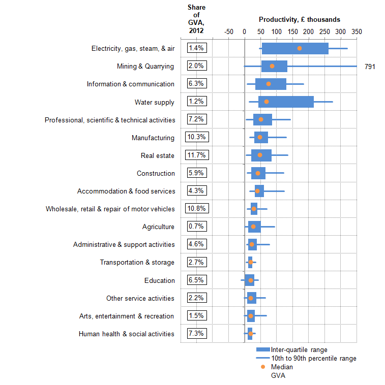
Notes for distribution of productivity
The ABS covers only the UK Non-Financial Business Economy which accounts for approximately two thirds of the UK economy in terms of Gross Value Added. The industries covered are (a) Agriculture (sections 01.6 and 01.7 of the Standard Industrial Classification 2007), forestry and fishing, (b) Production (section B-E), (c) Construction (section F) (d) Distribution services (section G) and (e) Non-Financial Services industries (sections H, I, J, L, M, N, P (private only), Q (SIC 87 and 88, private provision only in SIC 86.1 and 86.9), R and S).
Note that approximate value added calculated here and that published alongside the Annual Business Survey outputs differs from the National Accounts aggregates in both level and growth terms for a range of different reasons.
Consistent with other work in this field, deflators for the two-digit Standard Industrial Classification have been taken from the low-level GDP (O) release and used to deflate value added to constant 2014 prices. These deflators are compiled in gross output terms, and do not take account of price movements for intermediates.
Note that this differs from other work in the field which uses survey responses from the Business Register Employment Survey (BRES), which permits analysis by employment size-band. ONS are currently developing new methods of producing employment and employee estimates by employment size-band from BRES, with the aim of making these available in September 2016. Until these become available, ONS considers the IDBR to be the best source of this information. Despite this, some care should be taken when using employment from the IDBR as it is derived from a number of different sources (BRES, HMRC and imputed) and from differing time periods. In particular, some of the employment information from small businesses may be several years old. In addition, the productivity performance of firms in our analysis may be misrepresented to the extent that employment levels vary through the year. If employment is particularly strong (weak) at the time that the sample is drawn, then firm-level output per worker may be under (over) stated.
Some of these trends will be affected by changes in average hours worked. Changes in the shape of the distribution shown in Figure 13 may overstate the fall in productivity to the extent that employees shifted from full- to part-time employment.