1. Main points
GDP grew by 0.5% in the final quarter of 2015, bringing growth for the whole of 2015 to 2.2%. This is the 12th consecutive quarter of growth, although the rate of expansion moderated in 2015 compared to the 2.9% seen in 2014.
As well as consistent growth in the key services sectors, GDP growth benefited from an increase in mining & quarrying output in 2015. This contrasts with the falling levels of oil and gas extraction in previous years.
The manufacturing sector has experienced only a slow recovery since the 2008-2009 downturn, and contracted very slightly in 2015. Over the longer term, there has been a shift away from extraction and lower-end manufacturing towards higher value-added and finished goods production, as well as an increase in export intensity.
The trade deficit has been broadly flat since 2011, but within this the deficit with the EU has deteriorated while that with non-EU trade partners has improved. These divergent trends are largely driven by trade with Germany and with the US respectively.
The widening of the current account deficit, to a record high in 2014, is primarily the result of falling net foreign direct investment (FDI) income since 2011. The UK has generated lower rates of return on its overseas investments while the returns earned by foreign investors in the UK have been more resilient.
The distribution of average weekly hours worked has changed little over the past 20 years, with large mass around 39 hours a week, and smaller masses around 50 and 60 hours. However the portion of full-time workers with long hours (over 50) has fallen.
Following a rising trend since the 2008-2009 economic downturn, average weekly hours worked by full-time workers has fallen since the start of 2015. This is reflected in trends in the difference between workers’ actual and usual hours. While actual hours worked were on average 14% lower than usual hours prior to the downturn, this fell to 12.5% in the three months to January 2015, recovering slightly to 12.8% in the three months to November 2015.
2. Introduction
The preliminary estimate showed that UK GDP grew by 0.5% in Q4 2015, the 12th consecutive quarter of economic growth. Comparing the UK’s economic performance since the pre-downturn peak with that in the other G7 economies suggests that the UK’s performance has been at the centre of the group in terms of GDP (ranked third), but fifth in terms of GDP per capita. One factor holding back UK GDP growth prior to 2013 was the performance of the oil and gas industries – which reduced GDP growth by 1.2 percentage points between Q1 2008 and Q4 2013. However, output from Mining & Quarrying has increased in recent quarters, and the industry made a positive contribution to GDP growth during 2015.
This edition of the Economic Review also examines long-term changes in the manufacturing industries. This analysis suggests that the industry has shifted away from extraction and preparation of basic materials toward the manufacture of higher value added and final goods over the past decade, taking a position closer to the end of value added chains. It also finds that manufacturing has become more export orientated over the past decade, with turnover from exports accounting for a larger proportion of total turnover for all manufacturing sub-industries.
While the UK’s trade deficit shrank between 2010 and 2011, it has remained fairly stable over the following four years. However, this stability masks some notable changes in the geographical balance of UK trade. Since 2011, the UK’s trade deficit with the EU has grown while the trade balance with non-EU countries has moved from deficit to surplus. This edition of the Economic Review finds that much of the increasing deficit with the EU can be attributed to trade with Germany and the Benelux countries (Belgium, Netherlands, Luxembourg), while the more positive trade balance with the non-EU countries is largely due to trade with the US and China.
Despite the stability of the UK’s trade deficit in recent years, the current account deficit grew between 2011 and 2014 – largely due to falling net FDI income. This and previous Reviews, found that this is due to falling rates of return on UK FDI abroad, particularly in relation to the EU, together with a more resilient rate of return and rising levels of FDI into the UK.
Finally, this edition of the Economic Review examines trends in average hours worked. After rising during the economic recovery, average actual hours worked have recently started to fall. Whether this is a return to the long-term downward trend in average hours worked prior to the downturn or there are other factors at work is a key determinant of the degree of spare capacity in the UK’s labour market. This analysis suggests that the long-term decline in hours worked appears to be driven by a decline in the number of individuals working relatively long working weeks relative to 20 years ago, while the rest of the hours worked distribution remains very similar. However, the more recent growth and subsequent fall in average hours worked appears to be driven by changes in the proportion of usual hours actually being worked. This suggests that part of the post-downturn rise in average actual hours may have been related to a temporary fall in the amount of leave taken by workers, rather than as a consequence of structural change in the labour market.
Nôl i'r tabl cynnwys3. GDP
The preliminary GDP release showed that the UK economy grew by 0.5% in the fourth quarter of 2015 and by 1.9% when compared with the same quarter of the previous year. This is broadly in line with quarterly growth during the previous periods of 2015. Although Q4 2015 marked the 12th consecutive quarter of economic growth, there are indications that growth has slowed recently. GDP grew by 2.2% in 2015 as a whole, lower than in 2014 (2.9%) but higher than the 2010 - 2014 average (2.0%).
Figure 1: GDP growth, chain volume measure, Q1 2010 to Q4 2015, quarter on previous quarter and quarter on same quarter of the previous year
UK
Source: Office for National Statistics
Download this chart Figure 1: GDP growth, chain volume measure, Q1 2010 to Q4 2015, quarter on previous quarter and quarter on same quarter of the previous year
Image .csv .xlsThe services industries were the primary drivers of GVA growth, both in Q4 2015 and in 2015 as a whole. Figure 2 shows how different sub-industries contributed to GVA growth in the final quarter of 2015 and how this compares with 2015 as a whole. The three industries which made the largest contribution to growth in 2015 were wholesale, retail & repair services, professional, scientific & technical services, and information & communication services, which together accounted for 1.2 percentage points of the 2.2% growth of GVA over this period. Financial & insurance services and manufacturing detracted from growth, together reducing GVA by 0.1 percentage point.
Figure 2: Contributions to GDP growth in the year to 2014 and 2015
UK
Source: Office for National Statistics
Download this chart Figure 2: Contributions to GDP growth in the year to 2014 and 2015
Image .csv .xlsTaking the economic recovery as a whole, the UK’s performance has been middling in international terms. While GDP continues to grow, comparing GDP with its level in Q1 2008 (its pre-downturn peak) indicates that the UK’s economic performance compared with similar economies lies toward the middle of the range. Figure 3 compares GDP and GDP per capita in the G7 economies – the seven largest developed economies – to their respective levels in Q1 2008. While the trends are similar, the impact of population growth in Canada, the US and the UK is marked particularly in comparison with that in Germany and Japan.
Figure 3a: GDP and GDP per capita in G7 economies, Q1 2005 to Q3 2015, chain volume measure, Q1 2008 Q1 = 100
UK
Source: Organisation for Economic Co-operation and Development
Notes:
- Data for Japanese GDP per capita is unavailable between Q1 2005 and Q2 2007. Data for Canadian GDP per capita is unavailable for Q3 2015.
Download this chart Figure 3a: GDP and GDP per capita in G7 economies, Q1 2005 to Q3 2015, chain volume measure, Q1 2008 Q1 = 100
Image .csv .xls
Figure 3b: GDP and GDP per capita in G7 economies, Q1 2005 to Q3 2015, chain volume measure, Q1 2008 Q1 = 100
UK
Source: Organisation for Economic Co-operation and Development
Notes:
- Data for Japanese GDP per capita is unavailable between Q1 2005 and Q2 2007. Data for Canadian GDP per capita is unavailable for Q3 2015.
Download this chart Figure 3b: GDP and GDP per capita in G7 economies, Q1 2005 to Q3 2015, chain volume measure, Q1 2008 Q1 = 100
Image .csv .xlsThe UK’s current position reflects both the depth of the UK’s downturn and the strength of its recovery. In the three years to Q1 2008, economic growth in the UK was second only to Germany in both GDP and GDP per capita. All G7 economies experienced a fall in GDP and GDP per capita in 2009 – the UK’s 6.1% peak-to-trough fall in GDP was the 4th largest (or alternatively the 4th smallest), while the 7.0% fall in GDP per capita was 3rd largest. Comparing the most recent period for which data is available for all countries – Q2 2015 – with Q1 2008, places the UK third in terms of GDP and fifth in GDP per capita. This partly reflects the large fall in UK output during the downturn, but it also reflects relatively subdued growth in the years immediately following the downturn. In 2014 alone, GDP growth in the UK was the fastest among the G7, suggesting the UK’s relative economic performance has improved recently.
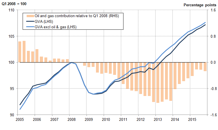
The performance of the oil and gas industry accounts for some of the UK’s comparative weakness during the economic downturn and more recently, during 2014 and 2015, for some of its strength. The share of output accounted for by oil and gas extraction, and mining and quarrying more generally, have been in long-term decline in the UK, as North Sea oil fields move towards depletion and the extraction of the remaining reserves becomes increasingly costly. This weakening of the industry’s performance accounts for some of the UK’s slower growth between 2008 and 2013.
These trends are shown in Figure 4, which illustrates the ‘wedge’ between output growth, including and excluding oil and gas extraction (the lines), and the cumulative contribution of oil and gas to GVA growth since Q1 2008. Between Q1 2008 and Q4 2013, oil and gas extraction detracted a cumulative 1.2 percentage points from GVA growth. However, during 2014 and 2015, oil and gas extraction contributed on average 0.5 and 0.3 percentage points to growth respectively. By Q4 2015, this resulted in oil and gas extraction having subtracted only 0.3 percentage points from GVA growth relative to Q1 2008, unwinding much of the drag since the downturn.
Figure 4: The impact of oil and gas extraction on chain volume measure GVA growth in the UK (Q1 2008 Q1=100 and percentage points), 2005 to 2015
UK
Source: Office for National Statistics
Notes:
- Contribution from oil and gas to GVA growth is calculated as the difference between growth rates for GVA and GVA excl oil and gas.
Download this image Figure 4: The impact of oil and gas extraction on chain volume measure GVA growth in the UK (Q1 2008 Q1=100 and percentage points), 2005 to 2015
.png (29.9 kB) .xls (32.3 kB)
4. Manufacturing
While manufacturing output fell by 0.1% in 2015, output growth for the industry as a whole masks long-term changes in the composition of manufacturing. Figure 5 shows manufacturing and production output relative to their respective average levels between 2000 and 2005. Following a period of relatively strong manufacturing and production growth in the 1980s and 1990s, manufacturing output throughout much of the 2000s did not rise or fall consistently, remaining fairly stable until the start of the downturn. Manufacturing output fell 13.9% between January 2008 and August 2009, while production output fell by 12.9%, cushioned by a slightly stronger non-manufacturing performance. Following a brief recovery in 2009-10, both manufacturing and production output appear to have returned to their stable, pre-downturn trends at a new, lower level; around 5% and 10% below their 2000 to 2005 averages, respectively.
Figure 5: Manufacturing and production output, indexed to their respective 2000 to 2005 averages, January 1975 to November 2015
UK
Source: Office for National Statistics
Download this chart Figure 5: Manufacturing and production output, indexed to their respective 2000 to 2005 averages, January 1975 to November 2015
Image .csv .xlsHowever, in addition to changing trends in manufacturing output growth over the past few decades, longer term shifts in the composition of manufacturing output mean that some industries have grown while others have declined. Figure 6 examines the changing share of each manufacturing sub-industry in total manufacturing GVA, comparing the first six years of this decade with the corresponding years in each of the previous two decades.
Figure 6: Shares of manufacturing current price GVA by manufacturing sub-industries, averages during 1990 to 1995, 2000 to 2005, and 2010 to 2015
UK
Source: Office for National Statistics
Download this chart Figure 6: Shares of manufacturing current price GVA by manufacturing sub-industries, averages during 1990 to 1995, 2000 to 2005, and 2010 to 2015
Image .csv .xlsFood products, beverages & tobacco has consistently been the largest sub-industry, accounting for a stable 16% of manufacturing GVA over this period, while coke and refined petroleum products remain the smallest component despite a slight increase in share in the most recent period.
Coupled with a falling share for basic metals since the 1990s, and a rising share for transport equipment, this suggests there may be a slight long-term trend in the UK’s manufacturing industries toward the creation of final-products at end of the production process and away from the more basic extraction end of the value chain. A good example of this is within metals where there has been stronger growth in fabricated metal products but slower growth in basic metals.
Accompanying this shift toward higher value added and final products are indications that manufacturing may have become increasingly export-orientated. TOPSI (Turnover and Orders in Production and Services Industries) data1 provides information on export and domestic turnover (demand) in current prices for each manufacturing sub-industry, and Figure 7 shows the comparative export intensities.
Figure 7: Ratio of export turnover to total turnover for selected manufacturing sub-industries (percent, annual averages), 2000 to 2005 and 2010 to 2015
UK
Source: Office for National Statistics
Notes:
- 2015 data includes January to November.
Download this chart Figure 7: Ratio of export turnover to total turnover for selected manufacturing sub-industries (percent, annual averages), 2000 to 2005 and 2010 to 2015
Image .csv .xlsA comparison of the sub-industries’ average export intensities between 2000-2005 and 2010-2015, shows that over time the percentage of turnover derived from exports has increased for all twelve featured sub-industries. In both periods, pharmaceuticals has consistently exported the largest proportion of its goods (49% in 2005-2010 and 57% in 2010-2015). However, it is notable that computer, electronic & optical equipment, other machinery & equipment, transport equipment and chemicals & related products also have export intensities exceeding 40% in the latter period. Food, beverages & tobacco and wood, paper & printing are the only two sub-industries to have export intensities below 10%; however food, beverages & tobacco has seen the largest proportional rise across the periods.
Notes for manufacturing
- TOPSI (Turnover and Orders in the Production and Services Industries) data is based on a sub-set of MBS data and does not provide as comprehensive coverage of each sub-sector as the wider MBS data used in the Index of Production calculations. Nevertheless the TOPSI data gives a useful indication of relative export intensities, and therefore the market exposure and competitive pressures of the various manufacturing sub-sectors.
5. Trade
The UK’s trade deficit was, on average, 2.7% of GDP between 2006 and 2010, falling to 2.0% between 2012 and 2014 (Figure 8). However, while the UK’s trade deficit remained fairly constant between 2011 and 2014, the UK’s trade balance with the EU and the non-EU diverged. Figure 8 shows that between 2006 and 2011, the UK ran a trade deficit with both EU and non-EU countries – although the trade deficit with the EU has been consistently larger since 2011. The two geographical areas have diverged, so that in 2014 the trade deficit with the EU stood at 3.2% of GDP while the UK had a surplus of 1.4% with non-EU countries.
Figure 8: UK balance of trade with EU and non-EU countries (respectively) and total trade balance, % of GDP, 1999 to 2014.
Source: Office for National Statistics
Download this chart Figure 8: UK balance of trade with EU and non-EU countries (respectively) and total trade balance, % of GDP, 1999 to 2014.
Image .csv .xlsHowever, particular countries within each area can be identified as driving trends in the trade balances. Figure 9 shows the contribution of selected countries to EU and non-EU trade balances. First focusing on the EU, although the UK has a net trade deficit with the EU, it does not have a trade deficit with all EU countries. In particular, Ireland stands out as contributing a surplus to the UK trade position throughout the past 16 years. However, the more recent decline in the EU trade deficit has been concentrated in Germany and the ‘Benelux’ group of Belgium, the Netherlands, and Luxembourg. Together these four countries contributed 1.3 percentage points to the 1.9 percentage point decline in the EU trade deficit as a share of GDP between 2011 and 2014.
Figure 9a: Contributions to the UK’s trade balance with selected EU and non-EU countries, percentage of GDP, from 1999 to 2014
EU
Source: Office for National Statistics
Download this chart Figure 9a: Contributions to the UK’s trade balance with selected EU and non-EU countries, percentage of GDP, from 1999 to 2014
Image .csv .xls
Figure 9b: Contributions to the UK’s trade balance with selected EU and non-EU countries, percentage of GDP, from 1999 to 2014
Non-EU
Source: Office for National Statistics
Download this chart Figure 9b: Contributions to the UK’s trade balance with selected EU and non-EU countries, percentage of GDP, from 1999 to 2014
Image .csv .xlsSimilarly for the non-EU countries, the UK has a mix of trade deficits and surpluses. The trade balance with the US registered a surplus of 1.8% of GDP in 2014, while trade with China stood at a deficit of 1.1%. The improvement in the UK’s trade balance with non-EU countries since 2011 appears both as an increase in the trade surplus with the US until 2013 together with a fall in the trade deficit with China. More recently, although the trade surplus with the US fell, trade balances with the ‘rest of non-EU’ have been a prominent factor in increasing the UK’s trade surplus with non-EU countries by 1.6 percentage points of GDP – 0.4 percentage points of which are due to an improved balance with Switzerland within the ‘rest of non-EU’ group.
Nôl i'r tabl cynnwys6. Foreign Direct Investment
The recent improvement on the balance of trade has had a correspondingly positive impact on the UK’s Balance of Payments – although this has been more than offset by a sharp deterioration of the UK’s balance on primary income. A large portion of this weakness appears to be a result of the balance on Foreign Direct Investment (FDI) income. The contribution of FDI to the current account balance, which has traditionally been positive, has fallen in each year since 2011, as shown in Figure 10. Including the most recent FDI data for 2013 and 2014 (and using other components as published in the Balance of Payments) results in net FDI earnings fell from £27.8 billion in 2013 to £13.2 billion in 2014. Measured as a percentage of nominal GDP, the indicative1 current account deficit in 2014 is the highest on record (4.5%). This is slightly higher than the Balance of Payments’ latest published estimate of the current account deficit in 2014 of 5.1% of GDP.
Figure 10: UK indicative current account balance and components, 2006 to 2014
Source: Office for National Statistics
Download this chart Figure 10: UK indicative current account balance and components, 2006 to 2014
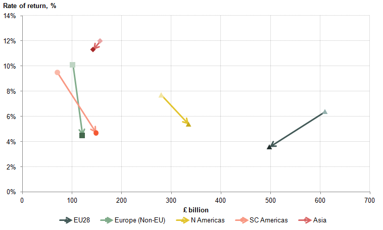
Image .csv .xlsAs with trade, dividing FDI earnings into EU and non-EU countries reveals a more complex story, and in the case of FDI highlights the importance of the EU as a factor behind the recent increase in the current account deficit. Changes in FDI earnings can reflect a change in the rate of return, a change in the stock of investment, or a combination of the two. Figure 11 presents changes in the UK’s stock of assets between 2011 and 2014 for selected regions, along with the rate of return on each region’s stock. Light (dark) data points provide information about the position in 2011 (2014). Shifts towards the horizontal axis indicate a declining rate of return, while shifts towards the vertical axis indicate disinvestment, and vice versa.
Figure 11: Movements in UK FDI assets and rates of return between 2011 and 2014
Source: Office for National Statistics
Download this image Figure 11: Movements in UK FDI assets and rates of return between 2011 and 2014
.png (16.6 kB) .xls (26.6 kB)
The fall in the rate of return on the UK’s FDI assets was relatively broad, and explains a large portion of the change in UK FDI credit. Figure 11 shows that rates of return fell across all the selected regions, reflecting an aggregate fall in the rate of return on UK FDI assets from 8.1% to 5.4% over this period. This fall was particularly marked in non-EU Europe (from 10.1% to 4.5%) and Southern and Central America (9.5% to 4.7%). However, the fall in the rate of return in the EU had a particularly large impact on the UK’s FDI balance, as this is where the largest fraction of UK FDI assets are based. The rate of return the UK generated on its EU based FDI assets fell from 6.4% in 2011 to 3.6% in 2014, explaining approximately two thirds of the decline in credits from the region. As a consequence, credits from North America were higher than those from the EU for the first time on record.
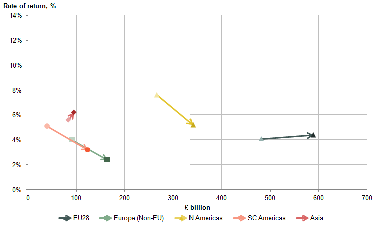
In contrast to assets, changes in rates of return for liabilities were more mixed, reflecting differences in the type of assets held by overseas agents in the UK (Figure 12). Despite mixed movements in rates of return, investment from all selected regions increased, suggesting that overseas investors have sought to increase their holdings in the UK. The factors behind this recent trend have been the subject of recent ONS analysis, but may include the appreciation of sterling against several major currencies - such as the Euro, Dollar, and Yen – between 2011 and 2014, and the UK’s relatively strong economic growth in recent years compared with other countries.
Figure 12: Movement in UK FDI liabilities and rates of return between 2011 and 2014
Source: Office for National Statistics
Download this image Figure 12: Movement in UK FDI liabilities and rates of return between 2011 and 2014
.png (14.6 kB) .xls (26.1 kB)
Similarly to credits, changes in debits to the EU are a key factor underlying an increase in the UK’s total FDI debits between 2011 and 2014. While the UK’s investment in the EU fell between 2011 and 2014, EU investment in the UK rose by more in absolute terms than any of the other four regions. In addition to a slight rise in the rate of return on these liabilities, this caused the UK’s debits to the EU to rise by £6.1 billion - accounting for most of the £6.8 billion increase in FDI debits.
Notes for Foreign Direct Investment
- FDI and current account estimates for 2013 and 2014 utilise the latest FDI data from the FDI statistical bulletin, published 3 December 2015. Due to time constraints, it was not possible to produce reconciled FDI data in time for the Balance of Payment Quarter 3 2015 release, published 23 December 2015. This edition of the Economic Review, and the recent FDI analysis paper, present FDI estimates consistent with the asset & liability measurement principle used in BoP, to provide early indication of the impact that incorporating these new data may have on the current account deficit. These estimates are therefore indicative, and assume all other components of the current account remain unchanged.
7. Inflation and household consumption
Annual inflation as measured by the Consumer Prices Index (CPI) increased marginally from 0.1% in November to 0.2% in December. Although food and non-alcoholic beverages prices continued to fall markedly – contributing -0.3 percentage points (ppts) to the overall total – restaurants and hotels, education and miscellaneous goods and services all made positive contributions, summing to 0.4 percentage points.
These high-level contributions mask some sizeable differences within several sub-components. Transport and housing and utilities prices have been particularly affected, as lower energy prices have pulled down on some items but other components have risen in price to offset this drag. Within the transport category, fuels have experienced price falls but stronger air travel prices offset the impact of lower oil prices in December. Similarly, the overall contribution of housing and utility costs to inflation was zero in December, but rentals made a positive contribution (+0.2 ppts) while energy utilities pulled down on inflation (-0.2 ppts).
A range of factors have been weighing down on inflation recently, including competition amongst supermarkets, falling commodity prices, and – until mid-2015 – the appreciation of sterling. However, a key factor and one that has an impact on a number of components is the fall in oil prices. During 2015, Brent crude oil prices fell by 44% in dollar terms and 41% in sterling terms. The main components affected by lower oil prices are fuels and lubricants related to the transport sector, and energy costs related to utility prices, with smaller knock-on effects in oil-intensive industries.
Energy prices in the CPI have fallen by 7.6% during 2015, with prices for liquid fuels, vehicle fuels & lubricants falling by 13.8% and prices for electricity, gas and other energy-based utilities falling by 2.4%. The weight attributed to energy in the basket of consumer prices has declined from an average of 8.9% over the five years to 2014 to 7.6% in 2015.
Figure 13 illustrates the contribution of energy to headline inflation in annual terms (left hand panel), and its two key sub-components (right hand panel). It shows the falling contribution from energy to inflation over the past four years, with a significant downward pull on headline inflation from energy during 2015. The prices of fuels and lubricants also appear to have contributed more significantly to the falls in inflation than energy-based utilities.
Figure 13: Contributions of energy and related sub-components to headline inflation (percentage points), 2001 to 2015
UK
Source: Office for National Statistics
Notes:
- Contributions are based on the relevant inflation rates and weights for each year, in the CPI release. The contributions may not add up exactly to those published in the CPI release due to rounding.
Download this chart Figure 13: Contributions of energy and related sub-components to headline inflation (percentage points), 2001 to 2015
Image .csv .xlsAs energy prices have fallen, and as households’ incomes have risen in real terms, households can consume a greater volume of goods and services without changing their saving or borrowing behaviour. Figure 14 shows the difference in the contributions to household consumption, by component, between 2011 and the four quarters to Q3 2015 – covering the period during which energy price inflation has eased. Amongst the main categories that have increased their contribution to total consumer expenditure over this period are transport excluding fuels, net tourism and recreation and culture, some of which might be considered as discretionary or leisure-related expenditure.
Figure 14: Change in the contributions to household consumption between 2015 and 2011 - pre and post falls in energy inflation (constant prices, percentage points)
UK
Source: Office for National Statistics
Notes:
- Difference in contributions to consumption expenditure growth for 2011 and 2015, with the 2015 figure being the four quarters to 2015 Q3 for comparative consistency with a full year for 2011. To date, only the first three quarters of 2015 have been published.
Download this chart Figure 14: Change in the contributions to household consumption between 2015 and 2011 - pre and post falls in energy inflation (constant prices, percentage points)
Image .csv .xls8. Average hours worked
The strength of the labour market and the increase in employment of particular has been one of the defining features of the economic recovery. The employment rate among those aged 16 to 64 rose from 70.1% in the three months to November 2011, to 73.0% in the three months to November 2014 and to 74.0% in the three months to November 2015: the highest level since at least 1971. These improvements are also reflected in recent falls in the number of people out of work: the headline unemployment rate fell from 8.5% to 5.1% over the same period. However, while the growth in employment is indicative of robust labour demand, average hours worked fell slightly over the last year, reversing some of the gains since the economic downturn.
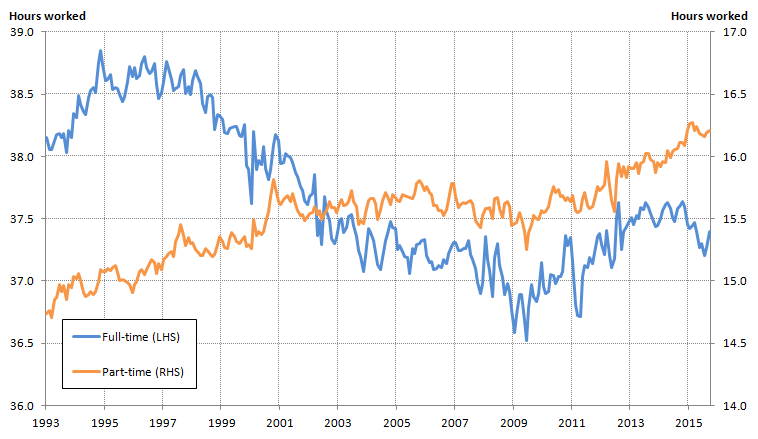
This recent fall in average hours worked carries implications for economic policy and appears broadly consistent with a reversion to the long-term decline in the length of the average working week. Average actual hours of work fell from 33.1 hours per week in the three months to November 1995 to 32.0 hours in the same period in 2007, before falling to 31.5 hours in the three months to November 2009. This trend reversed during the economic recovery, returning average actual weekly hours to its pre-downturn level by 2013. However, in recent months average hours have weakened slightly again. Figure 15 shows that these trends are reflected in average actual hours worked by full-time workers, while part-time workers have seen hours rise over the past 20 years.
Figure 15: Average actual weekly hours worked, full- and part-time (main-job) and all workers (main and second jobs), Jan to Mar 1993 to Sept to Nov 2015
UK
Source: Office for National Statistics
Download this image Figure 15: Average actual weekly hours worked, full- and part-time (main-job) and all workers (main and second jobs), Jan to Mar 1993 to Sept to Nov 2015
.png (35.5 kB) .xls (51.7 kB)
Explaining this recent fall in full-time hours is central to economic policy: if it reflects a resumption of the long-term trend and a positive choice by workers to supply less labour, then it both carries information about households’ perceptions of their economic security, and suggests a reduced degree of slack in the labour market. Alternatively, if the fall is temporary, then hours might be expected to recover from the recent fall, enabling firms to draw in more labour input without affecting wages.
Changes in average hours worked depend on both the composition of employment – including the shares of employment accounted for by full- and part-time workers, in addition to second jobs – and hours worked within each of these categories. While the part-time share of employment has risen markedly over recent years, trends in average hours are closely aligned with changes in average full-time hours. In the decade prior to the economic downturn, average full-time hours fell from 38.6 to 37.4 hours per week (Figure 15), mirroring the fall in overall average hours. The trends in the two series during the economic downturn and recovery have also been similar, and part-time average hours by contrast, have risen fairly steadily over the last 2 decades.
Understanding the nature of these changes requires a more detailed grasp of the underlying distribution of hours worked. Focusing on workers’ main jobs, Figure 16 shows the fractions of full- and part-time workers reporting working weeks of different lengths, as well as the average weekly hours worked for each group. The data are based on workers’ self-identification as part- or full-time. Among full-time workers the most common working week is around 38 hours long – close to the weekly non-seasonally adjusted average of 38.8 hours over this period. Full-time workers who work for between 36 and 40 hours per week accounted for 27% of all those in employment in the three months to November 2015, with smaller concentrations around 50 and 60 hours per week. Among part-time workers, the range of actual hours reported is broad and the distribution is relatively flat, capturing the variety of flexible working arrangements that this category includes. Both distributions have a small mass at zero hours: reflecting full- and part-time workers who were away from work in the survey’s reference week due to illness or leave, among other reasons.
Figure 16: Distribution of actual weekly hours worked in main job for full- and part-time workers, Sep to Nov 2015
UK
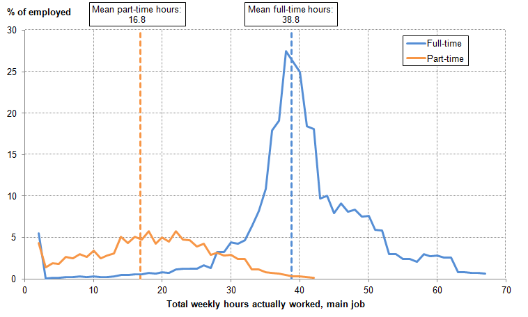
Source: Labour Force Survey - Office for National Statistics
Notes:
- A moving bracket of +/- 2 hours is applied at each point, so that (for example) the point at 10 hours represents the portion of workers who worked greater than or equal to 8 hours and lesser than or equal to 12 hours.
Download this image Figure 16: Distribution of actual weekly hours worked in main job for full- and part-time workers, Sep to Nov 2015
.png (22.8 kB) .xls (34.3 kB)
Over the longer term, changes in average actual full-time hours appear to have been largely driven by changes in the right hand tail of the distribution, and in particular a fall in the proportion of people working 50 hours or more. As Figure 16 makes apparent, average full-time hours can change because of (a) a shift in the entire distribution – where all full-time workers alter their weekly hours by a similar amount, (b) by changes in the shape of the distribution, or (c) by a combination of these effects. Figure 17 shows how the distribution of full-time hours worked has changed over the last 20 years. The stability of the distribution’s overall shape and position indicates that the length of the typical full-time working week has changed little over this period, but its concentration and the proportion of workers reporting a very long working week have changed notably. Between 1995 and 2015, the proportion of full-time workers reporting weeks of between 36 and 40 hours has risen from 30.0% to 36.1%, while the proportion working more than 50 hours fell from 16.0% to 11.0%. This shift is likely to reflect structural economic changes – including the growing importance of the services industries to employment – worker preferences and the impact of legislation on working hours such as the Working Time Directive.
Figure 17: Distribution of actual weekly hours worked in main job for full-time workers, Q3 1995, Q3 2005, and Q3 2015
UK

Source: Labour Force Survey - Office for National Statistics
Notes:
- A moving bracket of +/- 2 hours is applied at each point, so that (for example) the point at 10 hours represents the portion of workers who worked greater than or equal to 8 hours and lesser than or equal to 12 hours.
Download this image Figure 17: Distribution of actual weekly hours worked in main job for full-time workers, Q3 1995, Q3 2005, and Q3 2015
.png (26.3 kB) .xls (32.3 kB)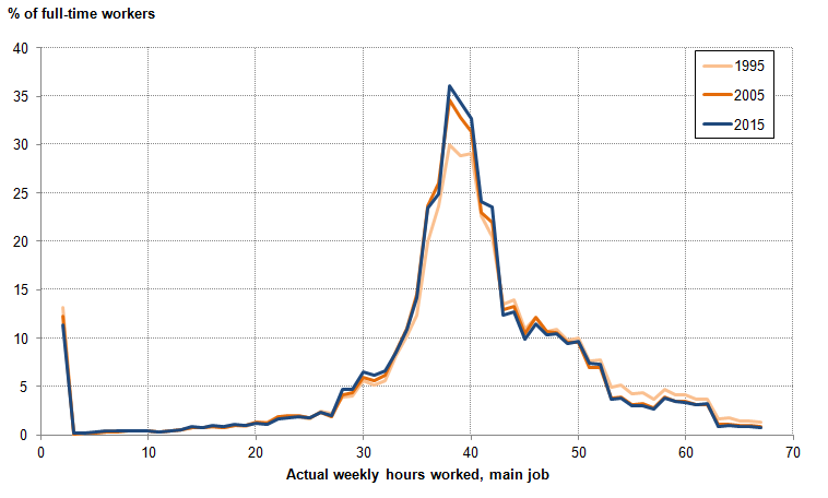
The growing concentration of the full-time hours distribution has been accompanied by a larger fraction of full-time workers who report between 25 and 35 hours of actual work per week. This shift is evident in Figure 17 above, and also accounts for the more recent fall in average hours of work between 2014 and 2015. Between the three months to November 2014 and the three months to November 2015, there was a further slight fall in the proportion of workers reporting working weeks of between 40 and 60 hours, which was offset by larger numbers of workers reporting a week of close to 30 hours. This shift in the mass of hours worked helps to explain recent movements in average hours worked: among rising numbers of full-time workers, the length of the average actual working week has shortened slightly in recent years.
While the shift in the mass of the hours worked distribution over the last year might be indicative of structural changes reducing the hours of labour supplied by workers, more detailed analysis suggests that the more recent change reflects a reversion towards pre-downturn patterns of leave. Figure 18 shows the distributions of actual and usual hours worked in the three months to November 2015. The difference between these two distributions captures the prevalence of absence from work for a range of reasons, and can help to identify whether a fall in actual hours is structural – in which case it is reflected in usual hours of work – or more temporary – in which case it is not.
Figure 18: Distribution of actual and usual weekly hours worked in main job for full-time workers, Sept to Nov 2015
UK

Source: Labour Force Survey - Office for National Statistics
Notes:
- A moving bracket of +/- 2 hours is applied at each point, so that (for example) the point at 10 hours represents the portion of workers who worked greater than or equal to 8 hours and lesser than or equal to 12 hours.
Download this image Figure 18: Distribution of actual and usual weekly hours worked in main job for full-time workers, Sept to Nov 2015
.png (21.8 kB) .xls (33.3 kB)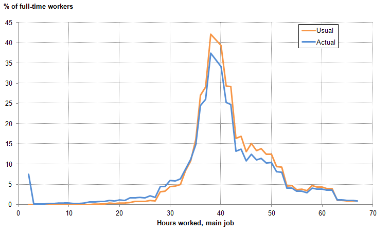
As is to be expected, the usual and actual full-time hours distributions are centred around the same point – between 36 and 40 hours per week. To the right of this peak, the number of actual working weeks reported is lower than the number of usual working weeks – reflecting patterns of leave, ill-health, and temporarily reduced hours among those who usually work relatively long hours. Below this peak, the number of actual working weeks reported is larger than the number of usual working weeks – reflecting the part-weeks worked by individuals on longer hours. Finally, while some workers do report working no hours in the reference week, it is very uncommon for people to report zero usual hours1. People in employment on a zero hours contract normally record their usual weekly hours as greater than zero, which is consistent with their being classified as in employment. The estimated average usual weekly hours for people employed on a zero hour contracts has been around 25 hours in recent years.
Analysis of how the difference between full-time workers’ actual and usual hours (their “unusual” hours) has varied through time suggests that the fall in average hours reflects changes in patterns of worker absence, rather than structural changes in the length of the working week. Figure 19 shows how the distribution of unusual hours – actual less usual hours – has changed through time. As a large portion of full-time workers report working close to their usual working week, in each period the distribution is concentrated around zero: workers above (below) this point report working more (less) hours than usual in the reference week. Figure 19 highlights that, when full-time workers work different hours than usual, this tends to be within around a day’s work (shown by the mass of the distribution lying within +/- 7 hours per week) – with the exception of those who are absent from work for the entire week (the mass between -35 and -42 hours per week).
Figure 19: Distribution of the difference between actual and usual weekly hours worked in main job for full-time workers, Sep to Nov 2005, Sep to Nov 2009, Sep to Nov 2012, and Sep to Nov 2015
UK
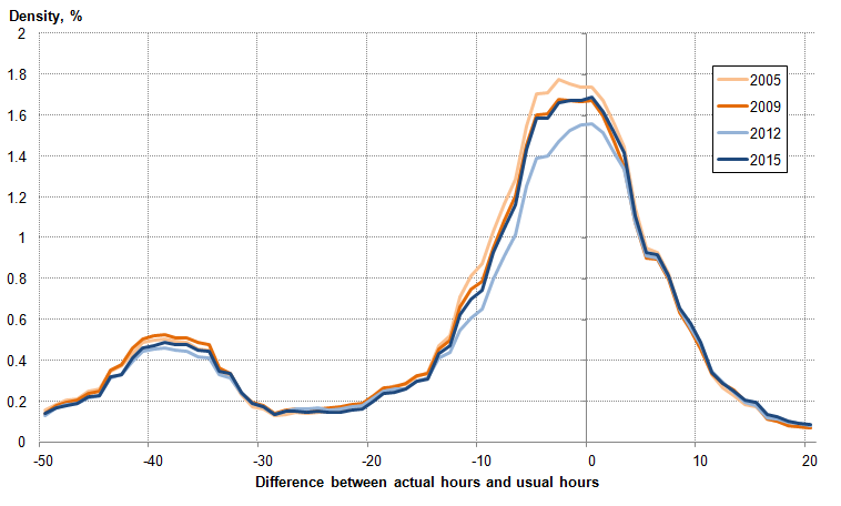
Source: Labour Force Survey - Office for National Statistics
Notes:
- A moving bracket of +/- 2 hours is applied at each point, so that (for example) the point at 10 hours represents the portion of workers who worked greater than or equal to 8 hours and lesser than or equal to 12 hours.
Download this image Figure 19: Distribution of the difference between actual and usual weekly hours worked in main job for full-time workers, Sep to Nov 2005, Sep to Nov 2009, Sep to Nov 2012, and Sep to Nov 2015
.png (32.0 kB) .xls (33.8 kB)
Although the distributions for 2005, 2009 and 2015 are relatively similar, there have been some marked recent changes – as shown by the 2012 distribution in particular. In this year, fewer workers reported being absent from work as many as 10 hours in the reference week, and fewer appear to have taken a full week of leave when compared with the other years shown. This may be as a consequence of a positive choice on the part of workers to supply fewer hours, or because firms demanded fewer hours in the face of weak economic conditions. Over the last year, the wedge between actual and usual hours has increased, largely because of a growing number of people reporting working around a day less than usual. Some of this effect, apparent in this analysis of non-seasonally adjusted data, may be due to the timing of the August Bank Holiday – which fell in the September reference week for the Labour Force Survey in 2015.
Some of the recent movement in actual hours can consequently be accounted for by relative movements in actual and usual hours. Figure 20 shows the ratio between these two series between 1993 and 2015. It indicates that prior to the economic downturn, actual hours worked were around 14% lower than usual hours – likely capturing normal patterns of ill-health and leave. This ratio fell slightly during the economic downturn – reflecting lower labour demand – but increased quite strongly between 2010 and 2014. Over this period, the ratio of actual to usual hours increased to its highest level since at least 1993. Most of this increase can be attributed to fewer people working less hours than usual due to ‘other’ leave and holidays, while a smaller positive contribution from fewer people working less hours than usual due to sickness or injury.
Figure 20: Ratio of average actual to usual hours worked, full-time workers, main job, 12-month moving average, March 1993 to November 2015
UK
Source: Labour Force Survey - Office for National Statistics
Notes:
- Actual hours worked are seasonally adjusted and taken from published tables. Usual hours are non-seasonally adjusted and derived from LFS microdata.
- Prior to 2005 data are quarterly and after 2005 are monthly.
Download this chart Figure 20: Ratio of average actual to usual hours worked, full-time workers, main job, 12-month moving average, March 1993 to November 2015
Image .csv .xlsOver the last eighteen months, this ratio has started to move back towards its pre-downturn level. The unwinding of the ratio – indicating more people working fewer hours than usual – has consequently held back the growth of average actual hours worked since the start of 2014. Again, this trend can largely be attributed to ‘other’ leave and holidays – more people report working fewer hours than usual for this reason. While there are several possible drivers, this movement is consistent with workers taking advantage of stronger real earnings growth or having the confidence to take more holidays relative to the past few years. Alternatively, some employers may have temporarily reduced workers’ hours instead of employment in response to the recent slowdown in GDP growth.
Notes for average hours worked
- Special cases for those in employment recording zero usual hours include those “on call” who did not work in the previous four weeks, and those who are retired but sit on a board of directors.