2. Main points
UK GDP is estimated to have grown by 0.6% in Q4 2015, up from 0.5% in the previously published estimates. Household and government consumption supported growth on the quarter, while investment and net trade slowed GDP growth over this period.
The household saving ratio continued its recent decline to 3.8% in the final three months of 2015, lower than during the economic downturn, reflecting stronger growth in aggregate household consumption than income.
The current account of the balance of payments declined to a record deficit of 5.2% of GDP in 2015, largely as a result of a fall in earnings on UK foreign direct investment (FDI) assets abroad relative to overseas FDI assets in the UK. The exposure of the UK to changes in commodity prices – in particular the oil price – and weaker overseas earnings of some the UK’s largest multinational companies help to explain this recent fall.
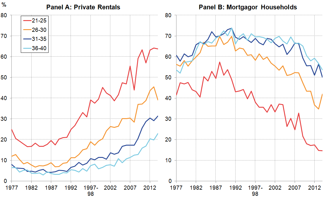
The three-decade long trend towards increased home ownership has reversed since the economic downturn: the rate of owner occupation fell between 2008 and 2014, while the incidence of private rentals increased over the same period. These changes were particularly pronounced for young independent householders, who were substantially more likely to live in rented accommodation in 2014 than three decades previously.
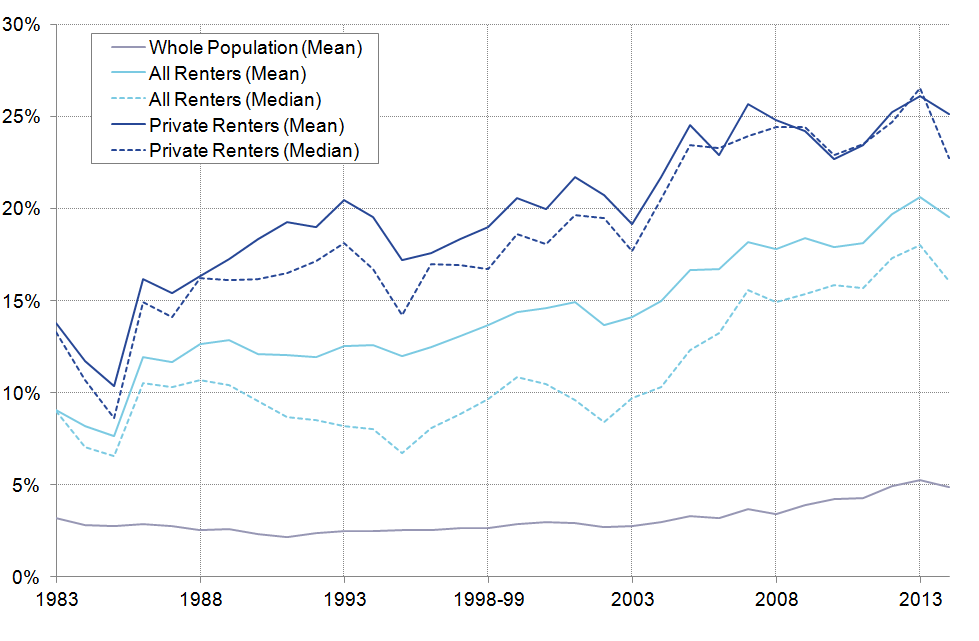
Among all renters, the proportion of household disposable income accounted for by rents has risen from 12% in 1986 to close to 20% in 2014. Among private renters the fraction is higher still: close to 25% on average in 2014. This ratio was highest in London in 2014 – where more than one-third of disposable income in privately renting households was absorbed by rent.
Nôl i'r tabl cynnwys3. Introduction
UK GDP grew by 0.6% in the final quarter of 2015, revised slightly higher from the previously published estimates. In 2015 as a whole, UK output is estimated to have grown by 2.3% – slower than in 2014 (2.9%) but faster than in any other year since the economic downturn. Following the trends which have emerged over recent years, much of the growth in the final three months of the year was led by household consumption, which added 0.4 percentage points to GDP growth on the quarter. As aggregate household expenditure grew more quickly than household income over this period, the saving ratio continued its recent decline to 3.8% of household resources in Q4 2015. This edition of the Economic Review examines the Quarterly National Accounts data and presents evidence on the drivers of growth during 2015 and the recent quarter.
The continued growth of UK output has come alongside the development of a substantial deficit on the current account of the balance of payments. The current account – which captures the value of flows of goods and services, investment income and government transfers between the UK and the rest of the world – declined to a deficit of 5.2% of GDP in 2015 – the largest annual deficit on record. Much of this recent decline is a consequence of a fall in UK earnings on overseas FDI assets relative to overseas earnings on investments in the UK. This edition of the Economic Review examines some of the drivers of FDI income flows, highlighting ONS analysis which suggests the UK’s exposure to commodity prices – and in particular the oil price – and the performance of some of the UK’s largest multinational firms both have a role to play in explaining recent developments.
The strength of the economic recovery continues to be reflected in the labour market. The employment rate rose to 74.1% in the 3 months to January 2016, and the unemployment rate fell to 5.1% over the same period. This edition of the Economic Review examines two aspects of recent labour market performance: the fall in inactivity and the rise in part-time working. It finds that the former has been driven by growth in the outflow from inactivity, which may be related to changes in the composition of the inactive population. Since the economic downturn, the share of the inactive accounted for by students – who are thought to be more attached to the labour market – has risen, while the share of retirees, those looking after the family and the long-term sick has fallen.
Finally, this edition of the Review examines how the economic downturn affected patterns of housing tenure in the UK – both in aggregate, and for specific age groups. Using detailed data from the Living Costs and Food Survey, it finds that the three-decade long trend towards increased home ownership has reversed since 2008, as the fraction of households who are privately renting has risen and the fraction of mortgagor households has fallen. These trends are particularly pronounced among younger people: the proportion of young independent householders living in rented accommodation has risen from 9% in 1980 to 39% in 2014. The fraction of disposable income accounted for by spending on rents has also risen over this period. Among renters, rents have risen from 12% in 1986 to close to 20% in 2014, while among private renters the ratio increased to 25% in 2014.
Nôl i'r tabl cynnwys4. GDP
UK GDP grew by 0.6% in the final quarter of 2015 – revised upwards by 0.1 percentage points compared with previously published estimates. In 2015 as a whole, UK GDP is now estimated to have grown by 2.3% – slower than in 2014 (2.9%), but faster than any other year since the onset of the economic downturn. Growth in GDP per head has been weaker: over 2015 as a whole, GDP per capita grew by 1.5% – down from 2.1% in the previous year. However, following 12 consecutive quarters of economic growth – the longest sustained expansion since 2008 – in Q4 2015, UK GDP was 6.8% higher than its pre-downturn peak. As shown in Figure 1, quarterly GDP growth has averaged 0.6% since the start of 2013.
Figure 1: UK GDP growth, quarter on quarter, chained volume measure, %, Q1 2007 to Q4 2015
seasonally adjusted
Source: Office for National Statistics
Download this chart Figure 1: UK GDP growth, quarter on quarter, chained volume measure, %, Q1 2007 to Q4 2015
Image .csv .xlsThe composition of GDP growth in the final quarter of 2015 broadly followed the pattern for recent years (Figure 2). Household consumption grew by 0.6% on the quarter, adding 0.4 percentage points to aggregate GDP growth, while government consumption added a further 0.1 percentage points. Net trade – which reduced annual growth during 2015 by 0.5 percentage points – also made a negative contribution in Q4 2015, as imports grew more quickly than exports in the final three months of the year. However, while investment has added to growth since 2013, it contracted on the quarter. Gross Fixed Capital Formation (GFCF) fell by 1.1% on the quarter, while business investment fell at the faster rate of 2.0%. Some of this fall is likely to reflect the unwinding of investment in the mining and quarrying industry, as firms have reduced planned investment in the light of recent falls in the oil price. In current price terms, investment by the mining and quarrying industry is estimated to have fallen by 28% in 2015 – returning to its 2012 level – and by close to 27% in the final three months of the year. Partly as a result, investment held back GDP growth in the final quarter of 2015.
Figure 2: UK GDP growth and contributions, percent and percentage points, 2012 to 2015
Source: Office for National Statistics
Notes:
- Figures may not sum due to rounding. HH and NPISH: Household and Non-Profit Institutions Serving Households. GFCF: Gross Fixed Capital Formation. GDP: Gross Domestic Product.
Download this chart Figure 2: UK GDP growth and contributions, percent and percentage points, 2012 to 2015
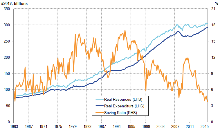
Image .csv .xlsHousehold consumption – which has supported the economic recovery over recent years – has come alongside a gradual fall in the household saving ratio to a 50-year low of 3.8% in Q4 2015. Figure 3 shows the levels of household expenditure and income between 1963 and 2015, as well as the resulting saving ratio. It shows the marked rise in the saving ratio following the economic downturn to 11.9% in Q3 2010 – when expenditure fell more sharply than income. As the economic recovery has progressed, rising expenditure and stable incomes have reversed this rise in the saving ratio, pushing it down to pre-downturn levels. While the saving ratio can be volatile from quarter to quarter, as households smooth their consumption against fluctuations in incomes, this downwards trend is well established. It in part reflects changes in actual income and spending, but is also affected by the behaviour of non-cash-items – such as the imputation of employer’s pension contributions – which may not be readily apparent to households. Movements in these items are considered in more detail in an analysis of alternate measures of the savings ratio.
Figure 3: Household resources and expenditure (constant 2012 prices) and the saving ratio, %
1963 Q1 to 2015 Q4, Households and Non-Profit Institutions Serving Households, UK
Source: Office for National Statistics
Notes:
- Household resources includes all items which accrue to households as a flow of income, including wages and salaries, mixed and property income and is measured after taxes and benefits. Resources also include several non-cash items, including employer’s social contributions and imputed rentals. Household expenditure also includes several non-cash items, such as imputed rentals. Resources and Expenditure have been deflated by the final expenditure deflator for households and NPISH to estimate real sources and real expenditure.
Download this image Figure 3: Household resources and expenditure (constant 2012 prices) and the saving ratio, %
.png (53.7 kB) .xls (48.6 kB)The negative contribution of net trade to GDP growth over the last 4 years reflects the relative strength of imports compared with exports over this period. Since the onset of a sustained economic recovery in Q1 2013, the volume of UK exports has grown at a compound average quarterly rate of 0.7%, while imports have grown by 1.2% per quarter. This same pattern is also evident in the 2015 data: when exports grew by 5.1%, but were out-paced by imports growth of 6.3%. However, the contribution of net trade has been quite volatile in recent years. While it was a modest drag on GDP growth in 2015 as a whole, net trade fluctuated between large positive and substantial negative quarterly contributions through the year.
Nôl i'r tabl cynnwys5. Current account and FDI
The relative performance of exports and imports also has a bearing on the development of the UK’s current account of the balance of payments. As well as movements in trade in goods and services, the current account captures the behaviour of earnings on overseas investments and government and other transfers. The current account deteriorated to show a deficit of 5.2% of GDP in 2015 as a whole – the largest on record - with the final quarter of 2015 showing a record quarterly deficit of 7% of GDP1.
While previous episodes of high UK current account deficits have been driven by deterioration in the trade balance – the difference between the value of UK exports and imports of goods and services – the present deficit has come about due to a worsening of the balance on the UK’s net earnings from foreign direct investment (FDI). This represents the difference between the UK’s earnings on its overseas assets and the earnings of overseas agents on their investments in the UK.
For most of the period since 1997, the UK’s primary income balance has been in surplus, reflecting the larger flow of income received on UK assets than on UK liabilities. However, over the last few years this trend has reversed (Figure 4). Changes in net investment income from FDI account for much of this reversal, falling from a surplus of 3.3% of GDP in 2011 to a deficit of 0.2% in 2015. Over the same period, the deterioration in the current account deficit has been of similar magnitude – from a deficit of 1.6% of GDP to a deficit of 5.2% of GDP.
Figure 4: Components of the UK current account balance, % of nominal GDP, 2009 to 2015
seasonally adjusted
Source: Office for National Statistics
Notes:
- FDI and current account figures for 2013 and 2014 make use of data from the recent FDI publication and are therefore indicative estimates, and therefore differ from the latest Balance of Payments estimates.
Download this chart Figure 4: Components of the UK current account balance, % of nominal GDP, 2009 to 2015
Image .csv .xlsThe deterioration in the FDI income balance has been driven by a combination of factors, including exchange rate movements and the relative exposure of the UK FDI stock to slower growing markets abroad. In particular, returns on UK investments overseas have weakened much more sharply than returns on overseas investment in the UK.
In part, continuing higher rates of return on UK liabilities reflect the relative strength of the UK economy. In addition, returns have weakened on the overseas assets of the 25 largest UK multinational companies, which account for just over a half of all UK direct investment abroad. The weakness of commodity prices – most notably oil – has also had a much larger impact on the returns to UK investments abroad than on foreign investment in the UK. The proportion of the UK’s overseas earnings accounted for by the mining and quarrying sector is twice as large as that for earnings by foreign investors in the UK.
Notes for Current account and FDI
- ONS has recently published revised estimates of FDI for 2013 and 2014, using the latest annual FDI survey. A paper published on 31 March sets out this latest data and explains the movements of FDI and revisions (FDI publication). These indicative estimates have not yet been incorporated into the latest balance of payments estimates but will be in the annual Blue and Pink Books in late June. The FDI and current account balance statistics presented here differ from those published as part of the recent Balance of Payments release.
6. Trade
While the contribution of net trade to real GDP growth has been quite volatile in recent years, the size of the trade deficit – and therefore the impact of trade on the current account – has been relatively stable as a fraction of GDP. As shown in Figure 4, the value of UK imports has exceeded the value of UK exports by around 2% of GDP each year since 2009 – accounting for a large portion of the level of the current account deficit, but very little of its change. This is a modest improvement from the UK’s performance between 2002 and 2008 – when the deficit averaged 2.8% of GDP – but remains notably weaker than in the late 1990s when the UK ran a small trade surplus.
However, the apparent stability of the trade deficit masks varying performance in the import and exports of goods and services. While the overall balance has changed relatively little in recent years, this reflects a continued deterioration in the balance on goods and an offsetting improvement in the balance on trade in services (Figure 5). The goods deficit – which was close to 2.0% of GDP in the mid-late 1990s – widened to 6.3% of GDP in 2008, and has continued to decline since the onset of the economic downturn. In 2015, the goods deficit was close to 6.7% of GDP – slightly smaller than in the previous year (6.8%). The balance on services, by contrast, increased from a surplus of around 1.8% of GDP in the mid to late 1990s, to a surplus of 3.2% in 2008. The global economic downturn and the financial market shocks notwithstanding, the services balance increased to a surplus of 4.8% of GDP in 2015 – with the implication that the UK net trade position is more dependent on trade in services than at any point in the previous two decades.
Figure 5: UK trade balance in goods and services, % of nominal GDP, 1995 to 2015
Source: Office for National Statistics
Download this chart Figure 5: UK trade balance in goods and services, % of nominal GDP, 1995 to 2015
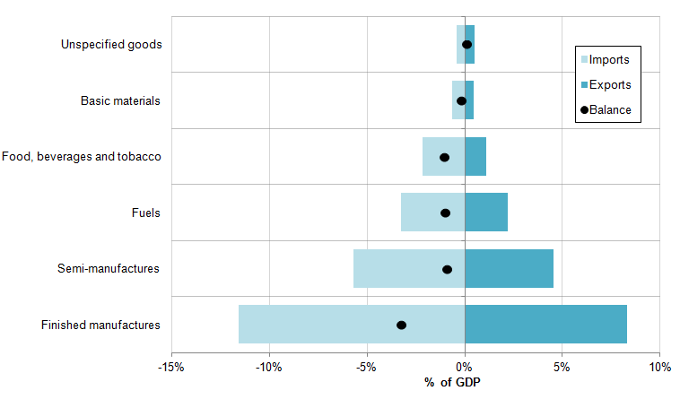
Image .csv .xlsThis deficit on trade in goods is largely driven by the UK’s position on finished manufactures. Figure 6 shows the average value of imports, exports and balance of trade for different goods categories between 2011 and 2015 expressed in terms of their fraction of nominal GDP. It indicates that while imports and exports are finely matched in some categories – including basic materials and unspecified goods, where the balance is close to zero over this period – the UK’s balance on other products is more substantial. The UK’s trade in food, beverages and tobacco, fuels, and semi-manufactures each result in a deficit of close to 1% of GDP in each case over this period, but the largest negative position comes from finished manufactures. Between 2011 and 2015, the value of UK imports of finished manufactures was around 11.6% of GDP on average per year, compared with exports of 8.3%. As a result, finished manufactures alone accounted for more than half of the deficit on goods. This pattern of trade is consistent with the UK being as dependent on overseas products during the production process as overseas agents are dependent on UK exports, but relatively more dependent on overseas products as a fraction of final demand.
Figure 6: UK trade in goods by commodity, 2011 to 2015 average
Source: Office for National Statistics
Download this image Figure 6: UK trade in goods by commodity, 2011 to 2015 average
.png (13.9 kB) .xls (26.6 kB)7. Labour Market
The strength of the UK economy continues to be reflected in developments in the labour market. The employment rate among those aged 16 to 64 increased to 74.1% in the three months to January 2016 – higher than a year earlier (73.3%) and the joint highest rate since comparable records began in 1971. Mirroring this strength, there was a fall in the unemployment rate from 5.2% in the 3 months to October 2015, to 5.1% in the 3 months to January 2016. Average weekly total pay – which has moderated in recent months – grew by 2.1% in the three months to January 2016, albeit slightly lower than in the previous three month period (2.4%).
This improvement in the labour market has been accompanied by a marked reduction in the inactivity rate; defined as the proportion of individuals aged 16 to 64, who are not looking for a job or are not available for work (Figure 7). After a period of relatively stable inactivity rates through the 1990s and 2000s, the inactivity rate among those aged 16 to 64 has been on a downward trend since 2011. In the three months to January 2016, the inactivity rate among those aged 16 to 64 of 21.8% was close to a record low.
Figure 7: Inactivity rate, 16 to 64 years old, January to March 1971 to November to January 2016
UK, seasonally adjusted
Source: Office for National Statistics
Download this chart Figure 7: Inactivity rate, 16 to 64 years old, January to March 1971 to November to January 2016
Image .csv .xlsThe recent fall in the inactivity rate reflects growth in the outflow from inactivity relative to the inflow into inactivity. Figure 8 shows these two flows as a proportion of the inactive population aged 16 to 64, indicating both the level and movement in these flows. Close to 10% of the inactive group – largely comprising retirees, students, those looking after the family and those not seeking work for other reasons – moves into and out of inactivity each quarter. Figure 8 also suggests that while outflows from inactivity have exceeded the inflows into inactivity for much of the past 5 years, the recent fall is largely driven by growth in the outflow relative to a stable inflow. This rise in the outflow suggests that an unusually large fraction of the inactive population has become economically active in recent months, possibly driven by changes in the composition of the inactive.
Figure 8: Inflow and outflow rate for inactivity, 16 to 64 year olds,
UK, four quarter moving average
Source: Office for National Statistics calculations - Labour Force Survey
Notes:
- Changes in the aggregate inactivity flows sourced from the longitudinal LFS may be different to changes measured in official inactivity numbers. This is due to methodological differences in the datasets. One such difference is that the longitudinal data do not include those who were 15 in the previous period and turned 16 by the second period - partly explaining why the inflow rate tends to be lower than the outflow rate.
Download this chart Figure 8: Inflow and outflow rate for inactivity, 16 to 64 year olds,
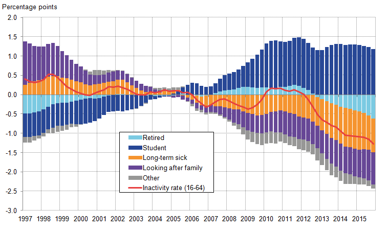
Image .csv .xlsTo examine these potential compositional effects in more detail, Figure 9 shows changes in the inactivity rate by reasons for being inactive, relative to the 2002 to 2007 average. It shows that the longer run reduction in the inactivity rate has mainly been driven by lower retirement rates, lower numbers of long- term sick and disabled, and lower numbers of people looking after the family, partly offset by an increase in the number of students – who have become a larger part of the inactive population. However, the easing in student inactivity has also played a part in the more recent downward trend. These shifts in the make-up and drivers of inactivity rates reflect some underlying shifts in working patterns amongst women and older workers, rising state pension age for women, changes in disability and sickness legislation and changing perceptions of job insecurity and attachment to the labour market.
Figure 9: Contribution to the change in the inactivity rate, relative to 2002 to 2007 average, 16 to 64 years old, Q1 1997 to Q4 2015
UK, four quarter moving average
Source: Office for National Statistics
Notes:
- The reasons for inactivity relate to individual aged 16 to 64 only. Therefore the retired are only those in early retirement.
Download this image Figure 9: Contribution to the change in the inactivity rate, relative to 2002 to 2007 average, 16 to 64 years old, Q1 1997 to Q4 2015
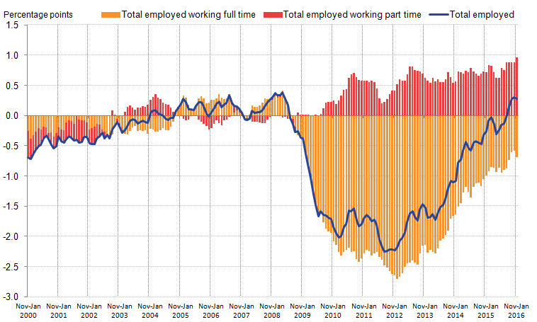
.png (30.7 kB) .xls (30.2 kB)The fall in the inactivity rate is one of several shifts in the labour market since the economic downturn, and comes alongside a rise in the number of people in part-time work. Figure 10 summarises this shift – showing contributions to the 16 and over employment rate of part- and full-time workers1. It indicates that the level of employment fell markedly during the economic downturn, mainly due to a fall in full-time employment. Lower numbers of full-time workers relative to the long-run average reduced the employment rate by 1.9 percentage points at the end of 2009, falling to a drag of 2.7 percentage points in 2012. The trend towards part-time workers appears to have accelerated during the economic downturn, partly offsetting the downward effect from full-time workers. By mid-2012, the employment rate was around 1.7 percentage points below its long-term average, reflecting a large negative contribution from full-time employment (-2.4 percentage points) and a substantial positive contribution from part-time employment (adding 0.8 percentage points to the employment rate). Between mid-2012 and the start of 2016, much of the rise in the 16 and over employment rate relative to its pre-downturn average has been as a result of the recovery of full-time employment, but part-time employment continues to be more prevalent than prior to the downturn.
Figure 10: Contribution to the change in the 16 and above employment rate, by working pattern, relative to the 2002 to 2007 average, UK
Source: Office for National Statistics
Download this image Figure 10: Contribution to the change in the 16 and above employment rate, by working pattern, relative to the 2002 to 2007 average, UK
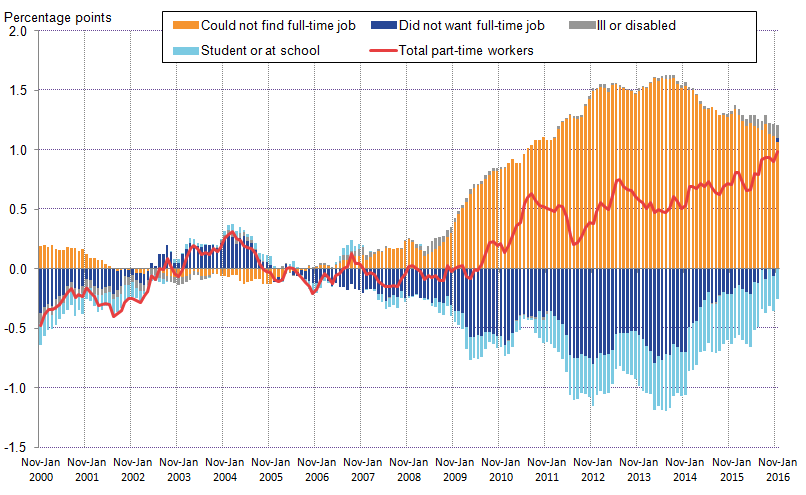
.png (34.0 kB) .xls (46.6 kB)The growing prevalence of part-time work may reflect underemployment ensuing from the downturn, or a structural shift in preferred working patterns. In an effort to identify the drivers of these developments, Figure 11 shows the contribution to the change in the proportion of part-time workers of all individuals aged 16 and above, by the reason stated for working part-time, relative to the 2002 to 2007 average. It indicates that the growth in part-time employment during and after the downturn was mainly driven by individuals who ‘could not find a full-time job’. This trend reached a peak in mid- 2013, but has started to moderate over the last year. While trends in the number of those who could not find a full-time job account for much of the change in the inactivity rate, individuals who ‘did not want a full-time job’ account for the largest share of those working part-time.
Figure 11: Contribution to the change in part-time workers as a proportion of all aged 16 and over, by reason for working part-time, relative to 2002 to 2007 average, UK
Source: Office for National Statistics
Download this image Figure 11: Contribution to the change in part-time workers as a proportion of all aged 16 and over, by reason for working part-time, relative to 2002 to 2007 average, UK
.png (41.7 kB) .xls (48.6 kB)Notes for Labour market
- The 16 and above employment rate is used instead of the headline (16-64) measure to make for a consistent comparison with the analysis on part-time workers.
8. Prices
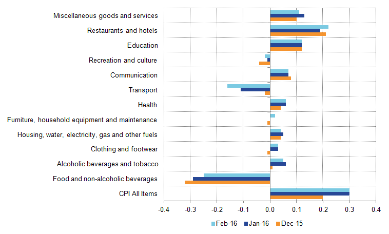
Despite the continued improvement of the labour market and the strength of the broader economic recovery, inflationary pressure in the UK has been muted, reflecting the fall in the price of oil, the strength of competition among supermarkets and changes in the value of Sterling during 2015. The Consumer Prices Index (CPI) measure of inflation averaged 0.0% during 2015 as a whole, down from 1.5% in 2014 and 2.6% in 2013, reflecting sharp falls in the cost of household energy and transport in particular. Inflation edged slightly higher in January 2016 – rising to 0.3% – and was unchanged in February 2016, largely as a consequence of reduced negative contributions from food and non-alcoholic beverages, partly offset by renewed falls in the costs of transport (Figure 12).
Figure 12: Annual CPI inflation and contributions to inflation in recent months (% and percentage points), UK
Source: Office for National Statistics
Download this image Figure 12: Annual CPI inflation and contributions to inflation in recent months (% and percentage points), UK
.png (16.0 kB) .xlsx (12.2 kB)While the contributions of several components have been relatively volatile in recent years – in particular, those exposed to changes in the oil price and the value of Sterling – some, largely services products have provided a fairly consistent contribution to the CPI. Figure 13 shows the rate of price change for the aggregate CPI and the rate of rental price change since 1997. While the aggregate CPI has shown relatively large swings in recent years – ranging from more than 5% in 2008 and 2011, to -0.1% in 2015 – the rate of price change for rentals has been more stable. Rental price growth over this period has varied around an average annual rate of 2.7% – falling following the economic slowdowns in the early 2000s and in 2009. As a consequence, rental prices have made a fairly consistent contribution to CPI inflation over this period.
Figure 13: CPI inflation and rental costs growth, UK
Source: Office for National Statistics
Download this chart Figure 13: CPI inflation and rental costs growth, UK
Image .csv .xlsThe relatively consistent price growth for rentals masks a mix of different experiences across the UK. Figure 14 shows the compound average annual growth rates of private rental prices – as captured by the Index of Private Housing Rental Prices – and of median full time earnings – as captured by the Annual Survey of Hours and Earnings – between 2012 and 2015. It suggests that rental price growth of 2.1% per year in England outpaced earnings growth of 1.2% per year over this period. In the North East, North West and Wales, average earnings growth was faster than rentals over this period, increasing the affordability of renting. In London, the South East and Eastern region, by contrast, rents grew more quickly than average earnings over this period.
Figure 14: Median full time earnings and rental prices, compound annual average growth rates, 2012 to 2015, UK
Source: Office for National Statistics
Notes:
- Average private rentals taken from the Index of Private Housing Rental Prices. Wage growth reflects the growth of average full-time earnings from the Annual Survey of Hours and Earnings on a residency basis. Note that the CPI measure of rental prices includes a broader set of rental prices – including for social renters and includes Northern Ireland. As a consequence, the average rental price change presented here may differ from that in the CPI.
Download this chart Figure 14: Median full time earnings and rental prices, compound annual average growth rates, 2012 to 2015, UK
Image .csv .xls9. Housing tenure
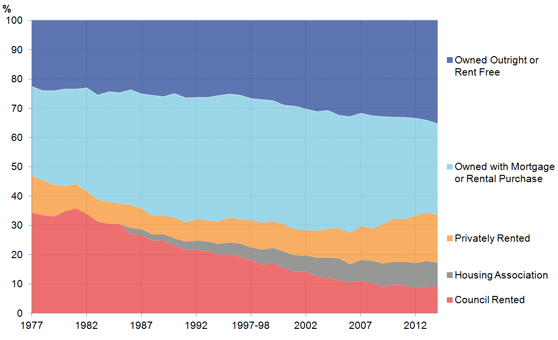
One of the lasting effects of the recent economic downturn has been on the pattern of home ownership in the UK, reversing several historical trends (Figure 15). According to the Living Costs and Food Survey, the proportion of households who rent their home from a private landlord increased slowly from 6% to 11% in the 20 years between 1988 and 2008, before rising to 16% in 2014. By contrast, the proportion of households who own their own home increased gradually from 56% to 71% between 1981 and 2008, but fell back to 67% in 2014. This fall in home ownership, and the marked increase in private renting, have reversed a three-decade long trend towards increased home ownership, and partly reflects constrained mortgage lending and the relative performance of house prices and household incomes during the recovery. This combination of effects has also helped to reduce the fraction of households which own their own home with a mortgage: this has fallen from a peak of 43% in 1991 to just 31% in 20141.
Figure 15: Household tenure: 1977 to 2014, UK
Source: Source: Living Costs & Food Survey, Expenditure & Food Survey, National Food Survey
Download this image Figure 15: Household tenure: 1977 to 2014, UK
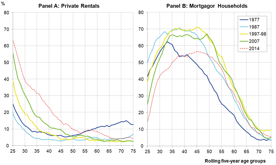
.png (34.8 kB) .xls (24.1 kB)While trends in aggregate home ownership have started to reverse in recent years, the impact on sub-groups of the population has been considerably larger. Not only has the number of people choosing to live at home with their parents increased markedly, but patterns of tenure among independent householders have also changed. Figure 16 shows the fraction of individuals of rolling 5-year age groups who live in privately rented accommodation (Panel A) and in mortgagor households (Panel B) in selected years, excluding individuals living with their parents2. Panel A indicates that the fraction of young people living in privately rented accommodation has risen markedly – both since the economic downturn and over the past 4 decades. In 1987, just 9% of those aged 26 to 30 were private renters; rising to 19%, 30% and 39% in 1997, 2007 and 2014 respectively. Almost one-third of those aged 31 to 35 were private renters in 2014, and one-in-five of those aged 37 to 41 were renters – markedly higher than in 2007.
Much of the recent rise in the incidence of private rentals is reflected in the sharp fall in home ownership – and in particular in the lower fraction of mortgagors. In the earlier periods of Panel B, the impact of policy – in particular the Right to Buy (1980) is clear: increasing the proportion of individuals of all ages living in mortgagor households between 1977 and 1987. Over the following two decades, the proportion of young people in mortgagor households fell, while the mortgagor proportion among those aged between 45 and retirement increased – likely reflecting the maturation of many of the younger householders who were part of the initial wave of house purchases. The difference between 2007 and 2014 is striking: the prevalence of mortgagors is lower than in 2007 among every age group below 55, and the prevalence of mortgaged home ownership among age groups under 40 is lower than in 1977, before the Right to Buy was introduced.
Figure 16: Proportion of individuals by age and housing tenure, rolling five-year age groups, UK
Source: Living Costs & Food Survey, Expenditure & Food Survey, National Food Survey
Notes:
- Household tenure is allocated to each individual in the household, and household weights are used to aggregate to population totals from 1995/96. Individuals who report being children or children-in-law to the household reference person and aged under 35 are excluded. Rolling five year age bands are used to avoid disclosive sample sizes.
Download this image Figure 16: Proportion of individuals by age and housing tenure, rolling five-year age groups, UK
.png (76.5 kB) .xls (37.9 kB)Figure 17 presents these data in a slightly different form, showing the proportion of individuals by age who live in privately rented accommodation (Panel A) and in mortgagor households (Panel B). It indicates that the rise in the incidence of private rentals has been particularly marked among 21 to 25 year olds – increasing from less than 20% in the early 1980s to more than 60% in 2014 – with other, early to middle aged groups also experiencing increases. Smaller fractions of these same groups now live in mortgagor households than at any point on record.
Figure 17: Proportion of individuals by age and housing tenure, rolling five-year age groups, UK
Source: Living Costs & Food Survey, Expenditure & Food Survey, National Food Survey.
Download this image Figure 17: Proportion of individuals by age and housing tenure, rolling five-year age groups, UK
.png (68.0 kB) .xls (32.3 kB)The growing number of rentals has been accompanied by growth in the share of disposable income accounted for by spending on rent – both at an aggregate level and on a household basis. Figure 18 shows the fraction of total household disposable income accounted for by rental charges on primary dwellings for different groups. For the population as a whole (pooling renters and non-renters), rentals accounted for around 5% of total disposable income in 2015 – close to its proportion of total household consumption in the National Accounts in the same period (5.3%). Among all renting households, rental costs accounted for around 20% of household disposable income on average – up from less than 10% in the early 1980s and 12% in 1986. Among private renters the fraction is higher still: close to 25% on average, up from close to 16% in 1986.
Figure 18: Mean rent to mean income ratio, median rent to mean income ratio, selected groups, %, UK
Source: Living Costs & Food Survey, Expenditure & Food Survey, National Food Survey
Download this image Figure 18: Mean rent to mean income ratio, median rent to mean income ratio, selected groups, %, UK
.png (46.0 kB) .xls (30.2 kB)These aggregate ratios also vary considerably by region (Figure 19). In London, spending on rent accounted for 34% of disposable income for private renters in 2014, compared with just 15% in the North East. The South West and South East also have ratios above 25%, while the East Midlands, Yorkshire and The Humber and Northern Ireland all have ratios below 20%. To some extent, these figures will reflect relative movements in the prices of renting across regions. Figure 14 shows the recent growth of rental prices in different parts of the UK relative to the growth of average full-time earnings, and suggests that rentals have become notably less affordable in London and the South East in particular, and have become more affordable in the North East and North West.
Figure 19: Proportion of household disposable income accounted for by rentals by region, private renters 2014, UK
Source: Living Costs & Food Survey, Expenditure & Food Survey, National Food Survey
Notes:
- Disposable income is measured after benefits and direct taxes are paid, consistent with the Effects of Taxes & Benefits publication.
Download this chart Figure 19: Proportion of household disposable income accounted for by rentals by region, private renters 2014, UK
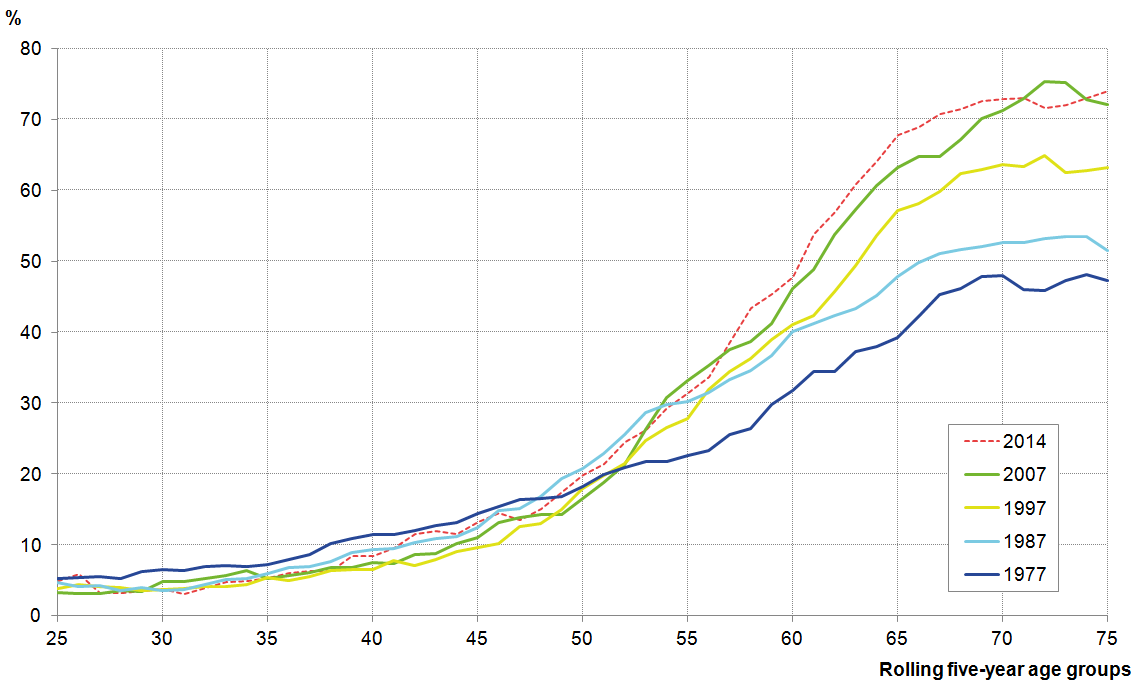
Image .csv .xlsAlongside the growing incidence and burden of rents, there has been a sharp rise in the proportion of households who own their own home outright. Outright ownership has risen from 23% in 1977 to 32% in 2007, and to 35% in 2014. This rise is particularly concentrated among those aged 50 and above: the incidence of outright ownership among age groups below this level has changed little over the past 4 decades, but was higher than previously recorded for those aged 55 to 70 in 2014 (Figure 20). The proportion of older householders living in accommodation which is owned outright has climbed markedly over this period: fewer than half of those aged 71 to 75 owned their home outright in 1977; by 2014, it was more than 70%.
Figure 20: Proportion of individuals by age living in owned outright accommodation, rolling five-year age groups, UK
Source: Living Costs & Food Survey, Expenditure & Food Survey, National Food Survey
Download this image Figure 20: Proportion of individuals by age living in owned outright accommodation, rolling five-year age groups, UK
.png (49.1 kB) .xls (32.3 kB)The growth in the number of private renters has come alongside growth in the number of households reporting that they receive income from properties other than their own home (Figure 21). This fraction has risen from 1.6% of households in 1979 to 5.6% in 2014, reflecting the growing prevalence of buy-to-let properties over this period. This proportion of households receiving rental income also appears to have risen relatively strongly since the onset of the economic downturn. Between 2008 and the most recent data, the fraction of households reporting income from rent has risen from 3.8% to 5.6%.
Figure 21: The proportion of households reporting receiving income from rented properties, UK
Source: Living Costs & Food Survey, Expenditure & Food Survey, National Food Survey
Download this chart Figure 21: The proportion of households reporting receiving income from rented properties, UK
Image .csv .xlsThe growing number of households reporting receiving rental income has been matched by growth in the importance of rental income to original income (Figure 22). Among all households, the ratio of rental income to original income has risen from close to 0.5% in 1997 to 98 to 1.4% in 2014. Among households reporting receiving income from rent, the ratio has risen from 8.5% to 13.3% over the same period. Trends from previous periods – for which weights are not available – are more volatile, but the more recent data suggests that for landlord households, rental income has grown more quickly than other sources of income since the onset of the economic downturn. This likely reflects the prolonged recent fall in real earnings, and the relatively slow adjustment of rents following the onset of the economic downturn.
Figure 22: Fraction of original income accounted for by rental income, all households (LHS) and HH receiving rental income (RHS), UK
Source: Living Costs & Food Survey, Expenditure & Food Survey
Notes:
- Original Income is defined as income before direct taxes and benefits: see ONS’ Effects of Taxes & Benefits publication.
Download this chart Figure 22: Fraction of original income accounted for by rental income, all households (LHS) and HH receiving rental income (RHS), UK
Image .csv .xlsNotes for Housing tenure
The Resolution Foundation reached similar conclusions in their ‘Living Standards 2016’ report, analysing the Family Resources Survey.
This chart allocates the tenure of a household (privately rented, owned with a mortgage, etc) to each of the individuals in the household. To control for the effect of more ‘living with parents’, it eliminates individuals who are children or children-in-law of the household reference person and are aged under 35. Comparable data including these individuals is available on request. Note that this analysis will capture changes in household composition in a way which focusing on the household reference person would not.
10. Reference tables
Table 1: UK demand side indicators, Feb 2014 to Feb 2016
| 2014 | 2015 | 2015 | 2015 | 2015 | 2015 | 2015 | 2016 | 2016 | |
| Q2 | Q3 | Q4 | Nov | Dec | Jan | Feb | |||
| GDP1 | 2.9 | 2.3 | 0.6 | 0.4 | 0.6 | ||||
| Index of Services | |||||||||
| All Services1 | 3.3 | 2.7 | 0.6 | 0.7 | 0.8 | 0.4 | 0.3 | 0.2 | .. |
| Business Services & Finance1 | 3.8 | 2.7 | 0.4 | 0.6 | 0.7 | 0.3 | 0.2 | -0.2 | .. |
| Government & Other1 | 1.9 | 0.7 | 0.2 | 0.5 | 0.4 | 0.2 | 0.4 | -0.3 | .. |
| Distribution, Hotels & Rest. 1 | 4.7 | 4.7 | 1.2 | 0.9 | 1.4 | 0.3 | 0.0 | 1.4 | .. |
| Transport, Stor. & Comms. 1 | 3.1 | 4.3 | 1.1 | 0.9 | 1.2 | 1.0 | 0.8 | 0.7 | .. |
| Index of Production | |||||||||
| All Production1 | 1.3 | 1.0 | 0.7 | 0.2 | -0.4 | -0.8 | -1.1 | 0.3 | .. |
| Manufacturing1 | 2.7 | -0.3 | -0.5 | -0.4 | 0.1 | -0.3 | -0.3 | 0.7 | .. |
| Mining & Quarrying1 | -0.5 | 6.9 | 7.6 | 2.4 | -2.2 | -1.5 | -3.9 | -5.0 | .. |
| Construction1 | 7.5 | 3.4 | 0.5 | -1.6 | 0.3 | -0.6 | 2.1 | -0.2 | .. |
| Retail Sales Index | |||||||||
| All Retailing1 | 3.9 | 4.5 | 0.9 | 1.0 | 1.1 | 1.3 | -1.3 | 2.3 | -0.4 |
| All Retailing, excl.Fuel1 | 4.3 | 4.2 | 1.0 | 0.9 | 0.6 | 1.3 | -1.2 | 2.3 | -0.2 |
| Predom. Food Stores1 | 0.8 | 2.2 | 0.5 | 0.5 | 1.1 | 0.6 | 1.2 | 1.0 | -0.3 |
| Predom. Non-Food Stores1 | 6.6 | 4.5 | 1.2 | 0.8 | -0.2 | 1.6 | -3.3 | 3.6 | -0.1 |
| Non-Store Retailing1 | 11.8 | 13.4 | 3.0 | 3.8 | 2.1 | 2.6 | -1.9 | 2.1 | -0.1 |
| Trade | |||||||||
| Balance2, 3 | -34.0 | -36.7 | -4.7 | -8.9 | -12.2 | -4.7 | -3.7 | -3.5 | .. |
| Exports4 | -1.4 | -0.4 | 1.9 | -2.3 | -1.1 | -1.7 | -0.6 | 0.1 | .. |
| Imports4 | -1.4 | 0.1 | -2.6 | 0.9 | 1.4 | -0.2 | -2.6 | -0.5 | .. |
| Public Sector Finances | |||||||||
| PSNB-ex3,5 | -2.0 | -18.5 | -3.7 | -2.4 | -3.8 | 0.5 | -3.9 | -3.7 | -0.5 |
| PSND-ex as a % GDP | 84.1 | 85.0 | 84.6 | 84.7 | 85.0 | 84.8 | 85.0 | 83.3 | 83.1 |
| Source: Office for National Statistics | |||||||||
| Notes: | |||||||||
| 1. Percentage change on previous period, seasonally adjusted, CVM | |||||||||
| 2. Levels, seasonally adjusted, CP | |||||||||
| 3. Expressed in £ billion | |||||||||
| 4. Percentage change on previous period, seasonally adjusted, CP | |||||||||
| 5. Public Sector net borrowing, excluding public sector banks. Level change on previous period a year ago, not seasonally adjusted | |||||||||
Download this table Table 1: UK demand side indicators, Feb 2014 to Feb 2016
.xls (31.2 kB)
Table 2: UK supply side indicators, Feb 2014 to Feb 2016
| 2014 | 2015 | 2015 | 2015 | 2015 | 2015 | 2015 | 2016 | 2016 | |
| Q2 | Q3 | Q4 | Nov | Dec | Jan | Feb | |||
| Labour Market | |||||||||
| Employment Rate1, 2 | 72.9 | 73.7 | 73.4 | 73.7 | 74.1 | 74.1 | 74.1 | .. | .. |
| Unemployment Rate1, 3 | 6.2 | 5.4 | 5.6 | 5.3 | 5.1 | 5.1 | 5.1 | .. | .. |
| Inactivity Rate1, 4 | 22.2 | 22.0 | 22.1 | 22.0 | 21.8 | 21.8 | 21.8 | .. | .. |
| Claimant Count Rate7 | 3.0 | 2.3 | 2.3 | 2.3 | 2.3 | 2.3 | 2.2 | 2.1 | 2.1 |
| Total Weekly Earnings6 | £480 | £492 | £491 | £494 | £495 | £495 | £497 | £497 | .. |
| CPI | |||||||||
| All-item CPI5 | 1.5 | 0.0 | 0.0 | 0.0 | 0.1 | 0.1 | 0.2 | 0.3 | 0.3 |
| Transport5 | 0.3 | -2.1 | -2.1 | -2.4 | -1.6 | -2.1 | -0.2 | -0.7 | -1.1 |
| Recreation & Culture5 | 0.9 | -0.6 | -0.8 | -0.8 | -0.3 | -0.1 | -0.3 | -0.1 | -0.1 |
| Utilities5 | 3.0 | 0.5 | 0.4 | 0.3 | 0.3 | 0.3 | 0.3 | 0.4 | 0.3 |
| Food & Non-alcoh. Bev. 5 | -0.2 | -2.6 | -2.3 | -2.5 | -2.7 | -2.4 | -2.9 | -2.6 | -2.3 |
| PPI | |||||||||
| Input8 | -6.6 | -12.8 | -12.0 | -13.6 | -12.0 | -13.1 | -10.4 | -8.0 | -8.1 |
| Output8 | 0.0 | -1.7 | -1.6 | -1.8 | -1.5 | -1.6 | -1.4 | -1.0 | -1.1 |
| HPI8 | 10.0 | 6.7 | 5.6 | 5.6 | 7.1 | 7.7 | 6.7 | 7.9 | .. |
| Source: Office for National Statistics | |||||||||
| Notes: | |||||||||
| 1. Monthly data shows a three month rolling average (e.g. The figure for February is for the three months Jan - Mar) | |||||||||
| 2. Headline employment figure is the number of people aged 16-64 in employment divided by the total population 16-64 | |||||||||
| 3. Headline unemployment figure is the number of unemployed people (aged 16+) divided by the economically active population (aged 16+) | |||||||||
| 4. Headline inactivity figure is the number of economically active people aged 16 to 64 divided by the 16-64 population | |||||||||
| 5. Percentage change on previous period a year ago, seasonally adjusted | |||||||||
| 6. Estimates of total pay include bonuses but exclude arrears of pay (£) | |||||||||
| 7. Calculated by Jobseeker's Allowance claimants plus out-of-work Universal Credit claimants divided by Jobseeker's Allowance claimants plus out-of-work Universal Credit claimants plus workforce jobs | |||||||||
| 8. Percentage change on previous period a year ago, non-seasonally adjusted | |||||||||
