2011 Census logotypes
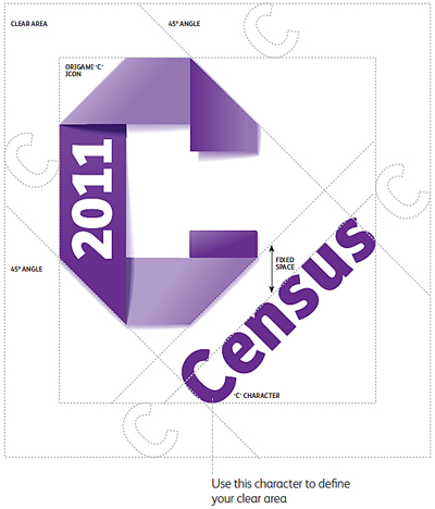
The 2011 Census logotype design combines the word ‘Census’ and a folded ‘C’ with the date when the latest census was taken. ‘Census’ sits at 45º so it stands out, adds dynamism and grabs attention. There is a fixed relationship between these two elements and 2011 Census logotypes must not be tampered with.
The 2011 Census logotype is available as an English version for England and a bilingual English/Welsh version must be used in Wales.
Different versions of the logo are available to download.
Defining the logotype clear area
There must be a clear area around the logotype to ensure that it stands out in all communication. Always put the logo in an area that is free of any other information; ideally on a white or light background. You can use the ‘C’ from the logotype to define the size of this clear space, as shown below.
Note that this ‘C’ character and the logotype have fixed proportions. The clear area will scale up or down as you increase or decrease the size of the logotype.
Minimum size of the 2011 Census logotypes - print
It is important that the logotype is clearly visible and readable. Hence make sure that you follow minimum sizes. For the 2011 Census logotype in English make sure that the logotype is no less than 25mm high. As the bilingual 2011 Census logotype includes ‘Cyfrifiad’ and ‘Census’ it also requires more space. Make sure that this logotype is no less than 29mm high.
Minimum size of the 2011 Census logotypes - digital
We also have minimum specifications for the logotypes when used in digital formats. When presented on a screen at 72ppi, the 2011 Census logotype in English should never be at a height of less than 100 pixels. Similarly, the bilingual logotype should never be used at a height of less than 117 pixels.
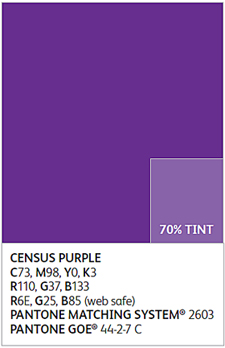
‘Census purple’
Colour is an important brand element and the ‘census purple’ has been chosen as it conveys both the official nature of the 2011 Census, while being a vibrant colour that will bring our communications to life.
Census purple
Notes:
CMYK = C73, M98, Y0 and K3
RGB = R110, G37 and B133
RGB (web safe) = R6E, G25 and B85
Pantone Matching System® = 2603
Pantone GOE® = 44-2-7 C
Download this image Census purple
.jpg (34.7 kB)
Efallai y bydd hefyd gennych ddiddordeb yn:
Related downloads
- Different versions of the logo (245.9 kB zip)