1. Background
Alongside estimates of quarterly labour productivity for the UK, Office for National Statistics (ONS) also publishes labour productivity for several industrial sections and sub-sections defined by the Standard Industrial Classification 2007: SIC 2007. These figures use estimates of gross value added (GVA) taken directly from the UK National Accounts and estimates of labour input to calculate labour productivity.
In this release, we expand our experimental dataset of labour productivity at a detailed industry breakdown. Previously, these time series began in Quarter 1 (Jan to Mar) 2009, as the change in SIC classification between 2008 and 2009 – from SIC 1992 to SIC 2007 – induced a break in some of our detailed industry level series. Using a methodology outlined in this article that overcomes these issues, these time series will now be available back to Quarter 1 (Jan to Mar) 1997.
This improvement in the granularity of labour productivity metrics allows more detailed analysis of productivity and is part of a broader work-programme being carried out by the ONS. In April 2017, we published experimental estimates of quarterly regional labour input on a consistent basis with equivalent UK-level metrics. In July 2017, we published the first set of experimental estimates of industry by region labour productivity and experimental estimates of labour productivity by industry division. Alongside this release, we have published updated estimates of labour productivity on a regional basis, at the NUTS1, NUTS2 and NUTS3 levels. The data published as part of this release extend this run of developments. Each of these outputs have been designed to be consistent with our headline measures of output and employment.
This note introduces these experimental data. It provides some initial analysis demonstrating trends in the data and explains some of their advantages and disadvantages. Section 2 outlines the methodology that we use to estimate the back series of data. Sections 3 to 5 present some of the main findings from these data.
As with all our productivity outputs, we welcome user views on the possible uses and usefulness of these data. This is particularly relevant for these experimental series. Please send any feedback to Productivity@ons.gov.uk. Subject to user feedback, it is our intention to publish these more detailed industry labour productivity metrics on a quarterly basis in the future.
Nôl i'r tabl cynnwys2. Methodology
Reclassifications of the Standard Industrial Classification (SIC) periodically occur to ensure our statistics accurately capture the changing economic and technological structure of the UK economy. Office for National Statistics (ONS) data that break the economy down into smaller types of industry are currently based on the Standard Industrial Classification 2007: SIC 2007. Data prior to 2009 were originally based on earlier classifications.
While reclassification is vital to measure the economy as it currently exists, it presents a challenge for the creation of long, consistent back series of data. Previous data, based on earlier classification structures, must be used to estimate new statistics consistent with the new classification structure. However, it is often not possible to apply the new classification system directly to old data, because classification under the new system may depend on information that is not available for the old data. For example, this is likely to be the case if classifications are normally based on survey responses. In this case, assumptions and models of the relationship between the old and new classification structure must be made.
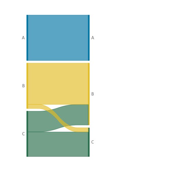
A useful starting point in the development of such models is a set of data that is “dual coded”: a dataset in which data for each household, business, or individual, was classified according to both the old and the new classification. A simplified example of such data is shown in Figure 1. In this case, people were classified into three groups: A, B, and C.
According to the old classification, each group contained an equal number of people. According to the new classification, 40% of those classified to C were reclassified to B, while 10% of those classified to B were reclassified to C. The result of the reclassification is the same number of people in A, an increased number in B and a reduced number in C. By dual coding the data in this example – gathering their classification under each system – it is possible to devise several different ways of treating historical data for which only the older classification is available.
Figure 1: Simple reclassification example
Old classification (left-hand side) and new classification (right-hand side).
Source: Office for National Statistics
Download this image Figure 1: Simple reclassification example
.png (11.7 kB)An efficient and simple way of using these data to model the relationship between the two classifications is to create a one-to-one map between each old category and the most common new category into which people from each old category are reclassified. Figure 2 shows the effect that using this model would have – everyone would be classified into the same category as previously.
Comparing this result with the actual reclassification in Figure 1 shows that this works well for categories such as A, where most or all people remain within the same classification, but less well for B and C.
Figure 2: Simple one-to-one mapping example
Old classification (left-hand side) and new classification (right-hand side).

Source: Office for National Statistics
Download this image Figure 2: Simple one-to-one mapping example
.png (4.8 kB)This simplified “modal” or one-to-one mapping represents the current treatment used prior to 2009 to convert data from the Labour Force Survey (LFS) on a SIC 1992 basis onto a SIC 2007 basis in the productivity hours system. As the simplified example shows, this is an efficient and accurate methodology when there are few reclassifications between industries. When using the 26 broad (primarily section-level) industries published as part of our output per hour National Statistics, this is broadly the case. However, when using the more detailed 66 industries presented in the experimental dataset for Labour Productivity by Industry Division, reclassifications become a bigger issue.
In particular, a one-to-one mapping requires that each new industry has at least one old industry for which the majority of people are reclassified into the new industry. This is problematic when, for example, the new classification splits an old category into two. All people from the old category would be classified to one of the two new categories and the other new category would contain no observations. This causes large breaks in time series and leads to data inconsistencies.
To resolve this issue, for the experimental Labour Productivity by Industry Division data, instead of a one-to-one mapping a proportional mapping is used from SIC 1992 to SIC 2007. Returning to the simplified example, this methodology uses the proportion of workers in each old category that go into each new industry and applies these to each individual, based on their reported category. Under the one-to-one mapping, for example, an observation that represents 100 people working in the “old” industry B would be counted as part of the “new” B with a weight of 100.
Under the new, proportional mapping, that same observation would be split into two observations – one that represents 90 people and falls into B and one that represents 10 people and falls into C. Once this is done for all observations, the result will be a distribution across the new categories which matches that in Figure 1. Compared with the old classification system, this proportional mapping scheme will produce an increase in the number of people in B, a decrease in the number of people in C, and no change in the number of people in A.
Using a proportional mapping methodology resolves the issue of some industries having few or no observations allocated to them and may more accurately reflect the relationship between the old classification system (SIC 1992) and the new system (SIC 2007). However, there are still several limitations to the methodology.
To create a dual-coded dataset on which to base our model, we use matched observations from the LFS of individuals in the same (main) job between Quarter 4 (Oct to Dec) 2008 and Quarter 1 (Jan to Mar) 2009 – with the SIC 1992 classification being an individual’s reported industry in Quarter 4 2008 and the SIC 2007 classification being an individual’s reported industry in Quarter 1 2009. From this dual-coded data, we calculated the weighted proportions of employees in each weighted SIC 1992 industry classification that mapped to each SIC 2007 classification, and similar proportions for non-employees (self-employed and other types of workers).
Our proportional mapping model requires several assumptions:
people in the same job report working in a comparable industry between quarters
people who report their industry in two consecutive quarters are broadly representative of individuals who do not report their industry in two consecutive quarters
the relationship between SIC 1992 and SIC 2007 in main jobs is similar to the relationship between SIC 1992 and SIC 2007 in second jobs
the relationship between SIC 1992 and SIC 2007 remains constant across time
To the extent that these assumptions do not hold, they act as limitations on the methodology. For example, as industries are self-reported in the LFS, there is the possibility that people change the industry they report even when they report being in the same job. If this is the case, unless people in the same job reclassify themselves across industries randomly then this could introduce bias into our model.
In addition, using proportional mapping when estimating division-level productivity hours results in figures that do not add up to section-level estimates based on a one-to-one mapping. To avoid a situation of our experimental division-level data conflicting with our section-level National Statistics, our division-level data have been constrained to the section level. We will consult with users about whether a proportional mapping methodology should be adopted at the section-level National Statistics.
Nôl i'r tabl cynnwys3. Distribution of output per hour across industries
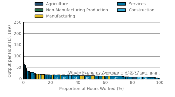
Using this lower-level industry data we can get a finer image the distribution of productivity across the UK economy and how this has changed across time. Figure 3 shows the level of output per hour in each division level industry in 1997 (the height of each column) and their respective shares of total hours worked (the width of the column). For example, 'retail trade except for motor vehicles and motorcycles' had the widest column representing the largest proportion of hours worked (12.4% of the total), but had a relatively low level of labour productivity in 1997.
Figure 3: Output per hour per industry in current prices
UK seasonally adjusted, 1997
Source: Office for National Statistics
Notes:
- This representation excludes real estate, which if included would be among the highest productivity industries. This industry is excluded because of its treatment within the national accounts – in particular, the attribution of owner-occupier imputed rentals from the expenditure and income measures of gross domestic product (GDP) to the real estate industry in the output measure – and the difficulties that this presents for interpretation.
- Industry 46 = Wholesale trade, except of motor vehicles and motorcycles, 85 = Education, 84 = Public administration and defence; compulsory social security, 86 = Human health activities, 47 = Retail trade, except of motor vehicles and motorcycles, 43 = Specialised construction activities, 56 = Food and beverage service activities.
Download this image Figure 3: Output per hour per industry in current prices
.png (31.8 kB) .xls (35.8 kB)In this period, only 18% of hours worked were in industries where productivity was higher than the whole economy average of £18.77. These industries, such as mining and quarrying, programming and broadcasting, and insurance, typically only have a small proportion of hours worked and are more often drawn from the production industries. Mining and quarrying was the most productive industry in 1997 and the only one to exceed an output per hour of £100 per hour (£120).
By contrast, most of the low productivity activities in this period are in the services industries, such as scientific activities, administrative and support activities, public administration and defence. Recreation activities, security services, landscaping, and repair services make up the lower end of this distribution, with output per hour below £7.
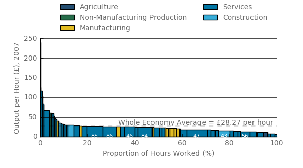
Figure 4 shows the equivalent data for 2007, following a long period of uninterrupted economic growth. While the shape of this distribution remained broadly unchanged – with only 16% of the hours above the average productivity level – the position of some industries within the distribution has shifted. In contrast with 1997, the manufacturing sub-divisions (yellow) were generally lower down the productivity distribution, while construction moved further toward the higher end of the distribution.
Services in general had little movement and still accounted for most of the hours worked. Again, the lower end of the distribution mainly consisted of various services industries, where the three lowest productivity divisions were security, landscaping and recreational activities.
Figure 4: Output per hour per industry in current prices
UK seasonally adjusted, 2007
Source: Office for National Statistics
Notes:
- This representation excludes real estate, which if included would be among the highest productivity industries. This industry is excluded because of its treatment within the national accounts – in particular, the attribution of owner-occupier imputed rentals from the expenditure and income measures of gross domestic product (GDP) to the real estate industry in the output measure – and the difficulties that this presents for interpretation.
- Industry 85 = Education, 86 = Human health activities, 46 = Wholesale trade, except of motor vehicles and motorcycles, 84 = Public administration and defence; compulsory social security, 47 = Retail trade, except of motor vehicles and motorcycles, 43 = Specialised construction activities, 56 = Food and beverage service activities.
Download this image Figure 4: Output per hour per industry in current prices
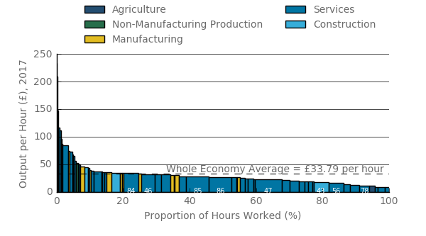
.png (32.2 kB) .xls (28.2 kB)Figure 5 shows the level of output per hour in the year to Quarter 3 (July to Sept) 2017 – eight years following the economic downturn, by which point output per hour was around 20% below its pre-downturn trend. Over this period the distribution of productivity may have become more skewed towards the tails. Nearly 25% of hours worked were in industries that have above average output per hour, an increase from around 17% in 2007 and 1997. Two relatively large industries in particular contributed to this change: manufacturing of food and construction of buildings. In 2017, both were above the whole economy average, whereas the former did so only in 1997 and the latter only in 2007. Together the industries accounted for 4% of total hours worked.
Figure 5: Output per hour per industry in current prices
UK seasonally adjusted, 2017
Source: Office for National Statistics
Notes:
- This representation excludes real estate, which if included would be among the highest productivity industries. This industry is excluded because of its treatment within the national accounts – in particular, the attribution of owner-occupier imputed rentals from the expenditure and income measures of gross domestic product (GDP) to the real estate industry in the output measure – and the difficulties that this presents for interpretation.
-
- Industry 84 = Public administration and defence; compulsory social security, 46 = Wholesale trade, except of motor vehicles and motorcycles, 85 = Education, 86 = Human health activities, 47 = Retail trade, except of motor vehicles and motorcycles, 43 = Specialised construction activities, 56 = Food and beverage service activities, 78 = Employment activities.
Download this image Figure 5: Output per hour per industry in current prices
.png (32.4 kB) .xls (28.2 kB)The manufacturing industries, which moved down the productivity distribution between 1997 and 2007, appear to have improved their relative performance between 2007 and 2017, moving up to higher levels of productivity compared with other industries. For example, food manufacturing rose back to a level above that of the whole economy average. Eight other manufacturing industries were above the whole economy average in 2017, compared with only four in 2007.
Outside of the manufacturing industries, there has been relatively little movement in the industry distribution. Most services industries have not noticeably changed in their positions. The industries with the lowest productivity are still security services, landscaping, and recreational activities. On the other hand, repair of computers and personal and household goods has had a large increase of productivity compared with the other industries. Construction has stayed at a level above the country average, helping to increase the total percentage of hours worked being above that level.
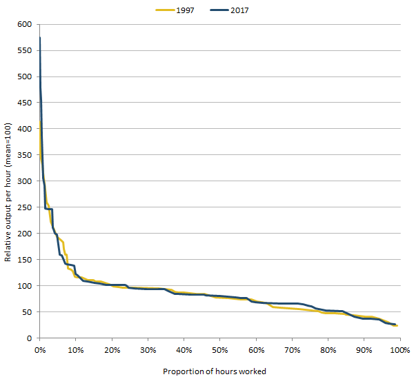
Despite these changes in industry positions, the broad shape of these distributions has been fairly stable over this 20-year period, albeit with a few noticeable differences. Figure 6 shows the outlines of the labour productivity and hours distributions for 1997 and 2017. Output per hour levels are indexed to the whole economy average of each respective period to account for changes in prices between the periods and to focus on changes in the shape of the distribution. When referring to a percentile, for example the 80th, we mean the area precisely 80% down the distribution. In 1997, 16% of hours worked were above the whole economy average, compared with 25% in 2017. As such, anything below those percentiles for their respective distributions will have below average productivity,
Figure 6 suggests that the relative productivity performances of different parts of the UK economy were little changed over this period. The most notable changes were at the ends of the distributions: the top 10% has seen the most changes in its distribution over the 20-year period, due to the greatest change in its composition. There has also been a relative increase in less productive areas of the distribution, with the area between 60th and 80th percentages gradually getting closer to the whole economy average.
Figure 6: Distribution of the divisional output per hour charts for 1997 and 2017, UK
Source: Office for National Statistics
Download this image Figure 6: Distribution of the divisional output per hour charts for 1997 and 2017, UK
.png (16.8 kB) .xls (31.2 kB)4. Distribution of output per hour growth across industries
While extra detail on the levels of productivity provides additional understanding of the changing structure of the UK economy, measures of productivity growth control for changes in prices and provides a better indication of how productivity in particular industries has fared across time.
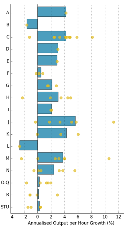
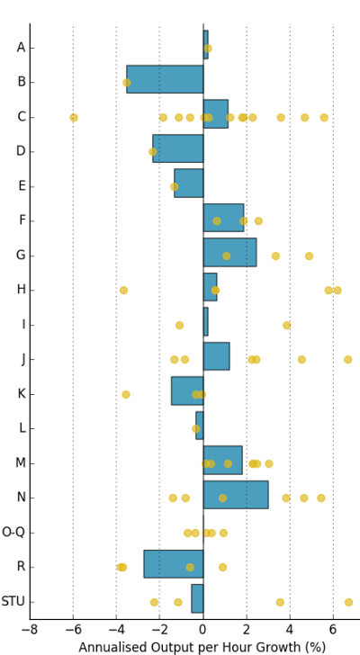
Figure 7 shows the average annual growth in output per hour per industry group between Quarter 1 (Jan to Mar) 1997 and Quarter 4 (Oct to Dec) 2007 (shown in the bars) with the growth rates of its component sub-industries (the dots). Figure 8 does the same for the post-downturn period, from Quarter 3 (July to Sept) 2009 to Quarter 3 2017.
Figure 7: Annualised output per hour growth per industry
UK seasonally adjusted, Quarter 1 (Jan to Mar) 1997 to Quarter 4 (Oct to Dec) 2007
Source: Office for National Statistics
Notes:
- Industry key: A: agriculture, forestry and fishing B: mining and quarrying C: manufacturing D: electricity, gas, steam and air conditioning supply E: water supply; sewerage, waste management and remediation activities F: construction G: wholesale and retail trade; repair of motor vehicles and motorcycles H: transportation and storage I: accommodation and food service activities J: information and communication K: financial and insurance activities L: real estate activities M: professional, scientific and technical activities N: administrative and support service activities O-Q: public administration, defence, education, human health and social work activities R: arts, entertainment and recreation STU: other service activities; activities of household and extra-territorial organisations and bodies
Download this image Figure 7: Annualised output per hour growth per industry
.png (74.0 kB) .xls (34.8 kB)
Figure 8: Annualised output per hour growth per industry
UK seasonally adjusted, Quarter 3 (July to Sept) 2009 to Quarter 3 (July to Sept) 2017
Source: Office for National Statistics
Notes:
- Industry key: A: agriculture, forestry and fishing B: mining and quarrying C: manufacturing D: electricity, gas, steam and air conditioning supply E: water supply; sewerage, waste management and remediation activities F: construction G: wholesale and retail trade; repair of motor vehicles and motorcycles H: transportation and storage I: accommodation and food service activities J: information and communication K: financial and insurance activities L: real estate activities M: professional, scientific and technical activities N: administrative and support service activities O-Q: public administration, defence, education, human health and social work activities R: arts, entertainment and recreation STU: other service activities; activities of household and extra-territorial organisations and bodies
Download this image Figure 8: Annualised output per hour growth per industry
.png (67.8 kB) .xls (26.6 kB)In both periods, an important feature that stands out is the marked variation of productivity growth experienced within the higher-level industries. Figures 7 and 8 show that analysing trends at the division-level (yellow dots) can yield quite different results compared with analysis of section-level data (blue bars), as a high-level industry may record productivity growth even when a majority of its sub-components see their productivity fall through time.
Focusing on the section level, between 1997 and 2007 all industries apart from mining and quarrying and real estate experienced growth. While most experienced productivity growth of between 2% and 6% per year on average, public administration, education, human health and other services experienced growth only marginally higher than zero.
By contrast, 7 of the 17 section-level industries experienced negative growth in productivity between Quarter 1 2009 and Quarter 1 2017, and growth rates for 12 were lower than in the pre-downturn period. The electricity, gas and steam, financial and insurance, and information and communication industries faced the largest reduction in output per hour growth, with a decrease of 7.6 percentage points, 5.0 percentage points and 5.5 percentage points respectively compared with the pre-downturn period. Construction and real estate were the sole sections that recorded an improvement in output per hour growth rates of more than 1 percentage point.
Nôl i'r tabl cynnwys5. The effect of reallocation on output per hour growth
While these new and more detailed industry-level growth rates are interesting in and of themselves, they also enable a more detailed analysis of industry-level contributions to overall output per hour growth rates for the UK. The extension of the available time series to cover the 1997 to 2017 period is particularly useful here, as it permits comparative analysis of changes in the contribution of different industries before and after the economic downturn.
As set out in earlier work, labour productivity in an economy can grow as a consequence of output per hour growth in its constituent industries, or as a consequence of underlying economic changes that put greater weight on more productive activities. The former effect – which is driven by the productivity performance of specific industries – is the direct or “within” industry effect: when productivity in an industry grows (falls), it contributes to (detracts from) overall productivity growth in the economy.
The latter effect – which is driven by changes in the structure of the UK economy – is often called the effect of “reallocation” on overall productivity growth, and comprises three types of change. Firstly, as labour moves (or is “reallocated”) from one type of activity to another it can affect overall labour productivity. For instance, if individuals move from relatively low productivity industries into higher productivity industries, then the average level of output per hour in the economy as a whole will rise. This effect consequently depends on movements of labour between industries with different levels of labour productivity – irrespective of the productivity growth rates of those industries.
Secondly, there is a price effect that can alter the weight of different industries in the calculation of productivity. If relative prices increase in high productivity industries, this will tend to increase the share of the economy accounted for by these industries, which in turn affects the overall level of labour productivity. These two effects – as well as a third, “interaction” effect between them – account for the size of the reallocation effect. Full details of this decomposition are available.
While some care must be taken when interpreting the results of this decomposition, the results are instructive and shed considerable light on the industries driving the UK’s recent economic slowdown. In particular, the results of this kind of analysis depend heavily on the granularity of the data used in their estimation: movements of labour and changes in relative prices will clearly appear larger when a larger number of industries are used, which will tend to push up the impact of “reallocation” forces relative to a more aggregated analysis.
The size of the main reallocation components is shown in Figure 9, as well as a cumulative five-year growth rate of output per hour. This figure indicates that for most of the period, movements of labour drove the reallocation effect, and that on average, labour was moving towards industries that had relatively high levels of labour productivity. As a result, the allocation effect contributed around 1 to 2 percentage points to whole economy growth of around 8% to 12% over a five-year window.
Following the downturn, the labour effect fell to near zero, similar to whole economy productivity growth as a whole. This is also consistent with a marked reduction in labour mobility during the economic downturn. However, while productivity growth has varied between 1% and 2% on a rolling five-year basis since 2015, the contribution from labour movement turned negative.
In addition, the price effect also became negative around the same time. This led to a reduction in the relative size of the industries affected, such as mining and quarrying, which corresponds with oil prices sharply declining. The joint negative contribution from the two series peaked at negative 2.7 percentage points in Quarter 3 (July to Sept) 2017, when whole economy growth was 2.5%. These data consequently suggest that any recovery in UK productivity growth will need support from both the within industry effect – which is much smaller than in the pre-downturn period – and the mix of activities.
Figure 9: Five-year output per hour growth and the allocation effect of labour, prices and the interaction between labour and prices
UK, seasonally adjusted, 2002 to 2017
Source: Office for National Statistics
Notes:
- Recent research by ONS has identified that there is scope for improvement to the telecommunications producer price deflator used in the output measure. If implemented, it appears likely this would likely increase the output and productivity of the telecommunications sector. However, as telecommunications are inputs into other industries there are likely to be equal and offsetting falls in output and productivity across a number of other sectors which used this service as an intermediate input. This change may therefore affect the performance of telecommunications compared with the other sectors, whilst leaving the overall aggregate productivity picture broadly unaffected.
Download this chart Figure 9: Five-year output per hour growth and the allocation effect of labour, prices and the interaction between labour and prices
Image .csv .xlsThe extension of these detailed data to cover a longer time period also enable comparisons with the extent to which different industries helped contribute to aggregate productivity growth over recent years.
While many similar analyses have been published – including of the contribution of different industries to the level of productivity and the contribution of different industries to the growth of productivity – this analysis examines industry contributions to changes in the growth rate of productivity, in particular, comparing growth in the five years before the economic downturn with the most recent five-year window.
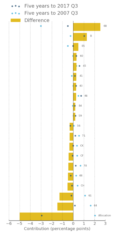
Figure 10 shows the contributions to aggregate productivity growth of the division level industries for which new estimates are available in (a) the five years to Quarter 3 (July to Sept) 2007 and (b) the five years to Quarter 3 2017, for the 10 industries contributing the most to productivity growth and the 10 industries contributing the least. Contributions to growth in each of these two periods are shown by dots, while the changes in these contributions are shown by bars. The “reallocation effect” is shown alongside these “within industry” effects.
Figure 10: Contributions to five-year output per hour growth from the 10 highest and 10 lowest contributors
UK, seasonally adjusted, Quarter 3 (July to Sept) 2007 and Quarter 3 (July to Sept) 2017
Source: Office for National Statistics
Notes:
- Industry key : 68: Real estate activities B: Mining and Quarrying 85: Education 60: Programming and broadcasting activities 45: Wholesale and retail trade and repair of motor vehicles and motorcycles 41: Construction of buildings 43: Specialised construction activities 46: Wholesale trade, except of motor vehicles and motorcycles 84: Public administration and defence; compulsory social security 59: Motion picture, video and television programme production, sound recording and music publishing activities 56: Food and beverage service activities 71: Architectural and engineering activities; technical testing and analysis CK: Manufacture of machinery and equipment n.e.c. CF: Manufacture Of Basic Pharmaceutical Products And Pharmaceutical Preparations 78: Employment activities 66: Activities auxiliary to financial services and insurance activities CH: Manufacture of basic metals and metal products 61: Telecommunications 64: Financial service activities, except insurance and pension funding
Download this image Figure 10: Contributions to five-year output per hour growth from the 10 highest and 10 lowest contributors
.png (69.4 kB) .xls (20.5 kB)Whole economy growth slowed from 9.6% to 2.5% between the two periods – of this fall, 5 percentage points can be attributed to the allocation effect. As a result, just over two-thirds of the fall in productivity growth over this time can be attributed to the shifting composition of the UK economy, with the remaining one-third being attributable to changes in growth for particular industries.
While telecommunications (61) and financial services (64) were the two largest negative contributors to the fall in productivity growth, together manufacturing industries also had a large impact. Telecoms and finance together contributed negative 2.8 percentage points to the slowdown in productivity growth, with all manufacturing industries combined contributing negative 2.4 percentage points.
Figure 10 also highlights that there were several positive contributors pushing up on productivity growth over the period. For example, while productivity in mining and quarrying fell between 2007 and 2013, in the years since it has grown. This change from falling productivity in the five years to Quarter 3 2007, with growth in the five years to Q3 2017, has put upwards pressure on whole economy productivity growth between the two periods. As a result, the contribution from mining and quarrying to the change in productivity growth was the second largest of the industries examined.
Nôl i'r tabl cynnwys