1. Main points
Labour productivity as measured by output per hour fell by 0.5% in Quarter 1 (Jan to Mar) 2017, down from 0.4% in the previous quarter; in services it fell by 0.6% while in manufacturing it rose by 0.2%.
The productivity of public services in the UK is estimated to have grown by 0.3% in Quarter 1 2017; public service productivity is now estimated to be 3.0% higher in 2016 than in 2010.
Experimental estimates of labour productivity on a region by industry basis suggest that the Finance and Insurance services, non-manufacturing production and the Information and communications industries in London, the East and South East were among the most productive regional industries in 2015.
Exploratory work on the feasibility of producing new estimates of investment in infrastructure in the UK – which is widely considered an important support for long-term productivity growth – is published alongside this release.
New evidence suggests that businesses with low levels of labour productivity in the UK are more likely to be small, young, single-site businesses, working in the services industries with a higher likelihood of exit than firms higher up the labour productivity distribution.
2. Economist quote
“UK labour productivity growth has struggled since the 2008 economic downturn, and the fall in the first quarter of 2017 brings to an end a recent run of quarters of positive growth”
“The experimental statistics that ONS releases today also reveal striking differences in productivity in different industries and regions. In 2015, output per hour worked in London’s financial and insurance industries was around seven times higher than in the lowest productivity regional industries”.
Philip Wales – Head of Productivity
Nôl i'r tabl cynnwys4. Labour productivity
Labour productivity as measured by output per hour fell by 0.5% in Quarter 1 (Jan to Mar) 2017, down from 0.4% in the previous quarter. As a consequence, UK labour productivity fell slightly below its pre-downturn peak in Quarter 4 (Oct to Dec) 2007. Although productivity fell for the economy as a whole, manufacturing productivity rose by 0.2% – but was outweighed by a fall in services productivity of 0.6%
This fall in labour productivity ends a run of productivity growth which extended over the previous four quarters, and suggests a continuation of the “productivity puzzle”. The puzzle is demonstrated by Figure 1, which shows the paths of output per worker and output per hour relative to their pre-downturn peaks, as well as the projected paths of these measures had their respective pre-downturn growth rates been sustained. On an output per hour basis, had labour productivity continued to grow at its pre-downturn rate it would be around 20% higher than at present. The gap on a per worker basis is slightly smaller – reflecting changes in average hours over this period – but remains substantial.
Figure 1: Output per hour and output per worker, UK
Seasonally adjusted, Quarter 1 (Jan to Mar) 1994 to Quarter 1 2017
Source: Office for National Statistics
Download this chart Figure 1: Output per hour and output per worker, UK
Image .csv .xlsThe weakness of UK labour productivity growth during the economic recovery reflects both relatively weak productivity growth within industries and a shift in the nature of production in the UK towards less productive activities. All else equal, the level of output per hour in the UK will rise (fall) if the level of labour productivity in any given industry increases (falls), or if labour moves away from less (more) productive industries towards more (less) productive industries.
Figure 2 shows the contributions of these two effects – within industry productivity growth and the "allocation" effect – to overall labour productivity growth over the past 2 decades. Prior to the downturn, the allocation effect made a relative small, slightly negative contribution. Productivity growth was largely supported by within industry productivity growth, although the source of this effect changed over time: while services (excluding finance) contributed strongly and positively for most the period, the contribution from finance gradually increased in the run up to the downturn. Conversely, the contribution to productivity growth from non-manufacturing production was fairly large in the late 1990s but gradually fell and turned negative – primarily due to falling output in mining and quarrying, partly related to falling reserves of oil and gas in the North Sea.
Figure 2: Contributions to quarter-on-year Output per Hour Growth, UK
Seasonally Adjusted, Quarter 1 (Jan to Mar) 1997 to Quarter 1 2017
Source: Office for National Statistics
Download this chart Figure 2: Contributions to quarter-on-year Output per Hour Growth, UK
Image .csv .xlsBoth the overall rate of labour productivity growth and the contributions of these factors have changed over the post-downturn period and show a particularly marked change over the last 2 years. Figure 2 shows that the allocation effect has been negative since the start of 2015 – indicating a relatively sharp allocation effect towards lower-productivity activities – and has been larger than at any point over the past 2 decades. Although this kind of analysis is often sensitive to the level of industry aggregation that is used, the change in the allocation effect over recent years holds even when using a more detailed industry breakdown to calculate the allocation effect. In Quarter 1 (Jan to Mar) 2017, a negative allocation effect of 0.7 percentage points weighed down on output per hour growth, which was 0.3% on the year. This negative allocation effect over the past 2 years reflects a shift of resources away from higher productivity industries, such as finance and mining and quarrying, toward lower productivity industries such as administrative services. We intend to pursue further study of this effect in future releases.
Nôl i'r tabl cynnwys5. Public service productivity
Also reported as part of this bulletin are the latest experimental estimates of quarterly public service productivity. These measures – which differ from measures of labour productivity by taking account of changes in a range of factor inputs, including labour and capital – show that productivity in the public services grew by 0.3% in Quarter 1 (Jan to Mar) 2017, up from an unrevised contraction of 0.1% in the previous quarter1. Breaking this down into the underlying components, the rise in productivity was driven by a 0.7% increase in output, while total public service inputs grew by 0.4%.
Growth in the most recent quarter reflects a continuation of the upwards trend which has been experienced in recent years. Figure 3 illustrates this growth in public service productivity since 1997, combining the latest experimental quarterly estimates – covering Quarter 1 2015 to Quarter 1 2017 – with annual estimates for between 1997 and 2014, taken from our Public service productivity estimates: total public service, UK: 2014 release. It suggests that, despite some volatility in the quarterly path, the productivity of UK public services has been on an upwards trend for much of the last 6 years. As a consequence, UK total public service productivity was 3.0% higher in 2016 than in 2010. Much like the most recent quarter, this has been driven by growth in total public service output, which rose by 5.4% over the same period. Inputs, on the other hand, have experienced somewhat slower growth, growing by 2.3% between 2010 and 2016.
Figure 3: Total UK public service productivity
1997 to Quarter 1 (Jan to Mar) 2017
Source: Office for National Statistics
Notes:
- Estimates from 1997 to 2014 are based on the existing annual series.
- Estimates from 2015 Q1 to 2017 Q1 are based on the experimental quarterly total public service productivity series.
- Estimates for 2015 Q1 reflect the growth rate between 2015 Q1 and annualised quarterly productivity for 2014.
- Estimates of productivity for the experimental period are indirectly seasonally adjusted, calculated using seasonally adjusted inputs and seasonally adjusted output.
Download this chart Figure 3: Total UK public service productivity
Image .csv .xlsNotes for: Public service productivity
- Measures of public service productivity are therefore conceptually closer, but not equivalent, to measures of multi-factor productivity than labour productivity.
6. New labour productivity metrics
Alongside these now regular quarterly releases, we have published two new and experimental datasets on labour productivity. These new outputs provide (a) estimates of UK labour productivity on a more detailed industry classification than previously available, and (b) estimates of region by industry labour productivity. These releases are part of a broader package of development work that is being carried out by the ONS Productivity teams to help explain the recent weakness of UK labour productivity. Both of these datasets are designed to be consistent with the headline labour productivity metrics and largely draw on the existing methodology, which is described in the companion articles which introduce these data. However, the provision of these more detailed statistics has necessitated the use of new methods and sources, which accounts for their experimental nature. As with all our productivity outputs, we welcome user views on the usefulness and potential uses for these data. These should be directed towards our inbox: productivity@ons.gov.uk
At the UK level, the first of these experimental releases provides estimates of labour productivity at a more detailed industrial breakdown than was previously available. Following a review of the methodology and, in particular, an assessment of the depth of sample provided for estimates of average actual hours worked, these estimates increase the granularity of our labour productivity metrics. Primarily at the two-digit level of the Standard Industrial Classification (SIC) 2007, these enable a more detailed analysis of labour productivity in the services industry in particular (where the number of published series rises from the 11 section-level industries, to a more detailed classification of 46 sub-industries). In manufacturing, the number of published series rises more modestly from 10 to 13, while data on non-manufacturing production and a more detailed classification of construction industries has also been made available. In the first instance, these series have been published for the period 2009 to 2017 on a quarterly basis, and – subject to user feedback – will be updated as part of the regular labour productivity release. We will look to extend these series further back in time in future releases.
The publication of these data should support a broad range of analysis and improve understanding of UK labour productivity, although their more detailed and experimental nature means that users should treat these estimates with care. While the methods used to produce these series are similar to those for the headline UK labour productivity measures, their more detailed nature inevitably increases the volatility of some of the more detailed estimates, and users are advised to consider longer-term trends in these data rather than placing weight on a single quarterly estimate.
Figure 4 shows one such longer-term picture and demonstrates the potential of this data to support understanding. It shows the compound average annual growth rate of labour productivity in each of section-level services industries (in the bars) alongside equivalent growth rates for each component, division-level industry (in the points) between Quarter 1 2009 and Quarter 1 2017, enabling an examination of which sub-industries have supported growth at the broader industry level. Where the bars and points are similar in magnitude, this indicates that labour productivity growth within a section-level industry has been similar in each of its components; where they differ – in some cases considerably – this points to a divergence in labour productivity growth within industries.
Figure 4: Annualised output per hour growth in services, UK
Seasonally adjusted, 2009 Quarter 1 (Jan to Mar) to Quarter 1 2017

Source: Office for National Statistics
Notes:
G - Wholesale and retail trade; repair of motor vehicles and motorcycles
H - Transportation and storage
I - Accommodation and food service activities
J - Information and communication
K - Financial and insurance activities
L - Real estate activities
M - Professional, scientific and technical activities
N - Administrative and support service activities
OPQ - Public administration and defence; compulsory social security, Education, Human health and social work activities
R - Arts, entertainment and recreation
STU - Other service activities, Activities of households as employers; undifferentiated goods- and services-producing activities of households for own use, Activities of extraterritorial organisations and bodies.
Download this image Figure 4: Annualised output per hour growth in services, UK
.png (15.4 kB) .xls (27.6 kB)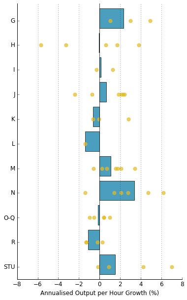
Figure 4 shows that analysing trends at the division-level can yield quite different results compared with analysis of section-level data. For example, section H (Transportation and storage) broadly maintained its level of labour productivity between Quarter 1 2009 and Quarter 1 2017. However, this reflected a mix of effects, in which the productivity growth of postal and courier services, land- and air-transport was offset by falls in the productivity of water transport and warehousing – which experienced the weakest productivity growth within services over the period. Similar variation is evident in several other section-level industries (notably information and communications (J), administrative and support service activities (N) and other services (STU)), while in other services industries the range of experience was more modest. Taking services as a whole, it is rare for all divisions within a section to have productivity growth in the same direction – demonstrating the extent to which variation at the division level within each section is a widespread phenomenon.
These more detailed, UK-level metrics are complemented by a set of more granular, region by industry labour productivity series. These experimental data use information from the Regional Accounts, the labour productivity system and – in a new development – the Annual Survey of Hours and Earnings (ASHE) to estimate productivity jobs and hours as well as nominal labour productivity for a breakdown of 16 industries within each of the 12 Nomenclature of Units for Territorial Statistics (NUTS1) UK regions. The methods used to produce these data and the limitations that these impose are set out in a second companion article, alongside the new data which are provided on annual basis for the 1997 to 2015 period. As with the more detailed industry metrics, we invite user feedback on these data, and suggest that users consider the long-term trends evident in this release, rather than focusing on specific annual movements.
These new experimental statistics enable analysis of labour productivity and its components at a more detailed level than was previously possible. For example, Figure 5 examines changes in the level of productivity hours in manufacturing across regions. It shows that the trend of falling total hours in manufacturing is reflected in all of the regions, with the principal reduction taking place between 1997 and 2009 before holding a fairly stable level post-downturn. The largest falls in total hours in absolute terms over this period were in the North West and the West Midlands, which lost 16.8m hours per week in manufacturing over this period. The largest relative falls occurred in London and Scotland, where total manufacturing hours are estimated to have fallen by around 50% over this period.
Figure 5: Total hours, Manufacturing (C)
NUTS1 regions, 1997 to 2016
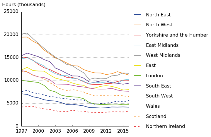
Source: Office for National Statistics
Download this image Figure 5: Total hours, Manufacturing (C)
.png (70.2 kB) .xls (30.7 kB)
The development of more detailed productivity hours data also enables the publication of more detailed labour productivity metrics. Figure 6 plots the levels of nominal labour productivity in manufacturing for each region in 2015. This shows that the levels of manufacturing output per hour worked are estimated to have been highest in the East, South East, North West and in Scotland – at close to £40 per hour worked in 2015. In the West Midlands and Yorkshire and the Humber, output per hour in manufacturing is estimated to have been around 25% lower than this – closer to £30 per hour worked in the same period. While these differences raise further questions – in particular about the composition of lower level industries in different areas – they provide a basis for future research and analysis.
Figure 6: Nominal output per hour in manufacturing
NUTS1 regions, 2015
Source: Office for National Statistics
Download this chart Figure 6: Nominal output per hour in manufacturing
Image .csv .xlsConducting analysis of this kind for each of the 16 industries for which regional labour productivity metrics have been produced provides evidence of wide variation in productivity levels in similar industries across the UK. Excluding real estate – which reflects the Regional Accounts treatment of imputed rentals for owner occupier housing costs – non-manufacturing production (A, B, D, & E) had the greatest range of output per hour values across regions, and varies by around £61 per hour worked between Northern Ireland and London. Similarly finance (K) has a wide range of labour productivity levels, with the majority of regions grouped between £40 and £50, and London at around £90. Both the manufacturing (C) and wholesale and retail (G) industries are examples of more uniform output per hour values across regions. These results are consistent with earlier, micro-level analysis of productivity variation across the UK regions which focussed on the private, non-financial business economy.
These data also enable a comparison the output per hour of each region by industry combination to provide some sense of the UK’s most- and least productive areas and industries in 2015 (Table 1). London and the South East each accounted for three of the top ten regional industries in 2015, including the financial and insurance activities, non-manufacturing production and information and communications industries in both of these regions. Finance accounted for half of these strongest performers – one of only three industries which feature in this group of highly productive regional industries.
Table 1: Top and bottom 10 industry-region productivity combinations (excl. real estate), UK
| Rank | Industry | Region | Value |
| 1 | K | London | 90.07 |
| 2 | A, B, D, & E | London | 78.1 |
| 3 | K | Scotland | 58.78 |
| 4 | A, B, D, & E | North East | 56.08 |
| 5 | K | South East | 51.16 |
| 6 | J | London | 50.91 |
| 7 | J | South East | 50.63 |
| 8 | A, B, D, & E | South East | 49.82 |
| 9 | K | Yorkshire and the Humber | 49.38 |
| 10 | K | East | 48.95 |
| 171 | I | North East | 14.95 |
| 172 | I | South East | 14.88 |
| 173 | R | North East | 14.64 |
| 174 | N | East Midlands | 14.31 |
| 175 | R | South West | 14.28 |
| 176 | N | Northern Ireland | 14.09 |
| 177 | R | Northern Ireland | 13.96 |
| 178 | R | Yorkshire and the Humber | 13.77 |
| 179 | I | Wales | 13.6 |
| 180 | R | Wales | 12.35 |
| Source: Office for National Statistics | |||
| Notes: | |||
| A, B, D, and E – Non-manufacturing production (Agriculture, Forestry and Fishing, Mining and Quarrying, Electricity, gas, steam and air conditioning supply, Water supply, sewerage, waste management and remediation activities). | |||
| C – Manufacturing. | |||
| F - Construction. | |||
| G - Wholesale and retail trade; repair of motor vehicles and motorcycles. | |||
| H - Transportation and storage. | |||
| I - Accommodation and food service activities. | |||
| J - Information and communication. | |||
| K - Financial and insurance activities. | |||
| L - Real estate activities. | |||
| M - Professional, scientific and technical activities. | |||
| N - Administrative and support service activities. | |||
| O - Public administration and defence; compulsory social security. | |||
| P - Education. | |||
| Q - Human health and social work activities. | |||
| R - Arts, entertainment and recreation. | |||
| S and T - Other service activities, Activities of households as employers; undifferentiated goods- and services-producing activities of households for own use. | |||
Download this table Table 1: Top and bottom 10 industry-region productivity combinations (excl. real estate), UK
.xls (29.2 kB)The lowest levels of labour productivity on an industry by region basis in 2015 are more geographically dispersed, but draw from an equally concentrated set of industries. Wales, the North East and Northern Ireland all account for two of these region by industry combinations, but all ten are drawn from just three industries – R, I and N. The difference in productivity levels between the least and most productive industries is particularly striking: in 2015, an hour worked in London’s financial and insurance industries produced around seven times the value added of an hour worked in the lowest productivity regional industries. These differences – likely to reflect relative levels of capital intensity, prices and some “core” differences in underlying productivity – are consistent with previous ONS analysis and academic work.
Nôl i'r tabl cynnwys7. New infrastructure investment measures
Alongside these new labour productivity metrics, we have also been examining the feasibility of producing statistics on infrastructure assets which are widely considered to be an important determinant of productivity: reducing the costs of production, reducing barriers to trade, and increasing competition through opening up markets. As part of this bulletin, we are publishing the first in a series of articles on our efforts to develop infrastructure statistics, starting with current price investment in these assets. Future articles will explore the development of price indices, stocks of infrastructure, and capital services derived from those stocks.
As there is no internationally agreed definition of infrastructure, the initial focus of this work has been to review current approaches to measuring and defining infrastructure from the relevant literature, and decide upon an appropriate definition. We focus our initial analysis on economic infrastructure: transport, energy, water, waste, and communications assets, as well as flood defences. In the future the scope of this work could be extended to produce a range of measures, on housing and on social infrastructure such as educational and healthcare assets.
In our paper, we present experimental data on infrastructure currently available for the public and private sectors. We draw on three data sources:
- government expenditure data sourced mainly from administrative data, for 2006 to 2015
- private sector survey data, for 2014 and 2015
- construction industry data collected by survey, for 2010 to 2016
These data sources reflect two distinct approaches to measuring infrastructure. The first two sources consider the investment in infrastructure assets by government and the private sector, consistent with infrastructure assets being considered as capital assets. The final source focuses on the construction of new infrastructure assets, reflecting the often physical nature of infrastructure.
Our initial estimates suggest that in 2015, government investment in infrastructure was £16.2bn, which accounted for 32% of total government investment. Over 80% of government infrastructure investment was on transport infrastructure, with the remainder predominately accounted for by investment in waste and water infrastructures. Our initial work suggests that private sector investment in infrastructure was £15.4bn in 2015 – over three-quarters of which was carried out by the Oil and Gas and Energy industries. In 2016, construction of new infrastructure assets by the construction industry totalled £19.1bn, of which approximately two-thirds was funded by private sector clients.
As with the other experimental data published as part of this release, we welcome user feedback on this initial work, which should be directed to our inbox: productivity@ons.gov.uk. We are taking forward a programme of work to develop these measures further, and any feedback will be useful as this work progresses. Future work will include detailed analysis of investment data at a more granular level and over a longer time period. We also intend to develop measures of the stock of infrastructure assets, and the services these assets provide into production.
Nôl i'r tabl cynnwys8. Quality adjusted labour input
These new, experimental statistics on infrastructure have been developed alongside work to improve the existing experimental statistics published by ONS on Quality Adjusted Labour Input (QALI). These series – which provide a measure of the effective supply of labour – have historically depended almost exclusively on data from the Labour Force Survey (LFS). The development work which is outlined in an accompanying article describes efforts to augment these data with information from the Annual Survey of Hours and Earnings (ASHE).
QALI indices complement traditional measures of labour input by taking account of changes in both the quantity of hours supplied and the composition or quality of that labour. As such, it is one measure of the effective supply of labour: weighting changes in the hours worked of relatively high (low) productivity workers more heavily (lightly) to produce an index which reflects both changes in the quantity and quality of the labour supply. While these indices are of interest in their own right, the primary driver for their estimation is for use in our multi-factor productivity work. In this framework, changes in output are explained with reference both to changes in factor inputs and to changes in an “unexplained” technological residual: incorporating measures of both the quantity and quality of labour in this framework is widely regarded as best practice.
As part of the development programme for this multi-factor productivity framework, we have been exploring ways of increasing the granularity of these QALI statistics – and in particular the number of industries for which QALIs can be computed. As currently specified, the QALI framework relies heavily on data extracted from the Labour Force Survey. QALI stratifies the employed labour force into 360 segments across 4 categories: education (6 strata), sex (2), age group (3) and industry (10), and collects data from the LFS on both hours worked and the hourly earnings of each category in each quarter. These estimates are constrained to estimates of total pay and hours, and then weighted together to produce a series which increases faster (slower) than a simple measure of hours worked when labour composition is shifting towards (away from) those categories with relatively higher hourly remuneration.
However, even relatively modest increases in the industrial detail of QALI present considerable challenges to the existing LFS sample size, which has motivated consideration of alternative sources of data on hours worked and pay. ASHE provides one such source, offering detailed estimates of hourly earnings of UK employees which we plan to use to augment the compilation of QALI indices.
While this work provides several benefits, the application of ASHE data to QALI is not straightforward. In particular, the deeper sample size of ASHE presents the potential for more detailed industry granularity; it is a survey of employers about their employees, and consequently is thought to provide a stronger industry breakdown and is thought to be less susceptible to potential reporting bias on hours worked and earnings. However, ASHE does not contain all the QALI categories – notably, it does not record levels of education – and it collects a measure of paid hours worked, rather than actual hours worked. Finally, the timing and the frequency of ASHE – an annual survey corresponding to the second quarter of the calendar year – means that the incorporation of these data is not straightforward.
There are several aspects to this work which are detailed in the accompanying article:
- the incorporation of occupational information into the QALI framework, and the conversion of historical ASHE data from previous vintages of the Standard Occupational Classification to the most recent equivalent
- work to assess the relationship between actual and paid hours worked using the LFS, so that records on paid hours from ASHE can be converted onto the actual hours worked basis which is appropriate for QALI indices
- the construction of a system which supports the benchmarking of hourly earnings in the QALI framework to ASHE estimates
These developments have also prompted improvements in other areas of the QALI system which are also outlined in the accompanying article. These include using information from ASHE on the sectoral breakdown of workers to re-visit previous work on the sectorisation of labour market metrics. In particular, ASHE provides an improved source of estimates of non-market sector workers other than those in central and local government, as well as information on the sectoral dimension of second jobs which is not available on LFS. Secondly, and not directly related to the use of ASHE, we report some small methodological changes to how QALI deals with LFS respondents who do not report their level of education.
All of the work reported in the accompanying article is exploratory, and we welcome user feedback on these proposals. We plan to do more work on converting occupation classifications and on modelling relationships within the LFS micro-data, and we need to develop the ASHE-LFS benchmarking framework from proof-of-concept to a full operational process. We will report on these planned developments alongside the next QALI release which is scheduled for October.
Nôl i'r tabl cynnwys9. ABS analysis of firm-level productivity
Alongside our efforts to develop new statistics – such as those on labour composition and infrastructure – to explain the UK’s productivity performance, we have also been pursuing a programme of micro-data analysis designed to examine how productivity trends have changed at the level of the individual business over recent years. The latest results of this programme are published as part of this Bulletin. This article examines the characteristics of firms in the bottom 10% of the labour productivity distribution – “laggard firms” – and extends previous work – (Ardanaz-Badia, Awano and Wales (2016)), which examined firms in the top 10% of the productivity distribution.
This work uses data from the Annual Business Survey (ABS) and the Inter-departmental Business Register (IDBR) to compare the prevalence of different firm-level characteristics among businesses in the bottom 10% of the labour productivity distribution, with their prevalence in the business population as a whole. Figure 7 provides two examples of this analysis: the left hand panel in this presentation shows the proportions of laggard firms by their age, while the right hand panel shows the proportions of those same firms by size-band. This analysis shows that a majority of the firms in this laggard group are relatively small businesses – as indicated by the large share of micro-firms in this group – and that around 55% of them were no older than 10 years old in 2015. These trends have changed somewhat over time – with the laggard group becoming slightly older and slightly larger in firm size – but compared to the population of businesses as a whole, our analysis suggests that firms in this group remain more likely to be smaller and younger on average.
Figure 7: The proportion of firms in the bottom 10% of the labour productivity distribution by age (left hand panel) and size (right hand panel)
Great Britain, 2003 to 2015
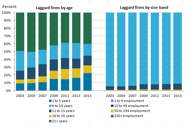
Source: Office for National Statistics
Download this image Figure 7: The proportion of firms in the bottom 10% of the labour productivity distribution by age (left hand panel) and size (right hand panel)
.png (12.9 kB) .xls (27.6 kB)
This analysis also suggests that firms in this group of low-productivity businesses are in a wide range of different industries, but that other services are particularly over-represented among the lowest productivity firms. Figure 8 shows the difference between the industrial mix of laggard firms and those of the population as a whole. In this presentation, points which are positive (negative) indicate over- (under-) representation in the bottom 10% relative to the population as a whole. It shows that a number of industries have been consistently over- or under-represented among laggard businesses over this period: in particular, the “Other services” industries have a consistently higher share in the bottom 10% than in the population.
Figure 8: Differences between bottom 10% of firms and firms in the population in terms of their industry distribution
Great Britain, 2003 to 2015
Source: Office for National Statistics
Download this chart Figure 8: Differences between bottom 10% of firms and firms in the population in terms of their industry distribution
Image .csv .xlsFigure 8 also highlights a number of marked changes in the industry mix of these groups. "Distribution, hotels and restaurants", for instance, is under-represented in the laggard group between 2003 and 2007, but this position reverses in 2008. By 2015, the share of firms in this industry in the laggard group was around 10 percentage points larger than in the population as a whole. Conversely, "Business services" progressed in the opposite direction, with a larger share in the bottom 10% than in the population prior to 2007 but not afterwards.
The paper also examines the regional distribution of relatively low-productivity businesses and their organisation: in particular, the prevalence of multi- or single-site businesses in the laggard group relative to the business population as a whole. It finds that relatively low-productivity firms are more likely to be single-site enterprises – although this difference is clearer on a per worker basis than on a per firm basis. The regional distribution of low-productivity firms also poses a considerable challenge which arises from the “headquartering” of multi-region businesses. Using a local unit version of the ABS, this analysis suggests that Wales, the North East and Yorkshire and the Humber account for a disproportionately large share of low-productivity businesses.
To address the longevity of firms at the bottom of the labour productivity distribution, we also augmented the Annual Business Survey data with information about firm survival. For each surveyed firm, we add information from the IDBR on whether the business is still active in annual increments for the five years after they were sampled. This enables us to calculate the share of businesses sampled in 2003, for example, who were still active in each of the years between 2004 and 2008. We repeat this exercise for each sample year, for firms with negative productivity at the point of sample, and for the remainder of firms.
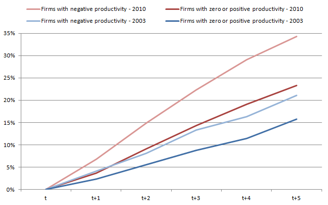
This analysis suggests that firms which record a period of negative value added are more likely to exit the marketplace than other firms. Figure 9 summarises this analysis by showing the cumulative share of firms surveyed in either 2003 or 2010 who became inactive in the 5 years after they were contacted. To examine the longevity of firms at different points in the labour productivity distribution, Figure 9 divides these firms into those who had negative value added at the time of the survey and the remainder of businesses. Of firms who were surveyed in 2003 and recorded negative value added, around 21% were inactive by 2008, whereas only around 15% of the other firms surveyed in 2003 became inactive over the same time period. This trend is also evident for businesses sampled in 2010, and suggests that experiencing a period of negative value added reduces the likelihood of firm survival.
Figure 9: Death rates, firms with negative productivity and those with zero or positive productivity in period "t"
Great Britain, 2003 and 2010
Source: Office for National Statistics
Download this image Figure 9: Death rates, firms with negative productivity and those with zero or positive productivity in period "t"
.png (17.9 kB) .xls (19.5 kB)
Finally, Figure 9 also highlights that firm survival probabilities appear to change through time. Comparing the curves for 2003 and 2010 in this Figure shows that firm death rates were higher in each subsequent period for businesses surveyed during 2010 than for businesses sampled during 2003. These data suggest that one aspect of the “reallocation” mechanism – which ordinarily support productivity growth by shifting activity and resources towards more productive businesses – operated broadly as expected over the recent economic downturn. However, whether this mechanism operated in a similar manner to that in previous downturns remains unclear. We intend to examine the feasibility of extending this work backwards to cover previous periods of economic contraction.
Nôl i'r tabl cynnwys