1. Main points
GDP growth has been slightly slower during 2015 than in 2014, and this pattern continued with quarter-on-quarter growth of 0.5% in the third quarter of this year. Private spending on consumption and investment remained robust, but there was marked weakness in the contribution to growth from net overseas trade. GDP growth is close to the OBR's estimate of potential growth, suggesting that the output gap is narrowing only slowly.
Annual CPI inflation has been flat at close to zero for most of 2015. This is a step down from the average rate of inflation during 2014 and 2013. Current weakness is driven by falling prices in the goods element of the CPI basket, and while services inflation has remained steadier at around 2.5% during 2015, this too has fallen from rates in earlier years.
The labour market has continued to strengthen, with the employment rate at a record high while unemployment fell further. The inactivity rate has fallen recently. This may indicate some further tightening in the labour market as the pool of potential labour diminishes, although the extent of this will depend on the composition of this inactive pool in terms of the degree of readiness to return to activity.
Analysis of recently published Annual Survey of Hours and Earnings (ASHE) data indicates that there has been an increasing concentration of total hours worked at or just above the National Minimum Wage level since 2005.
Almost 70% of full time workers experienced positive real earnings growth in the year to April 2015, close to twice the proportion in 2011.
2. Introduction
GDP continues to grow steadily, with growth being positive for ten consecutive quarters at an average rate of 2.5% on a quarter on quarter a year ago basis. GDP growth has been above the OBR’s estimate of potential growth since early 2013, and the output gap has been closing, though still remains slightly negative according to OBR estimates. A further indication of improving conditions is the sustained positive contribution to growth from household consumption and investment, both of which were weak during the early phase of the recovery but have been making steady, positive contributions to economic growth for the past two and a half years.
The performance of retail sales growth reinforces this picture, with retail sales growth hovering around 5% month on month a year ago over the past year, up from around 4% during 2014 and 1-2% during 2013. The latest retail sales figures reinforce the strength of growth in the non-store retailing sector, including internet sales, although this sector is still small in comparison with shop-based retail sales.
Inflation remains essentially flat, at close to zero, as it has been for most of 2015. The weakness of inflation primarily reflects goods-based inflation, which has been firmly negative, whereas services-based inflation has been steady at around 2.5% for much of 2014 and 2015, though it has come down since 2012 and 2013. The stronger decline in goods prices than services prices reflects a mixture of factors, but includes the greater contribution to goods prices from primary commodities and industrial materials which have seen falls over the past year, particularly for oil and petroleum based inputs, and the appreciation of sterling bringing down the domestic price of imports.
The labour market continues to show strength, with the employment rate at a record high and unemployment falling towards historic lows. The inactivity rate has come down to 22% in 2015 from 23.5% in mid-2011; although the labour market is showing signs of tightening, an important consideration is the make-up of the inactive pool of labour that could be drawn upon to feed labour demand, and the degree of attachment to the labour market among the inactive pool.
In-depth analysis of the Annual Survey of Household Earnings (ASHE) indicates that the introduction of minimum wage rates has a marked impact on the distribution of earnings, with the peak of the distribution shifting in line with changes in the minimum wage. This in turn has an impact on the rest of the distribution of earnings, with the distribution shifting upwards and to the right through time. However, this more reflects improvements in productivity and inflation driving up higher levels of earnings rather than what is happening at the bottom end of the distribution.
Nôl i'r tabl cynnwys3. GDP
The second estimate of Gross Domestic Product (GDP) indicated that the UK economy grew by 0.5% in the third quarter of 2015, unrevised from the preliminary estimate. This is a slight fall from 0.7% growth in Q2 2015 and is lower than average quarterly growth over the past three years (0.6%). Comparing the current quarter with the same period a year earlier, output growth has remained relatively stable falling from 2.4% in Q2 2015 to 2.3% in Q3 2015.
The second estimate of GDP contained the first information on the expenditure components of GDP in Q3 2015 (Figure 1). Following recent trends, the largest contributor to quarter on same quarter a year earlier GDP growth was household consumption, which added 2.0 percentage points to GDP growth over this period – around two-thirds of GDP growth. Household consumption has been making a solid and rising contribution to GDP growth since 2012. Investment continued to make a positive contribution to GDP growth for the tenth consecutive quarter. This steady contribution from investment likely reflects the improving economic situation.
Figure 1: Contributions to growth in the expenditure measure of GDP, quarter on same quarter a year ago, chained volume measure, seasonally adjusted
Source: Office for National Statistics
Notes:
- ‘Other’ includes the statistical discrepancy and change in inventories. ‘Private consumption’ equates to household consumption and ‘Non-profit households serving households’ consumption.
Download this chart Figure 1: Contributions to growth in the expenditure measure of GDP, quarter on same quarter a year ago, chained volume measure, seasonally adjusted
Image .csv .xlsWith GDP growth returning towards its pre-downturn trend and indications that spare capacity within the labour market is falling, it is useful to assess GDP growth against estimates of potential output growth. This would provide some indication as to whether the output gap is closing, and therefore whether inflationary pressures might start to build. The Office for Budget Responsibility (OBR) recently published updated estimates of potential output growth and the output gap, and these are presented alongside growth in GDP and growth in GVA (excluding oil and gas) in Figure 2 below. After ten consecutive quarters of GDP growth exceeding growth in potential output, the output gap has reached its lowest level since before the economic downturn. In 2015, GDP growth has averaged 2.5% on an annual basis, above the OBR’s estimated 2.1% growth in potential output for 2015 as a whole. With GDP growing at a higher rate than estimated potential output, the OBR estimates that the output gap has been closing in recent quarters and now stands at -0.6% of GDP.
Figure 2: Growth in GDP, growth in GVA excluding oil and gas, growth in potential output, and the output gap. Quarter on same quarter a year ago, %
Source: Office for National Statistics and Office for Budget Responsibility
Notes:
- Potential output excludes oil and gas.
Download this chart Figure 2: Growth in GDP, growth in GVA excluding oil and gas, growth in potential output, and the output gap. Quarter on same quarter a year ago, %
Image .csv .xlsRetail Sales
October 2015 marked the latest month in a three year period of retail sales growth as volumes increased by 3.8% compared with October 2014. Over the past year, retail sales growth has averaged 4.9%. This is up from an average of 4.0% during 2014 and 1.4% during 2013. This gradual build up in retail sales volumes likely reflects the wider economic picture of strengthening wage growth, a strong labour market with rising employment and falling unemployment, and the return of real earnings growth. This rising trend in retail sales growth in volume terms is broadly reflected in the quarterly household consumption path, though household consumption in the national accounts is made up of a number of other elements of spending, especially on services.
Although the majority of retail activity still occurs in retail outlets and shops, growth in retail activity is strongest in non-store retailing which includes on-line retailers. Figure 3 shows that since 2013 growth in non-store retail activity has been two to four times higher than that in retailing as a whole. This reflects, and is an indication of, the changing nature of the UK economy and consumer behaviour. However, due to its small size, non-store retailing continues to make a relatively small contribution to all retail sales.
Figure 3: Retail sales growth by sector (month on month a year ago)
Source: Office for National Statistics
Download this chart Figure 3: Retail sales growth by sector (month on month a year ago)
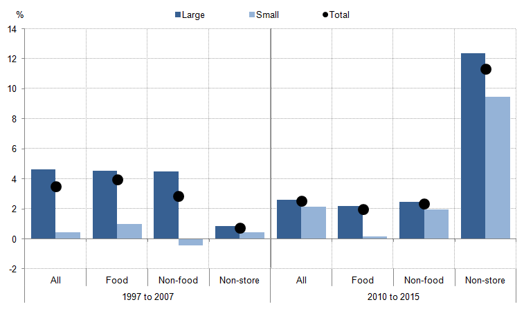
Image .csv .xlsFigure 4 breaks down retail sales growth by business size, and examines the growth across small and large businesses before and after the downturn. Two key points stand out from this chart: that sales from large businesses tended to experience higher growth both prior to and following the downturn; and that the growth of non-store retailing has taken off since the downturn. This represents something of a shift in the way consumers make purchases and how retail businesses present themselves to the market.
Figure 4: Growth across the retail sector, by business size, pre and post downturn (compound annual growth rate)
Source: Office for National Statistics
Notes:
- This chart presents compound annual growth rates from October 1997 to October 2007, and from October 2010 to October 2015.
Download this image Figure 4: Growth across the retail sector, by business size, pre and post downturn (compound annual growth rate)
.png (17.8 kB) .xls (19.5 kB)
Inflation
Despite GDP growth gradually improving over the past three years, and being above the OBR’s estimate of potential output growth, annual headline consumer price inflation remains just below zero at -0.1% and has been close to zero throughout 2015. This compares with 1.5% in 2014 - the lowest in a calendar year since 2004 but in line with annual rates of inflation during the period 1997-2004. Inflation has not been this low (around 0%), on a sustained basis, since the end of the 1950s. The recent weakness of inflation has been primarily driven by falling prices of goods, as figure 5 illustrates, but has been accompanied by relatively low services inflation which has averaged 2.4% since September 2013 compared to 3.5% in 2012 and 3.2% in 2013.
Figure 5: CPI inflation (% change month on month a year ago)
Source: Office for National Statistics
Download this chart Figure 5: CPI inflation (% change month on month a year ago)
Image .csv .xlsThe main downward pressures on inflation continue to be energy and food, which are particularly evident in the transport and food and non-alcoholic beverages categories. This is counteracted by contributions greater than 0.1 percentage points in restaurants and hotels, and education (see Figure 6). Energy has been a key factor driving down transport costs and prices, particularly vehicle fuels & lubricants which fell by 14% in the year to October.
Figure 6: Contributions to CPI inflation in October compared to September (% change month on month a year ago)
Source: Office for National Statistics
Download this chart Figure 6: Contributions to CPI inflation in October compared to September (% change month on month a year ago)
Image .csv .xlsThe current weakness in CPI goods is partly reflected in the evolution of the manufacturing producer price series – the prices that producers pay and receive for their products from other firms. Comparing the prices companies face (input prices) to the cost of their final product (output prices) indicates how firms are reacting to supply-chain price pressures, among other factors.
Figure 7 examines input and output prices of manufactures, in addition to series for each which exclude goods with volatile prices. Input prices tend to vary more than output prices for manufacturers, in large part because input prices reflect to a greater extent primary commodity and primary input prices such as oil, petroleum products, metals and raw materials. In contrast, output prices tend to be smoother because a greater proportion of the output price structure is taken up with labour costs which fluctuate much less than primary input prices.
In recent months this dynamic between input and output prices has become more evident as input prices have continued to fall, while output prices have remained fairly stable. Input prices have fallen by 12.1% in the year to October 2015 as part of a general downward trend in input prices since November 2013, whilst output prices have fallen by just 1.3% over the same period. This oscillation of input prices around a more stable path of output prices is not unusual over a longer time frame, but is more noticeable in recent months because of the period of relative stability during 2012 and 2013.
Figure 7: Producer prices – input and output price growth (%, month on month a year ago)
Source: Office for National Statistics
Download this chart Figure 7: Producer prices – input and output price growth (%, month on month a year ago)
Image .csv .xlsThe fall in input prices is partly a result of the fall in oil prices, which is reflected in manufacturing input prices as a 5.8% fall in fuel prices (including the climate change levy) since October 2014. Figure 7 shows that the exclusion of food, beverages, tobacco and petroleum accounts for the majority of the decline in growth of input prices since mid 2014. This exemplifies the higher weight of these elements for input prices than for output prices, where labour costs make up a much bigger share; unit labour costs in manufacturing rose by 3.1% in the second quarter of 2015, quarter on quarter a year ago.
Figure 8: Input prices by commodity type
Source: Office for National Statistics
Download this chart Figure 8: Input prices by commodity type
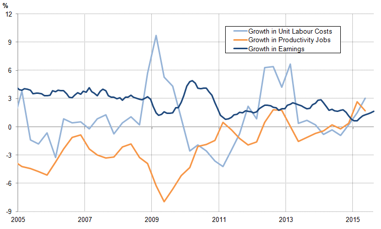
Image .csv .xlsWhile producer price inflation in the manufacturing sector remains negative, labour costs have recently picked up (Figure 9). Growth in the number of manufacturing jobs has been positive since the end of 2013, but earnings growth remains weak. However, despite earnings growth remaining below 2% since April 2014, growth in unit labour costs – a broad measure of the wage and non-wage costs required to create one unit of output - reached a nine-quarter high of 3.1% in Q2 2015. This latter result may indicate that increasing unit labour costs are a factor underlying the widening gap between input and output prices in the manufacturing sector, in addition to the fall in oil prices and the recent appreciation in sterling, making imports of primary commodities cheaper.
Figure 9: Growth in productivity jobs, earnings, and unit labour costs in manufacturing, %, 3m on 3m year ago
Source: Office for National Statistics
Download this image Figure 9: Growth in productivity jobs, earnings, and unit labour costs in manufacturing, %, 3m on 3m year ago
.png (35.9 kB) .xls (43.0 kB)
4. Labour Market
The labour market continued to improve in Q3 2015, in line with growth in output more broadly. The employment rate (age 16-64 years) is now at a record 73.7% (July to September), up from 73% a year ago and 71.6% two years ago. This reflects the addition of just under 420,000 employed people over the past year. Mirroring this improvement in employment is the decline in unemployment, which now stands at 5.3%, similar to the rate of unemployment prior to the recession in 2008 and 2009.
Figure 10: Headline labour market indicators (rate, %)
Source: Office for National Statistics
Notes:
- Please click on the image to view a larger version
Download this chart Figure 10: Headline labour market indicators (rate, %)
Image .csv .xlsThis notable improvement in the headline labour market indicators and the relatively low rate of unemployment has been accompanied by a fall in the inactivity rate. Figure 11 shows that the inactivity rate for aged 16-64 workers has fallen considerably since mid 2011 to close to the lowest rate on record. A previous Review covered this trend in detail, noting that it was driven by lower retirement rates (particularly among women aged 60 to 64), lower numbers of long term sick and disabled, and lower numbers of people looking after the family. This suggests that there is a shrinking pool of inactive labour to draw upon as the labour market tightens – albeit a pool which may be more attached to the labour market (readiness to return to the labour market) than prior to the downturn due to a higher student population. The distribution across age groups of inactive potential workers is important in determining the degree of spare capacity and employability of the inactive pool of labour, in terms of relevant qualifications, skills, experience and attachment to the labour market.
Figure 11: Inactivity rate (% of population,16-64 years)
Source: Office for National Statistics
Notes:
- Please click on the image to view a larger version
Download this chart Figure 11: Inactivity rate (% of population,16-64 years)
Image .csv .xlsThe resilience of employment through the downturn and early years of the recovery has been counterbalanced by low wage growth and a marked increase in flexible working patterns among workers in the labour market. The rise in employment was associated with notable increases in temporary and part time employment, as well as self-employment. Despite recent one-off dips in these series, this trend appears to be continuing, although there is now more full time employment and more voluntary flexible working.
Figure 12: Move towards more flexible working patterns (2005 Q1 = 100)
Source: Office for National Statistics
Notes:
- Self employed series covers full time and part time; other full time and part time series are only for employees and does not include self employed. Part time employees and full time employees also contain temporary employees.
Download this chart Figure 12: Move towards more flexible working patterns (2005 Q1 = 100)
Image .csv .xls5. The distribution of earnings
The continuing fall in the unemployment rate and growing evidence of tightening in the labour market has been accompanied by rising earnings growth in recent months. Average total weekly pay was 3.0% higher in the three months to September 2015 than the same period a year earlier, while over the same period private sector total pay growth was 3.4% – among the strongest rates of growth since 2009. This trend is affirmed by results from the Annual Survey of Hours and Earnings (ASHE) – ONS’ most comprehensive survey of individual pay. It suggested that median gross weekly earnings for full-time employees were £528 in April 2015, up 1.8%1 from £518 in April 2014, following growth of 0.2% over the year to April 2014.
While measures of average pay such as the mean and median are useful summary statistics, they can mask changes in the distribution of earnings which contain important information for policy. Figure 13 shows the distribution of gross hourly earnings for all employees in 1997 and 2015. In 1997, prior to the introduction of the National Minimum Wage (NMW), the UK’s earnings distribution was relatively smooth, positively skewed and centred on hourly earnings of between £4 and £5 per hour. Relatively few jobs paid below £3 per hour, while the long, thinning right-hand tail indicates the steadily falling number of jobs as hourly earnings rise. As a result of this positive skew, mean hourly pay was around 24.2% above the median in 1997.
Figure 13: Distribution of gross hourly earnings, +/-20 pence, 1997 and 2015, and the Adult National Minimum Wage in April 2015

Source: Annual Survey of Hours and Earnings (ASHE) - Office for National Statistics
Notes:
- Each point on the x-axis represents a rolling sum of the density of jobs receiving greater than or equal to 20 pence below, and strictly less than 20 pence above, the stated hourly earnings.
- As the density records the rolling sum of jobs paid within 20 pence of the stated amount at each point on the x-axis, jobs paid the April 2015 Adult National Minimum Wage (£6.50) will appear between the x-axis values of £6.30 and £6.70.
Download this image Figure 13: Distribution of gross hourly earnings, +/-20 pence, 1997 and 2015, and the Adult National Minimum Wage in April 2015
.png (27.2 kB) .xls (106.0 kB)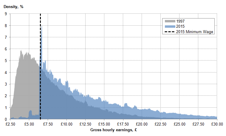
By 2015, however, the shape of this distribution had changed markedly. The earlier, smooth profile has been replaced by a striking, sharply-edged distribution, with a mass at around £6.50 per hour – the prevailing adult NMW in April 2015. Above this level of pay, the density of the distribution is less affected – albeit shifted to the right by both productivity gains and inflation. Median hourly pay was £11.57 in 2015 – 68.6% higher in nominal terms than in 1997.
Examining the distribution of earnings in this manner exposes several characteristics of the UK’s recent experience which are masked by changes in the median and mean measures. The growing concentration of pay at the bottom of the UK’s earnings distribution is particularly marked. While in 1997, the modal rate of hourly pay was between £3.74 and £4.14 and covered 6.0% of all jobs, in 2015, the modal rate of hourly pay was between £6.46 and £6.86, and covered 8.0% of all jobs.
Changes at the bottom of the UK’s earnings distribution appear to be closely related to changes in the NMW. Figure 14 examines this in more detail by showing the proportion of adult hours worked which are at or close to the NMW since its introduction in 1999. It shows that between 1999 and 2003, the NMW affected a relatively small fraction of total adult hours worked. 1.4% of total hours worked were within 2% of the NMW in 1999 – between £3.53 and £3.67 per hour2 – falling slightly to 1.0% of total hours in 2003. However, this fraction has increased steadily over the last decade. In 2015, 3.9% of total hours and just over 5.0% of adult jobs (650.4 Kb Pdf) were worked within 2.0% of the NMW.
Figure 14: Portion of adult hours worked paid close to the Adult National Minimum Wage, 1999 to 2015
Source: Annual Survey of Hours and Earnings (ASHE) - Office for National Statistics
Download this chart Figure 14: Portion of adult hours worked paid close to the Adult National Minimum Wage, 1999 to 2015
Image .csv .xlsThe concentration of hours worked at the NMW has been accompanied by a growing proportion of jobs paying just above this statutory minimum, providing some evidence of earnings compression over the past decade. Figure 15 examines this trend in more detail, showing the density of hours worked in several periods relative to the adult NMW in those periods. Around 2% of total hours worked paid around 20% more than the NMW at its introduction in 1999, rising to 2.4% in the mid-2000s, to 2.9% in 2015. By contrast, the fraction of hours worked at rates of pay more than twice the NMW appears to have come down slightly over this period, shifting the mass of the hourly earnings distribution closer to the NMW. These trends suggest that the NMW has risen more quickly than the earnings of workers immediately above the statutory minimum in recent years. This may have resulted either as a consequence of policy choice, or as a result of labour market conditions – including changes to productivity and modes of work - holding back the typical experience of earnings growth during the economic downturn. While it is difficult to be confident about the balance of these effects, the distribution of earnings appears to have become increasingly compressed at and just above the NMW.
Figure 15: Distribution of total hours worked by gross hourly earnings relative to the Adult National Minimum Wage, rolling 5 percentage point summed density, selected years

Source: Annual Survey of Hours and Earnings (ASHE) - Office for National Statistics
Notes:
- NMW is the National Minimum Wage
Download this image Figure 15: Distribution of total hours worked by gross hourly earnings relative to the Adult National Minimum Wage, rolling 5 percentage point summed density, selected years
.png (45.2 kB) .xls (41.0 kB)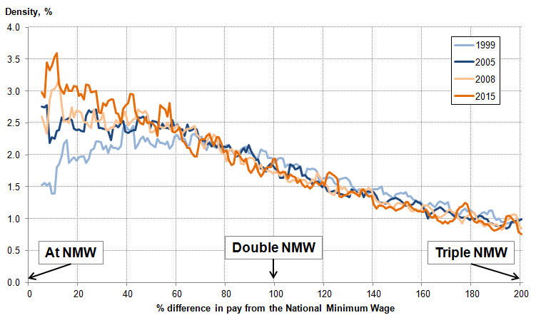
Composition of the workforce
The changing shape of the UK’s earnings distribution is partly a result of the changing composition of the workforce, which may have been one factor pushing earnings growth higher in 2015. Figure 16 provides one measure of these compositional effects, quantifying the impact of the changing occupational mix of employees on earnings growth. It captures the contribution of earnings growth within each of the headline occupational groups to the growth of average pay, as well as the impact of the changing number of jobs in each group. This latter effect – commonly referred to as a compositional effect – captures how the addition of more high- or low-skilled jobs affects average pay.
Figure 16: Contributions to growth in mean real weekly earnings, 2005 to 2015
Source: Annual Survey of Hours and Earnings (ASHE) - Office for National Statistics
Notes:
- The Consumer Price Index for April of each respective year has been used the deflate earnings.
Download this chart Figure 16: Contributions to growth in mean real weekly earnings, 2005 to 2015
Image .csv .xlsThe increase in real earnings growth between 2014 and 2015 was partially driven by a negative composition effect in 2014 coupled with a positive composition effect in 2015. In 2014, the growing proportion of jobs in the lower occupational groups acted to reduce average pay growth – as the addition of relatively more lowly-paid posts held back average pay. However, in 2015, the addition of relatively more well-paid posts appears to have reversed this effect. As a consequence, the compositional effect appears to have raised average pay in the year to April 2015, consistent with analysis from the 2015 July Economic Review.
Growth in earnings
Analysis of variation in levels of pay and conditional analysis of earnings provide insights into distributional outcomes in the UK, yielding information about how much more or less one group earns relative to another. However, the Annual Survey of Hours and Earnings (ASHE) datasets can also be used to examine the typical experience of earnings growth through time. Analysis of this sort can be used to address questions about the degree of inflationary pressure and the extent of spare capacity remaining in the UK labour market, which in turn may help economists understand wage pressures. By necessity, this work focuses on workers who report being in employment in consecutive periods – which permits the calculation of earnings growth rates for individuals.
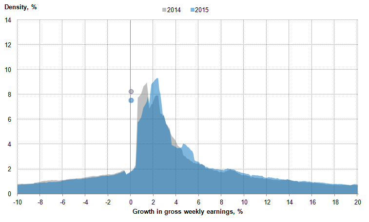
On this detailed basis, the experience of earnings growth is remarkably varied from one period to the next. Figure 17 shows the distribution of nominal weekly earnings growth rates in the year to April 2014 (in grey – corresponding to individuals in employment in both 2013 and 2014) and in the year to April 2015 (in blue – corresponding to individuals in employment in both 2014 and 2015). For each growth rate on the horizontal axis, the shaded area indicates the portion of employees who experienced earnings growth within 0.5 percentage points of that rate. Those who experienced zero nominal weekly earnings growth in each period are labelled separately by grey and blue dots for 2014 and 2015 respectively.
Figure 17: Distribution of growth in gross weekly earnings, +/-0.5 percentage point growth, 2014 and 2015
Source: Annual Survey of Hours and Earnings (ASHE) - Office for National Statistics
Download this image Figure 17: Distribution of growth in gross weekly earnings, +/-0.5 percentage point growth, 2014 and 2015
.png (22.9 kB) .xls (46.1 kB)
Perhaps the most striking feature of Figure 17 is the extent of variation in weekly earnings growth. Just below 1% of employees experienced close to 20% weekly earnings growth in 2015, while a similar portion experienced a fall of 10%. Previous analysis in the Economic Review examined several mechanisms through which these changes in earnings are metered, including changes in hours worked, changes in non-basic pay, and transitions between full- and part-time employment. This work suggested that all of these channels play a role when an employee’s earnings fall: basic pay appears to also play a role in explaining earnings growth between periods.
Secondly, Figure 17 suggests that the experience of earnings growth – as measured by the most frequently occurring earnings growth rates – strengthened between 2014 and 2015. In 2014, the most common nominal pay rise was around 1% - accounting for around 9% of employees – while a similar fraction experienced zero nominal weekly earnings growth. In 2015, although the proportion of employees experiencing zero nominal weekly earnings growth was only slightly lower, the most frequently occurring rate of growth was closer to 2% - again accounting for around 9% of all employees.
These data suggest both (a) that a lower number of people experienced a nominal pay freeze in the year to April 2015, and (b) that among those experiencing changes in earnings, pay growth strengthened. While previous Reviews have covered the possibility that a tightening labour market underlies these trends, the distribution of earnings growth in the education industry in particular goes some way to explaining the shift in density from 1% to 2% earnings growth. In 2014 23.7% of those in the education industry for over a year received around 1% earnings. By 2015, around 1% earnings growth was still common, but experienced by a lower 10.2% of education employees. Over the same period, the portion experiencing 2% earnings growth rose from 5.5% to 15.4%.
The median growth rate of earnings is one way of summarising the typical experience of earnings growth. Previous editions of the Economic Review have examined how this measure is less sensitive to factors which affect earnings growth – such as changes in the composition of the workforce – than other summary measures such as the growth in average earnings levels. Accounting for these factors is particularly important when comparing different sections of the workforce, such as the public and private sectors. In April 2015, for instance, median full-time gross weekly earnings in the private sector were £501, compared with £589 in the public sector. However, recent ONS analysis suggested that, after controlling for the occupational, sex and age mix of those in the public and private sectors, the gap between these groups is all but eliminated.
The median growth rate of earnings is another means of controlling for changes in the composition of the workforce. Figure 18 shows median weekly growth rate of earnings for all employees, as well as those in the private and public sector respectively. On this measure, earnings growth was at or just above 4% prior to the economic downturn, with the typical experience of pay growth in the public sector slightly faster than that in the private sector. Following the economic downturn, the median growth rate of earnings fell to around 2%, and the typical experience of pay growth fell in both the public and private sectors. However, the median growth rate of earnings has been around 1.0 percentage points higher on average in the private sector than the public sector since 2012, reversing the pre-downturn trend. In 2015, the typical experience of pay growth increased in both sectors and for the economy as a whole.
Figure 18: Median growth rate of gross nominal weekly earnings in different sectors, %
Source: Annual Survey of Hours and Earnings (ASHE) - Office for National Statistics
Download this chart Figure 18: Median growth rate of gross nominal weekly earnings in different sectors, %
Image .csv .xlsThe strengthening of the distribution of earnings growth came alongside a marked fall in the rate of inflation, resulting in a larger fraction of employees experiencing positive real earnings growth. Figure 19 shows the distribution of real weekly earnings growth for full time employees between 2002 and 2015 in the form of a ‘fan chart’. The orange line shows the median rate of earnings growth for these employees, while the shaded regions show the distribution of earnings increases, with the darker (lighter) areas denoting the centre (extremes) of the distribution. In times when the median growth rate is positive, a majority of these workers experienced an increase in their real earnings. Conversely, when the median growth rate is negative, a majority of these workers experienced a reduction in their real earnings. The shaded regions consequently yield information about the variety of experiences of workers.
The median growth rate of earnings is one way of summarising the typical experience of earnings growth. Previous editions of the Economic Review have examined how this measure is less sensitive to factors which affect earnings growth – such as changes in the composition of the workforce – than other summary measures such as the growth in average earnings levels. Accounting for these factors is particularly important when comparing different sections of the workforce, such as the public and private sectors. In April 2015, for instance, median full-time gross weekly earnings in the private sector were £501, compared with £589 in the public sector. However, recent ONS analysis suggested that, after controlling for the occupational, sex and age mix of those in the public and private sectors, the gap between these groups is all but eliminated.
Figure 19: The distribution of real gross weekly earnings growth for full-time employees, 2002 to 2014

Source: Annual Survey of Hours and Earnings (ASHE) - Office for National Statistics
Notes:
- The Consumer Price Index for April of each respective year has been used the deflate earnings.
Download this image Figure 19: The distribution of real gross weekly earnings growth for full-time employees, 2002 to 2014
.png (29.0 kB) .xls (29.2 kB)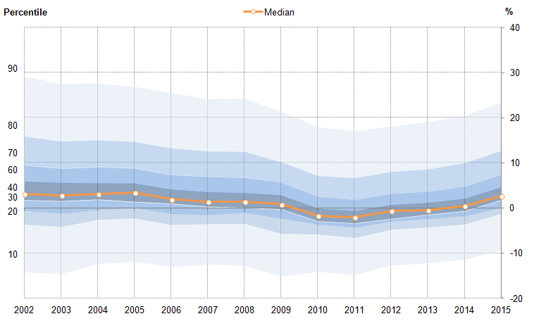
While Figure 19 shows the distribution in 2015 was relatively similar to that experienced prior to the downturn, this is a relatively recent development. Movement in the centre of the distribution of real earnings growth – denoted by the darkest blue area – shifted lower during the economic downturn and is only now at a position similar to pre-downturn trends. The 2010 to 2013 fall in real earnings was partly driven by this darker region shifting below the horizontal axis – a move from which the distribution was only starting to recover in April 2014. In April 2015, the median growth rate of real weekly earnings for full time employees increased to 2.6% - up from 0.5% in the year to April 2014, and -0.4% in the year to April 2013.
Developments in the UK labour market have also affected the range of the distribution, with 2015 marking an increase in growth rates in both tails of the distribution. The range of full-time weekly earnings growth outcomes narrowed relatively sharply during the economic downturn, largely as a consequence of fewer workers experiencing substantial earnings rises. At the 10th percentile of the earnings growth distribution, real earnings contracted by between 10% and 15% per year throughout this period – likely reflecting full-time workers reducing their hours or moving from one position to another. However, real earnings growth at the 90th percentile fell gradually between 2005 and 2009, before falling sharply in 2010, as more workers found it difficult to achieve substantial real earnings growth. In 2015, earnings growth at the 90th percentile strengthened to close to its 2008 level. A large fraction of this fall and subsequent recovery may be explained by changes in job to job moves during the downturn, as risk-averse employees and employers changed their behaviour.
Figure 20 summarises these trends, plotting the fraction of full time employees who received differing degrees of real earnings growth each period: the red (blue) bars show the fraction of these workers receiving real earnings falls (increases) each period by the magnitude of their change in earnings. Those who experience earnings growth at a rate that is broadly comparable to the CPI – defined as half a percentage point either side of the headline rate of inflation – are categorised separately (grey bars). This analysis shows that almost 70% of full-time employees experienced real earnings growth in 2015 – a larger fraction than in any year since before the economic downturn – continuing the improving trend established in recent years. In 2010 and 2011 – when wage growth on this measure was at its weakest, close to 60% of full-time employees experienced a fall in real weekly earnings – almost double the average of just 32% during the preceding eight years. Conversely, the fraction of full-time workers experiencing a rise in weekly earnings dropped markedly in these years – falling from an average of 62% between 2002 and 2009 to just 36% between 2010 and 2011. These data consequently suggest that the typical experience of earnings growth strengthened notably in 2015, consistent with evidence of a broader tightening in the labour market in recent years.
Figure 20: Percentages of full-time employees by their rate of annual real weekly earnings growth, %
Source: Annual Survey of Hours and Earnings (ASHE) - Office for National Statistics
Notes:
- The Consumer Price Index for April of each respective year has been used the deflate earnings.
Download this chart Figure 20: Percentages of full-time employees by their rate of annual real weekly earnings growth, %
Image .csv .xlsNotes for The distribution of earnings
This measure of growth refers to growth in the median – a comparison of the mid-point of the earnings-level distribution in one year and the mid-point in another year. This differs from the median growth rate of earnings – which matches employees across time to derive their individual earnings growth, and measures the mid-point of distribution of earnings growth. For more information on these different measures, see the March 2015 Economic Review.
These figures have been rounded to the nearest pence. For the purposes of Figure 14, ‘within 2%’ of the Adult National Minimum Wage in 1999 includes gross hourly earnings strictly greater than £3.528 and strictly less than £3.672.
6. Reference tables
Table 1: UK Demand side indicators
| 2013 | 2014 | 2015 | 2015 | 2015 | 2014 | 2015 | 2015 | 2015 | |
| Q1 | Q2 | Q3 | Jul | Aug | Sep | Oct | |||
| GDP1 | 2.2 | 2.9 | 0.4 | 0.7 | 0.5 | : | : | : | : |
| Index of Services | |||||||||
| All Services1 | 2.8 | 3.2 | 0.4 | 0.6 | 0.7 | 0.1 | 0.0 | 0.4 | : |
| Business Services & Finance1 | 3.6 | 3.9 | 0.1 | 0.6 | 1.0 | 0.1 | 0.1 | 0.7 | : |
| Government & Other1 | 1.4 | 1.4 | 0.2 | 0.1 | 0.1 | 0.0 | -0.1 | 0.1 | : |
| Distribution, Hotels & Rest.1 | 4.1 | 4.7 | 1.2 | 1.0 | 0.8 | 0.4 | -0.4 | 0.9 | : |
| Transport, Stor. & Comms.1 | 2.2 | 3.0 | 0.8 | 1.4 | 1.3 | 0.0 | 0.3 | -0.2 | : |
| Index of Production | |||||||||
| All Production1 | -0.8 | 1.4 | 0.3 | 0.7 | 0.3 | -0.3 | 0.9 | -0.2 | : |
| Manufacturing1 | -1.1 | 2.7 | -0.1 | -0.5 | -0.3 | -0.7 | 0.4 | 0.8 | : |
| Mining & Quarrying1 | -3.3 | -0.5 | 0.5 | 7.5 | 2.4 | 0.7 | 6.2 | -4.9 | : |
| Construction1 | 1.6 | 8.1 | 0.2 | 1.4 | -2.2 | -1.2 | -3.4 | -0.2 | : |
| Retail Sales Index | |||||||||
| All Retailing1 | 1.4 | 3.9 | 0.7 | 0.7 | 0.9 | 0.6 | -0.4 | 1.7 | -0.6 |
| All Retailing, excl.Fuel1 | 1.9 | 4.3 | 0.4 | 0.9 | 0.9 | 0.9 | -0.7 | 1.5 | -0.9 |
| Predom. Food Stores1 | -0.1 | 0.8 | 0.2 | 0.3 | 0.2 | 0.0 | -1.0 | 2.3 | -1.3 |
| Predom. Non-Food Stores1 | 1.7 | 6.5 | -0.1 | 1.2 | 0.9 | 1.4 | -0.2 | 0.5 | -0.3 |
| Non-Store Retailing1 | 17.2 | 11.8 | 3.7 | 2.8 | 4.1 | 2.1 | -2.0 | 3.6 | -1.3 |
| Trade | |||||||||
| Balance2,3 | -34.2 | -34.5 | -10.5 | -3.5 | -8.5 | -4.3 | -2.9 | -1.4 | : |
| Exports4 | 3.8 | -1.1 | -2.2 | 3.7 | -4.5 | -7.6 | 1.7 | 1.3 | : |
| Imports4 | 3.7 | -1.0 | -1.3 | -1.7 | -0.7 | 1.0 | -1.5 | -2.2 | : |
| Public Sector Finances | |||||||||
| PSNB-ex3,5 | -25.8 | -2.5 | -7.9 | -4.5 | -3.3 | -2.1 | 0.7 | -1.9 | 1.1 |
| PSND-ex as a % GDP | 78.1 | 80.9 | 80.0 | 80.7 | 80.6 | 80.1 | 79.9 | 80.6 | 80.5 |
| Source: Office for National Statistics | |||||||||
| Notes: | |||||||||
| 1. Percentage change on previous period, seasonally adjusted, CVM | |||||||||
| 2. Levels, seasonally adjusted, CP | |||||||||
| 3. Expressed in £ billion | |||||||||
| 4. Percentage change on previous period, seasonally adjusted, CP | |||||||||
| 5. Public Sector net borrowing, excluding public sector banks. Level change on previous period a year ago, not seasonally adjusted | |||||||||
Download this table Table 1: UK Demand side indicators
.xls (30.2 kB)Table 2: UK Supply side indicators
| 2013 | 2014 | 2015 | 2015 | 2015 | 2014 | 2015 | 2015 | 2015 | |
| Q1 | Q2 | Q3 | Jul | Aug | Sep | Oct | |||
| Labour Market | |||||||||
| Employment Rate1,2 | 71.5 | 72.9 | 73.5 | 73.4 | 73.7 | 73.6 | 73.7 | : | : |
| Unemployment Rate1,3 | 7.6 | 6.2 | 5.5 | 5.6 | 5.3 | 5.4 | 5.3 | : | : |
| Inactivity Rate1,4 | 22.4 | 22.2 | 22.1 | 22.1 | 22.0 | 22.1 | 22 | : | : |
| Claimant Count Rate7 | 4.2 | 3.0 | 2.4 | 2.3 | 2.3 | 2.3 | 2.3 | 2.3 | 2.3 |
| Total Weekly Earnings6 | £474 | £480 | £487 | £491 | £494 | £495 | £494 | £492 | : |
| CPI | |||||||||
| All-item CPI5 | 2.6 | 1.5 | 0.1 | 0.0 | 0.0 | 0.1 | 0.0 | -0.1 | -0.1 |
| Transport5 | 1.0 | 0.3 | -2.5 | -2.1 | -2.4 | -1.9 | -2.6 | -2.7 | -2.6 |
| Recreation & Culture5 | 1.1 | 0.9 | -0.4 | -0.8 | -0.8 | -0.6 | -0.9 | -0.8 | -0.4 |
| Utilities5 | 4.1 | 3.0 | 0.9 | 0.4 | 0.3 | 0.4 | 0.4 | 0.1 | 0.2 |
| Food & Non-alcoh. Bev.5 | 3.8 | -0.2 | -2.9 | -2.3 | -2.5 | -2.7 | -2.4 | -2.3 | -2.7 |
| PPI | |||||||||
| Input8 | 1.2 | -6.6 | -13.5 | -12.0 | -13.6 | -12.8 | -14.6 | -13.4 | -12.1 |
| Output8 | 1.3 | 0.0 | -1.7 | -1.6 | -1.8 | -1.6 | -1.9 | -1.8 | -1.3 |
| HPI8 | 3.5 | 10.0 | 8.5 | 5.6 | 5.6 | 5.2 | 5.5 | 6.0 | : |
| Source: Office for National Statistics | |||||||||
| Notes | |||||||||
| 1. Monthly data shows a three month rolling average (e.g. The figure for February is for the three months Jan - Mar) | |||||||||
| 2. Headline employment figure is the number of people aged 16-64 in employment divided by the total population 16-64 | |||||||||
| 3. Headline unemployment figure is the number of unemployed people (aged 16+) divided by the economically active population (aged 16+) | |||||||||
| 4. Headline inactivity figure is the number of economically active people aged 16 to 64 divided by the 16-64 population | |||||||||
| 5. Percentage change on previous period a year ago, seasonally adjusted | |||||||||
| 6. Estimates of total pay include bonuses but exclude arrears of pay (£) | |||||||||
| 7. Calculated by JSA claimants divided by claimant count plus workforce jobs | |||||||||
| 8. Percentage change on previous period a year ago, non-seasonally adjusted | |||||||||