2. Main points
Assessing the post-referendum UK economy
Economic data since the EU referendum vote have remained broadly encouraging this month. GDP growth has continued to grow roughly on trend, consumer spending and business investment has been holding up and employment remains at a record high.
Second estimate of GDP Quarter 3 2016
The headline growth rate of 0.5% over the quarter has not been revised from the preliminary estimate. This continues the relatively strong trend of growth prior to the EU referendum.
Short-term output indicators
Within construction, there is continued resilience of new orders although there is weaker construction output overall. Non-manufacturing industries such as utilities, real estate and wider business services are driving business investment.
Prices
There is some evidence of upward pressure on input prices for manufacturers, mainly driven by imported goods and crude oil. To date, there has been a more limited effect on consumer and producer output prices. House prices grew by 7.7% in the year to September, unchanged from August.
Distribution of earnings analysis
The proportion of part-time workers that have earnings that are within 1% of the National Minimum Wage or National Living Wage is considerably higher than full-time workers. There is a higher share of women in the private sector concentrated around National Living Wage pay rates of £7.20 per hour than women in the public sector. The industries which had the highest share of workers who experienced a pay freeze in 2016 included specialised construction activities and some areas of manufacturing.
Nôl i'r tabl cynnwys3. Introduction
This edition of the Economic Review provides an overview of the performance of the UK economy and includes the dashboard for assessing the UK post-referendum economy.
The Review also provides more in-depth analysis of the following data:
- Gross domestic product (GDP) Quarter 3 (July to Sept) 2016 second estimate and its expenditure components
- short-term output indicators, including trends in construction, business investment and manufacturing exports
- prices, with a particular focus on how prices for energy and imported goods and services are influencing the overall indices for producer and consumer prices
The focus on these data aligns with the introduction of the changes to the publishing schedule for economic statistics, which will begin in January 2017. This will be the start of a “theme day” approach to the publication of related statistics which will allow us to present a more coherent and consistent picture of UK economic activity.
This edition of the Economic Review also provides further analysis of the Annual Survey of Hours and Earnings (ASHE) dataset for April 2016. We consider the earnings distribution for different groups of workers in 2016 compared with previous years, looking particularly at:
- part-time wage growth
- gender pay differences within the public and private sectors
- which industries had the greatest share of workers who experienced around zero pay growth between 2015 and 2016
An updated table of our forthcoming economic statistics releases and the data periods they cover is at Annex A.
Future of the Economic Review
We are currently looking at how we can develop the Economic Review in the light of the improvements to the way we publish economic statistics from January 2017. Considerations include:
- how to incorporate in-depth economic commentary and analysis on the theme day statistics each month
- how to incorporate additional economic commentary on releases that are not featured in theme days, for example, economic well-being, wealth and assets publications or Annual Business Survey releases
- how to incorporate analysis of our micro-datasets, which inform important economic issues such as the productivity puzzle, inflation and exchange rate effects on the real economy, real wage changes and changes in household incomes
- timing and frequency of the Economic Review and related outputs
An initial decision has been made not to publish an Economic Review in the first week of January as a one-off transition to the new theme day publication timetable. We will provide details of our longer-term plans for any changes to the Economic Review in the next edition. A forward date for the Economic Review and any new analysis publications covering theme day releases will be confirmed before the end of the year.
Nôl i'r tabl cynnwys4. Assessing the post-referendum UK economy
This section of the Review provides an overview of the performance of the UK economy and includes the dashboard for assessing the UK post-referendum economy. This is updated in real time as new data becomes available.
Economic overview: November 2016
Economic data since the EU referendum vote have remained broadly encouraging this month.
Office for National Statistics (ONS) Chief Economist Nick Vaughan said:
"The big change in our economic circumstances since June's referendum has of course been the sharp depreciation of sterling. So manufacturers have faced higher prices for some raw materials and that in turn has started to push up the prices of goods leaving factories.
"Nevertheless, the economy as a whole has continued to grow roughly on trend with both consumer spending and business investment holding up.
"Meanwhile, the number of people in work has remained at a record high, although there are perhaps some early signs that the long and steady growth in employment we've seen these last few years is starting finally to slow."
Dashboard for assessing the UK post-referendum economy
ONS produces a wide range of economic statistics, which now contain data covering periods after the UK vote on EU membership that was held on 23 June.
The commentary and “trends to consider” information associated with each chart is not a forecast or prediction of whether the statistics will show any discernible effects of the EU referendum result. The purpose of the information is to aid understanding of how these data are potentially impacted by the international and domestic economic environment as we move forward in time.
Embed code
5. Second estimate of gross domestic product for Quarter 3 2016
Recent data for gross domestic product (GDP) and the broader National Accounts post-referendum have been generally encouraging, with overall headline activity broadly unchanged. However, within the headline data remains a set of notable imbalances such as the diverging performances of consumer-focused services compared with weaker construction and manufacturing industries.
Continued prominence of household consumption growth
The period immediately following the EU referendum was met with a lowering of external expectations of growth and weaker external indicators of activity. The average forecast for GDP growth in 2017 (published by HM Treasury’s Forecasts for the UK economy publication) was revised down in July to 0.8% from 2.1% in June, while external indicators of consumer confidence and business activity fell.
However, both forecasts and external indicators have improved in recent months, and our latest economic data continue to show headline activity growing at a similar rate to historical trends.
The latest GDP estimate shows that the UK economy grew by 0.5% in Quarter 3 (July to Sept) 2016, slightly slower than the 0.7% estimate for Quarter 2 (Apr to June) 2016. Growth in the latest quarter was lower than the average quarter-on-quarter growth (0.6%) seen since Quarter 1 (Jan to Mar) 2013, when the economy started growing steadily, but was not a significant departure from trend GDP growth over this period.
Despite some external indictors produced by market analysis companies such as GfK’s indicator of consumer confidence signalling weaker spending intentions, this has not been confirmed by firm economic indicators of spending such as retail sales or household final consumption. As has been the case in recent years, household consumption drove the increase in GDP in Quarter 3 2016, rising by 0.7% on the quarter.
Looking over a longer period (Figure 1) shows that private consumption has contributed 5.8 percentage points to the 8.8% recovery in GDP since Quarter 1 2013, while investment contributed 2.7 percentage points. These proportions have shown little in the way of rebalancing away from consumption toward investment. Although net trade improved markedly in the latest quarter, it has still acted to reduce GDP growth over the longer period shown.
Figure 1: Expenditure drivers of headline gross domestic product (GDP), percentage points
UK
Source: Office for National Statistics
Download this chart Figure 1: Expenditure drivers of headline gross domestic product (GDP), percentage points
Image .csv .xlsThe consumer-led recovery seen in the most recent quarter can also be seen in the industrial breakdown of output. Figure 2 shows the performance of total services output, a composite industrial indicator based on output in “consumer-focused” industries and output in the financial services industries. It shows that the consumer-focused industries performed broadly in line with total services, from the height of the downturn in Quarter 3 2009 to Quarter 3 2015. In the subsequent year, however, consumer-facing industries grew 6.7% while total services grew 3.0%.
The services industry has been held back by financial services – where output remains 10.1% below levels seen in Quarter 3 2009. By contrast, non-financial “professional” business services such as accounting and legal continue to significantly contribute to overall GDP growth.
Figure 2: Output in a selection of services industries, indexed to 100 at Quarter 3 (July to Sept) 2009
UK
Source: Office for National Statistics
Notes:
- ‘Consumer-focussed services’ include retail trade (45 and 47), food and beverage services (56), motion picture, TV and Music activities (59), cultural activities, libraries and museums (91), gambling (92) and sports, amusement & recreation activities (93).
Download this chart Figure 2: Output in a selection of services industries, indexed to 100 at Quarter 3 (July to Sept) 2009
Image .csv .xls6. Short-term output indicators
Construction and new orders
In contrast to the services industry, the construction industry has started to show signs of negative growth. Output fell 1.1% in the 3 months to September, following a contraction in the previous quarter. Looking over a longer time period, output remains 1% below levels seen prior to the economic downturn in 2008.
While overall activity fell, the decline in the 3 months to September was driven by an especially large fall in repair and maintenance, while overall new work undertaken was broadly flat. Furthermore, recent data on construction new orders signal continued growth in completed tenders – although these data are currently only available up to the pre-referendum period of Quarter 2 (Apr to June) 2016 and can be volatile.
Typically, construction output is best correlated with a 3 quarter lag in new orders, as shown in Figure 3. New construction orders increased by 8.5% on the quarter in Quarter 2 2016, driven by reasonably robust growth in housing and other new work such as private commercial. This suggests that any pre-referendum uncertainty that existed did not translate into a trend decline in new orders to tender.
Figure 3: Construction output and construction new orders (3 quarter lag), quarter on previous year growth
Percentage, 1998 Q1 to 2016 Q3, Seasonally adjusted, UK
Source: Office for National Statistics
Notes:
- Data are seasonally adjusted.
Download this chart Figure 3: Construction output and construction new orders (3 quarter lag), quarter on previous year growth
Image .csv .xlsLooking over the new orders data – which contains a project and regional breakdown – reveals some interesting trends in the construction industry. Figure 4 examines the share of new orders attributable to project types such as infrastructure and housing, as well as the regional breakdown. Rising bars over time show regions and project types which are increasing in value or prominence relative to the overall construction industry. Figures in brackets show the rolling 4 quarter growth in the most recent quarter.
Figure 4 shows that housing and infrastructure projects have accounted for an increasing share of total orders, while the share of commercial and industrial work has fallen (the latter could be explained by a smaller manufacturing base relative to the whole economy). Across the regions, London has historically claimed a large share of construction, and has been the only region to achieve a notable proportionate rise between the pre- and post-downturn periods.
Figure 4: Summary of growth (rolling 4 quarter growth in Quarter 2 (Apr to Jun) 2016) and share of new orders by region and project type (% total new orders)

Source: Office for National Statistics
Notes:
- Pre-downturn (1997 Q1 - 2007 Q4) and post-downturn (2008 Q1 - 2015 Q4).
- Percentages may not sum to due to rounding.
Download this image Figure 4: Summary of growth (rolling 4 quarter growth in Quarter 2 (Apr to Jun) 2016) and share of new orders by region and project type (% total new orders)
.png (25.5 kB) .xls (29.2 kB)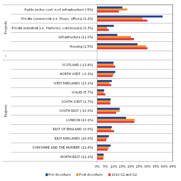
Signs of weakening business investment growth
While there has been stronger consumer spending and retail growth, the contribution from investment has showed signs of waning slightly in recent quarters. Business investment grew by 0.9% in Quarter 3 (July to Sept) 2016, this was slightly lower than growth in the previous quarter. However, investment fell 1.6% in the year to Quarter 3 2016, and is down 0.7% on a rolling 4 quarter basis.
Figure 5 shows the performance of business investment in total, as well as a breakdown by the industries that are investing. This shows that investment being undertaken by manufacturing firms started to fall back from the turn of 2016, while investment from non-manufacturing firms continues to drive growth in the total. The asset breakdown of business investment shows a great range across various products. Compared with values at the economy’s pre-downturn peak (Quarter 1 (Jan to Mar) 2008), investment in intellectual property products has risen by 9.1% while the broad category of ICT and machinery investment remains 8.0% below pre-downturn levels. Investment in transport equipment has also been strong in recent quarters, though this component can be volatile.
Figure 5: Business investment and investment by headline industry, rolling 4 quarter average, Quarter 1 (Jan to Mar) 2008 =100
Source: Office for National Statistics
Download this chart Figure 5: Business investment and investment by headline industry, rolling 4 quarter average, Quarter 1 (Jan to Mar) 2008 =100
Image .csv .xlsWithin the non-manufacturing industry – which contains services, construction and the raw material extraction industries – there have been large movements that have influenced headline business investment.
Figure 6 shows mining and quarrying investment acted to boost the headline figure between 2011 and 2013, rising by 32%, 5% and 6% in each calendar year respectively. This coincided with an extended period of maintenance in the industry which also resulted in lower output.
More recently investment has fallen back, while oil prices, output and North Sea Continental Shelf profits have been recovering. Other industries to have supported business investment growth include the utilities industries, real estate and wider business services, as well as financial services.
Figure 6: Business investment by lower-level non-manufacturing industry, rolling 4 quarter average, Quarter 1 (Jan to Mar) 2008 =100
Source: Office for National Statistics
Download this chart Figure 6: Business investment by lower-level non-manufacturing industry, rolling 4 quarter average, Quarter 1 (Jan to Mar) 2008 =100
Image .csv .xlsManufacturing and export intensity
The manufacturing industry has demonstrated a small drop in output over the post-referendum period – output fell 0.9% over the 3 months to September but rose 0.6% on the month, indicating that the level of activity is at broadly the same level as it was in the previous year.
However, within the headline numbers are encouraging signs of rising export values relative to domestic sales, especially in the most recent months (Figure 7). Anecdotal evidence from our survey respondents suggests that some buyers brought forward UK export orders in order to take advantage of the lower levels of sterling. In value terms, manufacturing export turnover rose 9.6% in the year to September, while domestic turnover remained broadly flat.
Figure 7: Index of manufacturing turnover by export and domestic sales, rolling 4 quarter average, non-seasonally adjusted, nominal values, indexed to 100 at 2007 average values
Source: Office for National Statistics
Download this chart Figure 7: Index of manufacturing turnover by export and domestic sales, rolling 4 quarter average, non-seasonally adjusted, nominal values, indexed to 100 at 2007 average values
Image .csv .xlsThis is a trend which has persisted over a number of years, and is prominent across a range of manufacturing products. Figure 8 compares the “export intensiveness” – defined as the share of total turnover attributable to export sales – across a range of manufacturing products between 2000 and 2005 (blue bars), the post-downturn period and the last 4 quarters. This shows that across every component there has been a move toward industries becoming more export orientated.
Industries that have increased their share by the largest amount include pharmaceuticals – which now attribute 60% turnover to exports – as well as computer and electrical products. There are no signs that this has changed in the most recent data, following the depreciation in sterling.
Figure 8: Average share of export sales by manufacturing product, 2000 to 2005, 2010 to 2015 and Quarter 3 (July to Sept) 2015 to Quarter 3 (July to Sept) 2016, (% total turnover)
Source: Office for National Statistics
Download this chart Figure 8: Average share of export sales by manufacturing product, 2000 to 2005, 2010 to 2015 and Quarter 3 (July to Sept) 2015 to Quarter 3 (July to Sept) 2016, (% total turnover)
Image .csv .xls7. Prices analysis
This section provides an overview of the prices data released this month and some further analysis and economic context for each dataset. Additional analysis in later sections is focused on:
- Consumer Prices Index (CPI)
- Producer Price index (PPI)
- House Price Index (HPI)
Further CPI and PPI analysis is available in the release Additional analysis of the Producer and Consumer price indices: October 2016.
Overview
Overall, Figure 9 shows that PPI input (Right Hand Scale) and output indices (Left Hand Scale) move in broadly similar ways over time, although the volatility of PPI input prices is considerably greater than for manufacturer’s output prices. CPI inflation rates have diverged from PPI input and output prices in different time periods, but there are relatively consistent patterns between movements in CPI and movements in PPI output inflation. There is a simple measure of correlation (with no allowance for time lags) of 0.8 between CPI and output PPI between January 1997 and October 2016. The simple correlation between input and output PPI inflation is 0.9 over the same period.
Figure 9: Annual growth in CPI, PPI input and PPI output indices, January 1997 to October 2016
Percentage, UK
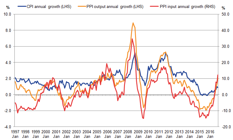
Source: Office for National Statistics
Download this image Figure 9: Annual growth in CPI, PPI input and PPI output indices, January 1997 to October 2016
.png (41.9 kB) .xls (52.7 kB)
Consumer and producer prices
Since the beginning of the year and in the context of the ongoing depreciation of sterling, there is some evidence of upward pressure on input prices for manufacturers, mainly driven by imported goods and crude oil. To date, there has been a more limited effect on consumer and producer output prices.
Mike Prestwood, head of prices, stated on 16 November on publication of the current data, “After initially pushing up the prices of raw materials, the value of the pound is now starting to boost the price of goods leaving factories as well. However, aside from fuel, there is no clear evidence that these pressures have so far fed through to the prices in the shops.”
Housing and rental prices
Housing market indicators for September suggested a period of relative stability during the month. House prices grew by 7.7% in the year to September, unchanged from August. England continued to show the strongest house price growth at 8.3%, which is around twice the rate of growth in Wales (4.4%) and Scotland (3.4%).
The rental market in Great Britain also remained relatively strong in the year to September 2016, as prices grew by 2.3%. This picture continued in the year to October 2016 when rental prices also grew at 2.3%. Rental price inflation was strongest in the South East (3.4%) and was weakest in Scotland (minus 0.2%) and Wales (0.4%).
In the longer term, how the supply and demand for housing of different tenures develops will affect housing and rental prices across the UK. Issues such as the availability of mortgages, interest rates, employment prospects and earnings will affect households’ decisions to buy or rent property and there will be regional variations in these factors which will affect housing and rental prices.
Analysis of CPI
The rate of inflation as measured by the Consumer Prices Index (CPI) increased by 0.9% in the year to October 2016, compared with a 1.0% annual increase in the previous month.
Figure 10 presents contributions to the CPI from products grouped by their relative import intensities, along with the inverted effective exchange rate (ERI). Goods and services which largely originate from domestic producers are grouped together in a low import-intensity group, while products which largely come from abroad are grouped into higher import-intensity groups. The ERI series has been inverted, so that a depreciation of the currency is represented by an increase in the line graph. This shows that a depreciation of the currency represents a higher sterling equivalent price for imported goods and services. Energy products, which have considerable import content, and on which the price of oil has a particular impact, are grouped separately.
Figure 10: Headline CPI inflation, contributions to inflation by import intensity and 12-month growth in the sterling effective exchange rate, monthly average (inverted)
Percentage, January 2008 to October 2016, UK
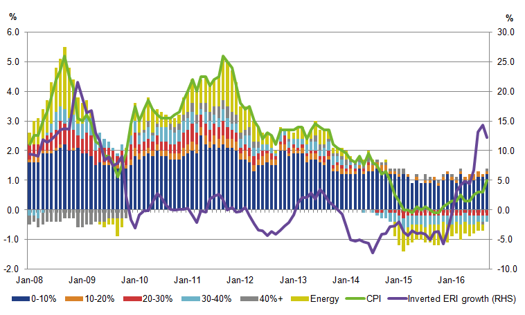
Source: Office for National Statistics
Download this image Figure 10: Headline CPI inflation, contributions to inflation by import intensity and 12-month growth in the sterling effective exchange rate, monthly average (inverted)
.png (44.5 kB) .xls (90.1 kB)
Figure 10 shows that the least import-intensive non-energy products have made a fairly steady contribution to the CPI rate of inflation between 2008 and 2016. In October 2016, the largest contribution to the increase in consumer price inflation continued to come from goods in the lowest import-intensive category (0 to 10%); however, this was slightly down from the previous month. The (10 to 20%) and (40% and over) import-intensive categories also continued to provide positive contributions to consumer price inflation in October 2016. Energy has seen the largest change in contribution between October 2016 and October 2015, turning positive for the first time since November 2014. This is likely to be due to a combination of factors including the increase in dollar and sterling equivalent oil price during 2016 to date and price falls for the energy component of CPI in the previous year.
Understanding the base effect and recent fuel-price movements
When reporting the changes in the 12-month growth rate, the “base effect” should be taken into consideration. This is when previous changes in a price index lead to headline changes being arithmetically low or high even though more recent trends indicate otherwise.
To see how this applies to recent movements in the fuels and lubricants component of CPI, Figure 11 shows the fuels and lubricants index and how the annual growth rate can be decomposed into a movement in the index in the base month and the remaining movement in the index overall.
The contribution to fuel and lubricants CPI growth from a positively-signed “base effect” is seen to be greatest the months between October 2015 and January 2016, and August, September and October 2016. This indicates that there were falls in the index in the base months, which then adds to the 12-month growth rate comparison in the case of the August to October figures this year (or reduces the negative growth rate comparison for October 2015 to January 2016).
Figure 11: Actual and base effects, annual growth rate in Fuels and lubricants component of the CPI, January 2015 to October 2016
Percentage and percentage points, UK
Source: Office for National Statistics
Download this chart Figure 11: Actual and base effects, annual growth rate in Fuels and lubricants component of the CPI, January 2015 to October 2016
Image .csv .xlsAnalysis of producer prices
The latest producer price inflation release shows that prices of imported products have been rising steadily over the past several months. Imported food, metals, chemicals, parts and equipment, and other imported materials have been providing higher positive contributions to input PPI, with imported products (excluding crude oil) contributing 6.9 percentage points to the 12.2% increase in input PPI in the year to October 2016. There is some evidence that this is now feeding into factory gate (output) prices, which in October saw the fourth consecutive monthly increase following 2 years of falls and the largest increase since April 2012.
The price of services sold by UK companies (measured by the Services Producer Price Index (SPPI)) increased 1.8% in the year to Quarter 3 (July to Sept) of 2016, compared with an increase of 1.5% in the year to Quarter 2 (Apr to June) of 2016. This is the largest increase seen since Quarter 2 of 2010. The main upward contributions to the annual rate of the SPPI came from information and communication, and professional, scientific and technical activities. These increased 3.2% and 2.0% respectively, in the year to Quarter 3 of 2016. Services inflation is largely driven by increased labour costs, and so will be broadly related to the strength of the overall economy, output growth of the service sector and labour market conditions in the services sector. Average total weekly pay, for example, for the services sector for the 3 months to September 2016 was 2.2% higher than the same period a year earlier (source: EARN01 table, Office for National Statistics).
Oil prices
Oil prices have been a factor in the upward trend in manufacturers’ input producer price inflation. Crude oil contributed 3.6 percentage points to the 12.2% increase in input producer prices in the year to October 2016. While this upward pressure in crude oil prices can be partly attributed to supply and demand factors in the international market, there is also an effect that can be explained by the depreciation of sterling against the US dollar.
The left-hand panel of Figure 12 shows the relationship between the global price of Brent crude oil (in sterling and US dollars) and the price of the PPI input component crude oil.
Figure 12: LHS: Brent crude oil (in Pounds and US dollars) and Crude Oil (Input PPI). RHS: Refined Petroleum Products (Output PPI) and Fuels & Lubricants
January 2015 to October 2016, January 2015 = 100, UK

Source: Office for National Statistics, Financial Times
Download this image Figure 12: LHS: Brent crude oil (in Pounds and US dollars) and Crude Oil (Input PPI). RHS: Refined Petroleum Products (Output PPI) and Fuels & Lubricants
.png (27.9 kB) .xlsx (15.7 kB)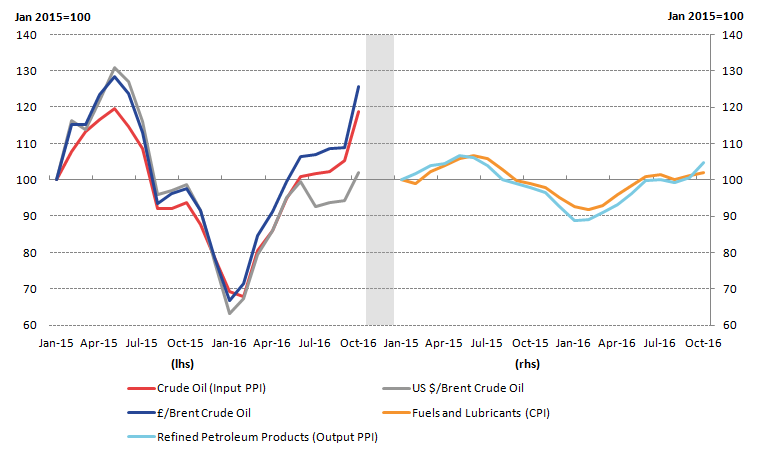
While Brent crude oil in US dollars and sterling closely tracked each other between January and December 2015, the 2 indicators started to deviate at the beginning of 2016. This gap widened further as a result of the depreciation of sterling towards the end of June 2016, following the UK’s referendum on its membership of the European Union. In October 2016, Brent crude oil priced in pound sterling increased at a faster rate than Brent crude oil priced in US dollars. In the year to October 2016, dollar Brent crude oil prices increased by 3.5% compared with 28.8% for pound sterling crude oil prices over the same period.
The additional cost to manufacturers following the increase in crude oil prices in sterling terms is likely to particularly affect the output component of PPI for “refined petroleum products”. In the year to October 2016, refined petroleum products contributed 0.49 percentage points to the 2.1% increase in output PPI. The right-hand panel of Figure 12 shows the relationship between the growth in the price of refined petroleum products (output PPI) and fuels and lubricants (a component of CPI) since January 2015. Both indices have generally moved together over this time period and the relationship may continue over the coming months.
Analysis of HPI
House price indicators for September suggested a period of relative stability during the month. House prices grew by 7.7% over the year to September, unchanged from August. While there is some evidence of a slight recovery in demand on the month, both demand and supply indicators remained somewhat weaker than in 2015 and early 2016.
There is evidence of regional variation with the Bank of England Agents’ Summary for Quarter 3 (July to Sept) 2016, saying there was a marked slowdown in activity in London and surrounding areas, but activity has fared better elsewhere in the UK.
In terms of housing demand, the Royal Institution of Chartered Surveyors (RICS) market survey for September reported a modest increase in new buyer enquiries – the first increase since February.
Figure 13 shows the 12-month growth rates in the volume and value of lending approvals for house purchases in the UK, against the growth in the UK House Price Index (HPI). All series are seasonally adjusted. The value and volumes of lending for house price purchases have shown wide movements since January 2005, with particular swings of negative 70% in the middle of 2008 compared with the middle of 2007, and a strong recovery of over 100% in 2009 compared with 2008.
Since 2009 there have been 3 growth periods in the volume and value of lending around 2012, 2014 and late 2015 into early 2016. The growth in the HPI broadly follows the cyclical movements in volumes and values of housing lending between 2005 and 2014 – although the scales are very different in Figure 13. It should be noted that house prices are captured at the end of the property transaction while mortgage approvals are at the beginning of the process – potentially explaining some of the lagged movements in the data.
In the most recent period average house prices have been growing steadily at around 7 to 8% per year while there has been more volatility in lending volumes and values. The most recent month has seen a fall of around 9% in both lending volumes and values over September 2015 while house prices have continued to rise at 7.7%.
Some of this difference in the series’ movements may be accounted for by increased quantities of cash purchases and larger deposits being required to supplement mortgage-financed purchases between 2014 and 2016. In this situation, house prices can continue to grow while the volume and value of mortgage lending slows. The change to stamp duty charges for buy-to-let properties, which came into force in April 2016, also created incentives to complete house purchases prior to the change coming in, causing a rise in the volume and value of lending for house purchases alongside continued house price growth.
Figure 13: Annual growth in volume of sterling approvals, value of lending for house purchases and UK House Price Index January 2006 to September 2016

Source: Bank of England, Office for National Statistics, Land Registry
Download this image Figure 13: Annual growth in volume of sterling approvals, value of lending for house purchases and UK House Price Index January 2006 to September 2016
.png (31.6 kB) .xls (43.0 kB)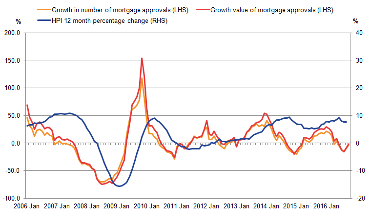
On the supply side, RICS also reported that new sales listings fell again in September compared with August, continuing the trend over the past 7 months. Our latest output in the construction industry bulletin reported a fall in construction of all new housing of 0.9% in August 2016, but there was a return to growth in September 2016 with output increasing by 0.7%. Year-on-year growth for new housing construction remained strong, with an increase of 8.9% compared with September 2016, the tenth period of year-on-year growth.
Notes for prices analysis
- Import intensity' refers to the percentage of final household consumption which is directly due to imports. This does not include the effect of goods which are imported and then used as inputs for goods produced domestically. As imports data is provided on a Classification of Products by Activity (CPA) basis which is not directly comparable to the COICOP classification, these estimates should be regarded as indicative.
8. Distribution of earnings
An analysis of the distribution of earnings using ASHE 2016 data and previous ASHE datasets over time was published on 26 October 2016. The analysis looks at some differences in the earnings distribution of UK workers by sex, region, skill level, age and working pattern. Earnings growth for those in employment between two consecutive years is also discussed. The analysis focuses on the low-end of the distribution and highlights some interesting elements of the National Living Wage (NLW) introduced in April 2016 for adults 25 years and over.
Using the same methodology, this section of the Economic Review provides some further analysis in three areas:
- part-time wage distribution and hourly earnings growth which was particularly strong in 2016 compared with 2015
- gender pay differences within the public and private sectors, and
- which industries had the greatest share of around zero wage growth (including bonuses) in April 2016
Part-time earnings compared to full-time earnings
Figure 14 shows that although both full-time and part-time workers have a similar spike of earnings around £7.20 (plus or minus 20p) per hour (which is close to the National Living Wage of £7.20 for those 25 years and over) around 18.6% of part-time workers (left hand scale) receive this rate of pay, compared with around 5.5% of full-time workers (right hand scale). A greater share of part-time workers receive relatively low pay rates of between £7.20 per hour and £10.20 per hour compared with full-time workers. A greater share of full-time workers receive higher pay rates above £10.20 per hour.
Figure 14: Distribution of gross hourly earnings by working pattern, April 2016
+/- 20 pence, UK
Source: Annual survey of hours and earnings, Office for National Statistics
Notes:
- Full-time is defined as employees working more than 30 paid hours per week (or 25 or more for the teaching professions).
- Each point on the x-axis represents a rolling sum of the density of jobs receiving greater than or equal to 20 pence below, and strictly less than 20 pence above, the stated hourly earnings.
- As the density records the rolling sum of jobs paid within 20 pence of the stated amount at each point on the x-axis, jobs paid the April 2016 Adult National Living Wage (£7.20) will appear between the x-axis values of £7.00 and £7.40.
Download this chart Figure 14: Distribution of gross hourly earnings by working pattern, April 2016
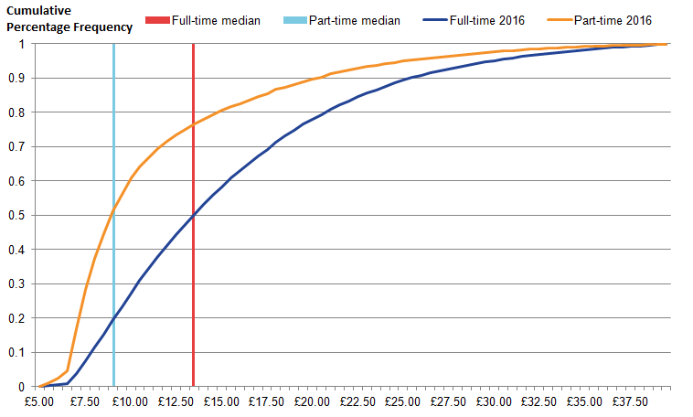
Image .csv .xlsFigure 15 shows the cumulative density distribution of part-time and full-time gross hourly earnings in April 2016. This presentation of the density distribution data shows how full-time hourly pay always lies above part-time hourly pay across the distribution, as well as at the median.
Figure 15: Cumulative distribution of gross hourly full-time and part-time earnings (including overtime), April 2016
UK
Source: Annual survey of hours and earnings, Office for National Statistics
Notes:
- Full-time is defined as employees working more than 30 paid hours per week (or 25 or more for the teaching professions)
- The distribution relates to a slightly truncated hourly pay sample of to £39.50 per hour due to disclosure control issues for part-time employees at this rate.
- Median part-time gross hourly pay is £8.91 per hour in April 2016.
- Median full-time gross hourly pay is £13.67 per hour in April 2016.
Download this image Figure 15: Cumulative distribution of gross hourly full-time and part-time earnings (including overtime), April 2016
.png (22.2 kB) .xls (37.9 kB)
Percentages earning close to the National Minimum Wage or National Living Wage
Figure 16 examines the proportion of workers that are on or near 1% of the National Minimum Wage (NMW), or more recently the National Living Wage (NLW), since 1999. To examine the differences in pay between different working patterns, we look at full-time and part-time working patterns. The proportion of part-time workers that are around 1% of the NMW or NLW is considerably higher than full time workers for all years in this series.
Figure 16: share of employees who earn within 1% of the National Minimum Wage or National Living Wage, by working pattern, April 1999 to April 2016, UK
UK
Source: Office for National Statistics
Notes:
- Full-time is defined as employees working more than 30 paid hours per week (or 25 or more for the teaching professions)
- For years prior to 2009, the chart includes data for employees who are 22 and over. For 2009 to 2015, the chart includes data for employees who are 21 and over. For 2016, the chart includes data for employees who are 25 and over. The change in age ranges over time relates to the eligibility for the adult rate of the National Minimum Wage or National Living Wage.
Download this chart Figure 16: share of employees who earn within 1% of the National Minimum Wage or National Living Wage, by working pattern, April 1999 to April 2016, UK
Image .csv .xlsThe percentage point gap between the share of each type of working pattern (which is within 1% of the NLW or NMW) has widened over time, particularly since 2010. In 2016 12.5% part-time workers were within 1% of the NLW compared to 2.6% of full-time workers – a gap of 9.9 percentage points. At the beginning of the series the gap was only 4 percentage points.
In terms of change over time, in 2016, the proportion of full-time workers who were 25 and over and earning near 1% of the new NLW in 2016 (compared to full-time workers who were 21 years or over and earning near 1% of the NMW in 2015) grew by 0.5 percentage points. The equivalent change for part time workers was 1.4 percentage points.
Growth in part-time earnings
Figure 17 shows the density distribution of part-time workers’ earnings but only shows the part of the density distribution lying between around £6 per hour and around £9 per hour in 2015 and 2016 to see the movements in this pay range more clearly.
The modal density has clearly shifted rightwards towards the new National Living Wage of £7.20 in 2016. Around 18.0% of part-time workers in 2015 earned £6.68 per hour (+/- 20 p) which is close to the NMW of £6.70 per hour while around 18.6% earned around £7.34 per hour (+/- 20p) in 2016 (close to the NLW of £7.20 per hour).
A greater share of part-time workers are also receiving higher wages (above the new NLW), up to around £9 per hour in 2016 compared with 2015. This illustrates some possible spill-over effects for those earnings just above the NLW pay rates for part-time workers in 2016.
Figure 17: Part of the density distribution of gross hourly earnings for part-time workers earning between £6 and £9 per hour, April 2015 and April 2016, UK
UK
Source: Office for National Statistics
Notes:
- Full-time is defined as employees working more than 30 paid hours per week (or 25 or more for the teaching professions).
- Each point on the x-axis represents a rolling sum of the density of jobs receiving greater than or equal to 20 pence below, and strictly less than 20 pence above, the stated hourly earnings.
- As the density records the rolling sum of jobs paid within 20 pence of the stated amount at each point on the x-axis, jobs paid the April 2016 Adult National Living Wage (£7.20) will appear between the x-axis values of £7.00 and £7.40.
Download this chart Figure 17: Part of the density distribution of gross hourly earnings for part-time workers earning between £6 and £9 per hour, April 2015 and April 2016, UK
Image .csv .xlsThis partly explains why there has been a relatively large increase of 5.2% in part-time median gross hourly pay (including overtime) between 2015 and 2016 as a much greater share of part-time workers have earnings close to the National Living Wage in 2016.
Public and private sectors
Figures 18a and 18b show the distribution of public and private sector earnings by gender. There is a stark difference between the earning profiles of those in the public sector and those working in the private sector. More private sector workers earn an hourly wage close to the NLW than public sector workers in 2016. Both figures feature much larger spikes around the NLW for private sector workers in comparison to public sector, regardless of gender. This is likely to reflect the types of occupations in each sector.
Figure 18a: Distribution of gross nominal hourly earnings by sector, males only, April 2016
UK
Source: Office for National Statistics
Notes:
- Each point on the x-axis represents a rolling sum of the density of jobs receiving greater than or equal to 20 pence below, and strictly less than 20 pence above, the stated hourly earnings.
- As the density records the rolling sum of jobs paid within 20 pence of the stated amount at each point on the x-axis, jobs paid the April 2016 Adult National Living Wage (£7.20) will appear between the x-axis values of £7.00 and £7.40.
Download this chart Figure 18a: Distribution of gross nominal hourly earnings by sector, males only, April 2016
Image .csv .xls
Figure 18b: Distribution of gross nominal hourly earnings by sector, females only, April 2016
UK
Source: Office for National Statistics
Download this chart Figure 18b: Distribution of gross nominal hourly earnings by sector, females only, April 2016
Image .csv .xlsComparing men and women by sector
Men and women tend to have different earning profiles: more men tend to be in higher pay brackets and the proportion of women closer to the National Living Wage is higher than men. There are a greater proportion of private sector females earning around the NLW in comparison to males in the private sector. For females in the public sector, there is less of a clear spike around the NLW and a much higher proportion of female on wages above £10 per hour compared to females in the private sector.
The distribution of earnings for male public sector workers is relatively smooth, with a higher proportion of workers earning over around £13 per hour than male private sector workers. This is similar to female public sector workers although there are greater shares of public sector female workers earning more than around £10 per hour (compared to around £13 per hour for men) than female private sector workers.
There is also a greater proportion of male private sector workers on higher wages than female private sector workers. This is represented by a smaller gap in the percentage density between male public and private workers at higher wages, whereas for women, there is a much larger gap between the private and public sector.
Earnings growth by sector and gender
Figures 19a and 19b shows the growth in gross nominal hourly earnings in the public and private sector in 2016 by gender. For the purposes of this analysis, only workers who are employed in two consecutive years are considered (this accounts for approximately two thirds of employees in the sample) and the pay measure is hourly earnings including overtime pay.
Figure 19a shows that the most common nominal pay rise for the private sector was around zero percent for both men and women between April 2015 and April 2016. For public sector workers, the most common nominal pay rise was around 1% for both men and women.
Around 11.8% of male and 10.4% of female private sector workers experienced a nominal hourly earnings growth of around zero, and around 14.5% of male and 14.7% of female public sector workers experienced a nominal hourly earnings growth of around 1%.
Figures 19a and 19b also show that a greater share of private sector workers received a pay growth of around 10.8% in 2016 than public sector workers, regardless of gender. However this pay rise was particularly evident in female private sector workers, with a large share (4.9%) receiving a pay growth of around 10.8%. This was considerably more than male private sector workers (3.1%). This is likely to be partly attributable to the introduction of the National Living Wage.
Figure 19a: Gross hourly earnings growth by sector, males only, April 2015 to April 2016
UK
Source: Office for National Statistics
Notes:
- This chart uses individual level data from ASHE to calculate the growth of nominal weekly earnings for individuals observed in pairs of years in 2015 and 2016. Note that the ASHE methodology is not specifically designed to model earnings growth for individuals over time.
- Note that the proportion of people experiencing a pay growth between 10% and 11% may not reflect the proportion of people on the National Living Wage in the earnings distribution in April 2016. This is because the growth analysis is focussing on employed workers in two consecutive periods and not just in April 2016.
Download this chart Figure 19a: Gross hourly earnings growth by sector, males only, April 2015 to April 2016
Image .csv .xls
Figure 19b: Gross hourly earnings growth by sector, females only, 2016
UK
Source: Office for National Statistics
Notes:
- This chart uses individual level data from ASHE to calculate the growth of nominal weekly earnings for individuals observed in pairs of years in 2015 and 2016. Note that the ASHE methodology is not specifically designed to model earnings growth for individuals over time.
- Note that the proportion of people experiencing a pay growth between 10% and 11% may not reflect the proportion of people on the National Living Wage in the earnings distribution in April 2016. This is because the growth analysis is focussing on employed workers in two consecutive periods and not just in April 2016.
Download this chart Figure 19b: Gross hourly earnings growth by sector, females only, 2016
Image .csv .xlsAnalysis of zero nominal pay growth by industry
This section presents data from the Annual Survey of Hours and Earnings (ASHE) relating to workers experiencing ‘pay freezes’ (i.e. around zero nominal earnings growth). For the purposes of this analysis, only workers who are employed in two consecutive years are considered (this accounts for approximately two thirds of employees in the sample) and the pay measure is hourly earnings including overtime pay.
Figure 20 shows the proportion of employed workers experiencing nominal pay freezes alongside the CPI inflation rate for April in each year from 2002 to 2016 (the inflation rate for April is used since the ASHE sample is collected in April).
Figure 20: Proportion of continuously employed workers experiencing nominal pay growth of around zero percent, and growth rate in CPI 2002 to 2016
UK
Source: Office for National Statistics
Notes:
- Annual CPI growth is taken for April each year. 2.This chart uses individual level data from ASHE to calculate the growth of nominal weekly earnings for individuals observed in pairs of years in 2015 and 2016 and the share of those receiving zero pay growth. Note that the ASHE methodology is not specifically designed to model earnings growth for individuals over time.
Download this chart Figure 20: Proportion of continuously employed workers experiencing nominal pay growth of around zero percent, and growth rate in CPI 2002 to 2016
Image .csv .xlsThe chart shows a clear break before and after the economic downturn of 2008-2009 in terms of the proportion of workers experiencing nominal pay freezes. From 2002 to 2008 (where 2008 measures wage growth between 2007 and 2008) the average proportion was around 5%, but since then (2009 to 2016) the average proportion was around 11%.
CPI inflation is also presented on the chart to consider whether there was any positive correlation between periods of close to zero inflation and the share of employees receiving around zero percent pay rises. This would imply real wages would not fall significantly in these periods. In fact, Figure 21 suggests that, particularly between 2010 and 2012 in the period immediately after the economic downturn, a higher prevalence of nominal wage freezes coincided with above-average inflation rates, implying real pay cuts in those years.
Table 1 shows the ten industries in which nominal pay freezes were most prevalent in 2016 (using the Standard Industrial Classification, or SIC at the 2 digit level).
Table 1: Top 10 industries by the share of employees experiencing around a zero percent pay increase, April 2016
| SIC code | Industry | Number of employees experiencing pay freezes as a proportion of the total number of workers experiencing pay freezes between 2015 and 2016, % | Proportion of total of those in employment in both 2015 and 2016, % | Difference (percentage points) |
| 85 | Education | 17.1 | 14.7 | 2.4 |
| 84 | Public Administration and Defence; Compulsory Social Security | 7.0 | 5.6 | 1.4 |
| 46 | Wholesale trade, except of motor vehicles and motorcycles | 5.7 | 4.0 | 1.7 |
| 47 | Retail trade, except of motor vehicles and motorcycles | 5.2 | 11.7 | -6.5 |
| 86 | Human Health and Social Work Activities | 4.7 | 10.2 | -5.5 |
| 43 | Specialised construction activities | 3.6 | 1.5 | 2.1 |
| 88 | Social work activities without accommodation | 2.9 | 2.4 | 0.5 |
| 45 | Wholesale and retail trade and repair of motor vehicles and motorcycles | 2.9 | 1.7 | 1.2 |
| 69 | Legal and accounting activities | 2.6 | 1.8 | 0.8 |
| 62 | Computer programming, consultancy and related activities | 2.4 | 1.4 | 1.0 |
| Source: Office for National Statistics | ||||
Download this table Table 1: Top 10 industries by the share of employees experiencing around a zero percent pay increase, April 2016
.xls (26.6 kB)Table 1 shows that more workers in the education industry (SIC 85) received a zero % nominal pay rise in April 2016 than workers who were in employment in 2015 and 2016 in other industries, and slightly more (2.4 percentage points) than their share of the overall number of workers in employment in both periods. Similarly those employees in wholesale trade, except motor vehicles and motorcycles (SIC 46) and specialised construction activity (SIC 43) experienced a more than proportionate share of pay freezes than their share of total employment in both periods.
On the other hand, a smaller share of employees in the human health and social work activities (SIC 86) and retail trade except motor vehicles and motorcycles (SIC 47) industries experienced pay freezes than their share of total continuous employment.
Looking within each 2-digit industry gives a slightly more granular picture of where zero percentage pay growth is most concentrated. The top 10 SIC 2 digit industries are shown in Figure 21.
As in Table 1, in April 2016, a relatively large share (16%) of employees in the specialised construction industry received no pay growth. Other types of construction industries e.g. of buildings and manufacturing of furniture and fabricated metal products feature in this analysis of relatively concentrated zero percentage pay growth.
Figure 21: Top 10 industries by share of around zero % earnings growth, UK, April 2016
UK
Source: Office for National Statistics
Download this chart Figure 21: Top 10 industries by share of around zero % earnings growth, UK, April 2016
Image .csv .xlsNotes for Distribution of earnings:
The Annual Survey of Hours and Earnings (ASHE) is based on a 1% sample of employee jobs taken from HM Revenue and Customs PAYE records. Consequently, individuals with more than one job may appear in the sample more than once. Information on earnings and hours is obtained from employers and treated confidentially. ASHE does not cover the self-employed or employees not paid during the reference period. The information for 2016 pay period included 13 April 2016.
To avoid disclosure issues all the distributional analysis combines records into 20p pay bands and probability density charts are created which show the proportions of the population who are likely to earn within each +/- 20p pay band. Intervals of 2p are used in the analysis to maximise the granularity of the analysis.
9. ANNEX A – Dates of our upcoming releases
Users have been in contact with us to ask when any impact from the recent EU referendum could feed through to our economic statistics. Below we set out the release dates from our main economic indicators and the data periods they cover.
Table 2: Dates of upcoming ONS releases
| Date | Indicator | Details | Date of following release |
| 07/12/2016 | UK index of production: Oct 2016 | Provides data for October | 11/01/2017: provides data for November 2016 |
| 09/12/2016 | UK trade: Oct 2016 | Provides data for October | 11/01/2017 : provides data for November 2016 |
| 09/12/2016 | Construction output in Great Britain: Oct 2016 and new orders July to Sept 2016 | Provides data for October | 11/01/2017: provides data for November 2016 |
| 13/12/2016 | Consumer Price Index 2016, November 2016 | Provides data for November | 15.01.2017 (provisional): provides data for December 2016 |
| 13/12/2016 | Producer Prices, November 2016 | Provides data for November | 15.01.2017 (provisional): provides data for December 2016 |
| 13/12/2016 | UK House Price index, October 2016 | Provides data for October | 17/01/2017: provides data for November 2016 |
| 14/12/2106 | UK labour market statistics: Dec 2016 | Provides data for August to October | 18/01/2017: provides data for September to November 2016 |
| 15/12/2016 | Retail Sales, November | Provides data for November | 19/01/2017: provides data for December 2016 |
| 15/12/2016 | Investment by insurance companies, pension funds and trusts in the UK (MQ5): Quarter 3 (July to September) 2016 | The first MQ5 release including an entirely post-referendum period | March 2017 (provisional) : provides data for Quarter 4 2016 |
| 21/12/2016 | UK public sector finances: Nov 2016 | Provides data for November | 24/01/2017: provides data for December 2016 |
| 22/12/2016 | Index of private housing rental prices (IPHRP) in Great Britain, results: Nov 2016 | Provides data for November | 27/01/2017 (provisional) provides data for December 2016 |
| 22/12/2016 | Overseas travel and tourism, monthly provisional results: October 2016 | Provides data for October 2016 | 27/01/2017 : provides data for November 2016 |
| 23/12/2016 | UK quarterly national accounts: July to Sept 2016 | Provides data for Q3 | 26/1/2017: Preliminary estimate of Q4 GDP |
| 23/12/2016 | Index of Services, October | Provides data for October | 26/1/2017: provides data for November |
| 23/12/2016 | Balance of Payments, Quarter 3 | The first Balance of Payments figures folowing the referendum | 31/3/2017: provides data for Quarter 4 2016 |
| 23/12/2016 | Economic Accounts, Quarter 3 | Provides data for quarter 3 | 31/3/2017: provides data for Quarter 4 2016 |
| 23/12/2016 | Consumer Trends, Quarter 3 | Provides data for quarter 3 | 31/3/2017: provides data for Quarter 4 2016 |
| 23/12/2016 | Business Investment revised, quarter 3 | Provides data for quarter 3 | 23/2/2017: provides provisional data for Quarter 4 2016 |
| 23/12/2016 | Economic Well-being, Quarter 2 | Provides data for quarter 3 | 31/3/2017: provides data for Quarter 4 2016 |
| 11/01/2017 | UK index of production: Nov 2016 | Provides data for November | 10/02/2017: provides data for December 2016 |
| 11/01/2017 | UK trade: Nov 2016 | Provides data for November | 10/02/2017: provides data for December 2016 |
| 11/01/2017 | Construction output in Great Britain: Nov 2016 | Provides data for November | 10/02/2017: provides data for December 2016 and new orders October to December |
| 17/01/2017 | Consumer Price Index December | Provides data for December 2016 | 14/02/2017: provides data for January 2017 |
| 17/01/2017 | Producer Prices, December 2016 | Provides data for December 2016 | 14/02/2017: provides data for January 2017 |
| 17/01/2017 | UK House Price index, November 2016 | Provides data for November | 14/02/2017: provides data for January 2017 |
| 18/01/2017 | UK labour market statistics: January 2017 | Provides data for September to November 2016 | 15/02/2017: provides data for October to December 2016 |
| 20/01/2017 | Retail Sales, December | Provides data for December 2016 | 17/02/2017 : provides data for January 2017 |
| 24/01/2017 | UK public sector finances: Dec 2016 | Provides data for December 2016 | 21/02/2017: provides data for January 2017 |
| 26/01/2017 | UK index of services: Nov 2016 | Provides data for November | 23/02/2017: provides data for December 2016 |
| 26/01/2017 | UK GDP, preliminary estimate: Oct to Dec 2016 | Provides first estimate of final quarter of 2016 | 23/02/2017: provides data for 2nd estimate of Q4 |
| 27/01/2017 | Index of private housing rental prices (IPHRP) in Great Britain, results: Dec 2016 | Provides data for December 2016 | 14/02/2017: provides data for January 2017 |
| 23/02/2017 | Migration in the UK, February | While this includes IPS estimates up to 30 September, most of the period was before the referendum | 25/05/2017: provides data up to 31 December 2016. Half of this period was before the referendum |
| Source: Office for National Statistics | |||
Download this table Table 2: Dates of upcoming ONS releases
.xls (35.3 kB)10. Demand and supply indicators
Table 3: UK demand side indicators
| 2014 | 2015 | 2016 | 2016 | 2016 | 2016 | 2016 | 2016 | 2016 | 2016 | |
| Q1 | Q2 | Q3 | Jun | Jul | Aug | Sep | Oct | |||
| GDP | 3.1 | 2.2 | 0.4 | 0.7 | 0.5 | |||||
| Index of Services | ||||||||||
| All Services1 | 3.3 | 2.5 | 0.7 | 0.6 | 0.8 | 0.3 | 0.3 | 0.3 | 0.2 | .. |
| Business Services & Finance1 | 3.9 | 2.6 | 0.7 | 0.6 | 0.3 | 0.3 | 0.1 | 0.0 | 0.1 | .. |
| Government & Other1 | 1.7 | 0.5 | 0.5 | 0.1 | 0.5 | 0.2 | 0.2 | 0.1 | 0.2 | .. |
| Distribution, Hotels & Rest1 | 4.8 | 4.6 | 1.4 | 1.1 | 1.1 | 0.1 | -0.1 | 1.2 | 0.6 | .. |
| Transport,Stor. & Comms1 | 3.0 | 3.8 | - | 0.6 | 2.3 | 0.9 | 1.6 | 0.5 | 0.0 | .. |
| Index of Production | ||||||||||
| All Production1 | 1.5 | 1.3 | -0.1 | 2.1 | -0.5 | 0.0 | 0.1 | -0.4 | -0.4 | .. |
| Manufacturing1 | 2.9 | -0.1 | -0.3 | 1.6 | -0.9 | -0.2 | -0.9 | 0.2 | 0.6 | .. |
| Mining & Quarrying1 | 0.6 | 8.5 | -1.2 | 2.8 | 4.3 | 1.6 | 6.8 | -2.9 | -3.8 | .. |
| Construction1 | 8.0 | 4.9 | 0.8 | -0.1 | -1.1 | |||||
| Retail Sales Index | ||||||||||
| All Retailing1 | 4.0 | 4.4 | 1.5 | 1.1 | 1.9 | -0.7 | 2.0 | 0.2 | 0.1 | 1.9 |
| All Retailing excl Fuel1 | 4.3 | 4.0 | 1.5 | 1.2 | 2.0 | -0.6 | 2.0 | 0.0 | 0.1 | 2.0 |
| Predom. Food Stores1 | 1.0 | 2.2 | 1.6 | 0.3 | 1.2 | -0.2 | 0.7 | 0.6 | -0.4 | 0.8 |
| Predom. Non-Food Stores1 | 6.4 | 4.4 | 1.3 | 1.3 | 1.6 | -1.4 | 3.5 | -1.4 | -0.3 | 2.7 |
| Non-Store Retailing1 | 12.0 | 13.1 | 2.6 | 5.9 | 7.5 | 1.4 | 0.7 | 4.4 | 4.1 | 3.6 |
| Trade | ||||||||||
| Balance2 3 | -36.2 | -38.7 | -10.0 | -12.7 | -11.0 | -5.7 | -2.1 | -3.8 | -5.2 | .. |
| Exports4 | -1.2 | -0.6 | 2.1 | 1.6 | 3.4 | 0.5 | 4.3 | 0.9 | -0.4 | .. |
| Imports4 | -1.6 | -0.1 | 1.5 | 3.4 | 2.0 | 3.9 | -3.5 | 4.5 | 2.5 | .. |
| Public Sector Finances | ||||||||||
| PSNB-ex3 5 | -0.6 | -23.1 | -4.5 | -2.4 | -1.6 | -1.8 | -1.3 | -0.7 | 0.5 | -1.6 |
| PSND-ex as a % GDP | 83.9 | 84.8 | 84.0 | 84.1 | 83.9 | 84.1 | 83.3 | 83.3 | 83.9 | 83.8 |
| Source: Office for National Statistics | ||||||||||
| Notes: | ||||||||||
| 1. Percentage change on previous period, seasonally adjusted, CVM. | ||||||||||
| 2. Levels, seasonally adjusted, CP. | ||||||||||
| 3. Expressed in £ billion. | ||||||||||
| 4. Percentage change on previous period, seasonally adjusted, CP. | ||||||||||
| 5. Public Sector net borrowing, excluding the impact of financial interventions. Level change on previous period a year ago, not seasonally adjusted. | ||||||||||
Download this table Table 3: UK demand side indicators
.xls (30.2 kB)
Table 4: UK supply side indicators
| 2014 | 2015 | 2016 | 2016 | 2016 | 2016 | 2016 | 2016 | 2016 | 2016 | |
| Q1 | Q2 | Q3 | Jun | Jul | Aug | Sep | Oct | |||
| Labour Market | ||||||||||
| Employment Rate1 2 | 72.9 | 73.7 | 74.2 | 74.5 | 74.5 | 74.5 | 74.5 | 74.5 | .. | .. |
| Unemployment Rate1 3 | 6.2 | 5.4 | 5.1 | 4.9 | 4.8 | 4.9 | 4.9 | 4.8 | .. | .. |
| Inactivity Rate1 4 | 22.2 | 22.0 | 21.7 | 21.6 | 21.7 | 21.5 | 21.5 | 21.7 | .. | .. |
| Claimant Count Rate 7 | 3.0 | 2.3 | 2.1 | 2.2 | 2.3 | 2.2 | 2.2 | 2.3 | 2.3 | 2.3 |
| Total Weekly Earnings6 | 480.0 | 492.0 | 497.0 | 502.0 | 505.0 | 502.0 | 505.0 | 504.0 | 505.0 | .. |
| CPI | ||||||||||
| All-item CPI5 | 1.5 | 0.0 | 0.3 | 0.4 | 0.7 | 0.5 | 0.6 | 0.6 | 1.0 | 0.9 |
| Transport5 | 0.3 | -2.1 | -0.6 | -0.9 | 0.8 | -0.2 | 0.2 | 1.0 | 1.2 | 2.3 |
| Recreation &Culture5 | 0.9 | -0.6 | -0.1 | 0.5 | 0.7 | 0.8 | 0.6 | 0.7 | 0.8 | 0.2 |
| Utilities5 | 3.0 | 0.5 | 0.4 | 0.0 | 0.0 | 0.1 | -0.1 | -0.1 | 0.2 | 0.3 |
| Food & Non-alcoh Bev5 | -0.2 | -2.6 | -2.5 | -2.7 | -2.3 | -2.9 | -2.6 | -2.2 | -2.3 | -2.4 |
| PPI | ||||||||||
| Input8 | -6.6 | -12.8 | -7.6 | -4.1 | 6.4 | -0.5 | 4.2 | 7.8 | 7.3 | 12.2 |
| Output8 | 0.0 | -1.7 | -1.0 | -0.4 | 0.9 | -0.2 | 0.4 | 0.9 | 1.3 | 2.1 |
| HPI8 | 8.0 | 5.9 | 7.9 | 8.7 | 7.8 | 9.4 | 8.0 | 7.7 | 7.7 | .. |
| Source: Office for National Statistics | ||||||||||
| Notes: | ||||||||||
| 1. Monthly data shows a three month rolling average (e.g. The figure for April is for the three months March to May) | ||||||||||
| 2. Headline employment figure is the number of people aged 16-64 in employment divided by the total population 16-64 | ||||||||||
| 3. Headline unemployment figure is the number of unemployed people (aged 16+) divided by the economically active population (aged 16+) | ||||||||||
| 4. Headline inactivity figure is the number of economically active people aged 16-64 divided by the 16-64 population | ||||||||||
| 5. Percentage change on previous period a year ago, seasonally adjusted | ||||||||||
| 6. Estimates of total pay include bonuses but exclude arrears of pay (£) | ||||||||||
| 7. Calculated by JSA claimants divided by claimant count plus workforce jobs | ||||||||||
| 8. Percentage change on previous period a year ago, non-seasonally adjusted | ||||||||||