
1. National accounts at a glance
This section of the Blue Book provides an examination of recent trends, key movements and international comparisons for a range of information contained in a number of the subsequent Blue Book chapters.
All UK data referred to in this section are consistent with the latest Blue Book 2016 publication. All international data have been sourced from Eurostat or the Organisation for Economic Co-operation and Development (OECD) and are accurate at 11 July 2016.
Nôl i'r tabl cynnwys2. GDP and the headline economy
Chapter 1 of the 2016 Blue Book provides information on the headline economy, including gross domestic product (GDP), which is one of the most frequently-used indicators of total domestic activity. Trends in GDP can be compared with other major economies, and this shows that the experiences of the other major European economies varied notably during the 2008 to 2009 economic downturn and subsequent recovery.
Figure 1 shows that while all of the selected countries experienced contractions in output, their performances since 2009 have been markedly different. UK real GDP fell by 4.4% between 2008 and 2009, a contraction in line with that of the European Union (4.5%). In contrast, France experienced a smaller fall of 2.9% and Italy and Germany both experienced larger contractions of 5.7%.
Figure 1: Real GDP indexed to 2007=100 (chained volume measures) for major European economies, 2007 to 2015
Source: Office for National Statistics, Eurostat
Download this chart Figure 1: Real GDP indexed to 2007=100 (chained volume measures) for major European economies, 2007 to 2015
Image .csv .xlsHowever, it is the paths of GDP since 2009 that are more divergent. The level of UK GDP was (7.0%) higher in 2015 than it was in 2007, a relative increase similar to that of Germany. Yet UK GDP was (12.6%) higher in 2015 than it was in 2009; this is due to the rate of UK GDP growth being higher from 2012 onwards. These data also highlight the different economic conditions across these countries, with 2015 GDP remaining below the respective 2007 levels in both Italy and Spain.
Nôl i'r tabl cynnwys3. The industrial and expenditure composition of GDP growth
While movements in GDP provide a picture of how the whole economy is performing, it is also important to consider the performance of individual industries, trends in the types of expenditure driving GDP, and how “production” accrues to wages and profits. These 3 different aspects can be observed in the output, expenditure and income measures of GDP respectively. A comprehensive explanation of these 3 measures can be found on the national accounts methodology page.
Looking at the industrial composition of economic growth shows that countries who have experienced similar recoveries have not necessarily achieved this through improvements to output in similar industries. For example, while non-financial private services have driven output growth across all major European economies except Italy, this has been the most prominent industry in the UK, making a contribution of 10.8 percentage points (ppts) to gross value added (GVA) growth from 2009 to 2015.
However, Germany has seen a GVA growth of 12.1% between 2009 and 2015, and non-financial private services has contributed to a lesser extent (4.0 ppts). Instead, manufacturing has been the largest driver of Germany’s growth, contributing 6.4 ppts, in contrast to many of the other economies where it has made a relatively smaller contribution (0.7 ppts in the UK).
Construction has acted as a drag for most of these economies, particularly Spain where it pulled down GVA growth by 4.2 ppts. Even in the 2 economies where it had a positive impact on GVA – Germany and the UK – the contribution of output in construction has been relatively modest.
Figure 2: Output contributions to total GVA growth for major European economies from 2009 to 2015

Source: Office for National Statistics, Eurostat
Download this image Figure 2: Output contributions to total GVA growth for major European economies from 2009 to 2015
.png (21.6 kB) .xls (28.7 kB)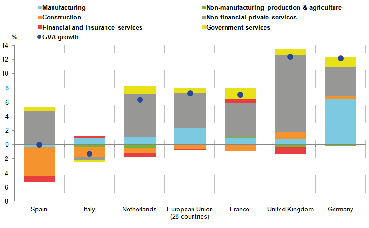
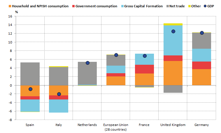
In terms of the expenditure measure of GDP, Figure 3 shows that, as well as gross capital formation, household and non-profit institutions serving households (NPISH) final consumption has been 1 of the main drivers of growth in the UK, contributing 5.6 ppts to GDP growth since 2009. However, this has not been the case for some other major European economies. While household consumption made a positive contribution in Germany, GDP growth has been more broad-based across components, with government consumption and net trade having larger positive contributions than in the UK.
While the other 4 components of expenditure have contributed positively to UK GDP growth since 2009, the UK is 1 of only 2 of the major European economies (the other being France) in which net trade has made a negative contribution to the recovery, equal to negative 1.8 ppts between 2009 and 2015. In Spain and Italy, economies that have experienced a more prolonged contraction in GDP, net trade has been the only major expenditure component to make a positive contribution, with household and NPISH consumption, government consumption and, in particular, fixed investment all making negative contributions.
In France, government consumption has been 1 of the main contributors to GDP growth, accounting for around 28.6 ppts of its GDP growth since 2009. This is markedly higher than for the other economies in which it has made a positive contribution, Germany and the UK, which were 14.1 ppts and 10.2 ppts respectively.
Figure 3: Expenditure contributions to total GDP growth for major European economies from 2009 to 2015, percent and percentage points
Source: Office for National Statistics, Eurostat
Download this image Figure 3: Expenditure contributions to total GDP growth for major European economies from 2009 to 2015, percent and percentage points
.png (19.1 kB) .xls (27.1 kB)
4. Trends in the income measure
Blue Book also includes supplementary information regarding different components that make up gross value added (GVA) for each industry. Under the income approach, GVA is split into compensation of employees (CoE), taxes less subsidies, gross operating surplus (GOS) and mixed income. Estimates of each industry’s intermediate consumption and total output are also published, with the difference between the 2 equalling GVA.
Such additional information available in Blue Book allows for more detailed analysis of national income. For example, CoE can be used to calculate how much of an industry’s production income accrues to wages and salaries and employers’ social contributions, whereas GOS data can be used to estimate how much profit is generated by companies after considering labour costs, taxes and subsidies.
For most (but not all) countries, CoE comprises the largest part of value added, and provides the basis for a number of important statistics including unit labour costs and the labour share of income. The latter can be interpreted as the proportion of output that is received by workers; 1 measure of this is the level of CoE as a proportion of nominal GDP, which is shown in Figure 4. As well as being an important indicator of how income is distributed across the sectors of an economy, the labour share of income has implications for consumer demand, UK competitiveness, and economic growth more generally.
Figure 4: Compensation of employees as a proportion of nominal GDP for major European economies, percent, 2000 to 2015
Source: Office for National Statistics, Eurostat
Download this chart Figure 4: Compensation of employees as a proportion of nominal GDP for major European economies, percent, 2000 to 2015
Image .csv .xlsFrom 1998 to 2015, UK CoE remained around 50% of nominal GDP, reaching 52.4% in 2009. In the most recent data, the UK’s share of CoE in nominal GDP is the third highest in the sample at 49.7%. In contrast, Italy’s share has been around 40% since 2009. While each country’s share has remained relatively constant over the period as a whole, there were sizeable changes during the economic downturn between 2008 and 2009. As nominal GDP started to fall, the labour share of income increased across all countries in the above figure.
The short-run trend of temporary increases in the labour share of income during downturns reflects, to some extent, the changing relationship between wages and productivity. If changes in productivity are not reflected in hourly wages (or vice versa), other things being equal, a change would be seen in the labour share. Economic theory stipulates that wages should be based on the productivity of workers so that, to a large extent, productivity and hourly wages should display similar trends. However, the UK’s labour share of income had been on a downward trend between 1975 and 1996, even though it has been more constant since. One interpretation is that productivity growth did not fully feed through into hourly wage growth as economic theory might suggest. A short-run breakdown of this relationship between wages and productivity may also explain why the labour share of income increases temporarily during downturns, a topic that has been explored further in our Examination of Falling Real Wages 2010-2013.
Nôl i'r tabl cynnwys5. The sector financial accounts
The United Kingdom Economic Accounts (UKEA), published by us, allow for an examination of the flow-stock relationship in the national accounts, with changes in flows such as income, spending and saving having an effect on assets and liabilities (stocks).
In the UKEA, the economy is grouped into a number of institutional sectors, split by type of activity, ownership and control. Sectors are defined as follows:
- non-financial corporations (NFCs)
- financial corporations (FINCOs)
- households and non-profit institutions serving households (households and NPISH)
- general government (GG)
- rest of the world
This provides us with a wealth of information on the UK’s economic performance and financial position relative to others. A comprehensive explanation of the headline sectors, income and capital accounts and the financial balance sheet can be found in published concepts, sources and methods.
The total value of financial and non-financial assets less financial liabilities represents the net worth of the UK economy. In 2015, this value rose to £8.8 trillion, a 5.9% rise on the previous year. Figure 5 shows how financial and non-financial assets and financial liabilities are distributed across 4 of the sectors. This shows that households and NPISH had a large positive net worth (the value of assets was greater than the value of liabilities) while the other sectors are more balanced, with the value of assets being close to that of liabilities, where financial and non-financial assets exceeded the value of financial liabilities.
Figure 5: UK assets, liabilities and net worth across the headline sectors, £ trillion, 2015

Source: Office for National Statistics
Download this image Figure 5: UK assets, liabilities and net worth across the headline sectors, £ trillion, 2015
.png (14.1 kB) .xls (27.6 kB)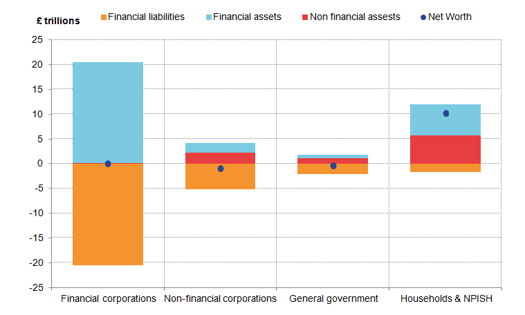
The total value of non-financial assets in the UK was £9.1 trillion in 2015. This is primarily comprised of dwellings and other buildings and structures, which together make up over four-fifths of the value of non-financial assets in the UK, with other fixed assets such as machinery and equipment, and inventories, also held.
Over 95% of dwellings are held by households while other buildings and structures are predominantly held by the non-financial corporations and general government sectors.
The total value of financial assets was £29.3 trillion in 2015; this includes a range of different asset types such as monetary gold, currency, securities, loans and insurance. This was matched by £29.6 trillion of financial liabilities, giving a net balance for financial assets of negative £0.3 trillion. These assets and liabilities were primarily held by financial corporations.
Figure 6 shows the decomposition of non-financial assets held in 2015 by sector. Household non-financial assets are shown to be almost entirely held as residential dwellings, while non-financial corporations hold a broader, more evenly distributed range of asset classes, such as machinery and equipment, and inventories. The general government and financial corporation sectors have a very similar asset mix, holding a large proportion of other buildings and structures with some machinery and equipment.
Figure 6: UK non-financial assets breakdown by sector 2015
Source: Office for National Statistics
Notes:
- Figure 6 does not include Non-produced non-financial assets as all values equalled zero.
Download this chart Figure 6: UK non-financial assets breakdown by sector 2015
Image .csv .xlsThere are, however, vast differences in the financial asset and liability mix across sectors, as shown in Figure 7. The general government sector is shown to hold most of its liabilities in debt securities, which reflects the fact that government tend to raise liquidity through government bonds. In contrast, households hold most liabilities in loans: of the £1.8 trillion of total financial liabilities in the household and NPISH sector in 2015, 92.6% came from loans, which can be attributed to mortgage debts necessary to pay for the residential dwellings assets held. Non-financial corporations hold most of their liabilities in shares and other equity.
On the financial assets side, households hold the majority of assets in insurance and pension schemes (which can be attributed to pensions and insurance products owned by households), but also hold some shares, currency and deposits. Other sectors hold a greater proportion of shares, debt securities and loans.
Figure 7: UK financial assets and liabilities breakdown by sector, 2015

Source: Office for National Statistics
Notes:
- NFC stands for non-financial corporations, FC stands for financial corporations, GG stands for general government, and HH and NPISH stands for households and non-profit institutions serving households.
Download this image Figure 7: UK financial assets and liabilities breakdown by sector, 2015
.png (25.0 kB) .xls (29.2 kB)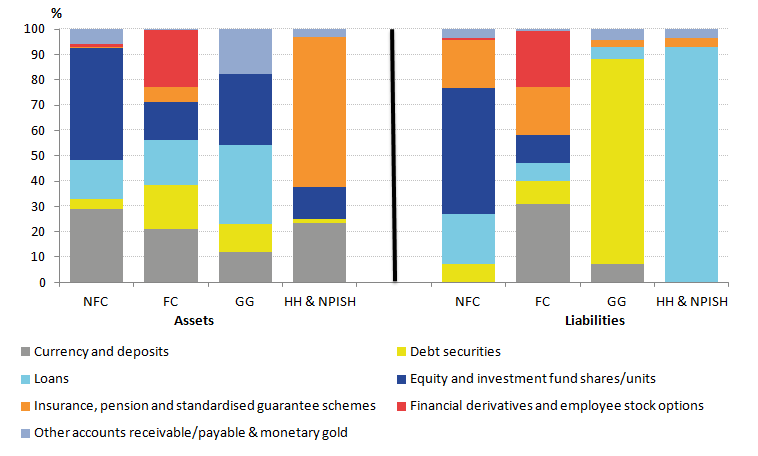
6. Households
The households section of the Blue Book provides a large amount of disaggregated information for the sources of household disposable income and the breakdown of household expenditure. Comparing these data over time allows for analysis of how events, such as the 2008 to 2009 economic downturn, can affect household spending habits and the income that they receive. Figure 8 shows the growth in total primary income resources received by households. This measure presents the income received by households for their role in the production process, plus any property income received from their existing stock of assets. It consists of wages and salaries, employers’ social contributions, property income, and mixed income and gross operating surplus (which includes income from self-employment). The measure of property income received includes rent, dividends and interest. As these data are taken from the primary income account, it shows households’ resources before the effects of taxes and benefits.
Figure 8: Breakdown of growth of UK household resources, percent and percentage points, 1997 to 2015
Source: Office for National Statistics
Notes:
- GOS stands for gross operating surplus.
Download this chart Figure 8: Breakdown of growth of UK household resources, percent and percentage points, 1997 to 2015
Image .csv .xlsThe largest positive contribution to household resources growth between 1997 and 2008 was wages and salaries. During the economic downturn and the subsequent recovery, the growth of this component became more subdued, and in 2009, the contribution of wages and salaries increased total household resources by just 0.1 percentage points (ppts). Meanwhile, mixed income and gross operating surplus (GOS) acted to reduce resources growth by 5.7 ppts and property income by 4.2 ppts, which coincided with the large reduction in interest rates on deposits.
Since 2009, Figure 8 shows that strengthening growth in wages and salaries has acted to improve total resources growth gradually. In 2015, the negative contribution of property income and declining contribution of mixed income and GOS have led to a lower level of household resources growth compared with 2014. In 2015, wages and salaries continued to drive growth and contributed 2.1 ppts. The increase to total resources growth has been supported by growth in mixed income with GOS contributing 0.8 ppts. In 2014, social contributions acted to reduce total resources for the first time since 2008 (by 0.3 ppts) and in 2015 have contributed positively by just 0.1 ppts.
Real household disposable income
Chapter 6 also provides information on how taxes, redistributive measures (such as social benefits) and property income payments on existing liabilities affect household total resources. This culminates in an estimate of the income available to households for final consumption expenditure or saving, known as household disposable income. This measure can then be deflated by the price of household consumption to give a measure of household and non-profit institutions serving households (NPISH) real household disposable income (RHDI). Figure 9 shows RHDI for the G7 countries for which data are available1.
Figure 9: Real household and NPISH Disposable Income (RHDI) growth for the UK and the range of RHDI growth rates for available G7 countries, percent, 2000 to 2014
Source: Office for National Statistics, OECD
Notes:
- NPISH stands for non-profit institutions serving households and RHDI stands for real household disposable income.
Download this chart Figure 9: Real household and NPISH Disposable Income (RHDI) growth for the UK and the range of RHDI growth rates for available G7 countries, percent, 2000 to 2014
Image .csv .xlsComparing UK RHDI growth with that of the other G7 countries shows that the UK tended to have one of the higher growth rates in real disposable income between 2000 and 2007. RHDI growth picks up in 2012, returning the UK’s growth rate towards the top of the range in 2013 and 2014 too.
The net lending/borrowing of households
In the financial accounts, statistics for the net lending and borrowing position of households can be broken down to show the extent to which financial assets and liabilities are acquired by the sector. Figure 10 shows net lending/borrowing from the financial accounts and its constituent components over the period 1997 to 2015. Positive bars indicate where households have acquired financial assets (for example, deposits and pension assets) while negative bars indicate the acquisition of financial liabilities (for example, loans). If the acquisition of assets exceeds the acquisition of liabilities, this indicates that households are lending to other sectors in the given period.
Figure 10: Breakdown of UK net lending/net borrowing (£ billion), 1997 to 2015

Source: Office for National Statistics
Download this image Figure 10: Breakdown of UK net lending/net borrowing (£ billion), 1997 to 2015
.png (32.1 kB) .xls (29.7 kB)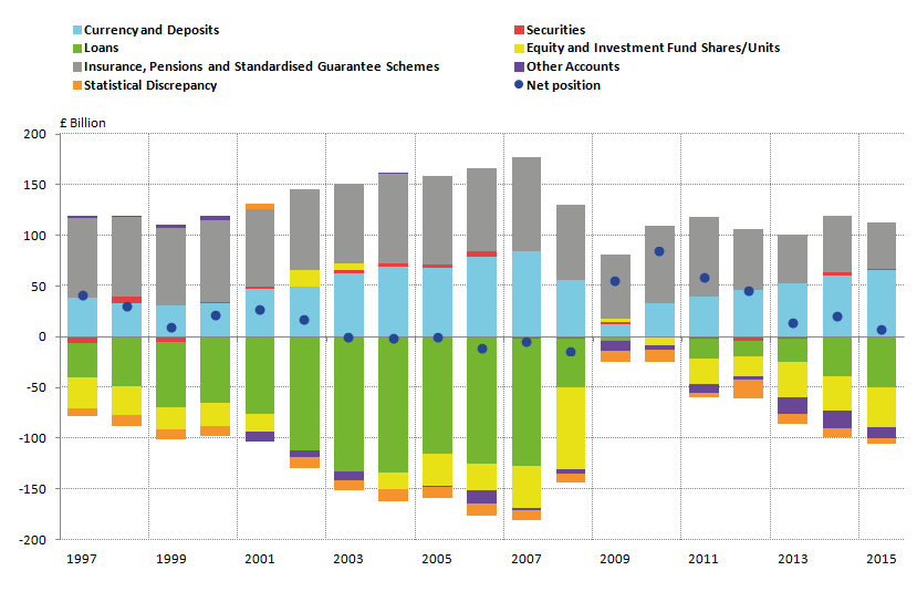
Figure 10 shows that between 2005 and 2008, households started to become net borrowers, acquiring an increasing amount of loans relative to deposits and other assets. Following the downturn, households acquired far fewer loans and only acquired a slightly smaller amount of assets, to become net lenders to other sectors. This peaked in 2010 when UK households lent £84.5 billion. Households then started to move towards becoming net borrowers as the acquisition of liabilities increased. In 2015, households remain slight net lenders, by £7.5 billion, driven by an increase in acquisition of loans and equity and investment fund shares and only slight changes in the values of assets.
Household expenditure
Household consumption expenditure provides an insight into the spending behaviour of households. From 2009 onwards, both household disposable income and household consumption expenditure increased, and in 2015 final consumption expenditure by UK households increased by 2.8 ppts. But while it is important to observe total growth in consumption, emerging trends can also be observed through the changing composition of household expenditure. This is shown in Figure 11, which attributes the share of total nominal household expenditure to a range of categories.
Figure 11: Consumption expenditure in the UK (by resident and non-resident households) as a percentage of total domestic consumption expenditure for 1997, 2009 and 2015
Source: Office for National Statistics
Download this chart Figure 11: Consumption expenditure in the UK (by resident and non-resident households) as a percentage of total domestic consumption expenditure for 1997, 2009 and 2015
Image .csv .xlsThe largest change in the composition of domestic household consumption expenditure has been that of transport; the share of household consumption attributable to these products increased by 1.0 percentage point between 2009 and 2015. This is a result of transport expenditure growing at a faster rate (32.5%) than domestic consumption expenditure (22.1%). Expenditure on restaurants and hotels, and clothing and footwear has also increased as a share of total consumption expenditure between 2009 and 2015, by 0.8 ppts and 0.4 ppts respectively. Together with expenditure on health, which grew 0.1 ppts between 2009 and 2015, these are the only 4 components that have grown as a proportion of total expenditure over this period to the extent to which each are now greater than their respective shares in 1997.
Of the other components of final household consumption expenditure, the biggest decreases between 2009 and 2015 were in the recreation and culture (0.9 ppts) and housing (0.8 ppts) sectors. We have recently improved the measurement of imputed rent, which in turn has affected consumption expenditure on housing. More information on these changes and their impact can be found in the Changes to National Accounts: Imputed Rental article. Housing expenditure increased its share between 1997 and 2009 but has now fallen and is 0.3 ppts lower in 2015 than in 1997.
Furthermore, the shares of expenditure on “discretionary” items tended to fall between 1997 and 2009. Economic theory suggests that spending on discretionary items as a proportion of total expenditure may fall during an economic downturn. However, in some cases, the shares of these discretionary items has continued to fall up to 2015 despite UK GDP being (12.6 ppts) higher than it was in 2009. Alcohol and tobacco and recreation and culture each comprise a smaller share of total expenditure than they did in 1997 and 2009. Restaurants and hotels seems to be an exception as its share is now higher than it was in 1997.
Trends in household saving
The household saving ratio measures the proportion of gross household disposable income that is saved. Figure 12 suggests that the UK’s saving ratio in 2014 was among the lowest of the European countries for which Eurostat data were available, and is 4.1 ppts lower than that of the 28 economies of the European Union. The UK’s ratio was 6.1% compared with the European Union’s 10.2%; Ireland, Spain, Finland and Portugal also appear to have ratios below the European Union average. By contrast, Sweden’s saving ratio of 18.2% is the highest of the countries presented in Figure 12.
Figure 12: Household and NPISH saving ratio for selected European economies, percentage of total resources, 2015

Source: Office for National Statistics, Eurostat
Notes:
- There are no internationally agreed standards for measuring the saving ratio. Therefore these data provide an indication of these ratios.
Download this image Figure 12: Household and NPISH saving ratio for selected European economies, percentage of total resources, 2015
.png (12.0 kB) .xls (28.2 kB)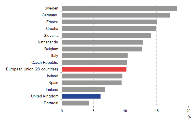
Since the economic downturn of 2008 to 2009, household income and expenditure patterns have developed in different ways, and these developments can be seen through movements in the saving ratio. Figure 13 presents the saving ratio across time for a selection of major European economies. Between 2008 and 2010, the UK experienced a sharp increase in the saving ratio from 5.4% to 11.0%. As the economic outlook worsened and consumer confidence fell following the downturn, households began to save a greater proportion of their income despite record low interest rates. This sharp movement was mirrored in Spain, the Netherlands and the European Union as a whole. However, the increased propensity to save was not observed to the same extent in France and Germany, with their saving rates being broadly unchanged over the period 2004 to 2015. In 2010, the UK’s saving ratio began a downward trend; the most recent data shows it currently stands at 6.1% in 2015.
Figure 13: Household and NPISH saving ratio for selected European economies, percentage of total resources, 2004 to 2015
Source: Office for National Statistics, Eurostat
Notes:
- Saving ratio is household and NPISH total resources, current prices (CP), seasonally adjusted (SA), as a percentage of household and NPISH gross saving (CP SA).
- NPISH stands for non-profit institutions serving households.
Download this chart Figure 13: Household and NPISH saving ratio for selected European economies, percentage of total resources, 2004 to 2015
Image .csv .xlsSince the economic recovery began to take hold in 2010, the saving ratio in the UK fell for 3 continuous years between 2010 and 2013, before experienced a slight increase in 2014, only to decline again in 2015.
This suggests consumer confidence has improved over the period. This decline is in part because disposable income has risen very slowly while expenditure has risen more quickly, restricting the share of income that households save.
Notes for Households
- Data for Canada were not available, so references to the G7 in this section exclude Canada from these calculations.
7. Corporations
Corporations produce goods and services for the market. In the national accounts, these are split into financial (FINCOs) and non-financial corporations. The main distinction is that financial corporations primarily deal in financial assets and liabilities whereas non-financial corporations do not. This section begins by looking in detail at non-financial corporations before considering FINCOs.
Non-financial corporations
The non-financial corporations sector includes retailers, manufacturers, utilities and business service providers among others. It can also be broken down into 2 sub-sectors: public non-financial corporations, which are government-owned trading businesses; and private non-financial corporations. The following analysis will focus on private non-financial corporations (PNFCs).
Company profits (often referred to as the gross operating surplus of corporations) account for the majority of PNFC primary resources, supported by some additional property income (such as interest received on investments and reinvested earnings on foreign direct investment). However, property income paid (primarily dividends that PNFCs pay to other sectors) has exceeded property income received in all years since records began in 1997.
Figure 14 shows the contributions of the components of gross disposable income in the PNFC sector to its overall growth. Higher growth in gross profits supported positive disposable income growth over the decade prior to the downturn, with the exception of 1999, 2001 and 2006. Disposable income fell quite sharply over the economic downturn due to lower profits, and fell in 2012 before growing by 4.4% and 8.6% in 2013 and 2014. This growth was driven by the continued increases in gross operating surplus, from contributing 1.5 ppts in 2012 to a contribution of 15.3 ppts in 2014. The latest data show that PNFCs once again had negative net disposable income in 2015 and the positive contribution from gross operating surplus (GOS) fell back to 2.4 ppts while the negative contribution from net property income was similar to that in 2014.
Figure 14: Contributions to annual growth in UK private non-financial corporations' gross disposable income, percent and percentage points, 1998 to 2015
Source: Office for National Statistics
Download this chart Figure 14: Contributions to annual growth in UK private non-financial corporations' gross disposable income, percent and percentage points, 1998 to 2015
Image .csv .xlsIn the PNFC sector, we equate gross saving with gross disposable income (the 2 terms are interchangeable for this sector). Gross saving equates to retained profits, representing the internally-generated funds available for firms to invest. Positive net lending arises when the gross saving of firms exceeds their capital expenditure. If the sector as a whole were a net borrower, it would imply that internally-generated funds were insufficient to meet planned capital expenditures (hence necessitating the borrowing of funds from other sectors). Therefore, trends in PNFC net lending can be accounted for by movements in these 2 components: gross saving and gross capital formation.
As Figure 15 shows, the sector has been a net lender since 2002 due to broadly stable gross saving, and a gradual fall in the ratio of capital expenditure to gross domestic product (GDP). In 2012 and 2013, PNFC net lending as a proportion of GDP fell quite sharply due to a declining corporate saving rate and rising capital expenditure before levelling off in 2014. Gross saving and gross capital formation both fell in 2015, reducing PNFC net lending to 1.0% of GDP.
Figure 15: Net lending in the UK PNFC sector and its components as a proportion of GDP, percent, 1997 to 2015
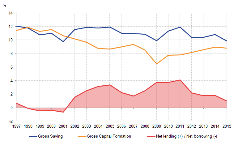
Source: Office for National Statistics
Download this image Figure 15: Net lending in the UK PNFC sector and its components as a proportion of GDP, percent, 1997 to 2015
.png (23.0 kB) .xls (28.7 kB)
With net lending remaining positive since 2002, internally-generated funds for the PNFC sector has been more than sufficient to meet planned capital expenditure, and has consequently been a net lender to other sectors of the economy.
Financial corporations
The financial corporation (FINCO) sector consists of institutions whose principal activity is the production of financial services. FINCOs can be divided into 3 main groups: monetary and financial institutions, including bodies such as central banks; insurance corporations and pension funds; and other financial corporations. In contrast to other sectors, the main source of primary income for FINCOs is from net interest received from the existing stock of assets and liabilities held by the sector. In other words, the interest received by FINCOs on financial services sold on the market provides a key source of income for these businesses.
Figure 16: The components of gross disposable income (GDI) for financial corporations, £ billion, 1997 to 2015
Source: Office for National Statistics
Download this chart Figure 16: The components of gross disposable income (GDI) for financial corporations, £ billion, 1997 to 2015
Image .csv .xlsLooking in more detail at FINCO, gross disposable income (GDI) reveals that it has been relatively constant since 2005. Figure 16 shows the uses of FINCO GDI and the overall value by which total resources have changed per year. GDI fell to £37.2 billion in 2015, which is a value last seen around 2003. It can be observed that the biggest use of FINCO total resources in 2015 was other social insurance benefits. There has been a shift in how these corporations have used their resources in the period since 1997. Other current transfers were the larger category into the 2000s; the change in uses towards other social insurance benefits occurred gradually, becoming more evident from the mid-2000s onwards.
Nôl i'r tabl cynnwys